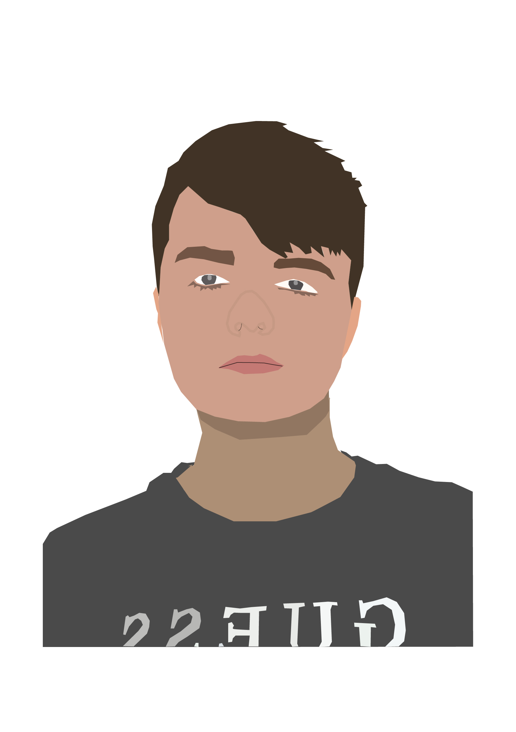
This is my first self portrait made using Adobe Illustrator. For this portrait, I used a photograph of myself as a reference. The photo I used is an ID photo, which is serious and true to life, which I decided to convey in the portrait itself. The reason why I did this is because I wanted the viewer to have an accurate representation of me, like how I am in person.
For this design, I took a more realistic approach with the tones and shapes used. I used the colour picker to get the tones within the image as close as I could in the illustration, matching the tones of my skin, hair and eyes. This is so that people can recognise me and place a face to the designer. It creates more of a personal feeling and a connection between the viewer of my work and myself, making them feel more at ease and familiar as to who I am .
Although I used true to life colours, I wasn’t precise with my shapes, choosing to create a general suggestion with more basic shapes. This creates a more lifelike appearance but also has an illustrative feeling to it, so it doesn’t look 100% exactly like the photograph it is based off of, which would defeat the purpose of it being an illustration. We can see this on the nose, where I used a thin stroke to create a general idea of the shadows – it still looks like my own nose, but it doesn’t show every intricate detail and shadow. I chose to create a semi-stylised portrait which kept enough basic features for it to look realistic enough and recognisable.
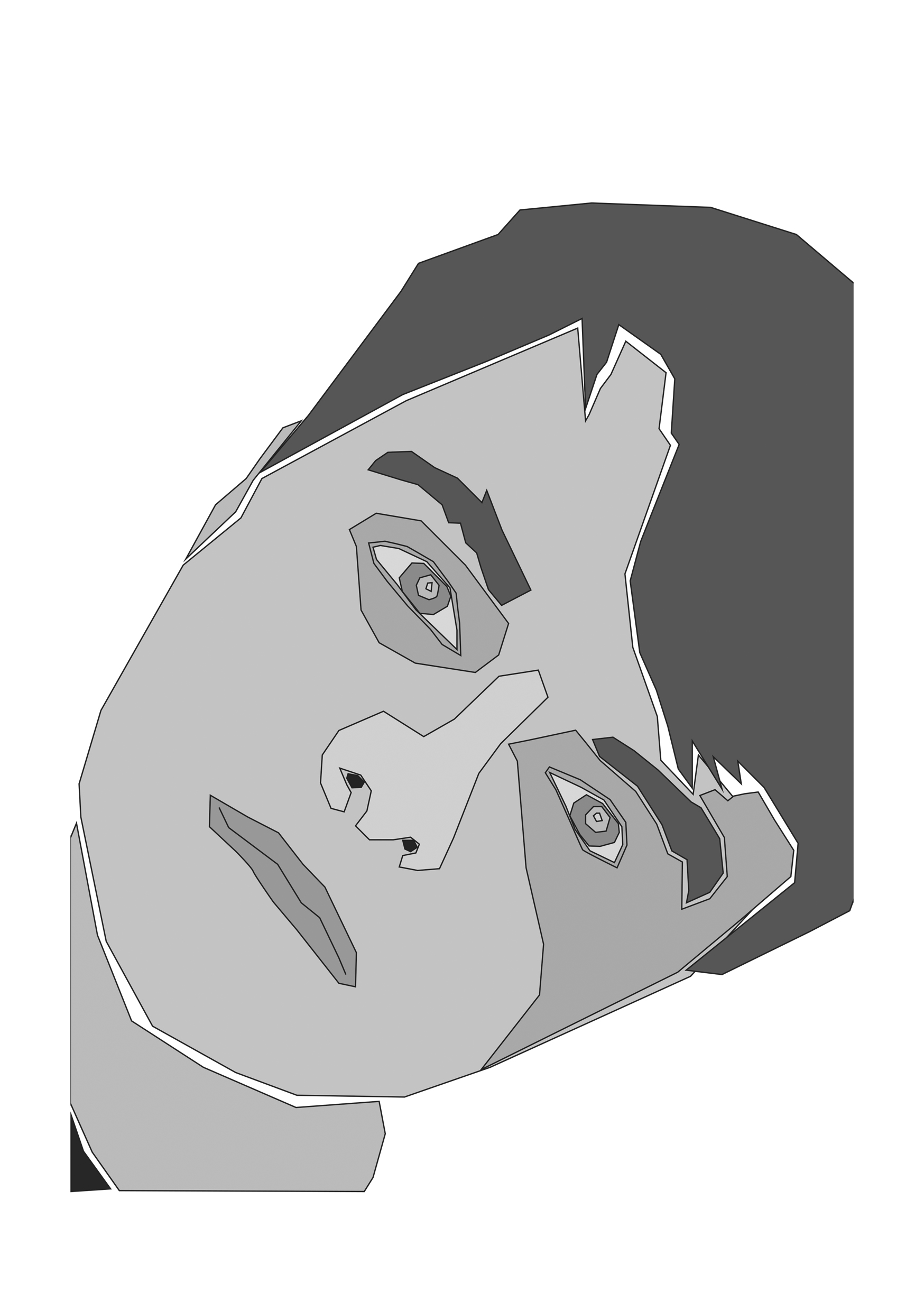
This is my second self portrait made in Illustrator. I based this illustration off of another photograph of myself, this time at a more tilted angle for an interesting composition. The photo is a selfie that I took, which is why I decided to take a more fun, unserious approach to match the casualness of a selfie, as opposed to the more serious ID picture. I went for more impressionistic shapes and decided to use a monochromatic grey colour palette to create dramatic contrasts between light and dark.
The choice to use grey was to get across that I am calm and cool-headed, that I am serious and that I manage to remain at ease under pressure. Grey can also vary from being a light ashy tone, to a more moody dark tone, I think it can create a multitude of feelings so I wanted to use it as a way to add depth and some drama to my portrait.
The shapes used are a lot more jagged and imperfect. I was less precise and instead created a fragmented appearance, which I have furthered by separating elements such as the hair, the neck and the eyebrows. The negative space adds more contrast and looks like bits of a puzzle being put together.
My intention for this portrait was to show myself as different pieces being put together, all of which make up who I am. It represents all my ideas and traits being put together to form who I am as a person.