Colour
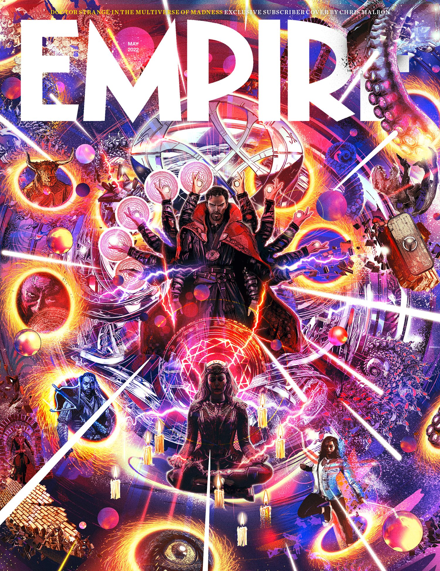
Left: Good use of colour in editorial design
This is a good example of colour in editorial design. This image shows a magazine cover illustration which employs lots of colour.
The designer has used an array of vibrant, expressive colours which are balanced out with each other. The result is a highly saturated, visually appealing magazine cover. This cover is dramatic and enticing to the eye. From far away, it is hard to miss and seems to draw you in out of curiosity.
The most dominant colours in this design seem to be a deep blue and warm yellow. The two colours are both on opposite sides of the colour wheel, which creates contrast between cold and warm tones. This same contrast prevents the design from being overly blue and brings in some differentiation between colour groups.
The people within this design appear to be darker in tone, using less saturated colours to offset the bolder shades. This draws attention to them and creates a range from light to dark, which is more effective as it distinguishes the people from the background, which is quite busy and has the potential to become extremely overpowering.
Another way the design is equalled out is by the use of white. The white is extremely bright and adds a sense of luminance, with the lines segmenting the design and also drawing the eye inwards. The EMPIRE text is also in white, which pronounces it more and adds importance to the name, emphasising the title. The white is extremely stark and automatically sets itself apart from the rest of the design. If the white was to be swapped out for another colour, the legibility may become affected and parts would become lost within the rest of the design. The white acts as a rest stop for the eye, leading us away from the more chaotic background momentarily.
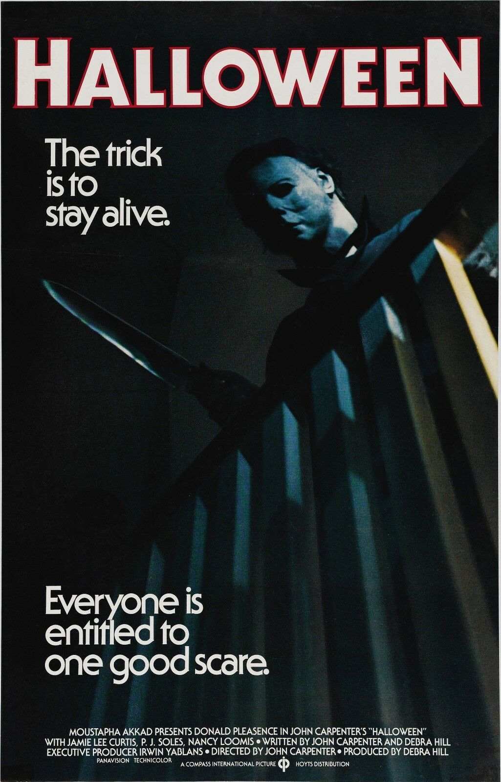
Left: Less effective use of colour in editorial design
This is an example of less effective use of colour in editorial design. This is a movie poster for the 1978 film Halloween.
Halloween is a slasher movie, and the man in the poster is the main villain of the movie. The colour blue doesn’t convey this very well and doesn’t appear scary or intimidating. The blue also doesn’t work very well when paired with the stroke of the text.
I have used the Pantone colour books in Adobe Illustrator to show how I would redesign this with better use of colour.
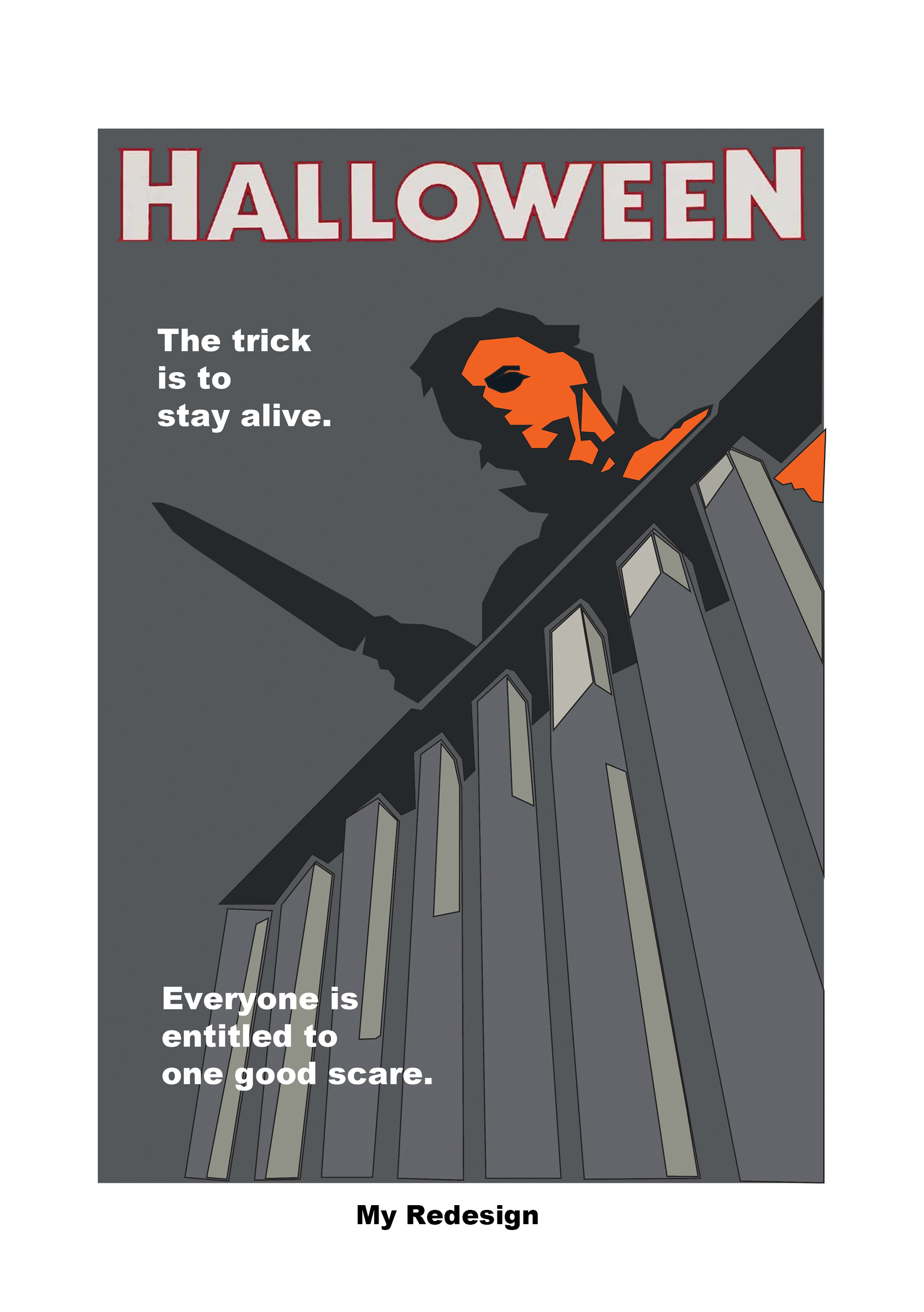
In this redesign, I have swapped out the blue light being cast over the villains face with an orange one. I have chosen to use orange as it is more associated with the concept of Halloween.
The colour blue is seen as non-threatening and calming (Cherry, 2020). This makes the villain seem less unnerving which isn’t desired as the poster is promoting a slasher movie. We do not want the viewer to feel calm, but instead we want to make them feel alert and more on edge when viewing this poster.
As opposed to the colour blue, orange is more high-energy (Cherry, 2021), so it would be more likely to draw the attention of the viewer and make them focus on the villain.
I kept the dark backdrop to contrast the orange. The darkness also creates a more unnerving feeling to the poster.
References:
Cherry, K (2020) The Colour Psychology Of Blue. Available online: https://www.verywellmind.com/the-color-psychology-of-blue-2795815 [Accessed 26.10.2022]
Cherry, K (2021) The Colour Psychology Of Orange. Available online: https://www.verywellmind.com/the-color-psychology-of-orange-2795818 [Accessed 26.10.2022]
Malbon, C (2022) Empire – May 2022 Subscriber Cover [Magazine]. Available online: https://www.empireonline.com/movies/news/empire-doctor-strange-multiverse-of-madness-covers-revealed/ [Accessed 26.10.2022]
Unknown artist (1978) Halloween (1978) The Trick Is to Stay Alive [Poster]. Available online: https://www.ebay.com/itm/222001097140?icep_id=114&ipn=icep&toolid=20004&campid=5338192659&mkevt=1&mkcid=1&mkrid=711-53200-19255-0&ufes_redirect=true [Accessed 26.10.2022]