Composition
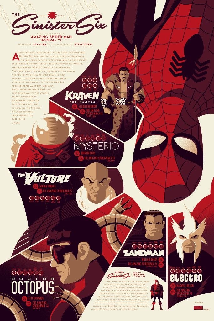
Left: Good example of 2D composition
This is an example of good 2D layout and use of composition within editorial design.
This design has been well considered and flows well, leading the viewer across the page and drawing attention to each element inside the design.
The most dominant element is the spiders web, which expands from around the character and down to the lower left corner of the design, creating a diagonal split in the composition, leading the eye around each arch of the web, all of which showcase a different piece of information.
The use of white space also breaks up the elements and makes the design easier to digest, as it isn’t all just spaced together tightly, allowing breathing space for each segment of information.
The headline is placed in the upper right corner, and is sized appropriately in order to not throw the composition of balance by being too large. Underneath this, we see a body paragraph, and the designer has aligned the text to warp around the web, which fills this space nicely and doesn’t leave any awkward spacing between the text and the illustration.
In the upper left corner, there are also some faint diagonal lines descending towards the heading, subtly leading the eye downwards towards the text. The bottom right corner is balanced by a second body paragraph, which is smaller, filling in the small area of space and avoiding any chunky gaps.
Finally, the Marvel logo is placed right within the lower right corner, fitting nicely and ensuring that everything is perfectly balanced without being overpowering.
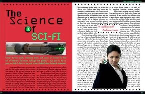
Left: Poor example of 2D composition
I have now found a bad example of 2D layout and composition in editorial design. This is a magazine spread about sci-fi, and the science behind it. The design isn’t laid out well and all the text is grouped together into two large columns, which appears monotonous. The balance isn’t very good either, as the images and headlines seem to clash and throw each other off.
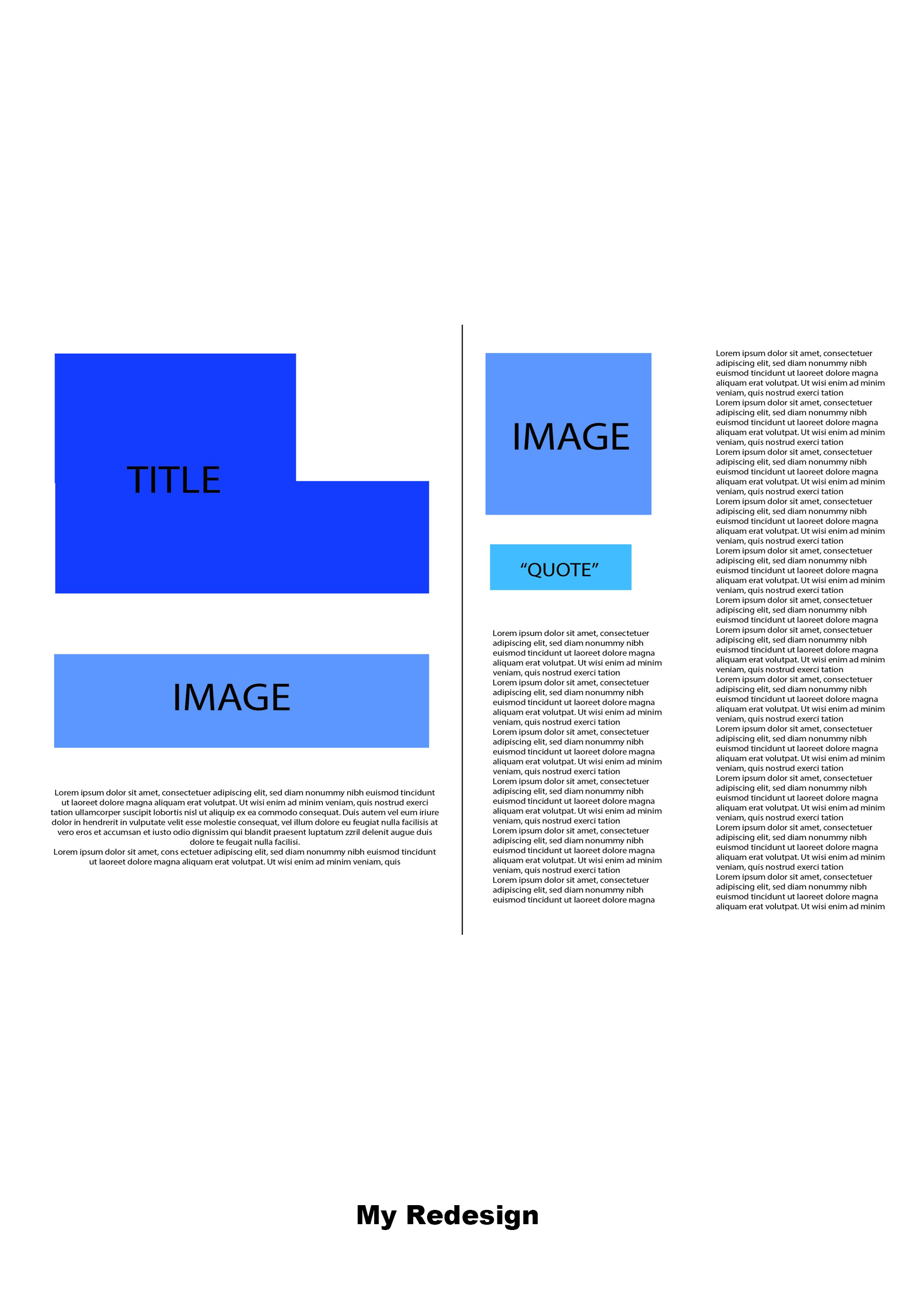
Using Illustrator, I have used basic shapes to show how I would change the layout to be more effective.
I would start by having the title flushed right in the upper left corner, allowing the text to spread across the top third of the frame, bringing the eye outwards.
I would then place the screwdriver image slightly below the centre of the left page, leaving a slight bit of space for the text to avoid a cramped appearance.
Then with the short blur paragraph, I would align that beneath this in the centre, condensing the text box and creating length horizontally to draw the eye inwards.
On the right side, I’d place the image of the woman in the top left corner, creating balance between the two images by having them aligned almost diagonally. Then I would place the quote beneath this so it doesn’t affect the text columns.
For the left text column, I would bring it down lower than the right to create some slight asymmetry and to avoid the text looking intimidating. By breaking down the sizes of the text boxes, it appears less like an essay to the viewer and creates a break visually. The right text box descends vertically down the entire page, forming vertical lines to break the horizontal ones, which is also accentuated further by the spacing between columns, creating a more flattering and inviting composition to this spread.
References:
Unknown Artist (n.d) The Science Of Sci-Fi [Magazine Spread]. Available online: https://www.pinterest.co.uk/pin/896075657084929462/sent/?invite_code=402dc90d257e45218d476c251760b3da&sender=896075794516860563&sfo=1 [Accessed: 20.10.2022]
Whalen, T (2016) Sinister Six [Poster]. Available online: https://www.artcollectorz.com/artworks/artwork-detail?artwork_id=12797&edition_id=16352 [Accessed 20.10.2022]