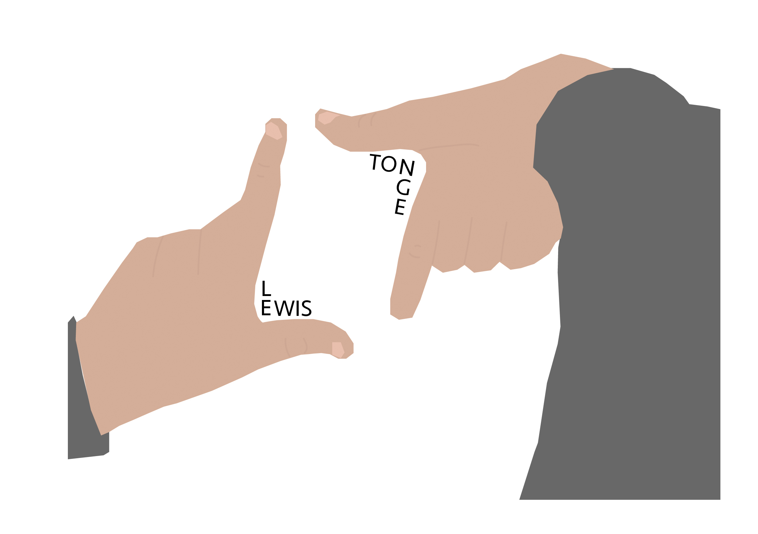
My first conceptually designed logo uses the idea of two hands placed together to form my initials. I based the illustration off of my own hands, which adds a personal touch rather than using a photograph of someone else’s hands. My initials are LT, so I used my thumb and index finger to form the two letters, with the bar of the T emphasised by the faint wrinkle which runs along from my thumb horizontally.
The space between my hands creates a frame effect, so I would be able to overlay this logo over other images to create points of interest, whilst adding my own personal effect. The frame aspect represents how I take careful consideration to make sure that all details of my work are on point and effective.
I chose to keep colours more subdued. I didn’t go for a variety of tones because whilst I wanted it to be obvious that the illustration is of hands, I didn’t want to distract from the shapes of the L and the T. I did use simple lines of a darker beige to add detailing between fingers, and I illustrated my fingernails to create more of an impression of hands.
I’ve also included part of my jumper sleeves within the composition, which form leading lines coming inwards and centralising the main area of the design (my hands). To have just the hands on their own wouldn’t really lead the eye anywhere and the hands would look strange since they’d just be floating in the frame.
To make it more clear who I am, I’ve also added in my full name, bending the text to fit around the corners of my hands. This helps to make the shapes more visible, and also fill out some of the excess space in the middle, so the gap isn’t too spacious and empty.
This is my second conceptually designed logo. I wanted to show more of my interests and information about me in this design. I had the idea of creating a badge icon, similar to that of a football club badge, as I enjoy watching and playing football and it is one of my main hobbies.
I chose quite a simple format, which is almost like an arrow pointing down. This way, the logo can be applied to other designs but not look too complex and distracting.
For the main image on the crest, I have illustrated the Humber Bridge at sunset. I am from Hull, so it made sense to show this somehow – and the Humber Bridge is one of the most iconic parts of the city. As soon as you see the bridge you know you are home again. I used various line weights to create distinction between the beams and the joints of the bridge, making the design look more intricate and varied.
I used blue tones, as they are my favourite colour. Blue is also the main colour for Chelsea, who are my favourite football team. I used multiple shades of blue for depth and contrast. The blue and orange tones work particularly well as they’re complimentary colours.
I included my initials as well as my full name to fill up the middle and lower thirds of the design. My full name forms the point at the lower portion, leading the appealingly, where it descends down and then ascends back up to the other side of the design, creating symmetry also.