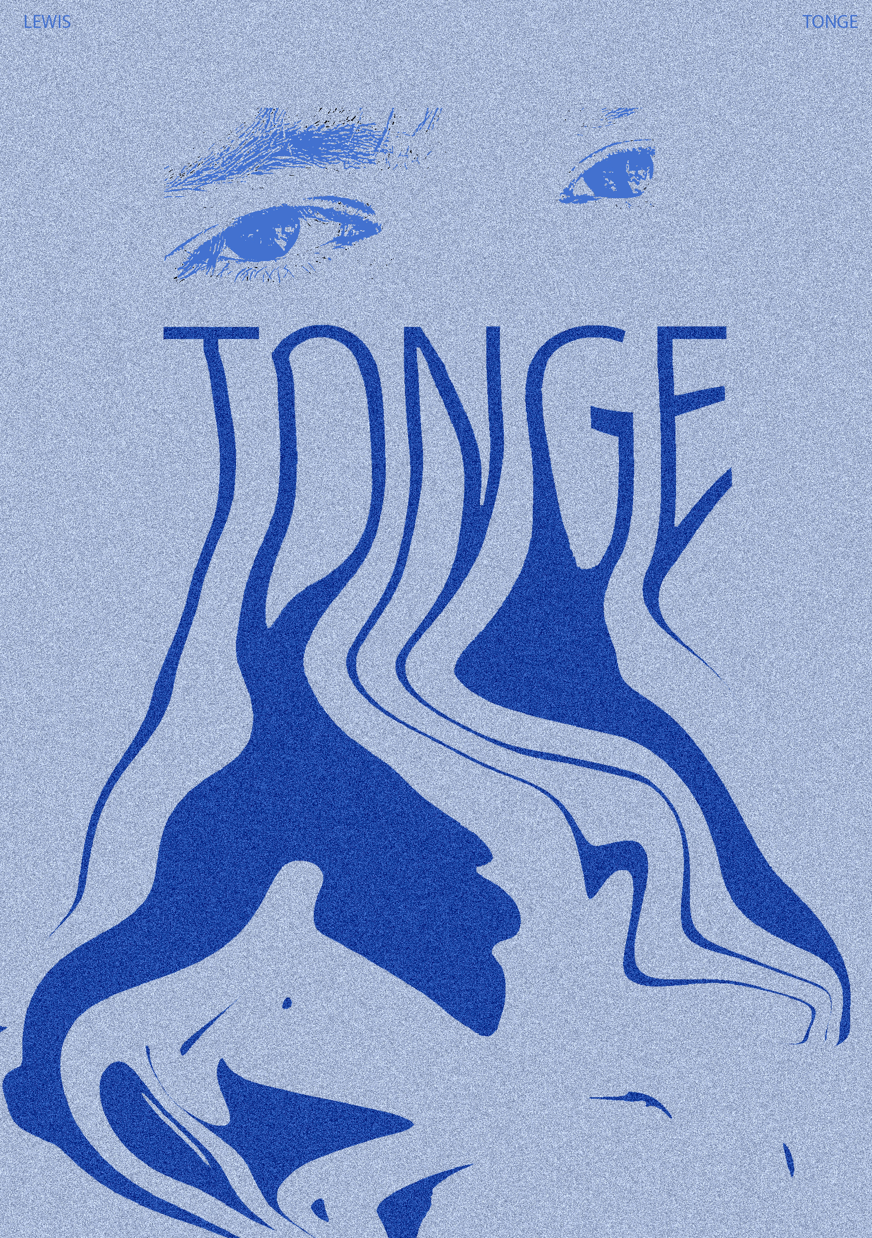
For my first self-promotional image poster, I designed an abstracted, almost psychedelic retro-looking poster. I had the idea of using my last name to create an impactful feeling, placing it in the central-upper third. I used a tall, condensed typeface and manipulated it so it appeared to be melting. The elongated text worked well for this as it looks to be pulling downwards. The melting represents all my creativity and ideas ‘bleeding out’ onto the page, almost as if there is too much and it is spilling out. My full name is on the top of the poster too, but I have used it more as a frame since my last name is already really pronounced and is a big focal point in the poster.
I wanted to fill out the upper third of the design, so I brought in an image of my eyes. The eyes are supposed to be a window to the soul, and this creates a more personal aspect to the poster, as if the eyes are looking directly at the viewer and connecting with them. The type is the strongest element in this poster, so I made the eyes a lighter blue tone for lower contrast, as not to take away focus from the text and have the elements clashing.
Blue is my favourite colour, which is why I used it. The poster is monochromatic but contrast is formed through the different shades used. Darker shades of blue are used for the areas I want to be pronounced, such as my surname. I added grain onto the poster for some texture, and to create a more ‘worn’ and imperfect appearance, which adds more depth to the design.
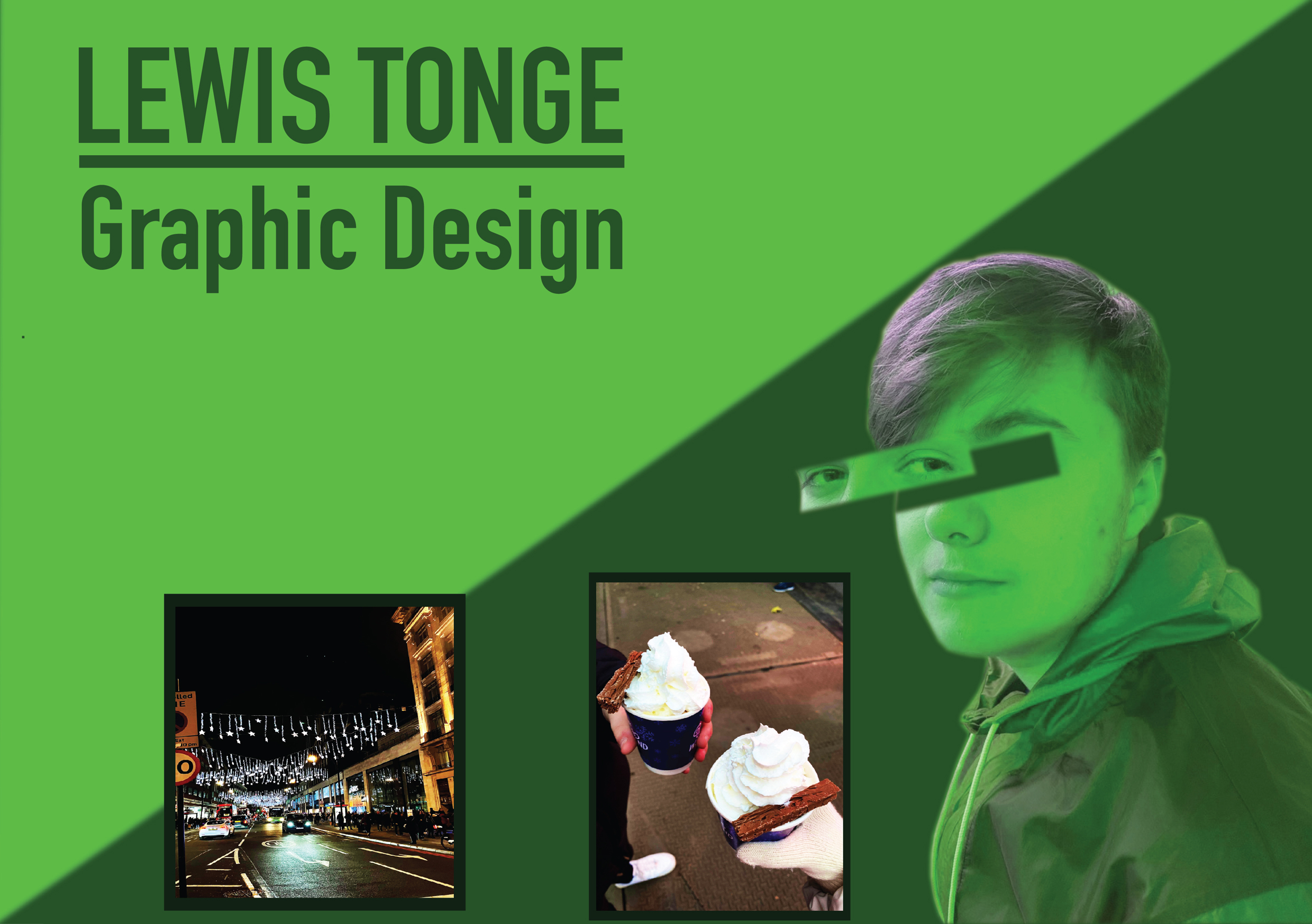
My second poster is a landscape one. I wanted to try out a different format. This poster is more structural, using sharp lines and shapes to divide the composition. I started by splitting the composition diagonally, creating leading lines. Half of the frame is light green, and the other is dark green – my second favourite colour following blue. In the upper left corner is my full name underlined for emphasis. Underneath it is graphic designer, which is what I am advertising myself as in this poster. I then made two image boxes, with a black border. The images are from my trip to London, which shows I enjoy travelling and having fun experiences. One of the photos shows a hot chocolate I had in London, which I included as it is one of my favourite drinks.
In this poster, I decided to show myself. I used a photograph of myself, placing it in the lower right corner to balance out the rest of the elements. I colourized the image to green to match the rest of the design. I cropped my eyes and brought them outwards to create a more interesting look to the image. The cropping of the eyes adds more shape and forms a more surreal appearance.