My subject for editorial design research is film.
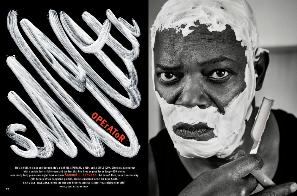
Left: Good example of typography
This is an example of effective use of typography in editorial design. This spread is from Esquire magazine and features Samuel L. Jackson. The image on the right shows Jackson shaving his face, and the designer has mirrored this on the opposite side by using a white, streaky typeface upon a contrasting black backdrop. The text has been manipulated to resemble shaving foam, with the headline reading ‘Smooth operator’. The letters get larger in the middle, giving a sense of movement and rhythm, with the letters joined up close together to create a continuous, ‘smooth’ effect. This word is also aligned so that it goes diagonal instead of horizontal, which, along with how large the text is, adjusts the hierarchy to force the viewer to read this first as it is so bold and dramatic. The word ‘operator’ stands out as one of the only inclusions of colour in the design, along with Samuel L. Jackson in the body text – this commands the viewers attention and is used to bring the eye to where the designer wants the reader to look. ‘Operator’ uses a sans-serif text to contrast ‘smooth’ and is placed within the counter of the ‘O’, varying between upper and lower case to oppose the ‘smooth’ typeface above in favour for a more jagged looking effect. The body text uses a sans-serif typeface which helps distinguish this part of text to the the heading and the smaller size also tells us this. The text is centre aligned and the tracking is close-knit, filling in the lower area of the page nicely and balancing out the large heading above. Some important bits of information have been made bold, such as the films Jackson has starred in, this adds emphasis and brings in interest to popular projects, making the viewer want to read on.
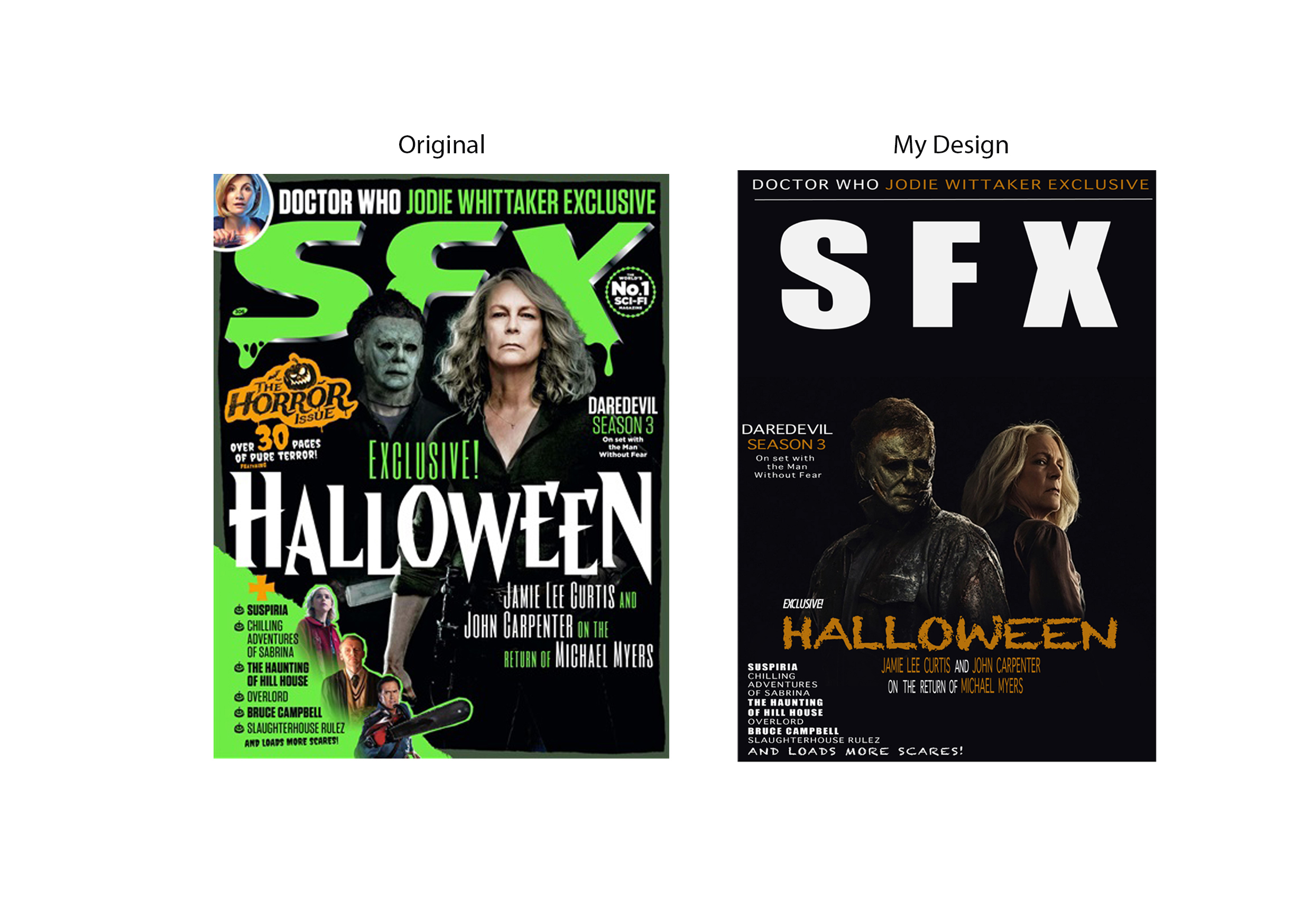
In comparison, this magazine cover doesn’t use typography as effectively. I have redesigned this to improve the typography using Adobe Illustrator. I began by placing the magazine title at the top of the design, making sure it wasn’t covered up like the original which affects the readability and is covered up by the image. I swapped the slimy-effect for a simple sans serif typeface to make the title seem more dramatic and intense. I think the slime was a little bit cliché and cheesy, which is why I opted to not include it in my own design. I felt as though there was too much information on the original design, so I narrowed it down a little bit, placing smaller headings around the image instead of placing text directly over the photograph. I made use of the excess space around the image rather than covering it up as I felt it balanced the frame out more and allowed each element to stand out on its own. I chose to use orange alongside the white text to add contrast, but also because it seems to match the Halloween theme better than green but still keeps the vivid bold aspect of the design. I used a few different typefaces, mostly sans-serifs in different sizes and weight variations, but I did go for more of a decorative, spooky looking typeface for ‘Halloween’. I did this to add more personality to the cover and to compliment the main story heading, which improved the order of hierarchy, making this the most obvious piece of information alongside the title. I kept the essence of the original design, such as the slight horror-elements and some of the text placements, but I instead chose to refine other elements down for a less overpowering and busy design.
Reference list:
Blumhouse Productions (2022) Halloween Ends [Poster]. Available online: Halloween Ends (2022) (imdb.com) [Accessed: 7.10.2022]
Future plc (2018) SFX November 2018 [Magazine]. Available online: SFX Magazine Subscriptions for Businesses (dltmagazines.co.uk) [Accessed: 6.10.2022]
Hearst Communications (2019) Smooth Operator [Magazine spread]. Available online: SMOOTH OPERATOR | Esquire | April 2019 [Accessed: 6.10.2022]