To help create an understanding of the presentation and branding of Silver Scream, I have made guidelines which describe things such as fonts and colours which are to be used when designing movie posters and other materials for part of the campaign. The guidelines have been designed to reflect the company by using blood dripping imagery and dark, horror style colours and the company logo.
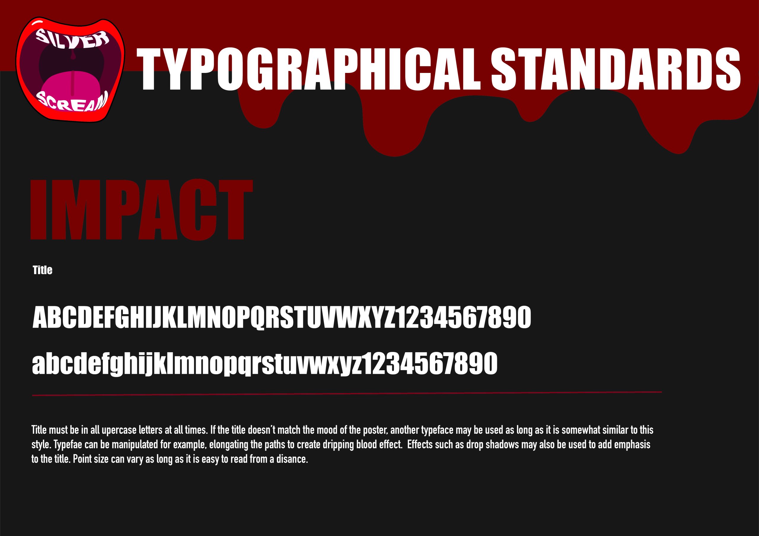
Movie titles should use Impact. The titles can be manipulated to add personality and to link with the themes of the movie in order to enhance the design. I chose impact since it is very bold and as the name would suggest, impacting, which would fit within the realm of horror due to it being dramatic and almost quite intimidating, instilling a sense of fear and precaution in the viewer.
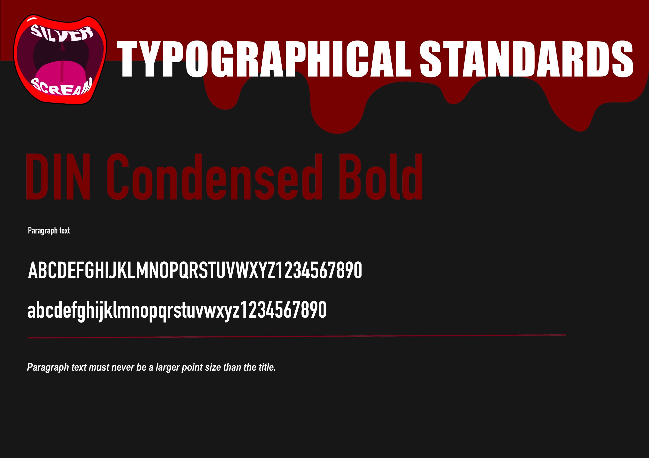
For paragraph text like credits or sub headings, I chose DIN Condensed Bold. I chose this because it is more thin and doesn’t compete with the more heavy title font. Because of how tall and narrow the font is, it creates a cramped and slightly uncomfortable feeling when looking at it. I have specified that the paragraph text must never be larger in size than the title, because the title text is more important than other text on the design, so it should always be the largest in size.
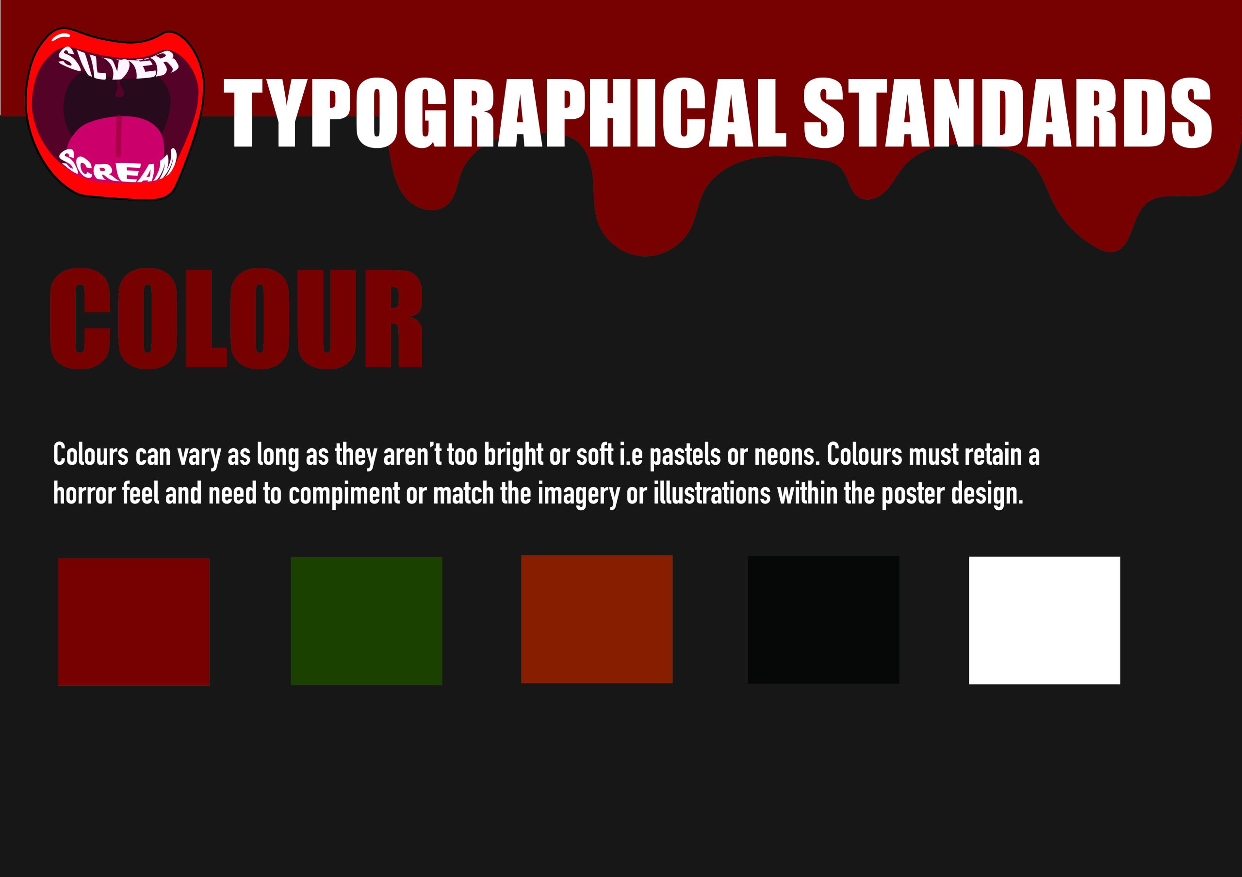
The final slide describes which colours are to be used. I have specified that the colours must not be neon or pastel rainbow colours, but instead need to be more muted and darker colours which are associated with horror. Colours such as blood red, greens, oranges, black and white are favoured, since they’re more grungy and dim. Rainbow colours would look confusing and strange, which is why I wouldn’t use them in my designs.