Examination and Analysis of Other Festival Websites and Apps
For this project, I have been asked to come up with a refresh for the Freedom Festival brand, including a new web design. Before I start to design, I will look at other festival’s websites and apps for inspiration and to see what key features I should think about when I make my own for the Freedom Festival 2024.
Your events website is important for promoting your website because it has all the information that visitors should know. If your website is designed poorly, and visitors cannot access this information, then you may lose interest or confuse the visitor.
Glastonbury Festival

To start off, I have took a screenshot of Glastonbury Festival’s website. I think that this website uses a column grid, with large margins on either side. I think this because each section of the navigation is equal in width going across the top of the page, with the main section also taking up the same amount of space as the navigation, which has caused them to be aligned.
The use of a grid has meant that there can be hierarchy and order, and also allows creative choices, such as the varied heights in the navigation bar, and the varied text alignment in the lower section. These choices work because they fit the guides still, and the website flows easily. The guides help the designers know where to place design elements without losing hierarchy or shape (Galvan, nd)
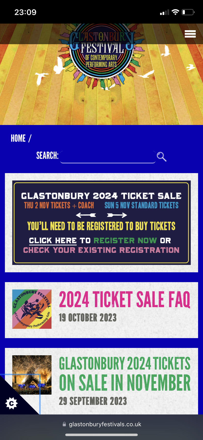
For the mobile website, I think they have also used a column grid similar to the main website design. The elements still line up but have had to become stacked so that they fit on a smaller device. Because the navigation is so long, there is a burger menu at the top right. This makes the website more organised and means that there isn’t lots of information squished into a small space.
You can see that the design is the same. They use the same logo, illustration, colours and typography. The consistency makes the website recognisable and makes sure visitors can tell they are on the same website even if the layout is slightly different.
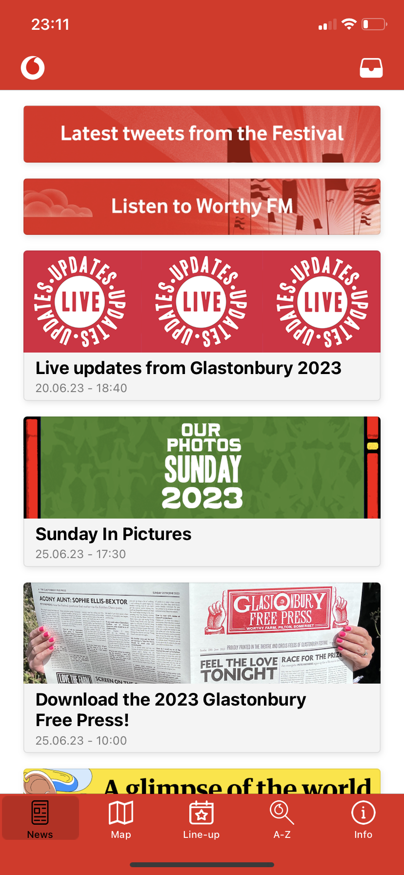
And now I have looked at the Glastonbury app for mobile. I think that the app is confusing because it doesn’t look like the main website or mobile website. The colours, typography and imagery are completely different and misguiding. Even the logo is a Vodaphone logo, and not the Glastonbury one. This inconsistency is not good, because it could make the user feel untrustworthy and that it is a fake app.
“Consistency is the key to successful branding. And consistency goes beyond the product itself. The brand promise must be clear with every interaction each stakeholder experiences.” (Arruda, 2016).
This app doesn’t reflect the same ideas as the website, and is unclear because of this. This is why it is important to aim for consistency across platforms, which can be done through similar visuals and design choices.
Mobile First Website Design
Something a lot of companies do now is use mobile first design to create their websites. This is because recent years show that over 50% of web traffic comes from mobile, so it is now being prioritised as it is the most popular way of viewing sites.
Designing for mobile first means that you can work your way up from the smallest screens, and add in more elements as you go up, instead of working on large screens first and being forced to compromise design choices. (Unadkat, 2023)
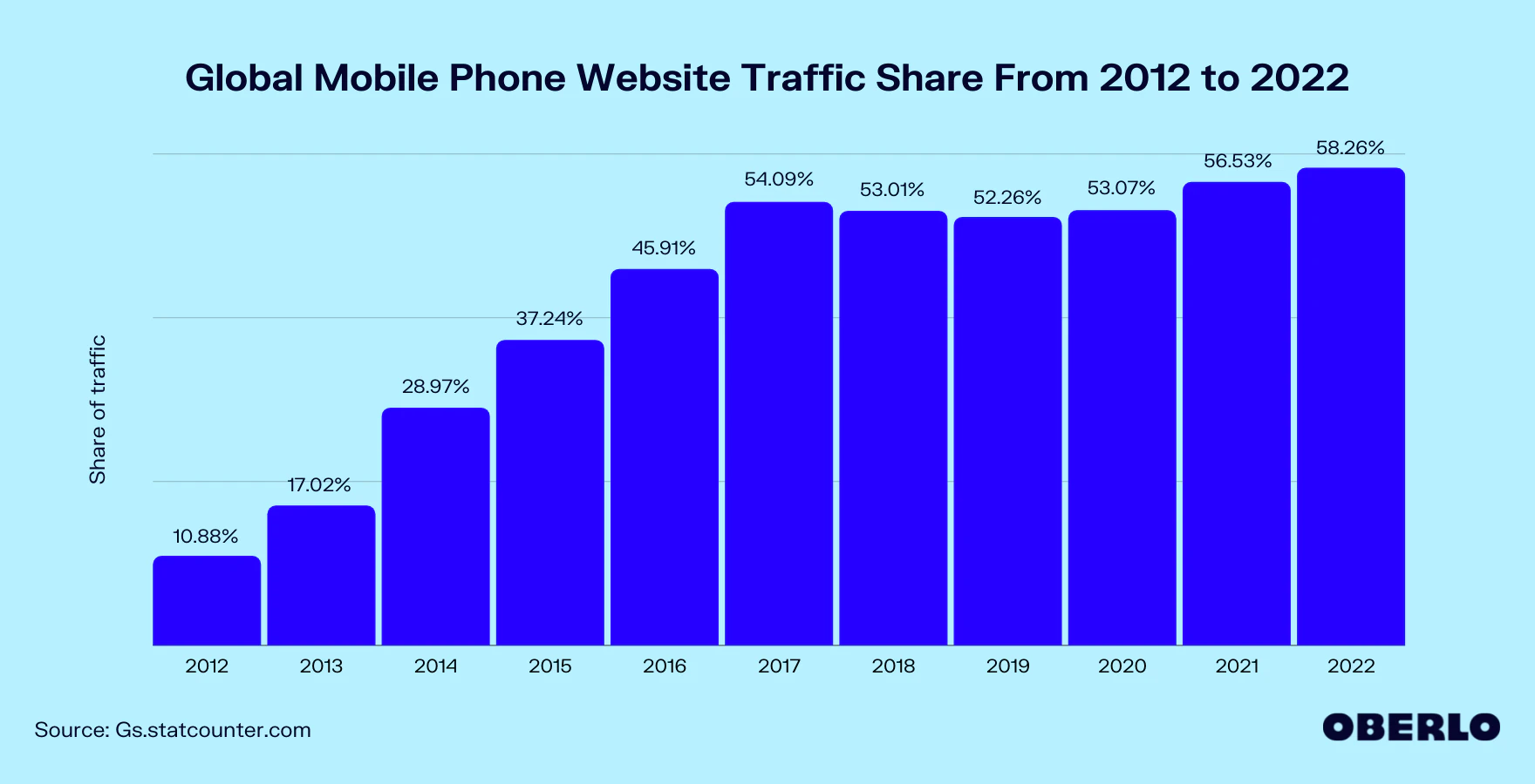
This chart shows how much share of traffic mobile phone devices have taken in the past 10 years. You can see how it has risen over the years, which proves its importance.
Conclusion
For the project, I want to make sure that I use clear grids to form hierarchy and shape. I will also use grids to form similar layouts on different platforms. I also want to keep visuals consistent too by using the same elements, which will make the Freedom Festival clear and trustworthy to stakeholders. I also want to take a mobile-first design approach to make sure the website will work across screens effectively.
References:
Arruda, William (2016) Why Consistency Is The Key To Successful Branding [Article]. Available online:https://www.forbes.com/sites/williamarruda/2016/12/13/why-consistency-is-the-key-to-successful-branding/ [Accessed: 29.10.2023]
Galvan, Monica (nd) How To Use A Grid In Web Design [Article]. Available online: https://www.flux-academy.com/blog/how-to-use-a-grid-in-web-design [Accessed: 29.10.2023]
Oberlo (2023) WHAT PERCENTAGE OF INTERNET TRAFFIC IS MOBILE? [Image]. Available online: https://www.oberlo.com/statistics/mobile-internet-traffic [Accessed: 29.10.2023]
Unadkat, Jash (2023) Mobile First Design: What it is and How to Implement it [Article]. Available online: https://www.browserstack.com/guide/how-to-implement-mobile-first-design [Accessed: 29.10.2023]