Visual Identity Across Channels and Accessibility
“Once a brand is established, it needs to become a recognizable identity that the external world can perceive. This recognition comes with consistency, and achieving that consistency requires a strong visual identity system.” (Gregory, 2022)
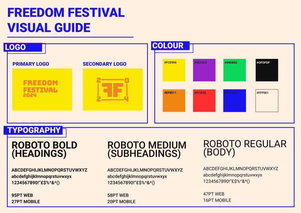
Throughout my development log I have been working on a collective visual identity that I can use across all channels, including web and app devices. It was important for my visual identity to translate across platforms and be responsive to different factors such as screen size, device compatibility and user intuition. I have done this by using things such as web safe typography that can scale up and down but still be readable and clear, HEX value colours that are screen accurate, and various logo forms that can be used interchangeably depending on the display sizes.
I have also considered the layout of my website for both a desktop screen and a mobile screen. I have created mockups that demonstrate how the website can still be used on smaller screens, and I have used different methods to apply responsive design.
I have put all this information onto one document, where I can show other people the brands visual identity and so that myself and others can understand how the identity should look.
I have also considered the point size of the text to make sure it is always at a suitable size that is readable and clear to users. Accessibility is important to consider in UX and one thing to consider when designing accessibly is if typography is legible on a range of screens and devices. It is also important to consider how older display models may make it harder to view some typefaces, which is why I purposely chose a font that is web safe. Web safe fonts also reduce loading times as they are pre-installed and that is something to think about especially with older, slower devices.
I have also made sure text isn’t smaller than 16pt, because this means users can view text comfortably, whilst some exceptions may be made for captions, which are usually smaller (Patti, 2023).
I have chosen colours with a higher contrast against each other so that users with poor eyesight can comfortably see the content. Although the logo is low contrast, the weight of the logo creates clear distinction. It becomes an issue with things such as smaller text sizes.
All of this has been applied to my mockups. I will continue to apply accessible and responsive design as I progress towards my final outcome. You can see how I have also applied the visual identity aspects into my mockup, showing how it spans across multiple channels. I can also take this visual identity into things such as print, social media and motion design as part of my final presentation.
Reference List:
Gregory, Lauren (2022) Visual Identity Systems: What They Are & Why They Matter [Article]. Available online: https://blog.hubspot.com/marketing/visual-identity-systems [Accessed: 19.11.2023]
Patti, John (2023) The Role of Typography in Designing for Accessibility [Article]. Available online: https://www.hyphadev.io/blog/the-role-of-typography-in-designing-for-accessibility#:~:text=Best%20Practices%20for%20Ensuring%20Accessible%20Typography%201%201.,5.%20Do%20Not%20Use%20Images%20of%20Text%20 [Accessed: 19.11.2023]
W3 (2019) Designing for Web Accessibility [Article]. Available online: https://www.w3.org/WAI/tips/designing/#use-headings-and-spacing-to-group-related-content [Accessed: 19.11.2023]


