Conceptual Energy Drink Animation Storyboard
“The key ingredients of a great TV ad are a clear and concise message, engaging visual elements and a strong emotional appeal. Not only that, it’s important to consider the target audience, tone of the ad and timing as well.” (Holdens, nd)
Once I had all my planning and designs done for my energy drink can, I then started to plan out my animation. To start this I made a storyboard and drew six boxes which would equate to twenty frames each to add up to the 120 frame amount.
I had my storyboard start with the can spinning so the viewer would see the whole can, then it would lean into the screen to act like the viewer is having a drink, then it would lean back to being stood up. After this, the can would then spin again, and once the can had done another spin, the flavours of the drink would fall down to cover the screen so it could go to a new scene. After this it would go back to a blank screen with all three cans dropping down into frame, and then the two cans on either side of the middle can, would then move in to leaving only the middle can. After this, the slogan would drop down, ending the animation.
This storyboard successfully shows off the product and it’s different flavours. I also plan on having the animation transform into colour from black and white to show the transformation after drinking it from dull to exciting, showing how the product gives you energy when drinking.
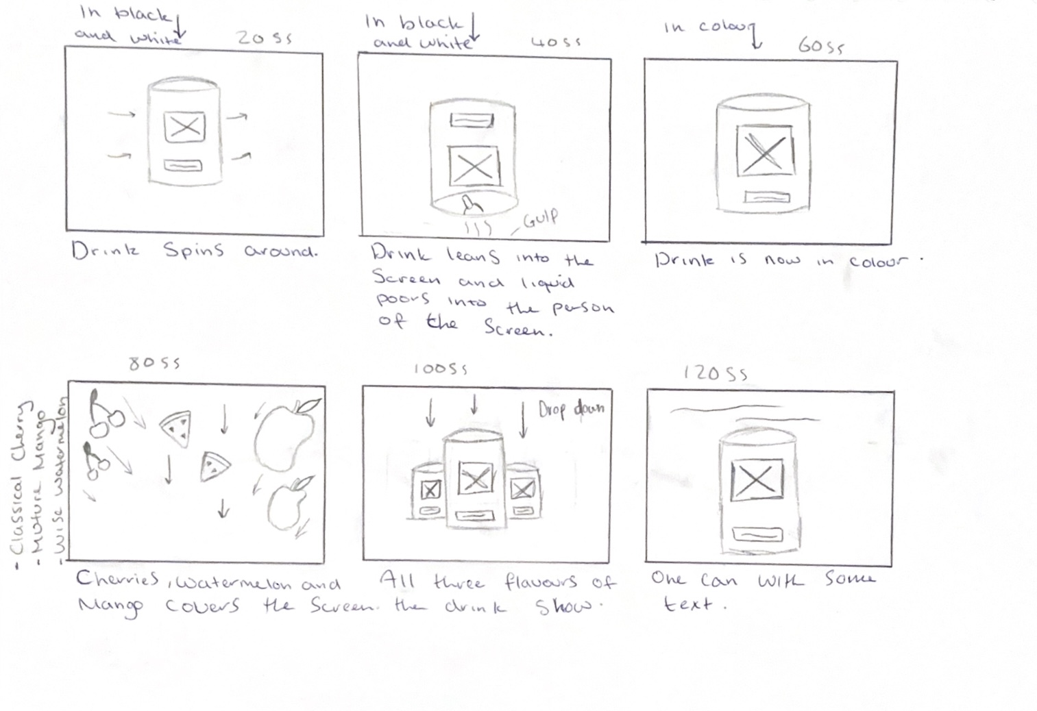
In my storyboard, I wanted the fruits to drop down into frame covering the screen which would create a transition. To do this, I first looked at some YouTube tutorials on how to make a cherry and watermelon slice in blender. I chose to use 3D models of the fruits to create depth and to prevent them looking flat as they drop down and bounce back up. Using 3D models also meant I could create a shadow and dimension which adds a sense of layering which is more interesting visually. Because I decided to not use the mango can design, I only made cherries and watermelons which I then added colour to before importing to Stager, where I could move them bit by bit and take screenshots. The tutorials I followed are linked below in the reference list.
In my animation, I would have the first half of the animation in black and white before transforming into colour. To do this, I will use After Effects and edit the footage made using screenshot to create this transition by using basic key framing to make the animation fade into colour after the drink tips forward. This idea came because the third-year students said that they liked my logo in black and white and mentioned the idea of possibly using this within my animation, as black and white is associated with old TVs, which link to the vintage name.
Reference List:
Farrukh 3D (2024) Easy Modeling Tutorial – Watermelon | Blender [Video]. Available online: https://www.youtube.com/watch?v=o2Qh-9jFKzs [Accessed: 17/03/2024]
Holdens (nd) The ingredients of a successful TV advert [Article]. Available online: https://holdens.agency/blog/the-ingredients-of-a-successful-tv-advert/ [Accessed: 18/03/2024]
Juhl, Soren (2023) Cherry in Blender | 3D Modeling Process | by 3D artist Søren Juhl [Video]. Available online: https://www.youtube.com/watch?v=TfwSZ7vzd1E [Accessed: 17/03/2024]