For this assignment, we have been asked to create an energy drink for people over 60. Fewold people drink energy drinks, statistics show that only 15% of people who are age 50-64 drink energy drinks. (Statistica, 2024)
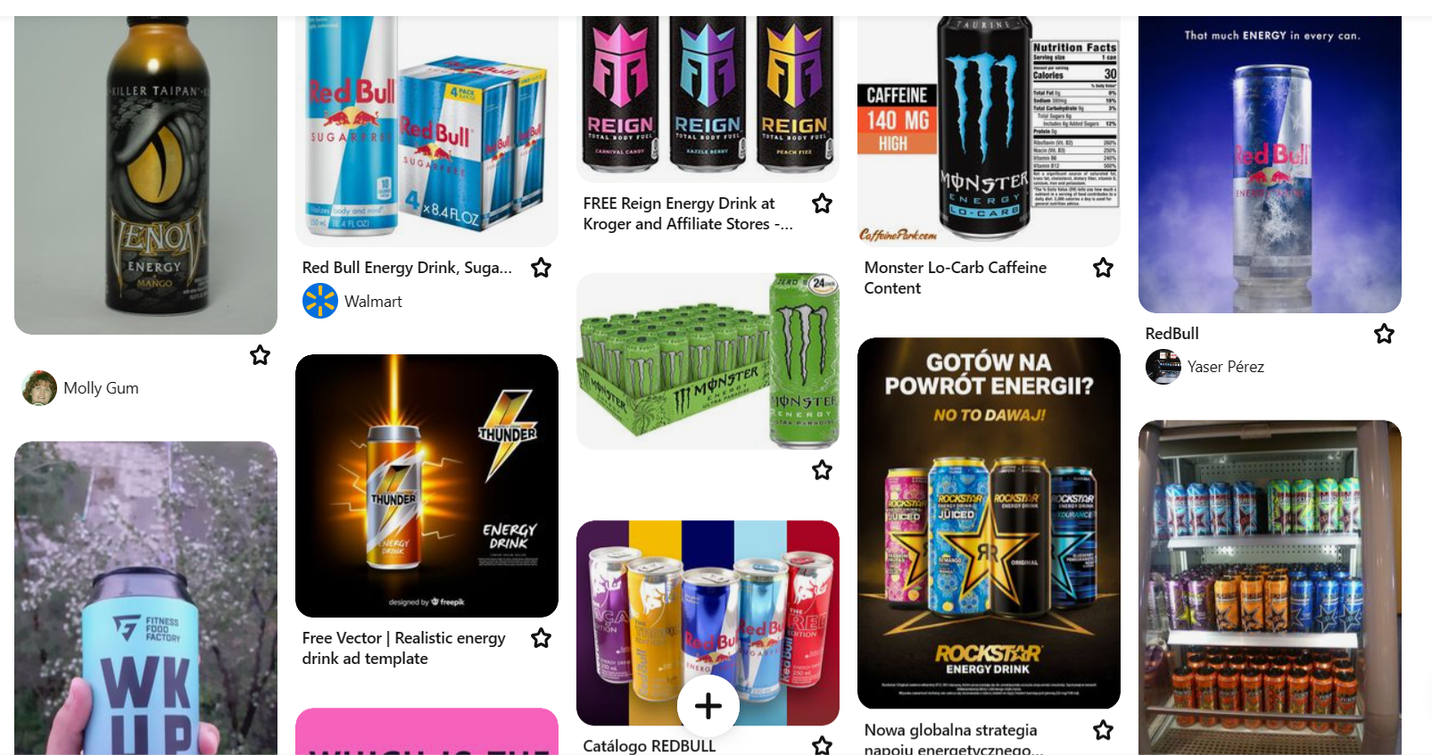
I first went looking for energy drink logos. I made a Pinterest board of logos, and after found that a lot of energy drink logos use a noticeably young adult style as they are more targeted towards this age group. They use brighter colours in the logos which are more eye-catching for a younger audience. An example of this style is Monster Energy. Monster use a mixture of bright colours on their logos as they use bright colours to fill in the logo. Their logo is a ‘M’ which is made by using monster scratches, also another eye-catching feature for a young audience and very masculine.
“If your target audience is younger, bolder and higher contrast colors can help create a sense of excitement.” (CTM, 2023)
Screenshot from my Pinterest board of energy drink logos
My own image of an energy drink logo
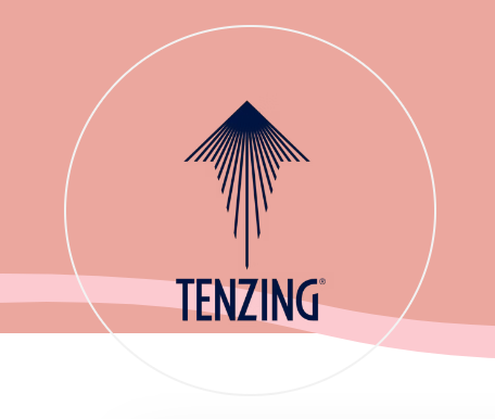
One of the energy drink logos that I have found that have more of an adult feel to them is Tenzing, I think this because their logo uses a less decorative font and doesn’t use stylizedsymbols in them like Monster, they also use an arrow with a sun at the top with sunbeams coming down to make the arrow, which is also used to make the top of a mountain which is used on the design. The logo is a simpler logo which makes me think that it is an energy drink aimed towards older adults looking for something more natural.
Tenzing energy drink logo that I found
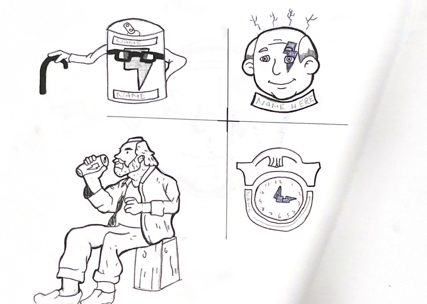
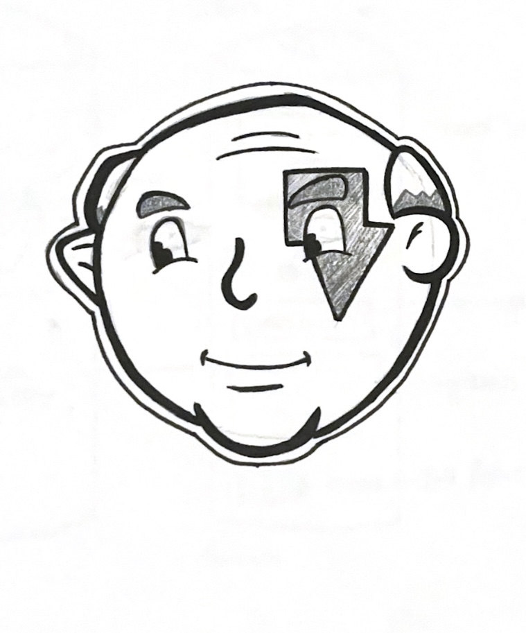
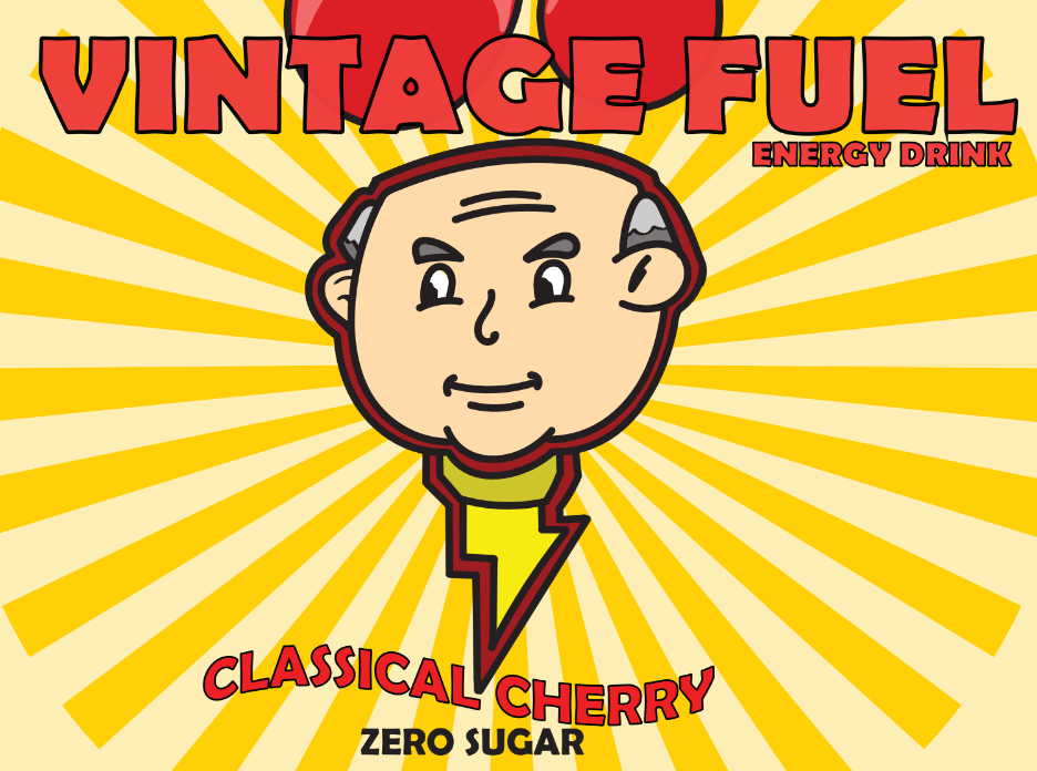
For my logo, I started off by making four logo sketches and picking the strongest idea. I went with one that has an old man with a lightning bolt across his eye. The first improvement I made was taking inspiration from vintage characters that I had looked at and giving my character the same eye style. The next improvement I made was by giving him more outlines and making them thicker.
My 4 logo sketches that I made
Inspiration for my logo with thick outlines
Inspiration for my logo with the eyes
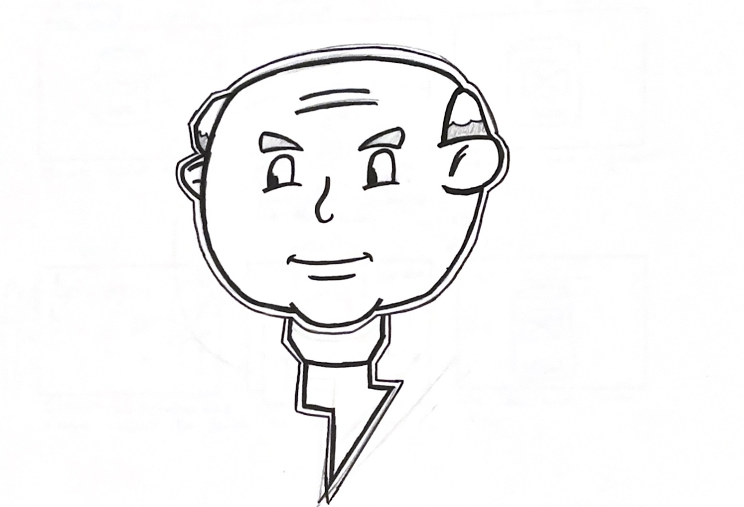
After doing this I then showed my teacher and the third-year students my logo for review. My teacher suggested I take the lightning bolt off the character’s face and use it as a tie. After makingthis change,the logo looked better, and I started making it digitally.
My first logo that I made
My updated logo after feedback
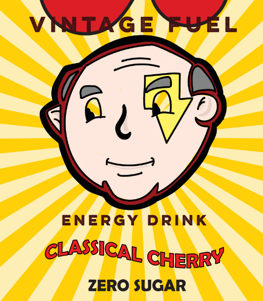
To produce the name for my energy drink, I began by writing down the words ‘Old’ and ‘Energy’ and wrote down other words that relate to them two. I had a few name ideas but narrowed it down to Senior Force or Vintage Fuel, I ended up choosing Vintage Fuel as I thought the name went better with my logo, I chose a font but wasn’t happy with how it went with my logo, my teacher then said to have the logo match with the way the flavor font looked by having a black outline. After finding a better font and giving it ablack outline I thought it looked much better and complete.
My can design with original font
My updated font after feedback
Reference List:
CTM (2023) Energy Drink Labels: Key Components You Need to Know [Article]. Available online: https://ctmlabelingsystems.com/labeling/energy-drink-labels-key-components-you-need-to-know/ [Accessed: 17/02/2024]
DckyDesign (nd) Panther Mascot [Image]. Available online: https://dribbble.com/shots/19172981-PANTHER-MASCOT [Accessed: 04/03/2024]
Statistica (2024) Consumers of energy drinks in the United States as of December 2023, by age [Article]. Available online: https://www.statista.com/forecasts/228168/energy-drinks-consumption-usa [Accessed: 17/02/2024]
Tenzing (2024) Tenzing Logo [Image]. Available online: https://itstime.earth/speakers/tenzing [Accessed: 22/02/2024]
Tonge, Lewis (2024) Energy Drink Logo Pinterest Board [Pinterest Board]. Available online: https://www.pinterest.co.uk/lewis20022002/energy-drink/ [Accessed: 19/03/2024]