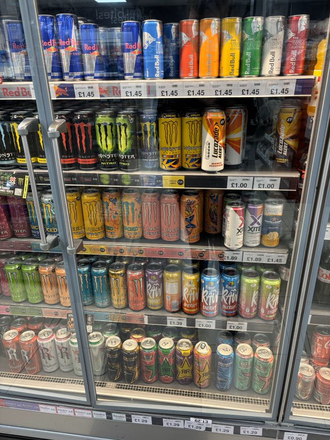
After creating a logo, I then started to look at packaging designs. I started by going on Pinterst and gathering different images of packaging designs, then I decided to gather my own images by going to shop and photographing all the energy drinks in the fridge. From looking at what Images I have gathered, I have found that most energy drink have the same feel to their can design as they are all aimed for young adults. Even though they are not aimed towards an older market, they all include necessary information such as, ingredients, use by date and nutrition information. I will use this information in my own package design as it is legally required.
“Correct product packaging and labelling is crucial not only for the customer experience, but also for their safety.” (Gareth, 2022)
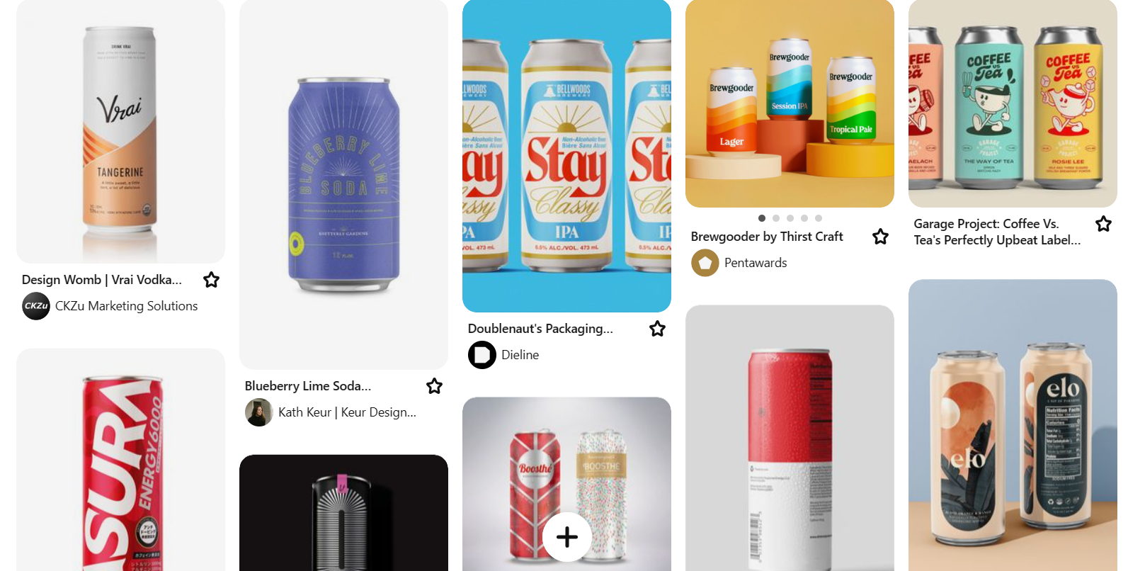
Some package design inspiration that I found on Pinterest
My own image of energy drinks in shops
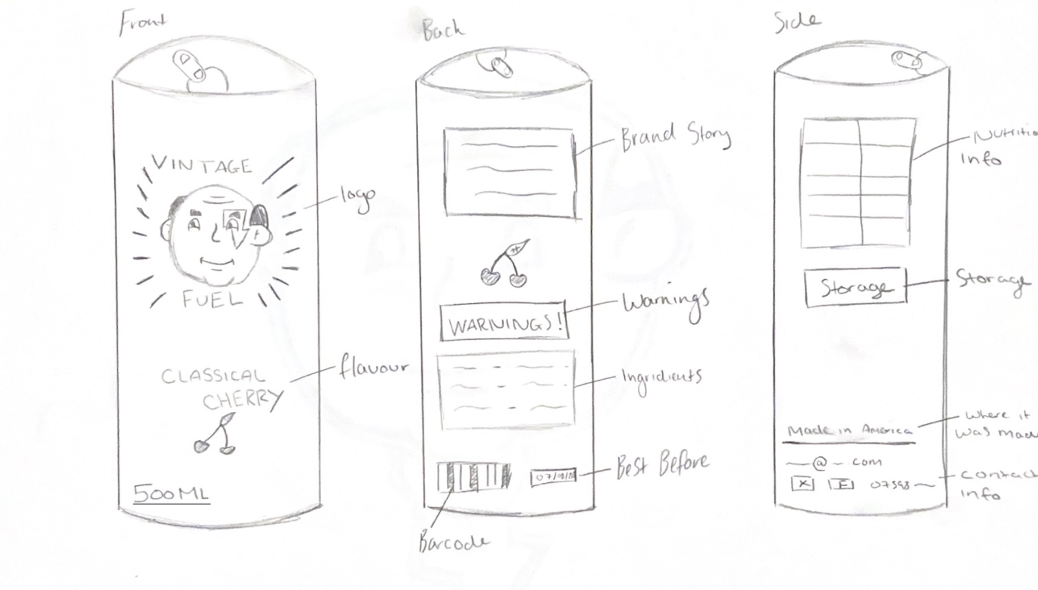
I then created some sketches of how my package design will look from the front, side and back. On my package design I decided to curve the text where the flavour is because it gives a nice classical feeling to it, I also gave it sunbeams behind the logo as this is a vintage style used often and it draws the eye inwards to the logo. I put all the required text on, such as the ingredients, barcode and best before date in places where I think they would go althoughI later changed some of this when creating it digitally.
My sketch of my package design
After showing the package design to my teacher and the third-year students, I got some useful feedback. I was told to make sure everything curves around the can right, to not leave massive amounts of space or cramp things together, and to rearrange the text on the can so itcomplements each other. This feedback helped me when redesigning my package design digitally, leading it to come out much better and improved.
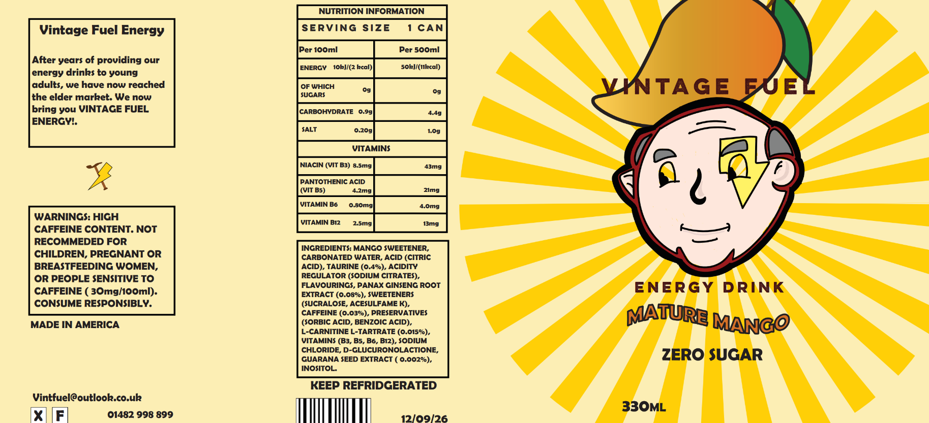
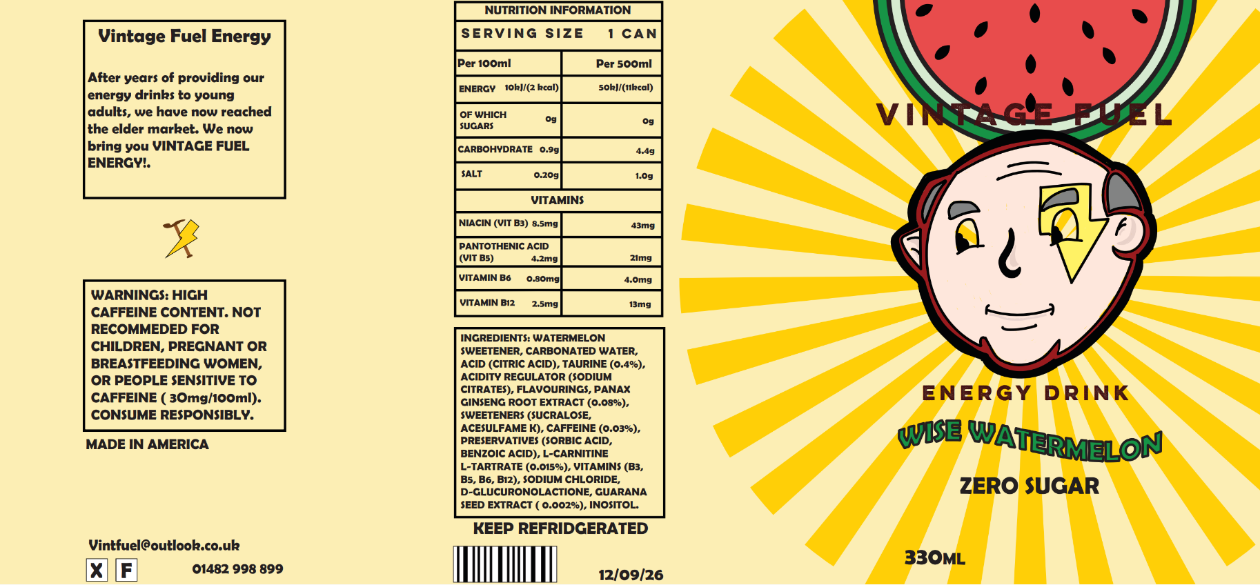
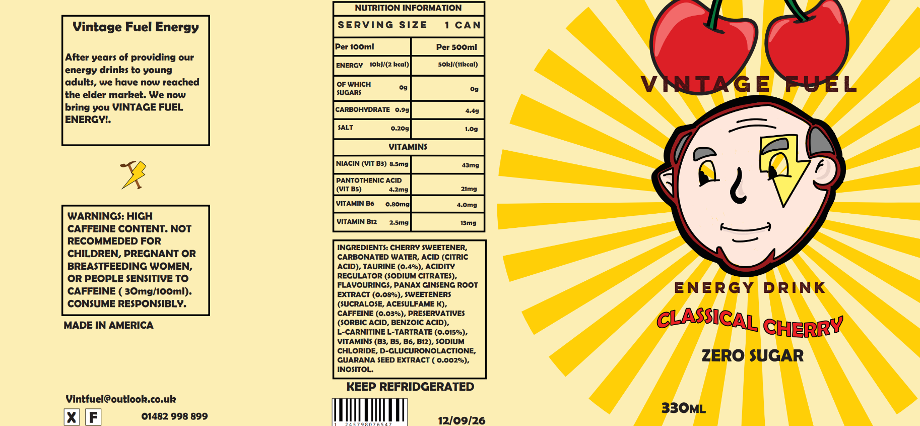
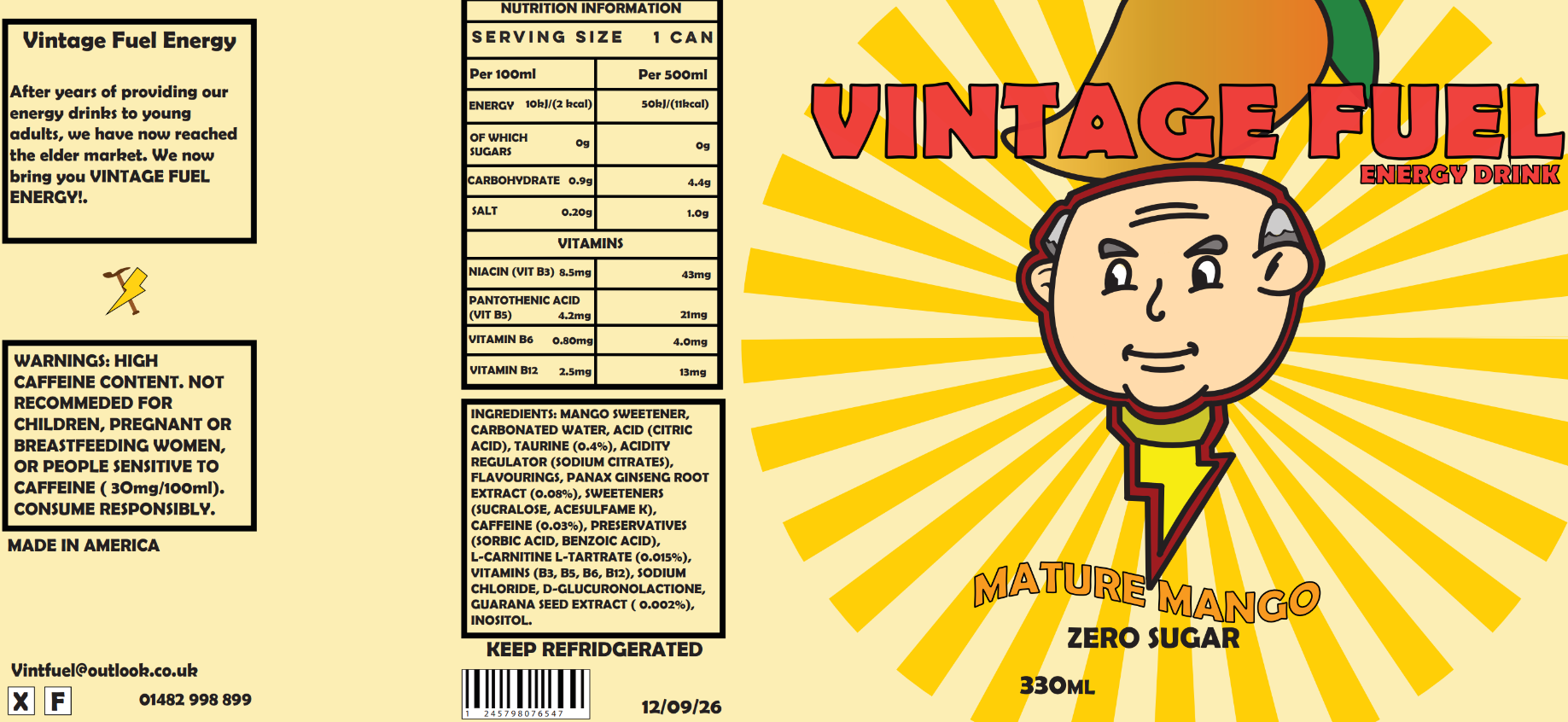
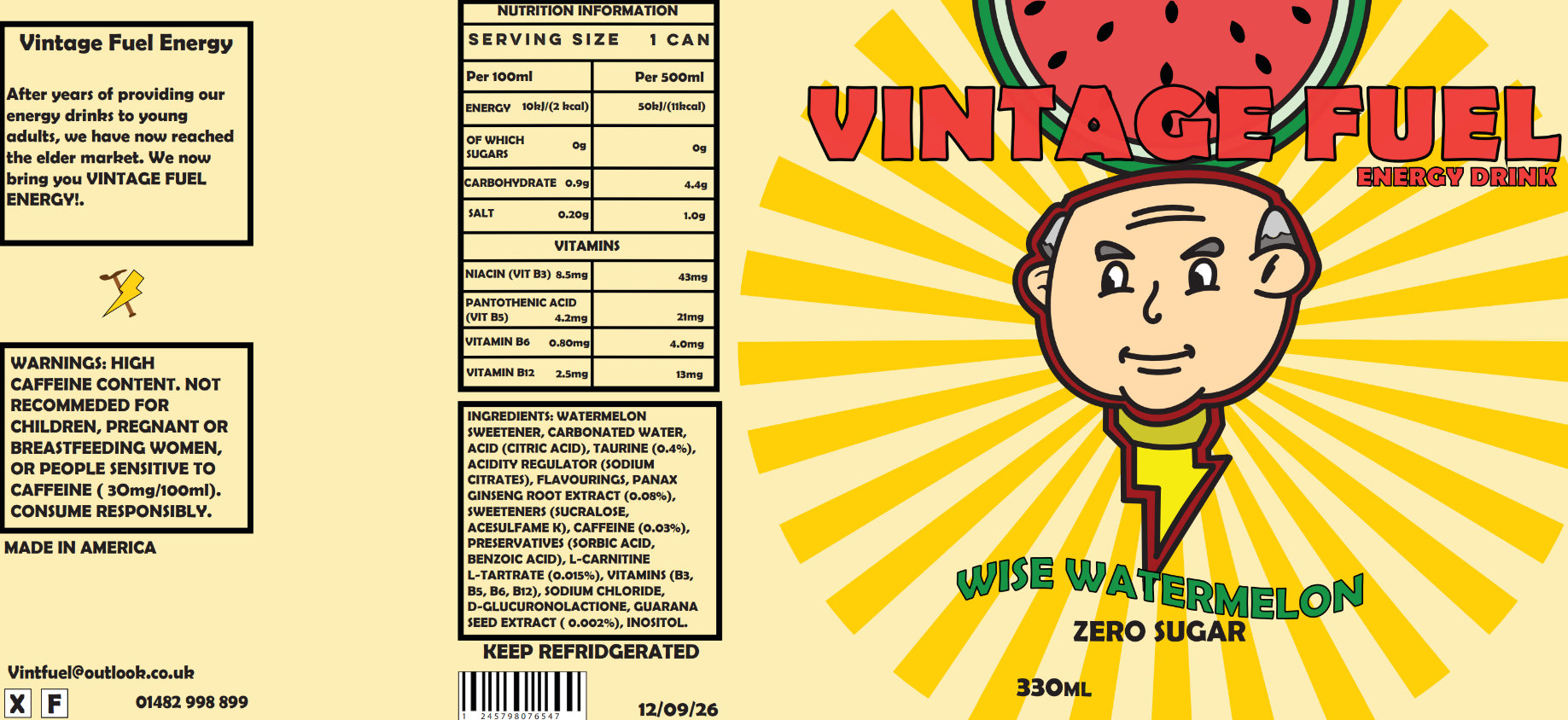
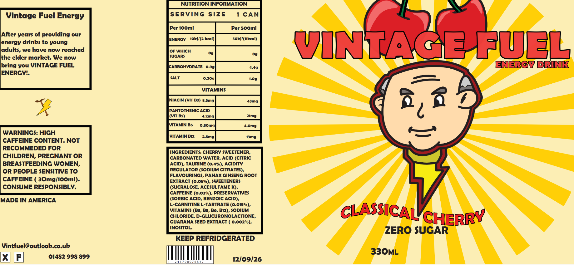
I made three different package designs, all using the same text but different illustrations of the fruit at the top to match each flavour. I did this so customers can clearly see the illustration and know what flavour it is without having to spend ages looking for it on the label. The three flavour ideas I decided upon were Classical Cherry, Wise Watermelon and Mature Mango. I used words like Classical, Wise, and Mature because they relate to elderly people, and I used alliteration to create a snappy fun name for each flavour.
“In the shopping context, where consumers decide which food products to buy by spending a limited amount of time and cognitive resources [1], packaging helps consumers decide which product to choose by capturing their attention and convincing them that it contains the product which best suits their needs.” (Gill-Perez, 2019)
Original Mango package design with original font
Original Watermelon package design with original font
Original Cherry package design with original font
Updated Mango package design with updated font (didn't end up using)
Updated Watermelon package design with updated font
Updated Cherry package design with updated font
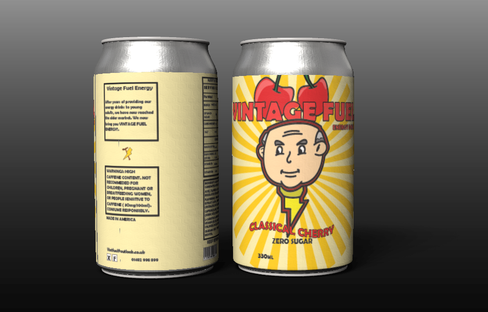
I eventually decided to take out the mango design. I did this because I thought that the mango illustration appeared more like a pepper andcould be confusing to some people. I instead stuck with the other two designs, which I placed onto a can model to see how they would look when mocked up.
Final package design on can models
Reference List:
Gareth [2022] The Law on Product Labelling: What Must You Legally Show? [Article]. Available online: https://www.labelsource.co.uk/news/post/the-law-on-product-labelling-what-must-you-legally-show#:~:text=These%20need%20to%20include%20information%20on%3A%20The%20name,Storage%20and%20cooking%20instructions%2C%20where%20necessary%20Origin%20marking [Accessed: 15/03/2024]
Tonge, Lewis [2024] Package Design Inspiration [Pinterest Board]. Available online: https://www.pinterest.co.uk/lewis20022002/package-design/ [Accessed: 19/03/2024]