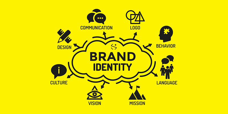
“Constructing a brand identity is an opportunity to personify a brand, bring it to life, and establish strong emotional connections with its audience.
By creating a unique and distinguishable identity, a brand can differentiate itself from its competitors and build a lasting reputation.” (Andrivet, 2023)
Having just a logo for a brand isn’t enough in the modern era of marketing and branding. A good logo can eventually become easy to recognise by itself, but this is more common for long established brands such as Apple or Nike, who had to spend many years building their brand and trust with their audience and still have a series of brand guidelines which are more than just a logo and include rules which make the audience connect more with them.
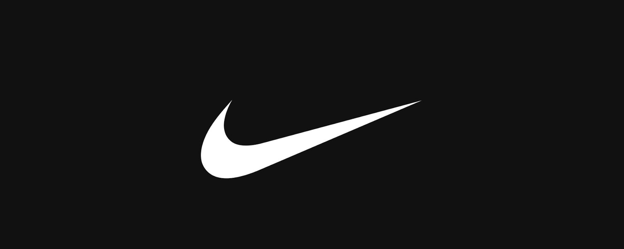
The Nike tick is extremely recognisable on its own
The Nike tick, or swoosh, is one of the most iconic brand icons in the world. The story behind the swoosh is that in 1971, Blue Ribbon Sports had decided to change their name to Nike after the roman goddess of victory. The point of the name was that their brand led to victories in sports. They needed a new logo for their name and asked a graphic design student named Carolyn Davidson to come up with a design which showed motion. This led to the iconic swoosh. (Kyamko, 2023)
“The Swoosh is more than just a checkmark. It represents the wing of the Greek goddess Nike, symbolizing speed, movement, power, and motivation. Davidson’s design captured the spirit of athleticism and excellence that Nike aspired to represent.” (Kyamko, 2023)
Original Nike logo drawings
Even in the early logo drawings, Carolyn Davidson offered some brand guidelines for how the logo should appear and how the typography should be used too. Brand guidelines can also outline typography, including the fonts used, sizes and positioning.
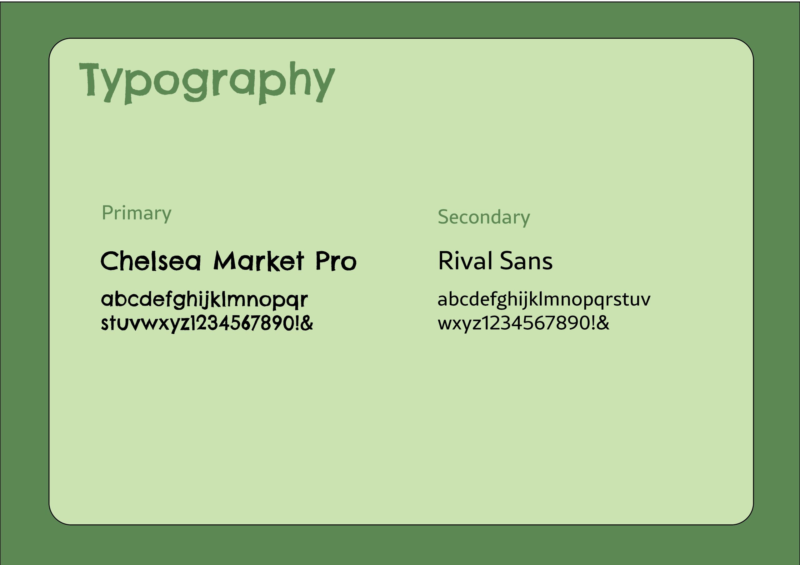
This has inspired me to think about my brand beyond my logo and how I can build a visual identity around it to support the brand and create a story. First, I will start with the typography and think about how it should appear. The font I used for the logo was an Adobe font named Chelsea Market Pro, it was fitting to the brand as it is childlike and a bit messy, so it felt more fun and playful. The jaggered hand-drawn effect of the font looked like it could have been scribbled by a young child and communicates that the brand is aimed towards a younger audience because it isn’t as sophisticated and perfected. To pair with this typeface, I used a simple but easy to read typeface called ‘Rival Sans’, because it balanced the other typography and will work better for smaller sized text such as product ingredients or descriptions on packaging like the cooking instructions, whereas Chelsea Market Pro works better for the names of products and flavours since it is bold and will draw the viewers eye straight to the important information.
The NN group say that less is more and not to overdo it with decorative fonts, which is why you should balance out your display fonts with a neutral font, especially for copy text due to the smaller size causing potential readability problems. “Reserve decorative typefaces that have a lot of personality for less-utilized elements, such as headers or illustrations. Decorative typefaces are difficult to read at small sizes and should never be used for body copy.” (Krause, 2022)
Typefaces for my brand
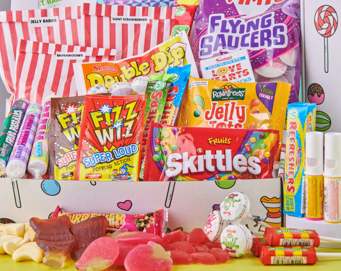
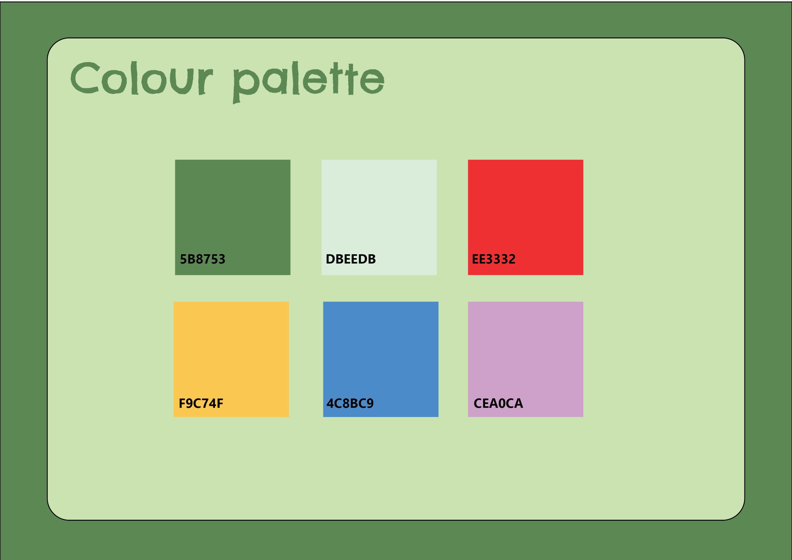
Next, I considered the colour palette of my brand. I already chose a green colour for the logo as I wanted to connect the brand with health and wellness, which green can easily be linked to due to leafy green vegetables and being natural. I noticed that a lot of brands aimed at young children use extremely bright colours and sometimes this looks acidic and unnatural, which is not what I want my brand to say. Also, this may appeal to children, but parents are usually the ones doing the food shopping, so it was important for me to think about how adults may perceive the products. If I follow in the steps of brands who use extremely saturated colours, it may accidentally group my brand in with them and put parents off.
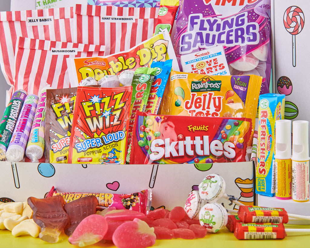
Unhealthy sweets which use bright coloured packaging
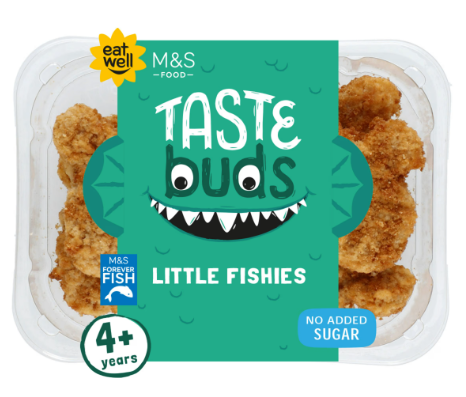
I have instead decided to use a more muted colour palette to avoid looking processed and unnatural. M&S have their own range of kids ready meals and their colour palette is less saturated and as a result it feels more healthy and organic. They keep the childish elements by using illustrated character faces which brings playfulness to make it clear that the brand is catered to kids. I want to do something similar by using illustrations or other elements to make the designs more fun without relying on crazy colour palettes.
M&S taste buds use a more muted colour palette
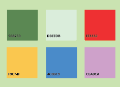
For my colour palette, I have used colours such as green and yellow to link to the healthy aspect, and paired these with colours such as blue, red and purple to also add fun and excitement. I chose to use colours which aren’t too saturated like how M&S Taste Buds do. I also added the hex values to make it easier to identify the exact shade and to make sure all brand elements are using the exact same colours.
Colour palette for my brand
And finally, with my branding elements decided on, I now will bring all my components together into a document which will be my brand guides. Brand guides help to inform others on your identity and how to design for your brand. I have made an A3 document with information on the logos, typography and colour palette, and I have designed the brand guides to match the branding so it feels more in-line with the brand.
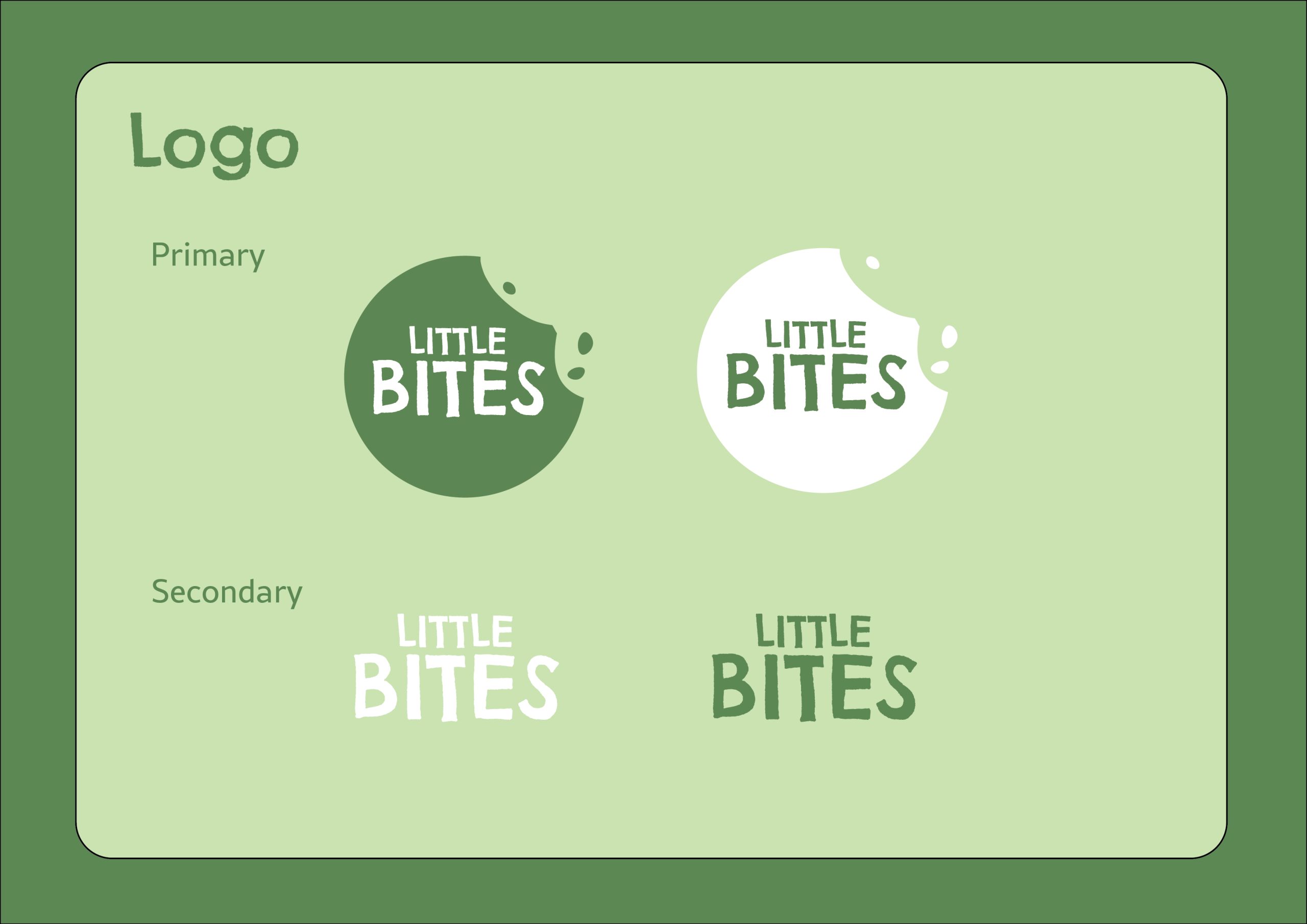
Logo guidelines
Typography guidelines
Colour guidelines
Reference List:
Andrivet, Marion (2023) The Power of a Strong Brand Identity: Definition, Importance, and Key Elements [Quote]. Available online: https://www.thebrandingjournal.com/2023/03/brand-identity/ [Accessed: 25/02/2025]
Kyamko, Mary (2023) Nike Logo: History, Meaning, Design Influences, and Evolution [Article]. Available online: https://www.crowdspring.com/blog/nike-logo/ [Accessed: 25/02/2025]
Kyamko, Mary (2023) Nike Logo: History, Meaning, Design Influences, and Evolution [Quote]. Available online: https://www.crowdspring.com/blog/nike-logo/ [Accessed: 25/02/2025]
M&S (2025) Taste Buds Little Fishies [Image]. Available online: Kids’ Ready Meals | M&S [Acccessed: 25/02/2025]
Nike (1971) Nike logo original drawings [Image]. Available online: https://images.crowdspring.com/blog/wp-content/uploads/2023/11/16165345/original-nike-logo-drawings.png [Accessed: 25/02/2025]
Nike (2025) Nike swoosh [Image]. Available online: https://miro.medium.com/v2/resize:fit:4164/format:webp/1*idXubtJAE8MZU-AYIHMKsQ.png [Accessed: 25/02/2025]