I am now going to start producing packaging designs for the food products in my brand.
The products that I have chosen for the food range are: A spaghetti and meatball ready meal, a milk chocolate bar and cheese and onion crisps.
I have chosen foods that are popular with children and decided to add a healthy spin by making them into nutritious alternatives that are just as tasty. The products are made with less sugars, salts and fats than other brands.
When creating my packaging designs, I looked at packaging for other healthy products like mine for inspiration. I found different examples of packaging designs and used them to create a mood board to generate ideas. I also did the same but for unhealthy food products and created another mood board so I could compare the both of them and look at what to avoid and what to include on my designs.
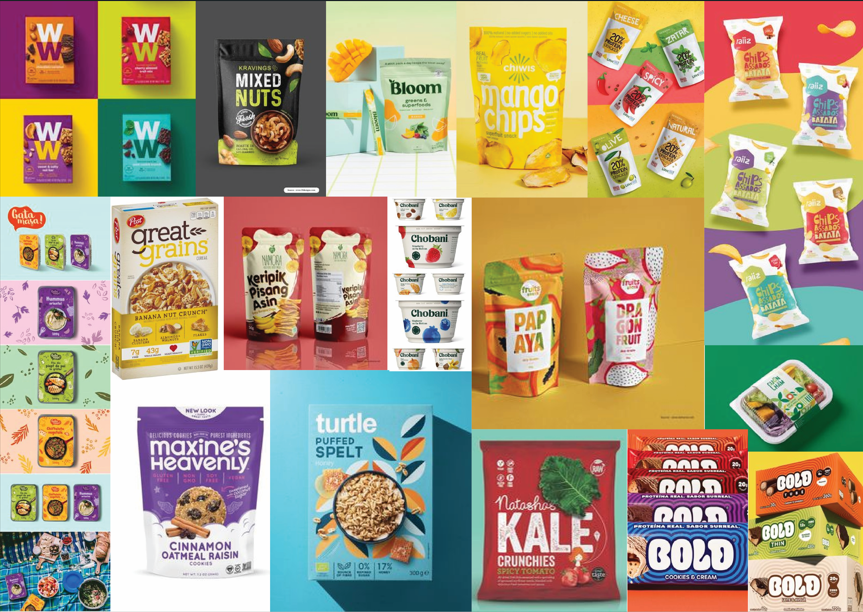
Healthy Mood Board
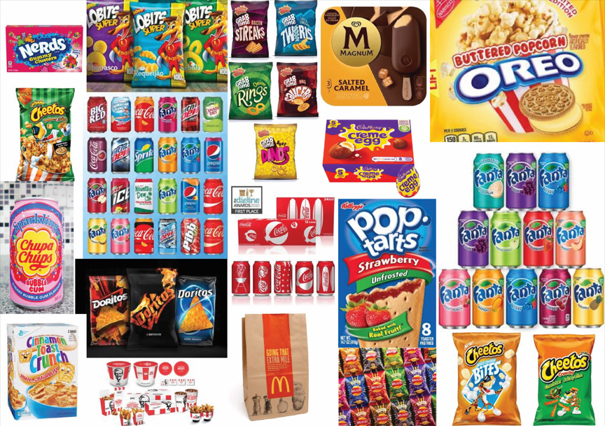
Unhealthy Mood Board
I noticed that a lot of packaging use various types of green as green is a colour associated with health and the unhealthy packaging would uses a lot of reds, orange and yellows. The healthy packaging would also use different types of items which would make you think of health, these were items like leaf’s, fruits and vegetables.
I also realised that a lot of healthier product packaging use various shades of green, a colour associated with health, as well as colours which look more organic and natural. In comparison, the unhealthier packaging used lots of bright and unnatural colours which were over saturated and as vibrant as possible. The healthier products focused on showing images or illustrations of the ingredients, such as fruits and vegetables, but the unhealthier ones tended to have more characters or cartoonish illustrations on them.
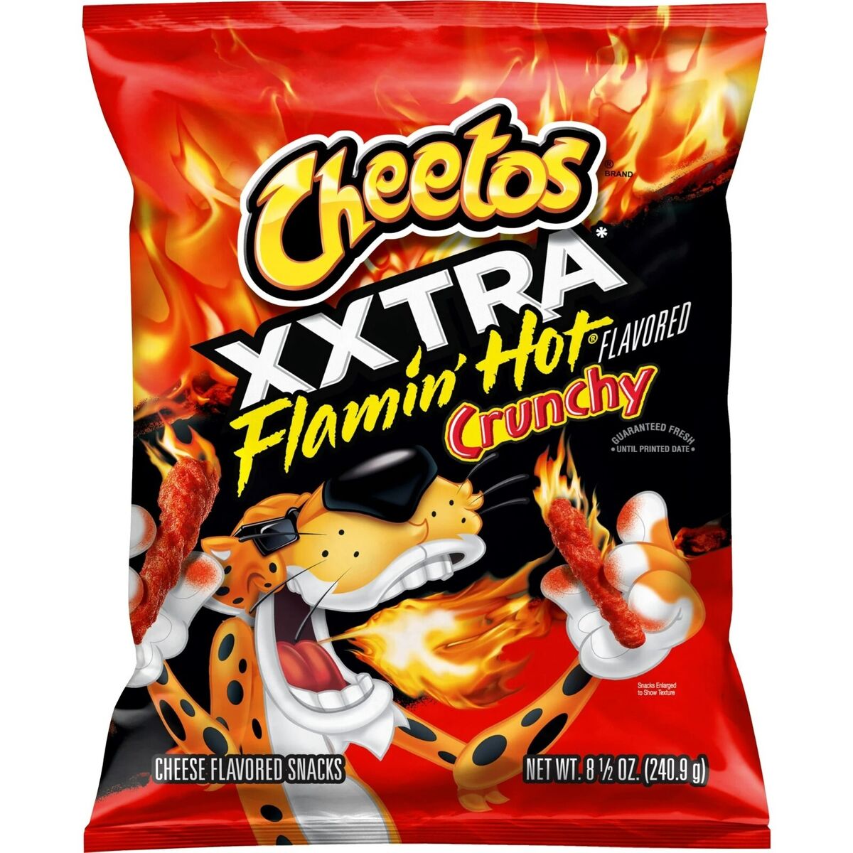
Cheetos packet
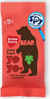
Bear YoYo packet
To compare these, I have looked at the Cheeto’s packaging in comparison to the Bear Yoyo packaging. Cheeto’s are an unhealthy snack which features a cartoon tiger character wearing sunglasses, which children may see as cool or fun. Bear Yoyo are a healthier brand who’s packaging says ‘1 of your 5 a day’ on which tells you instantly it is the better option. Their mascot is a shaded bear figure which is simplified and less stylised, which feels more calmer compared to the Cheeto tiger who comes across as more excited. The colours on the Cheeto’s are very strong and intense and their typography is more dramatic. The colours on the Bear Yoyo are also bright but are less saturated and the typography feels more hand drawn and friendly.
Research says that colour psychology plays a big role in food marketing and that fast food brands use colour combinations which convey excitement and hunger, such as reds and yellows. Green and yellow combinations are viewed as organic and fresh, and blues and whites suggest cleanliness and purity. (Athreya, nd)
The greens and images of healthy ingredients were two things I wanted to bring to my packaging. I wanted to use the same greens from my branding to keep things consistent and I wanted illustrations of the products to be on the packaging so customers knew exactly what they were buying. It was also important that the logo would be on the packaging and be very large and visible.
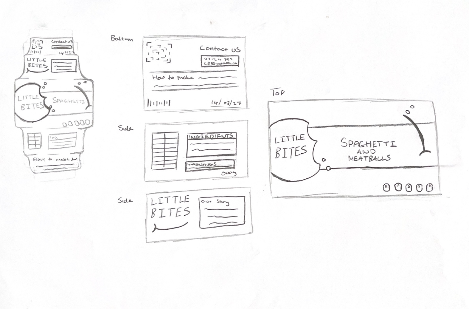
Ready Meal Sketches
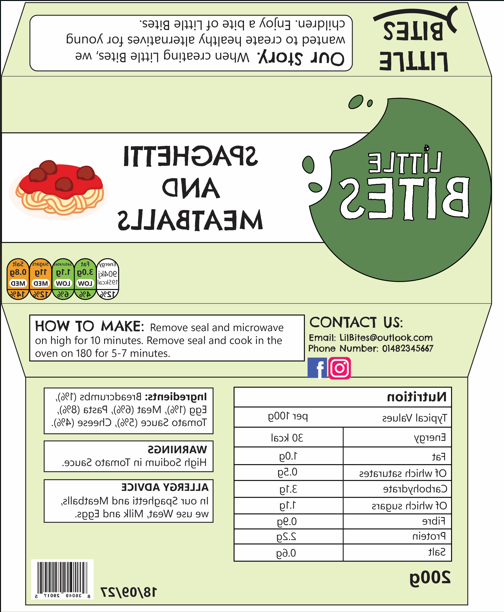
Ready Meal Flat Packaging
I began with the packaging for the ready meal. I started with a sketch to decide on the layout, covering the top, bottom and the sides. I wanted the package to be a carboard sleeve which slides over the plastic tray containing the food. For the top, I used the most important information such as the logo, the name of the product and an illustration to show what it is. I also included nutritional information such as the fat, sugars and calories, using the traffic light system to show that each category was healthy. The bottom included most of the text about the ingredients, warnings and more detailed nutritional facts. On the side is information about preparing the meal, contact information and some information about the Little Bites company.
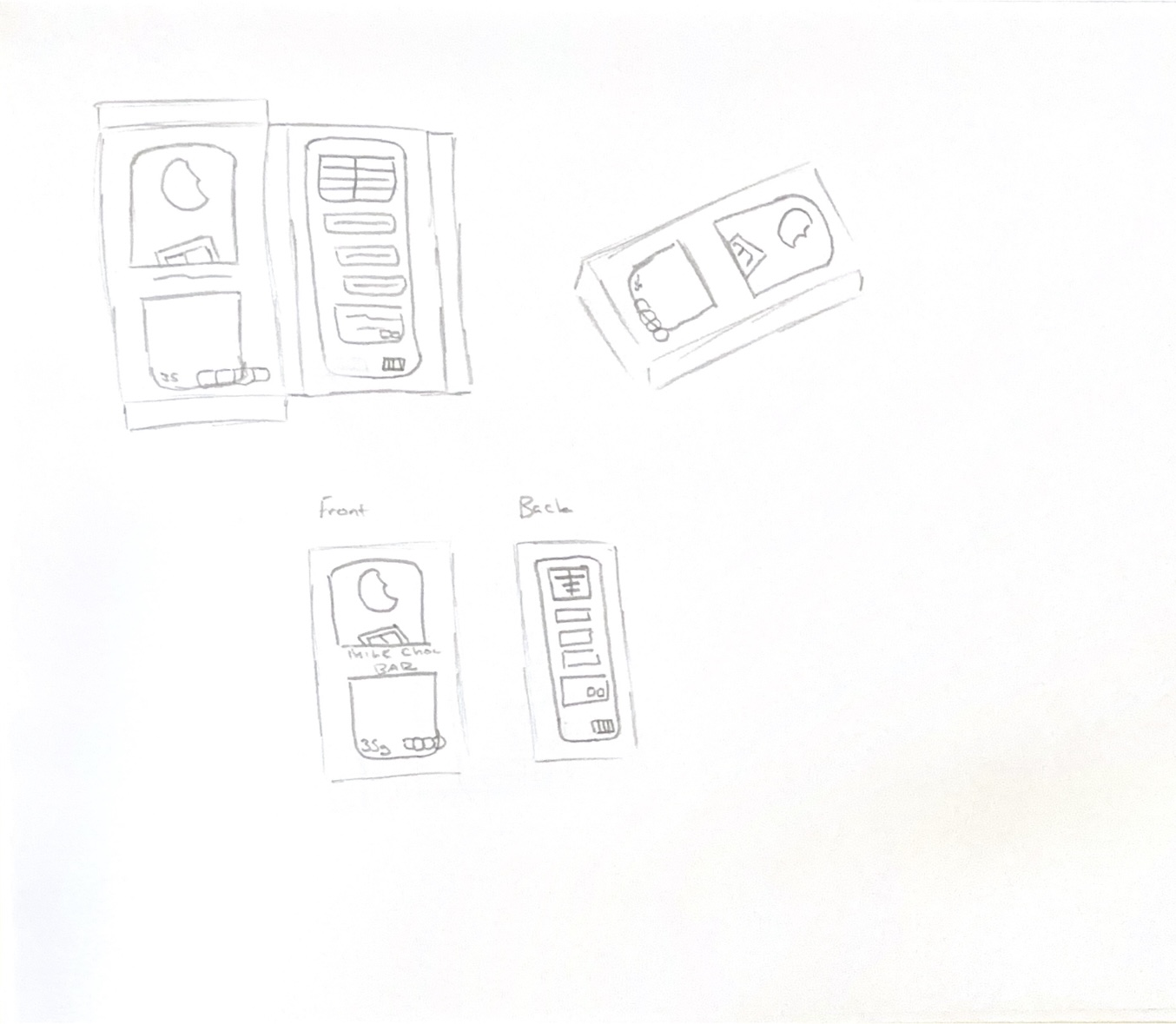
Chocolate Bar Sketches
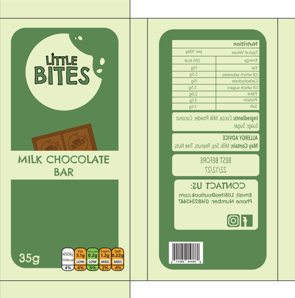
Chocolate Bar Flat Packaging
I did the same process for the chocolate bar packaging. I sketched both a flat version and a folded version of the packaging. I focused on the top and bottom sides of the packaging for this product because the sides would be too thin to have any content on except for colours or patterns. I kept the packaging similar to the ready meal packaging to show that these products were all part of the same brand and to make them look cohesive when placed together. I made the logo a little bit smaller on here but still large enough compared to other elements and to make it stand out with visual hierarchy. For the illustration, I made a design of a chocolate bar to let buyers know what the product is from a far.
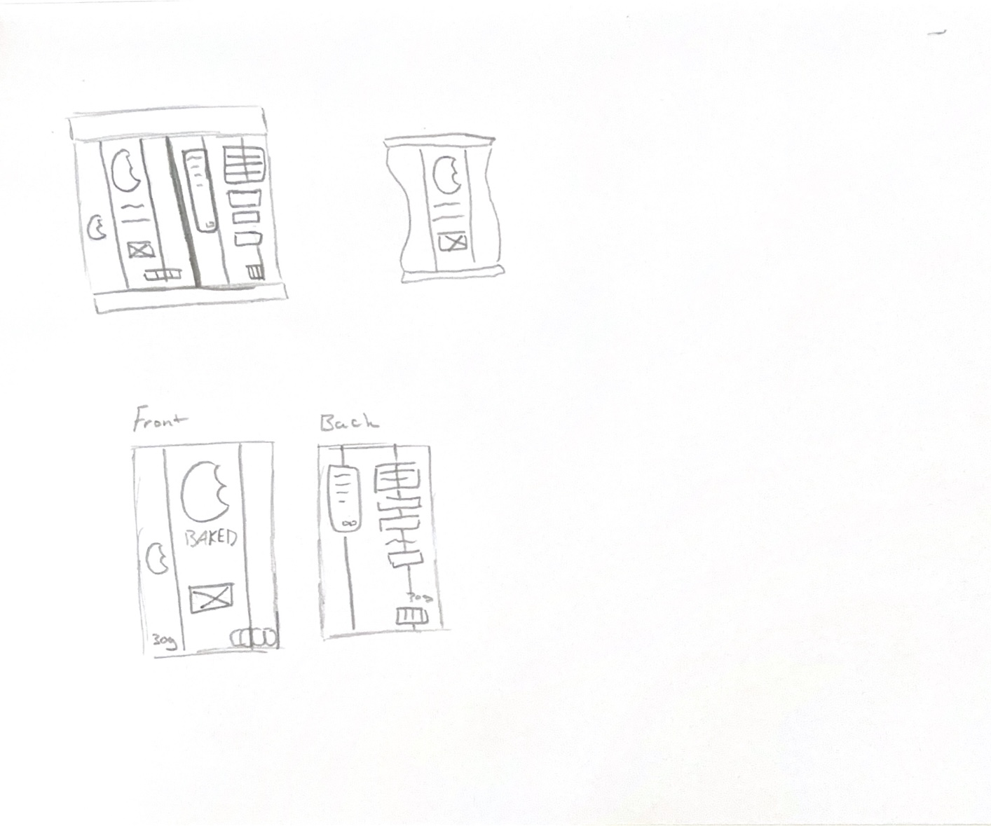
Crisps Packet Sketches
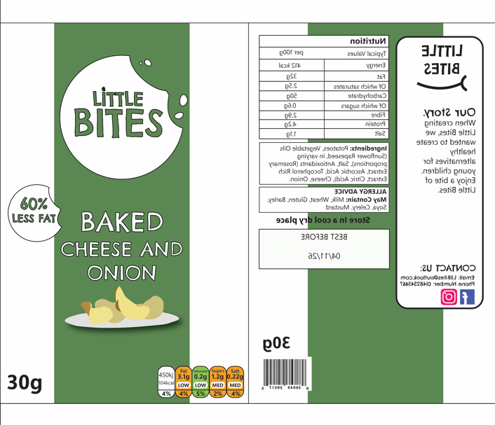
Crisps Packet Flat Packaging
The final product was the crisps packet. I created a sketch again and decided to keep the front of the packet simpler, showing the logo, the product and the flavour. A lot of brands use green for cheese flavours, so I used the green from my brand and added a stripe down the centre of the packet to both match the brand identity and make the customer associate the colour with the flavour. To show that the crisps are healthier than the average brand, I added a sticker which says ‘60% less fat’ on the front, making the crisps more appealing to parents who are looking for a better substitute. The back of the packet has all the nutritional information, contact, and best before date.
For each product, I have made sure to add the legally required information such as the sell by date, barcodes, allergy information, ingredients and the net weight. I have also used the colour coded nutrient diagram to quickly indicate that the products are lower in fats, sugars and salts, meaning parents who are in a rush can quickly scan the product and see that they are healthier due to the green and orange colours on the nutritional values.
Some issues I faced when designing these products were that some of the information didn’t fit how I had intended and I had to rethink the layout and the sizes of elements to make sure they fit but were still legible. Another issue was that I had intially designed a smiling mouth to the designs to try and make the brand look more positive and appealing, but I didn’t think it worked very well and it threw the design off so I decided to not go with this idea. For the social media logos, I designed my own in Illustrator so that I had them ready for use in other designs later in my project, and to use in the future.