Product posters
As a part of my project, I created some posters to promote my brand’s products. Before I started to design my posters, I looked at promotional poster designs from other companies to see what works for them and to inspire my designs too.
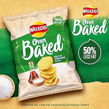
I looked at Walkers crisps and found a design which is quite simple yet effective. This is for their oven baked line and shows the product in the centre left of the design taking up most of the space and drawing your attention there first. There is the brands logo to the side which is also large because it makes you recognise the company, who are very well known. There is a tagline which says ‘50% less fat’, which makes the product more appealing to people who are health conscious. The colours used are matching the salt and vinegar flavour and match the design of the crisp packet, with a green diagonal stripe across a textured beige background. There is also a small bowl of salt to show the ingredients in the product which makes them feel less processed and more natural. I also noticed a small disclaimer text for the ‘50% less fat’ tagline to say that the product has 50% less fat than normal crisps. When I looked at this further, I found out that it is a legal requirement to avoid misleading consumers.
“Besides avoiding civil court proceedings against the Federal Trade Commission, advertising disclaimers also protect your business by removing legal liability surrounding a customer’s purchase. In other words, they tell a customer you’re not responsible for making them buy the product.” (Crawford, 2024)
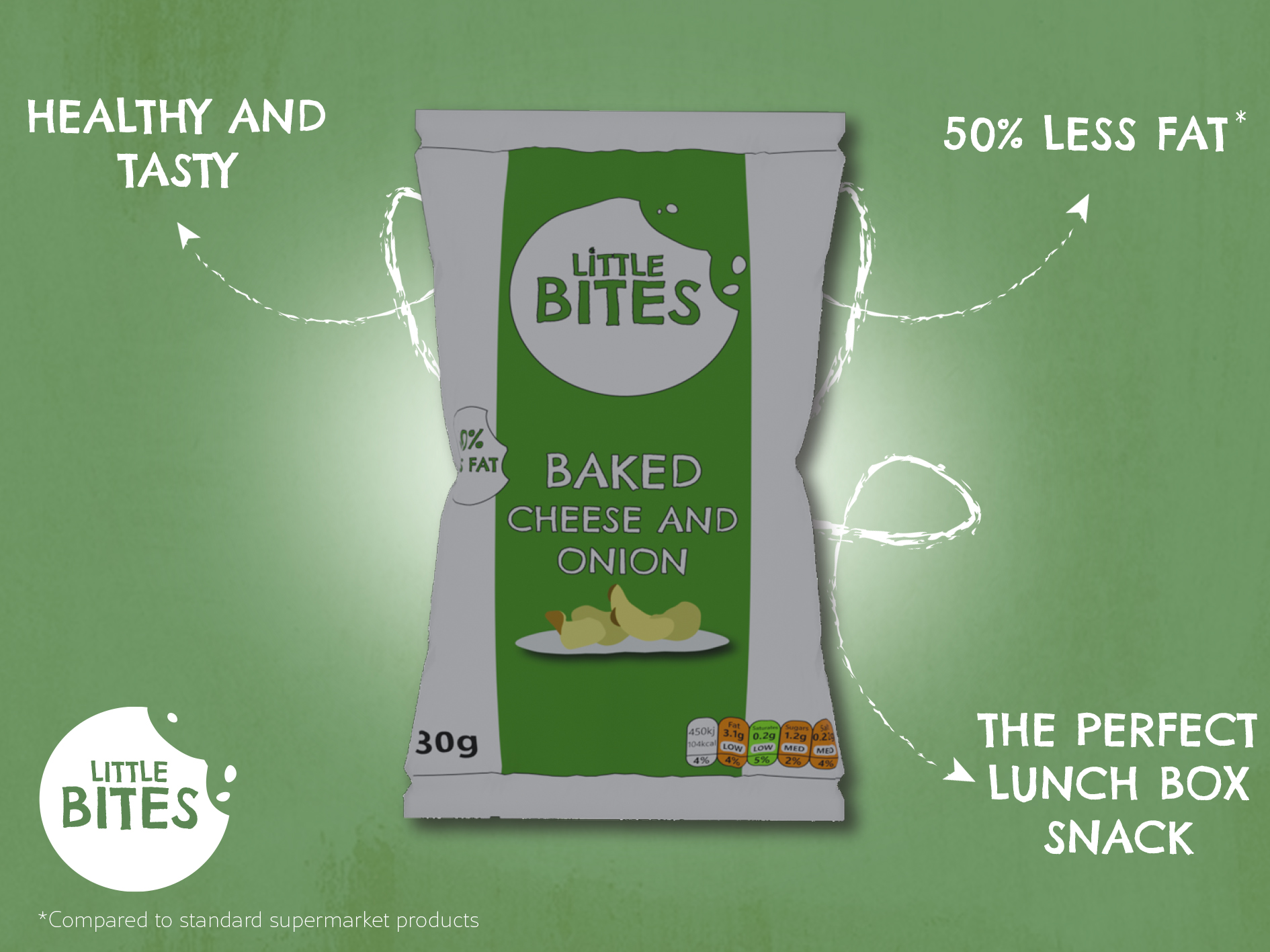
For my own design, I was inspired by Walkers because of the simplicity and how the poster was straight to the point. I decided to make the crisp packet be in the centre of the poster against a green backdrop, and I added a white circle behind the packet which I blurred to make it look like it was spotlighting the crisps to draw your attention in. To make this effect stronger, I added a darker green to the edge of the design and blurred it for a vignette look which made the brighter areas contrast more. I also used a drop shadow to make the crisps stand out more in the foreground and to feel less flat. For the outside of the design, I added arrows which pointed in to the product and highlighted things such as them being perfect for lunchboxes and that they were low in fat. Like Walkers, I made sure to add a smaller disclaimer to say ‘compared to other supermarket brands’ to avoid being misleading. For text, I used the Chelsea Market Pro font to connect with the brand identity, and I used a scratchier brush style for the arrows to add texture and make the design feel hand drawn. I then added the brand logo and a free texture over the entire design to add a rustic feeling which makes the product come off as natural.
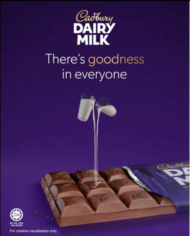
I also looked at Cadbury posters and saw that they too used simple designs which put the attention more on the product with a tagline and the logo. They have also used vignette effects to bring attention to the middle where the product is and they show the bar of chocolate unwrapped to reveal the inside.
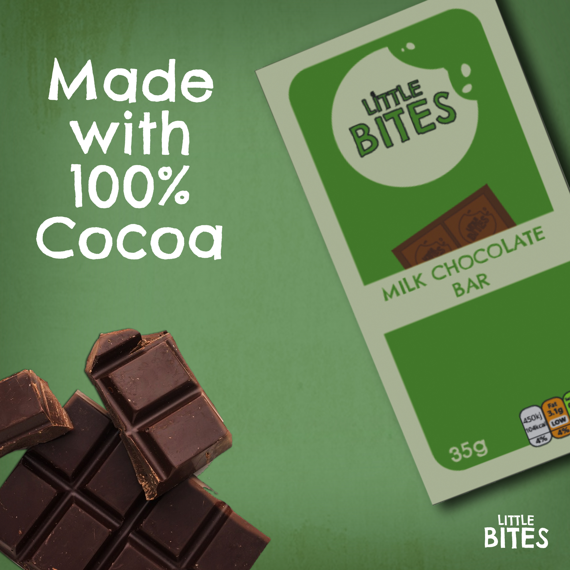
I made my own advert for the chocolate, starting with the background which I used the same style as before by adding the same texture because I wanted the posters to be recognisable as the Little Bites brand. I used an image of my chocolate bar and placed it off to the right at an angle, which left space for me to add a free image I found of a bar of chocolate. I put the chocolate at the bottom left to balance out the large space the product took in the top right. I then added some text saying ‘made with 100% cocoa’ above the chocolate and the logo in the bottom right. I used the text logo instead of the icon because it fit in the space better since it was more horizontal and matched the angles in the design.
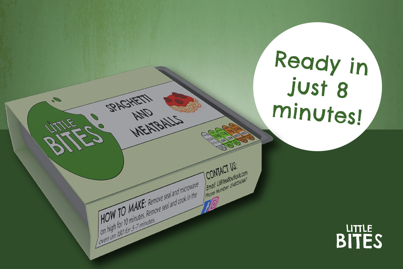
The last poster I made was for the ready meal product and I wanted to show how quick and easy it is to prepare for parents who are short on time but want to provide a tasty meal for their children. I created a landscape design and used a darker green on the bottom half to create a surface for the ready meal to sit on. I kept the texture on the top half and added a white circle to bring attention to some text which says ‘ready in just 8 minutes!’ emphasising how easy it is to prepare the meal in a rush. I added the logo to the bottom right corner and made the ready meal quite large to showcase the product and bring the focus to this part of the design.
Reference List:
Cadbury (2020) Cadbury there’s goodness in everyone [Image]. Available online: https://www.minimeinsights.com/2020/09/12/cadbury-dairy-milk-celebrates-the-goodness-of-everyone/ [Accessed: 03/04/2025]
Crawford, Jason (2024) Advertising Disclaimer That Helps You Stay Compliant and Protected [Quote]. Available online: https://www.websitepolicies.com/blog/advertising-disclaimer#:~:text=Besides%20avoiding%20civil%20court%20proceedings,making%20them%20buy%20the%20product. [Accessed: 03/04/2025]
Efe_Madrid (nd) White and brown watercolour texture [Image]. Available online: https://www.freepik.com/free-photo/white-brown-watercolor-texture_7391285.htm#fromView=keyword&page=1&position=17&uuid=9053685f-bd0c-4d76-8361-cf3182087a3d&query=Rustic+Texture [Accessed: 03/04/2025]
Freepik (nd) Delicious chocolate in flat lay [Image]. Available online: Delicious chocolate in flat lay | Free Photo [Accessed: 06/04/2025]
Walkers (2025) Walkers Oven Baked Salt and Vinegar Crisps [Image]. Available online: https://m.media-amazon.com/images/I/A1mVBpRD4KL._AC_UF350,350_QL80_.jpg [Accessed: 03/04/2025]