Food brands have websites where customers can view their products and make orders or receive customer support and find out more about the company. I have decided to make a website page for Little Bites so customers can easily buy items and keep up to date with new releases or flavours.
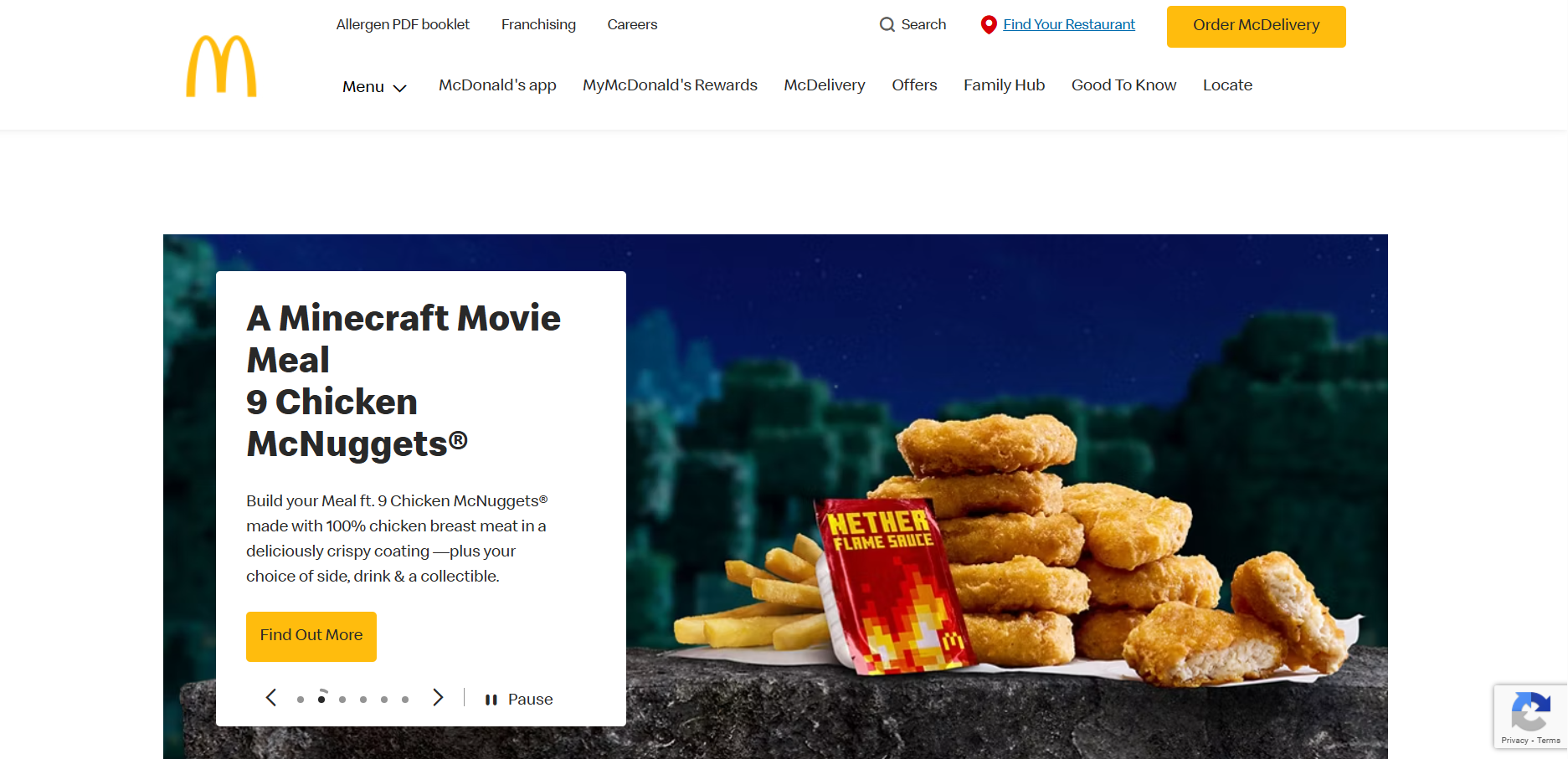
McDonald's website landing (own screenshot)
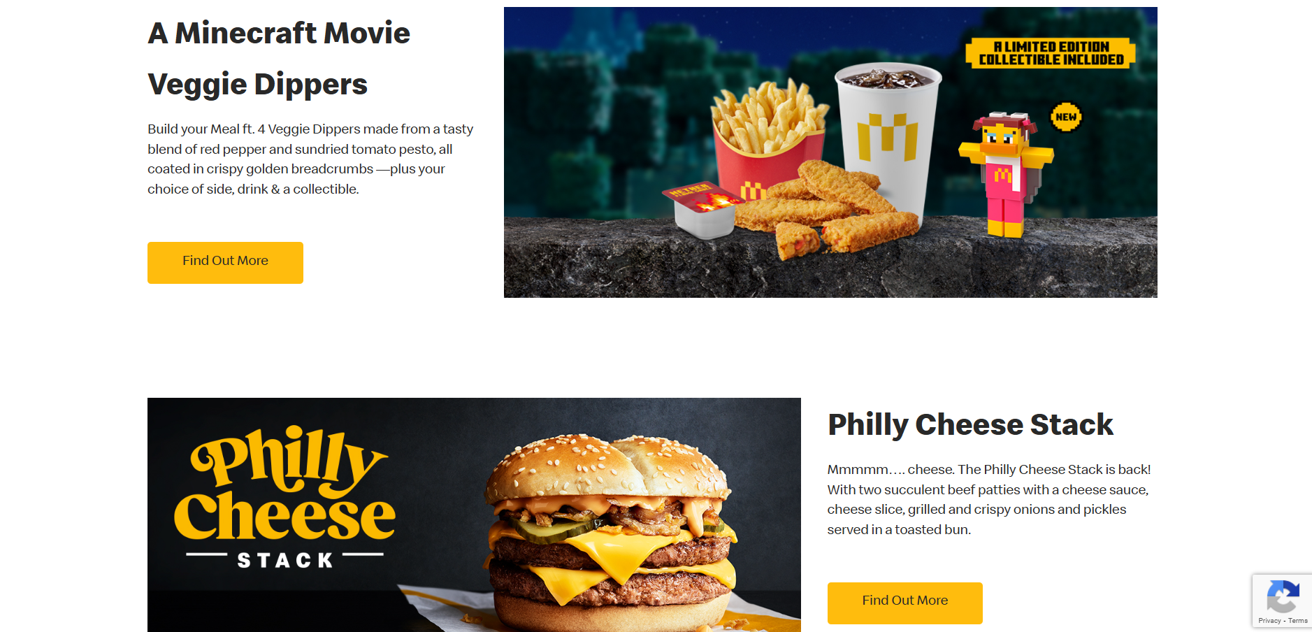
McDonald's website section (own screenshot)
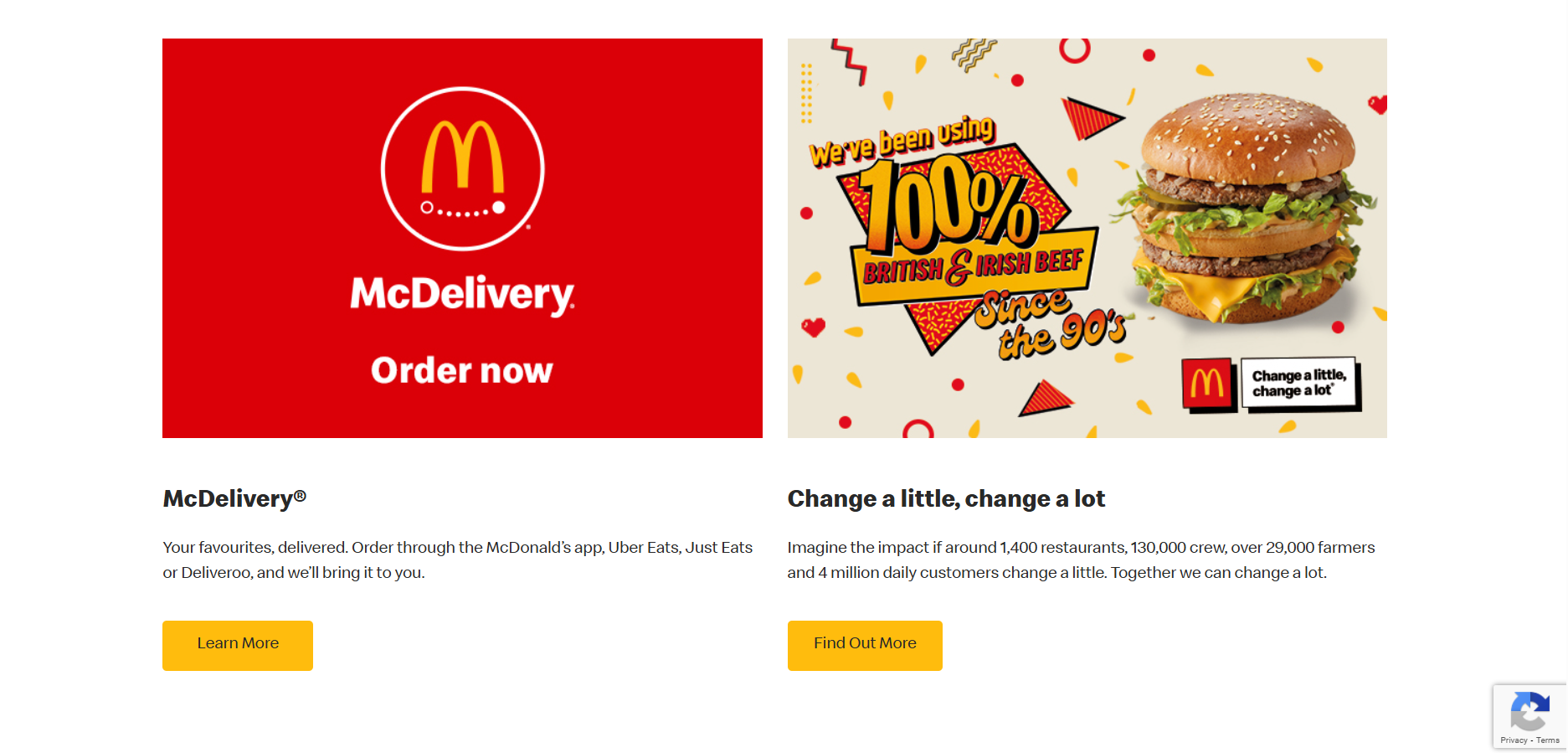
McDonald's website section (own screenshot)
I have looked at some websites for inspiration to see how they display information and what they include. I started with McDonald’s as they are one of the most well-known food brands and their website will be high quality. Their website has a navigation across the top where the first thing you can look at is their menu to see the products they sell, and then things such as their rewards and offers. Then there is a large image slideshow which links to recent news in the brand, like their new happy meal collaborations and saver menu. As you scroll on the layout switches between image-text, text-image on opposite sides which makes balance and is easy to follow. There are call to actions on each section to find out more about featured products or offers. At the bottom is a contact box and a footer which has links to their social media sites and to the terms and conditions.
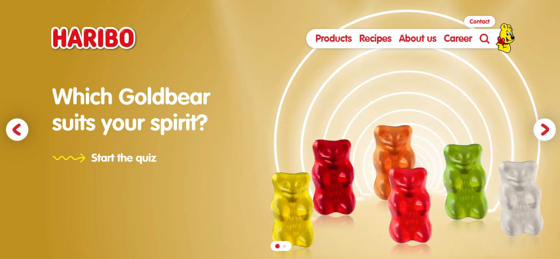
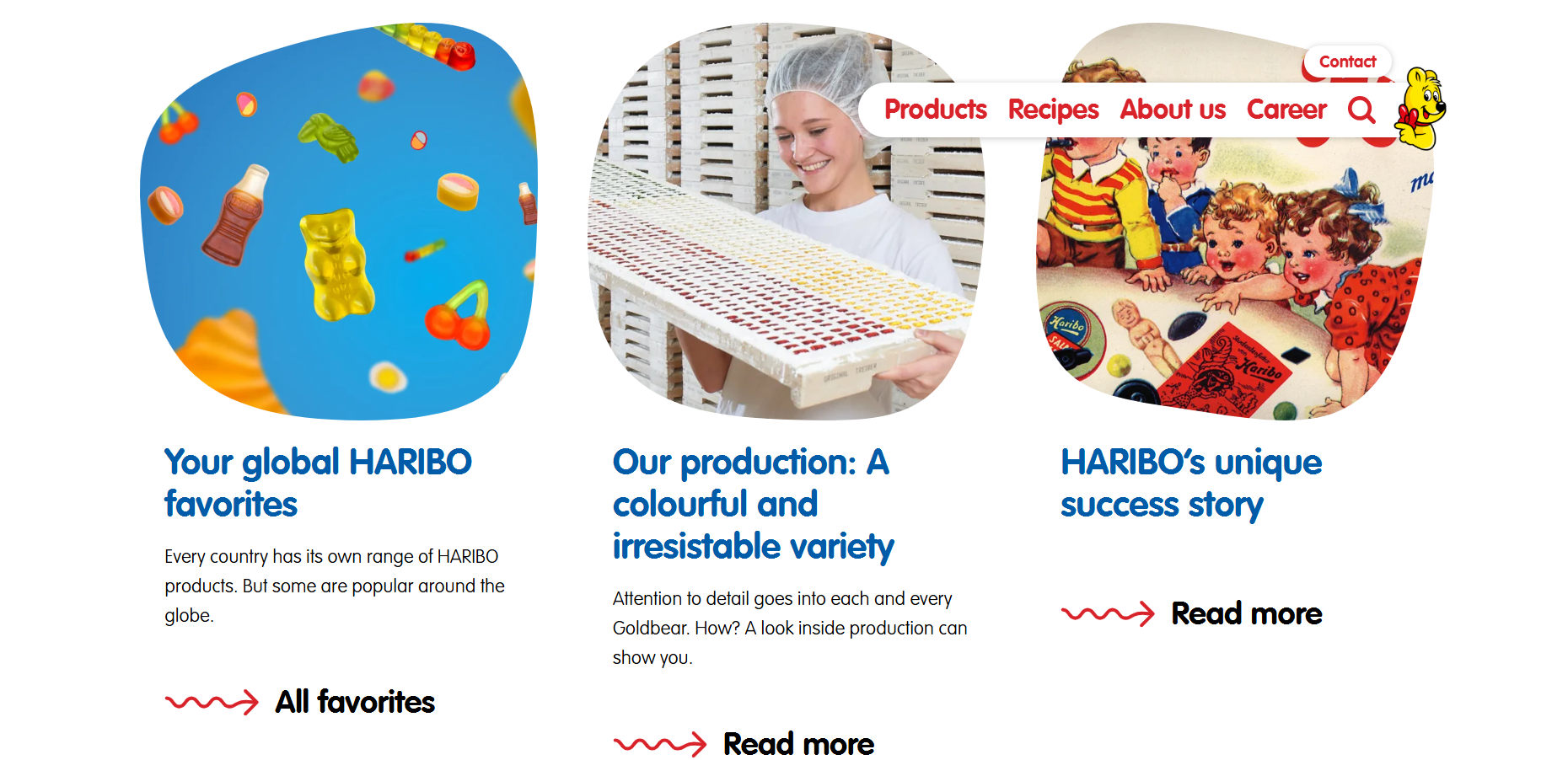
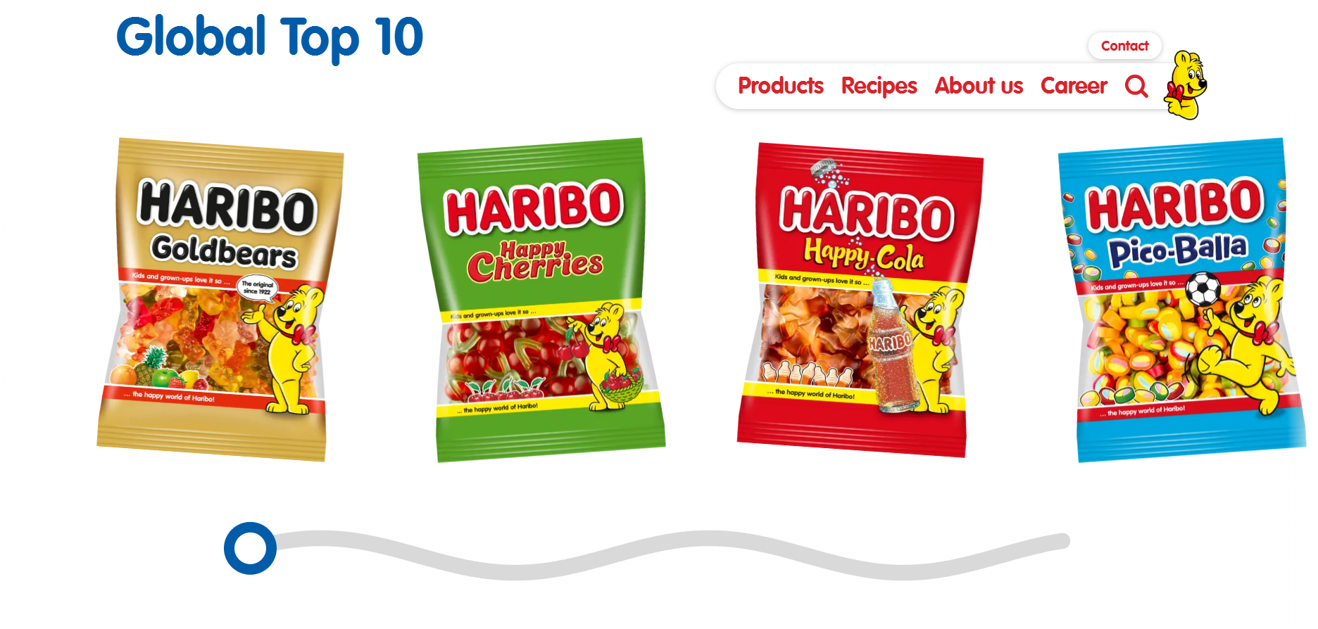
I then looked at the Haribo’s website, which was more kid-friendly than McDonald’s with less links of the navigation and bright colours and shapes and squiggles. There is a large image across the top of the page which links you to a quiz and shows animated gummy bears dancing, which is more appealing to children visiting the website. Then their website is constantly changing layouts for each section to keep it varied, with a row of three news articles and call to actions to read more, and a video showing an advert. I also saw that the images weren’t square or rectangular but rounded and more random, something kids will find more fun. I also think the changing layouts will be more appealing because it keeps it different and more exciting to scroll through. At the bottom of the page is a horizontal scrolling section which is designed like a squiggled line and a circle which can be used to move back and forth. The motion is very fun to interact with and makes the website more playful.
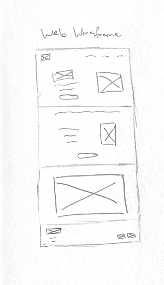
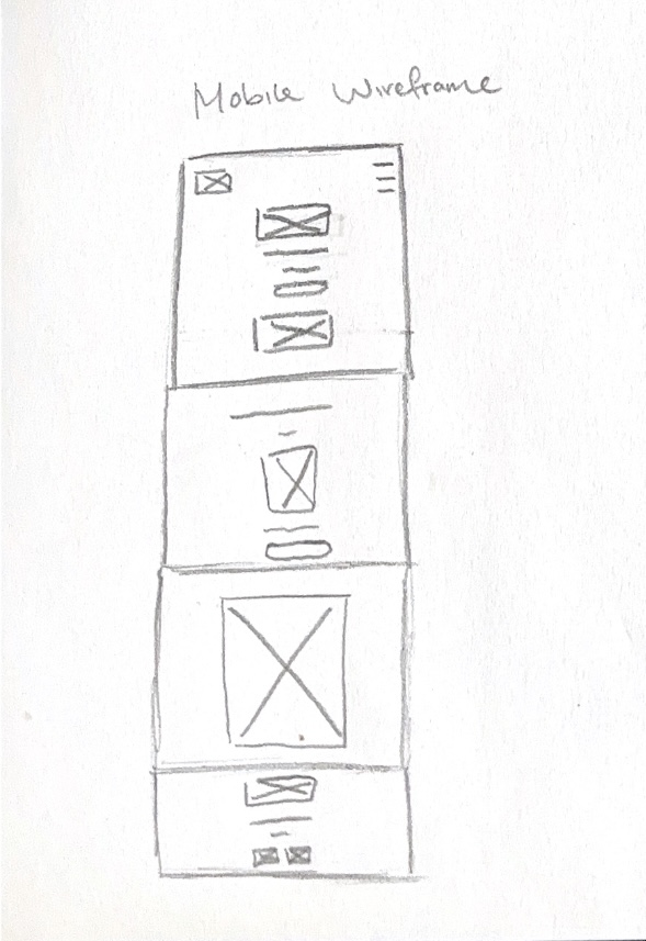
Website wireframe sketch
After gathering inspiration, I have made a wireframe for the website layout. I have made a wireframe sketch for a long website home page and sectioned it into four parts, a landing, a section for new products and a call to action to order, a section for the animation I made, and a footer section with links to social media sites and contact information such as addresses.
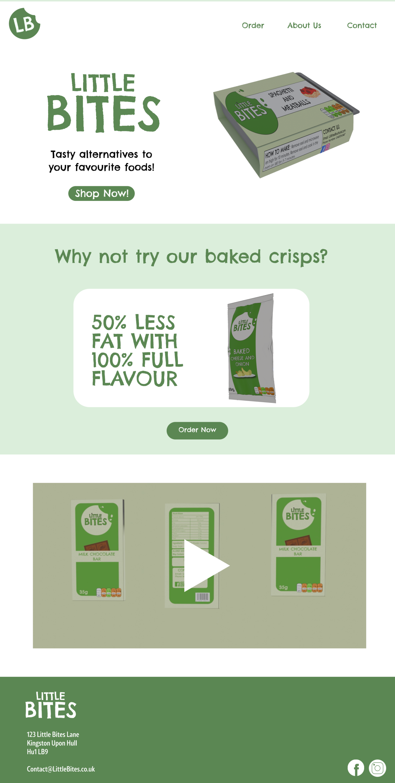
Little Bites website
I used Figma to make the high-fidelity design and used a 1920×1080 frame as it is the standard website size. I used my brand colours and the logo for the landing page and made a navigation bar. I made the navigation shorter with less links because I thought the McDonald’s navigation had too many links compared to the Haribo’s one which worked better for kids. I used an image of my products and the other logo style to make an attention grabbing first impression, I also added a call to action underneath the text to get users to shop now. The text is to the left and the image is to the right, but for the next section I used a central alignment to create variety. For this section, I used an image of the crisps with the text “why not try our baked crisps?”. I used a white box shape to break the green and to make this stand out more and I used the tagline “50% less fat, 100% flavour” to show that the crisps were lower in fat but still just as tasty.
The next section shows a video preview of the animation and takes up the full space. For the top and bottom sections, I used the same colour background, but for the middle section I used green to make an alternating effect which made the design more varied as it switched back and forth.
And then for the footer, I added the logo again and an address and an email that customers can contact the company on. In the bottom corner are the links to the Instagram and Facebook pages, and I used Illustrator to make these icons myself.
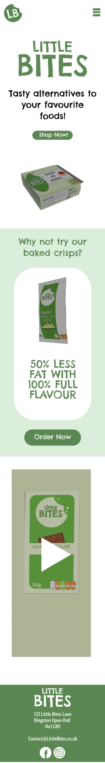
My Mobile Wireframe
Lots of kids now use mobile devices more than laptops or computers, so I made a mobile version of the website to make the design responsive. I made another wireframe sketch and compressed the design by adding a hamburger menu for the navigation and stacking elements vertically. This is because there isn’t as much space going across the screen, so things have to become stacked to fit. I changed the alignment of most of the design to be centered to keep everything fitting on screen, such as the footer. The footer is now all stacked instead of the links been to the right and text to the left. I made images and text sizes smaller to fit the mobile screens better because the size of the website design would be too big on mobile.
Little Bites mobile website
“Responsive design can help you solve a lot of problems for your website. It will make your site mobile-friendly, improve the way it looks on devices with both large and small screens, and increase the amount of time that visitors spend on your site. It can also help you improve your rankings in search engines.” (WebFX, ND)
A responsive website makes it easier for users to navigate, and they then spend more time browsing, which will make them more likely to buy the products.
Reference List:
WebFX (nd) Why is Responsive Design So Important? [Quote]. Available online: Why is Responsive Design So Important? [Accessed: 12/04/2025]