For my project, I am creating a campaign for a series of horror movie posters, produced by Silver Scream Productions. The campaign is aimed at horror and film fans alike, of all ages and genders.


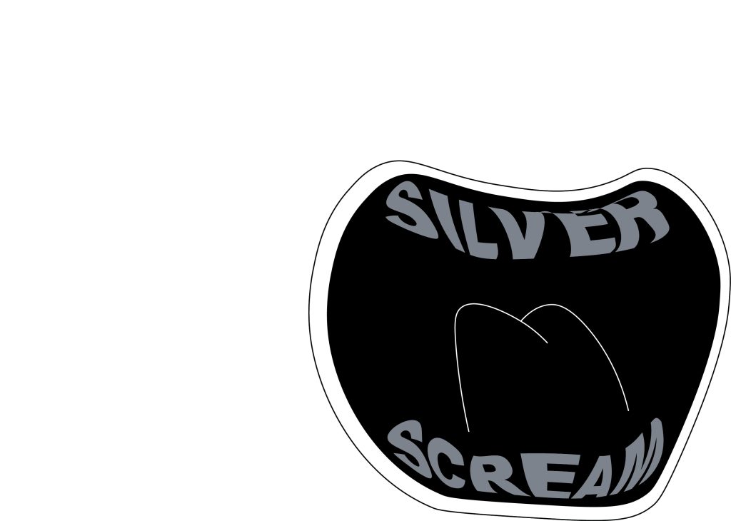
For the company logo, I have designed a logomark of a screaming mouth. The idea comes from the name ‘Silver Scream’ – which plays on the film term ‘silver screen’, and ‘scream’ – which is commonly associated with horror.
“Logos and branding are so important. In a big part of the world, people cannot read French or English–but are great in remembering signs.” (Lagerfeld, K)
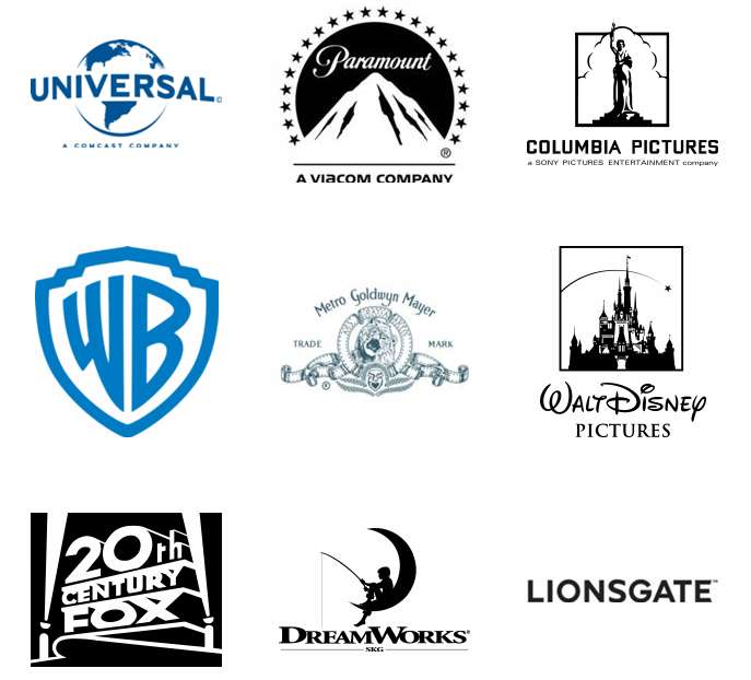
Expanding on this point, a logos main function is to identify what something is, and to be memorable. By using such imagery, it is clear that the logo is linked to horror or fear. The quirky design also makes it stick and easier to recognise.


The logo itself is quite simplified. I held back on finer details since the logo would need to be clear at any size, big or small, and adding minute details may obscure the logo at smaller sizes and won’t be very clear anyways. To avoid the logo being too simplified and flat, I used a range of tones to add shadows and highlights so that the design is more lively and fun.
I had the idea of replacing the teeth with the name of the company. To do this, I made each word into a ‘set of teeth’, warping the text to fit the contours of where the teeth would typically be. The warping of the text also creates movement, as there are areas in which one letter seems to swell, and another seems to recess. The shakiness is reminiscent to how ones voice may shake and quiver when screaming, or even the way that one may tremble physically when feeling fear, which ties back in to the themes of horror.
References:
DeJong, J (2021) DVD’s stacked atop each other [photograph]. Available online: https://twitter.com/snailstampede/status/1346891606260129800?ref_src=twsrc%5Etfw%7Ctwcamp%5Etweetembed%7Ctwterm%5E1346891606260129800%7Ctwgr%5E2080d7a7520aa7a15429b99d7ed8290f24942382%7Ctwcon%5Es1_c10&ref_url=https%3A%2F%2Fmelmagazine.com%2Fen-us%2Fstory%2Ffamily-video-vs-blockbuster. [Accessed: 01.01.2023]
Dougherty, S (Unknown) Film Company Logos [Photograph]. Available online: https://www.pinterest.co.uk/pin/570409109032386186/ [Accessed: 01.01.2023]
Lagerfeld, K (2009) Karl Lagerfeld, Global Aphorist [Article]. Available online: https://www.wired.com/2009/07/karl-lagerfeld-global-aphorist/ [Accessed: 01.01.2023]
