
Envy:
For this movie, I have created a regular poster, and a bus advertisement. The movie is about vanity and how jealousy can push someone to extremes. I added a vintage sepia filter to the image for a creepy haunting feel, and added texture to make the photo look like an old photograph. For a creepier feel, I obscured the girls face to look scratched out, adding a sense of mystery. For the title, I have manipulated the text to look like shattered glass, linking to the theme of mirrors and vanity.
I have also added quotes to all posters and taglines, as well as production information and credits. This is to fill the composition and to make the posters feel more realistic.


SLICE:
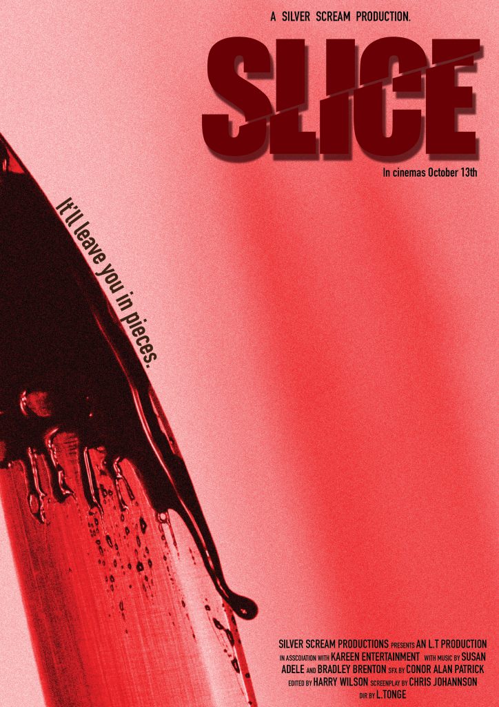
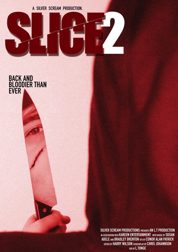
SLICE is a slasher horror film. To show this, I took images of a knife with fake blood dripping and close up images of the killer with a cut on his cheek. I added a red filter to create drama and a more intense appearance. The title has been ‘sliced through’ and is skewed to add personality. I used the curve of the knife to add the tagline and kept the first poster quite minimal. In both posters, we don’t see a full view of the killer, which adds mystery and fear of the unknown, raising the stakes and intensifying the designs.

SLICE 2:
SLICE 2 is a sequel to SLICE. It is a continuation of the first film and has similar concepts. I kept many elements the same to show that it is a sequel and to create continuity between the posters. This time, we see the back of the killer, with a portion of his face reflected in the knife. By showing more of the killer here, it shows how we have learnt more about him and some of the mystery is slightly reduced, but still there.


The Intruder:
This is a horror thriller about an intruder within someone’s home. For the first poster, I used an image of the intruder at the top of the stairs, stood threateningly with a red light cast behind him to create a silhouette and a more intimidating look. The stair railings almost look like weapons and also lead us in towards the intruder. I blended the dark areas out and filled the negative space with the title and a key illustration. The tagline reads on either side of the figure to create symmetry and balance.
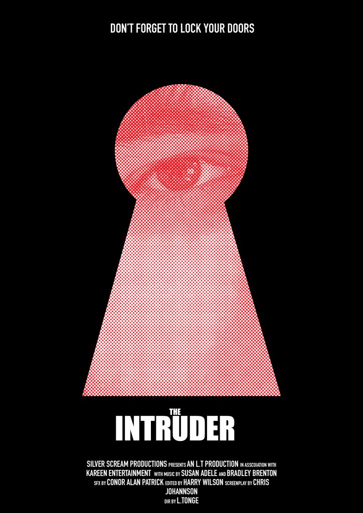
For the final poster, I used a close up photo of the intruder masked onto a keyhole illustration, so it looks like he is spying through into the house. I added a halftone effect and made the image red for a vintage effect similar to iconic posters such as The Shining, which uses similar effects to create something unsettling and intrusive. I didn’t include the key as I felt the keyhole was strong enough on its own.
