All images are my own.
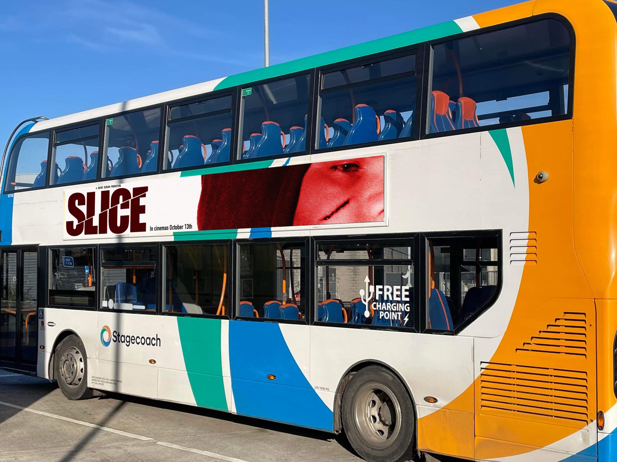
I made this poster so that it can be displayed on the side of a bus. Lots of people take public transport around the city, and the bus travels all around which means it is likely that many people will see this poster whilst out. Since you will probably only see the bus passing briefly, I made sure to put all relevant information – movie name, release date, and an interesting image which links to the movie.
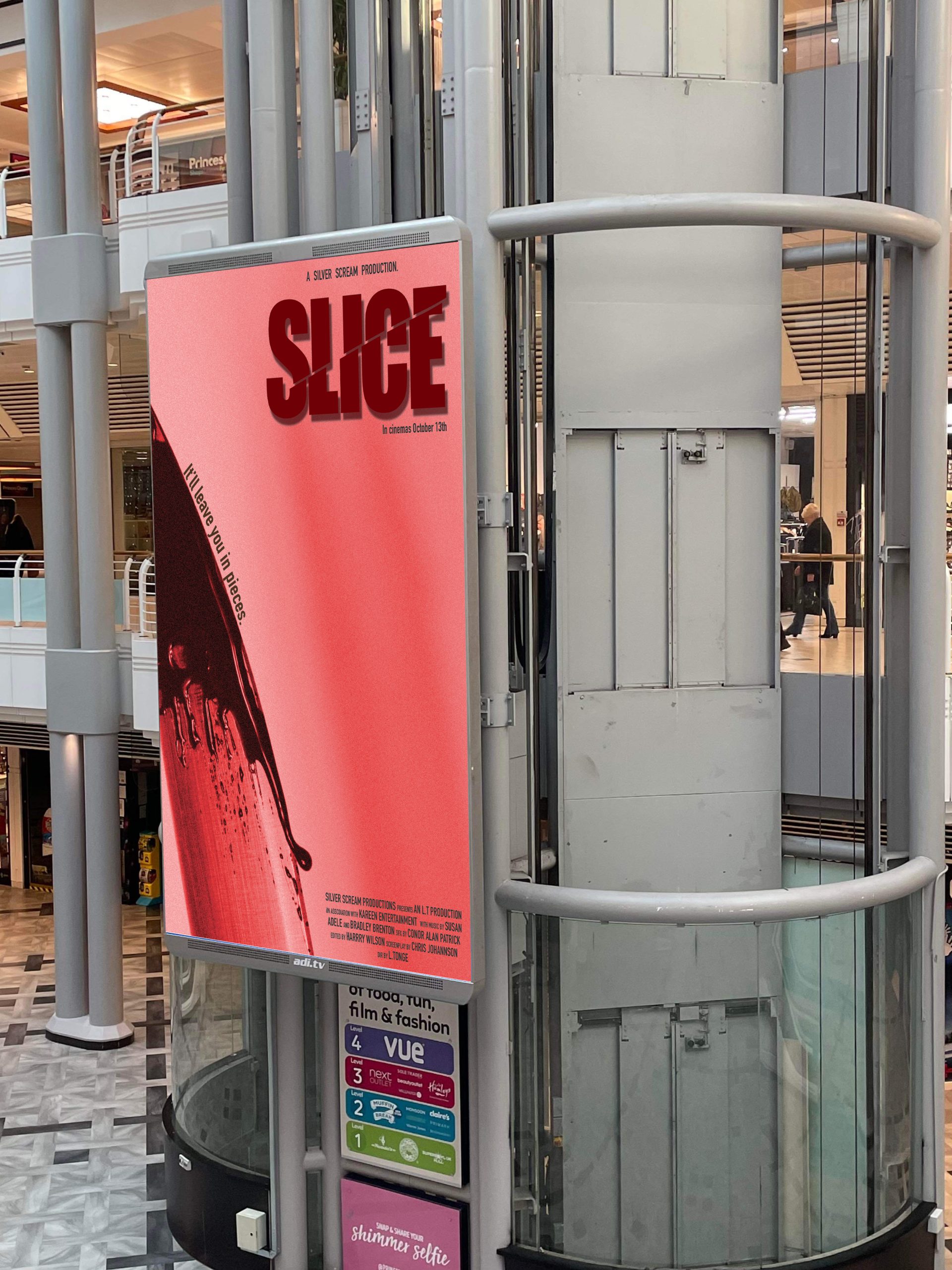
Because this poster is situated on a stationary object, unlike the last one which is placed upon a moving vehicle, I am able to place more information, such as the production credits and a tagline. I’ve also kept the important information, but now passers-by can take more time to look at the poster. The photograph is eye-catching and has a sense of shock value, which will grab attention and force viewers to acknowledge the poster – which will lead them to the information, and generate interest.
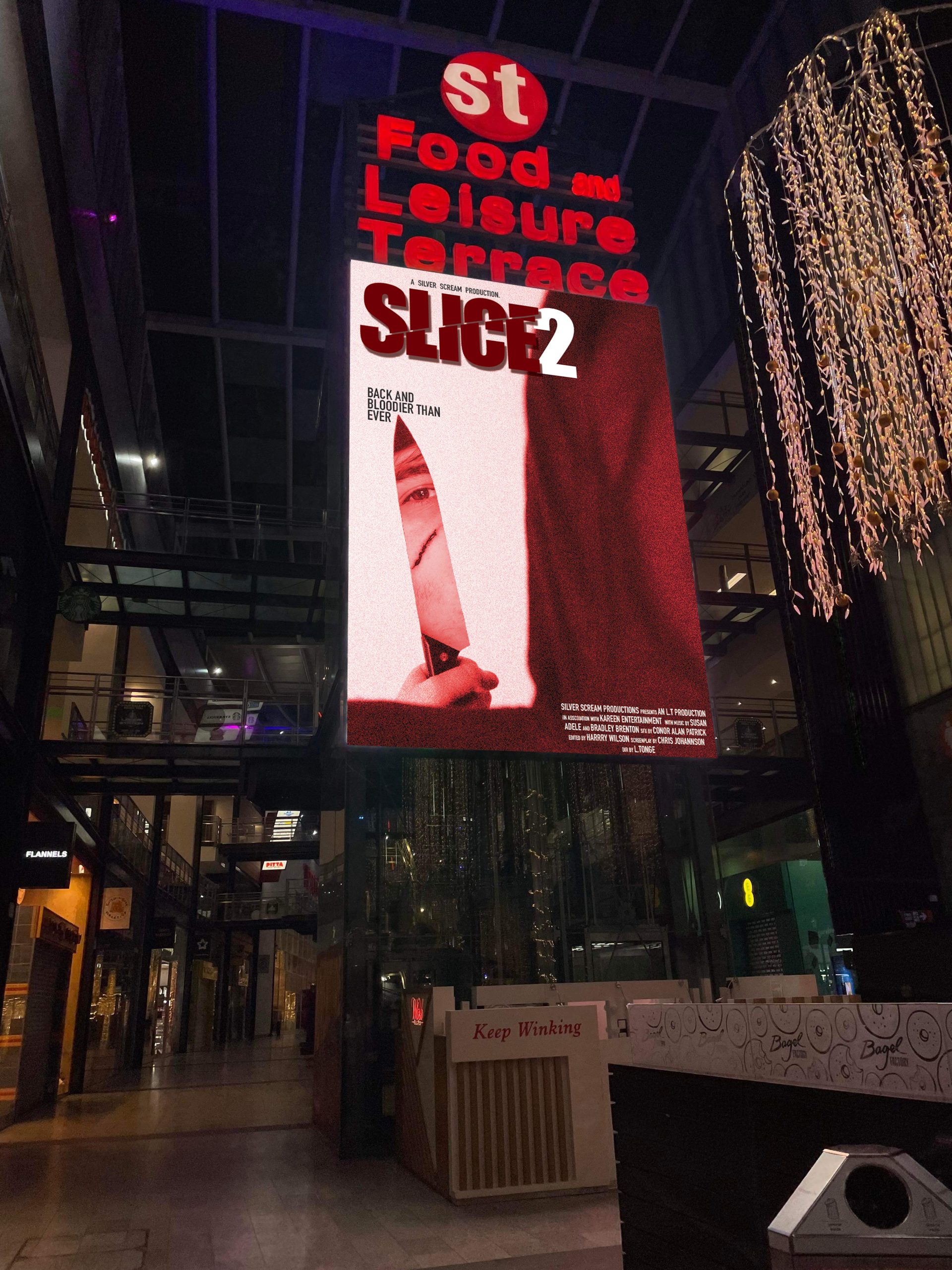
For the sequel poster, the advertisement is within a busy shopping centre. When walking through, it will appear as if we are behind the killer, who is looking at us through the knife’s reflection. The feeling of being watched is typically unsettling and most people find it slightly uncomfortable, so this will create an atmosphere of what to expect from this movie – attracting horror fans. The main villain is also prevalent and recognisable due to his scar, which is likely to attract fans of the first movie to go and watch this one.
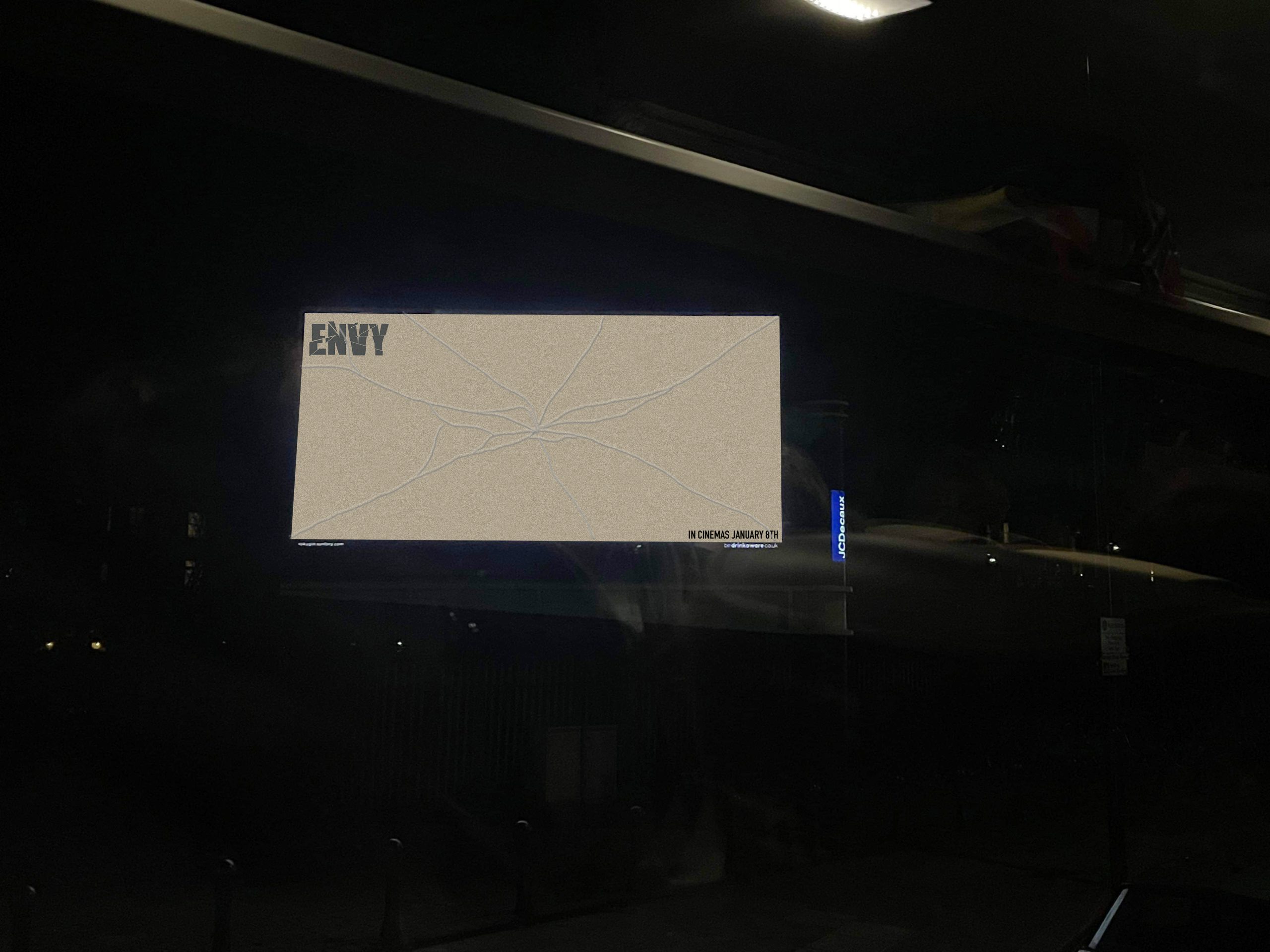
To form more of a conceptual advertisement, I designed a minimalistic bilboard poster for Envy. I used the vintage sepia-tone brown and placed the movies logo and release date in either corner. I made a cracked glass effect, which links to the movies theme of vanity and self-obsession turned deadly. Although simple, this poster instinctively creates curiosity within the viewer to find out more. It is unusual and makes you double take at the shattered effect. The result is that viewers will search the movie up to find out more information, and a buzz will be created.
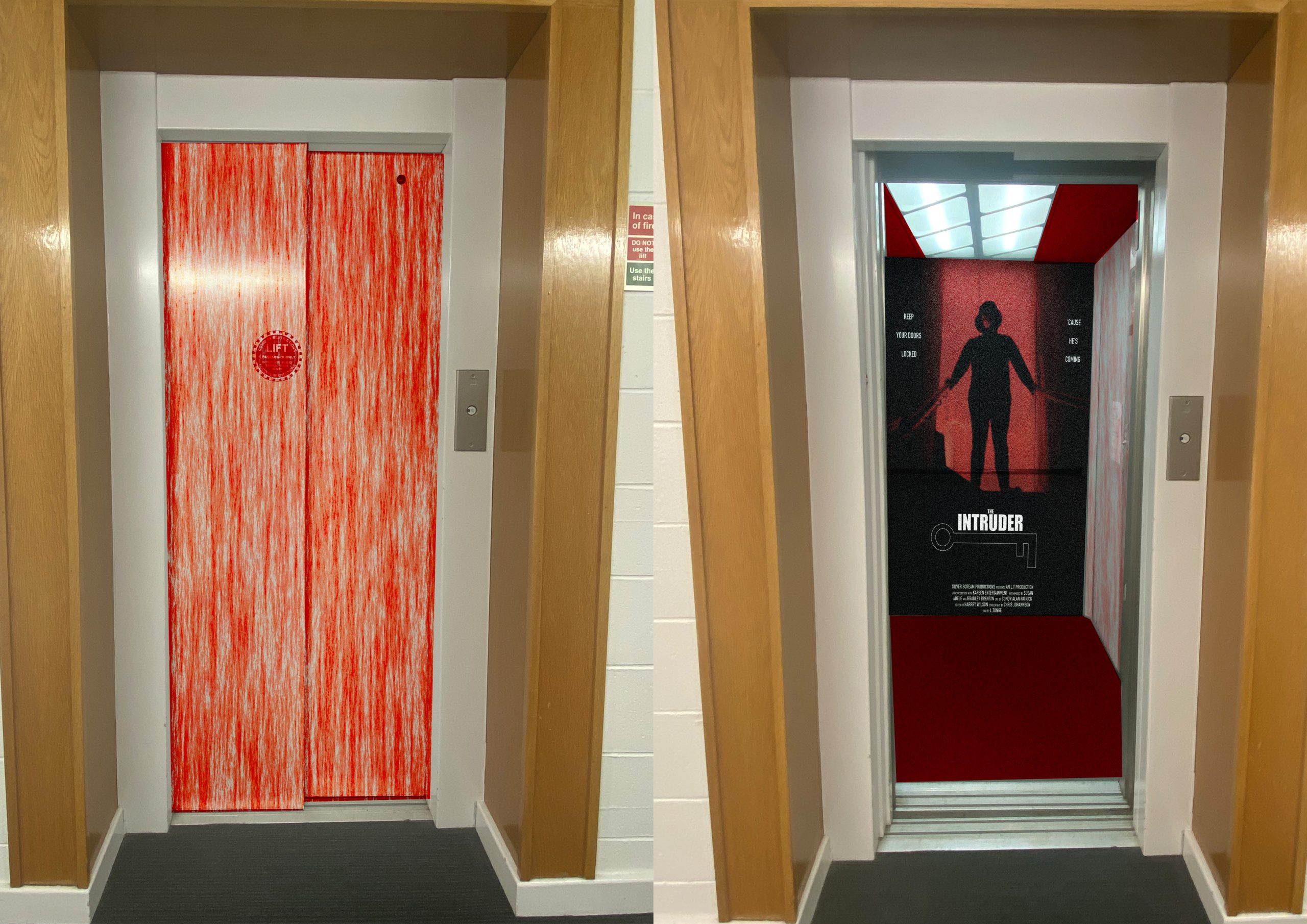
This advertisement is meant to be more immersive for the viewer. When approaching the elevator, you see the doors covered in blood, which straight away piques a mixture curiosity and fear. When the doors open, we see the movie poster on the back wall, and more blood on the side walls. The reasoning for this is because it pushes the boundaries of regular advertisements and creates shock and excitement, which will get people talking about the film.
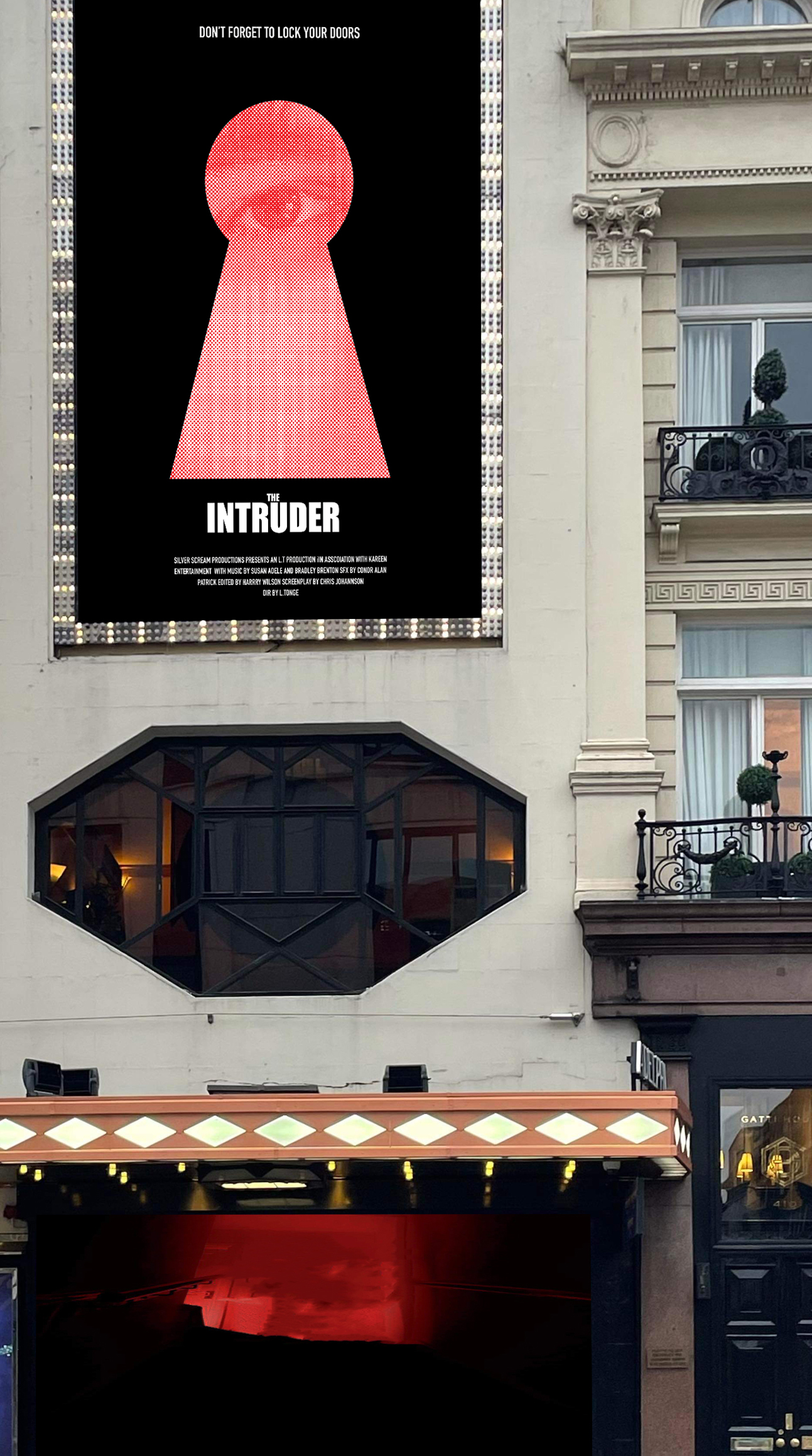
This is the second poster for The Intruder. This poster shows a huge keyhole with an eye looking through, which creates the sense of being watched and intrusion. The placement of the poster is right near these huge windows, which furthers the themes of intrusion and invasion of privacy. Because of the huge scale of the advertisement, which is on a busy street, viewers will be drawn to look at it, and will be more likely to inquire about the film, wanting to find out more.