This is how I have decided to layout my website content, following one of the sketches I did in my prototype stage.
I have now completed my final design for my website portfolio and I have created all my content to go in it.
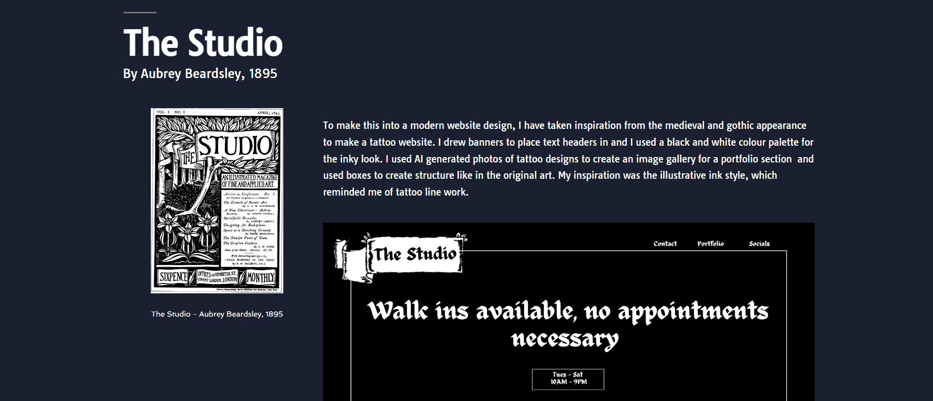
The idea from my layout was one that I did in my paper prototypes, with the images swapping sides. I made a few adjustments so that it worked better, like keeping text to all one side. I kept the text all to the left besides the original art and above my recreation. This way is better as the user can view it in an upside down L shape from Original-Text-Redesign, which creates a natural viewing flow and is more pleasant.
To make the experience more fun, I have used motion effects to make the content for each section float in as you scroll down to it. I had to be careful to not go too overboard, since motion effects can easily become too annoying or distracting for the users. This is supported by Page Laubheimer, who says, “when UI animations are subtle, unobtrusive, and brief, they can improve the user experience and can communicate feedback and state changes, prevent disorientation, and strengthen signifiers. But they should not be overused, as they can easily become overwhelming and distract users.” (Laubheimer, 2020).
I think this is true, so I have only used it to introduce new sections and to create more progression in my website.
The colours I have used are black, white, dark blue, and light blue. I wanted a professional and clean appearance and didn’t want too much colour to distract from the designs. I used white for regular text, black for the website title, dark blue for the background and light blue for links. I also chose to use one font, which was a sans-serif clear font that can be easily read on screens.
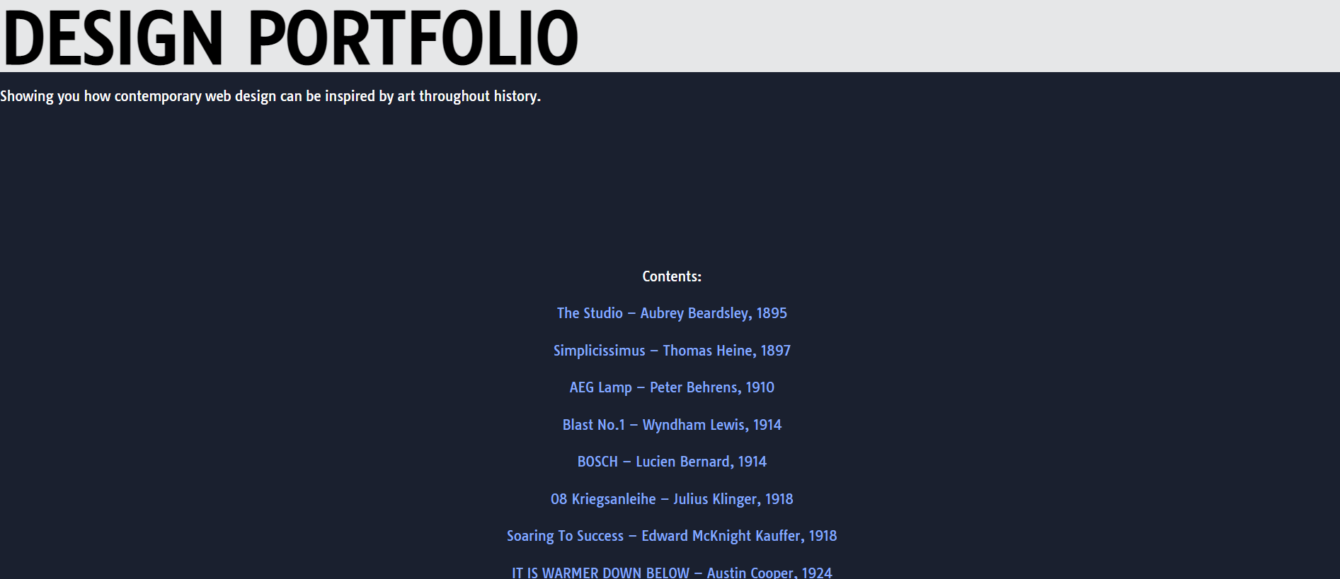
At the top of my portfolio website I added contents. This is so users can jump to sections if they are looking for something specific
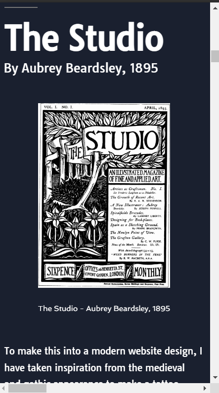
At the top of my website is the name and a little subtitle which tells the user what my website is for.
I didn’t like that my website opened and straight away, you see all the content and artwork. It felt a bit rushed and I wanted to add something before this so that you aren’t jumping right into everything. Also, this way the motion effects wouldn’t all start as soon as you open the page, which may be offputting.
I instead just made a contents, which is placed in the centre to avoid an unbalanced space as the text reads down. I just put the artworks in order and linked each title to the section so users can click to a point. This also brings in the timeline aspect a little bit better as you can see everything all at once in order.
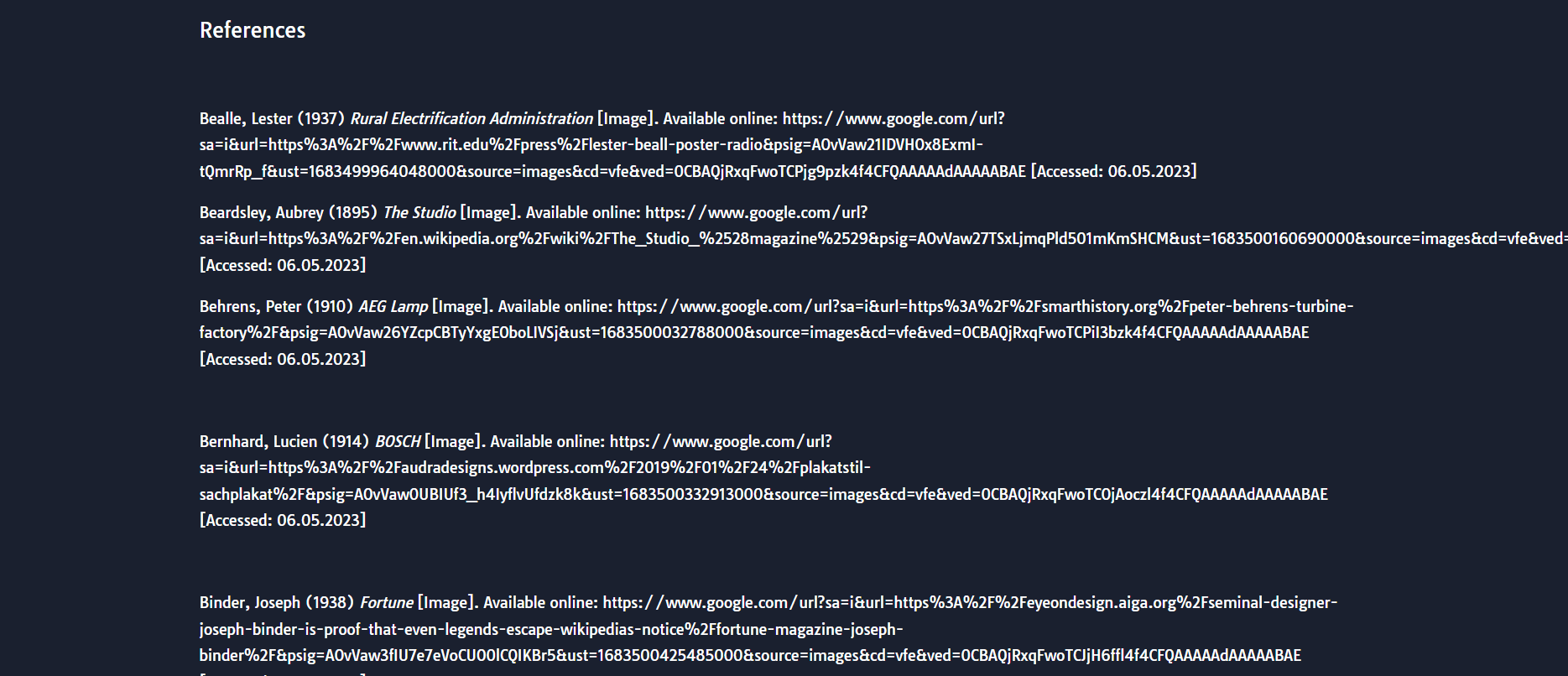
A reference list at the end to show where the art is from
At the end I put all my references. I had found my artworks in a book, but downloaded the images online, so I cited the online websites since I used those downloaded photos.
I added the references to give proper credit to the original art and to make it clear they were outside sources. I used Harvard referencing for this.
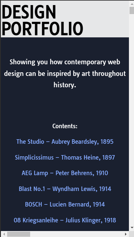
Top of my website on mobile
How my website looks on mobile
I then finally made sure my website was responsive on mobile. Most users now view sites on mobile (Interactive Design Foundation, nd), so making it responsive is important. Because my website was already quite simplified in layout, the only thing that really needed changing was the heading. I made the heading smaller and centred the text to read better on mobile. The rest of the content automatically stacked on each other and worked well on mobile.
References:
Interactive Design Foundation (nd) What is Responsive Design? [Article]. Available online: https://www.interaction-design.org/literature/topics/responsive-design [Accessed: 07.05.2023]
Laubheimer, Page (2020) The Role of Animation and Motion in UX [Article]. Available online: https://www.nngroup.com/articles/animation-purpose-ux/ [Accessed: 07.05.2023]