Now, I will take a look at how the Freedom Festival website has changed over the years. I am doing this so that I can see what is important to the design and function of their website.
I have used the Wayback Machine website to collect screenshots of old Freedom Festival websites. This is a website which archives different webpages and lets you look back through different years at websites.
2012
Freedom Festival 2012 website
Freedom Festival 2012 website information page
Freedom Festival 2012 website events page
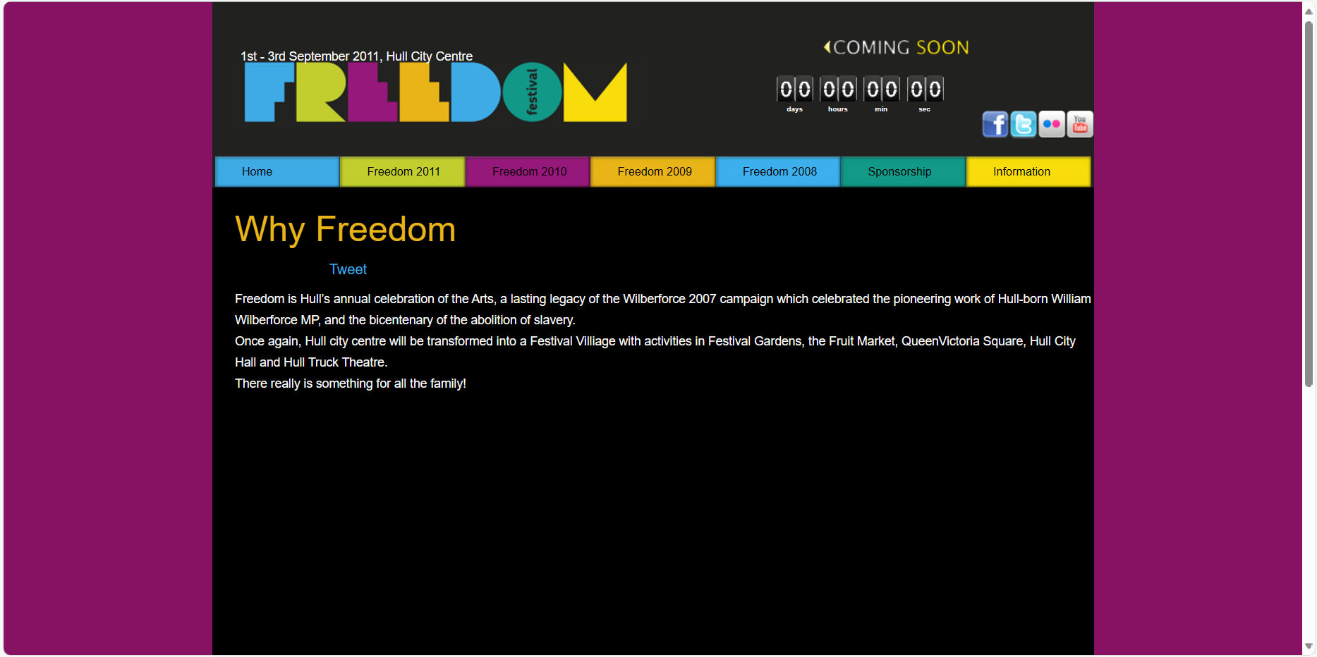
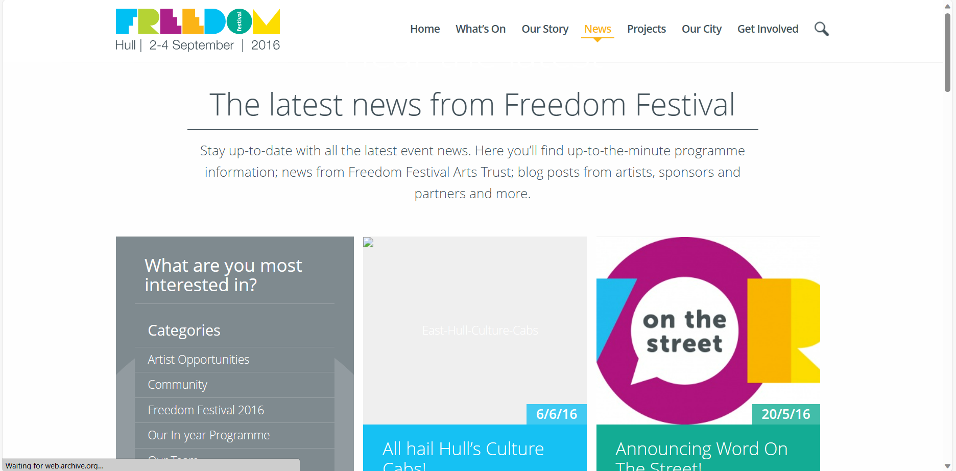
This is how the website looked in 2012 for Freedom Festival. This website style is clearly outdated and more simple compared to the websites we see today. This design is split into small block sections, and there isn’t a lot of white space, so there seems like there is a lot of information in the space.
I notice that the colour purple stands out a lot, and it is paired with black. I don’t think this is a good choice of colour as it seems quite dull and makes the festival seem lacklustre because of it. The navigation also doesn’t work well since some of the titles float in the middle and it makes the boxes seem too big in comparison, which throws off the overall look.
There is a countdown to the next Freedom Festival, which looks a bit dull also. It doesn’t seem exciting and the graphic style is outdated. It is a similar colour to the background, so becomes lost. The social media icons are also outdated, but that is because it is the 2012 designs, and some of these sites aren’t popular no more.
There is an overall lack of contrast, which brings the hierarchy down. The typography is a bit plain and does not really stand out to me. For the ‘Why Freedom’ page, there is too much space, where I think an image should have maybe gone to add some more interest to this section.
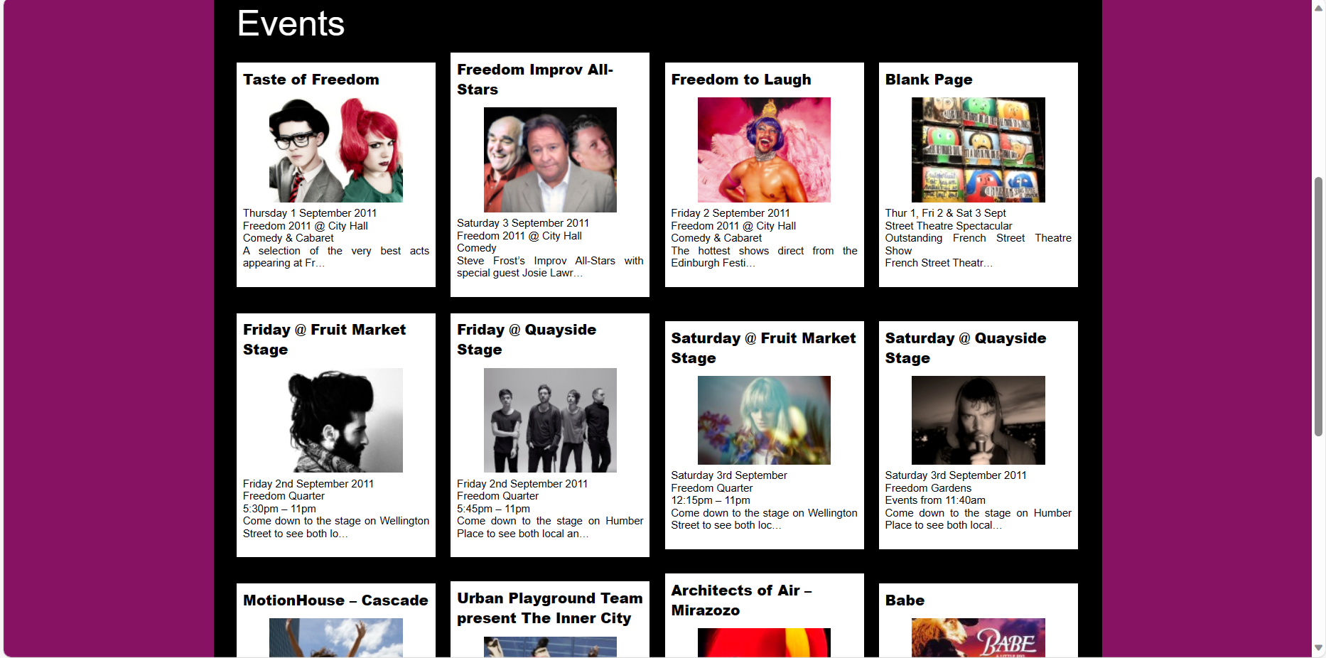
For the events section of the website, I noticed that some of the boxes are different in size, which looks messy and breaks the grid used. I think these sections could have been condensed so that they line up, which would look better because it is more ordered.
2016
Freedom Festival 2016 website
Freedom Festival 2016 website projects page
Freedom Festival 2016 website news page
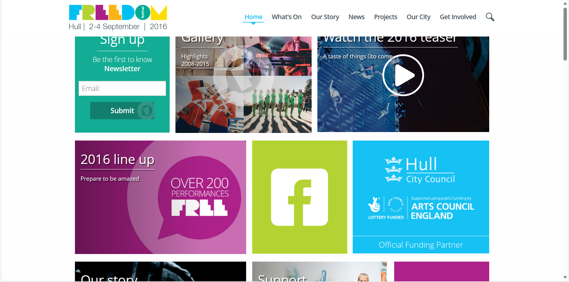
This is how the website looked in 2016 for Freedom Festival. This version looks better because it is more bright and vivid, which shows more personality for the festival. The black text against white is also easier to read and there is more clear use of a grid.
In the grid, there are sections of different sizes to show importance and make you look to the important sections first. The variation is also fun, but it works because each section lines up and still respects the grid layout. Hero images are also used for different pages, which helps to break up the large bits of text, where before there was no images and just text which left too much empty space.
The typography is still simple, but more rounded and uses different point sizes to create hierarchy. More simple fonts work better on screen because they are easier to read at smaller sizes, which is why sans-serif type is used a lot in web.
The colours of the logo have also been used throughout the website, which looks cohesive. The navigation also becomes highlighted with these colours to show what page you are on, which shows attention to small details and ties the design together.
The navigation is neater and less blocky now, it instead sits in line with the logo at the top of the screen, making it easier to use the website properly.
2023
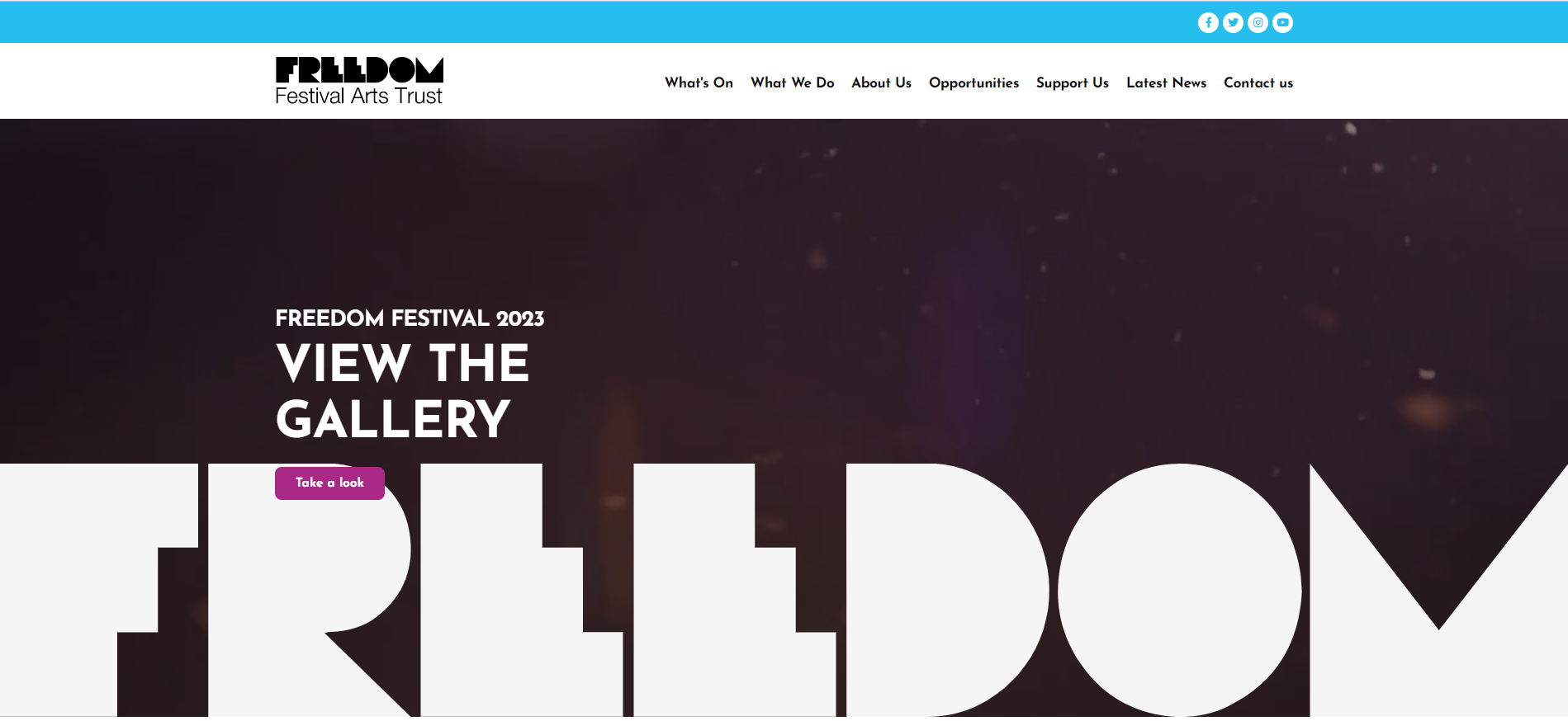
Freedom Festival 2023 website
Freedom Festival 2023 website sections
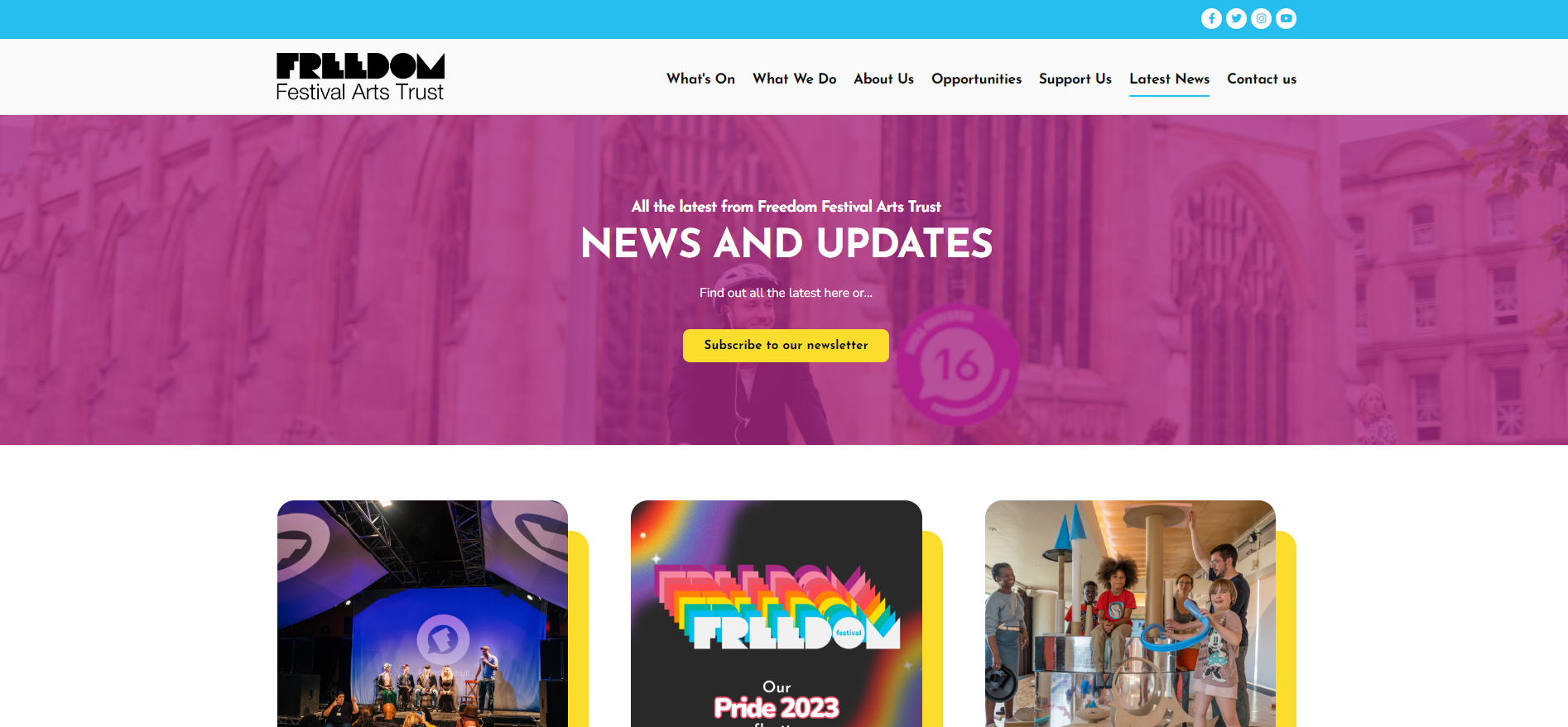
Freedom Festival 2023 latest news
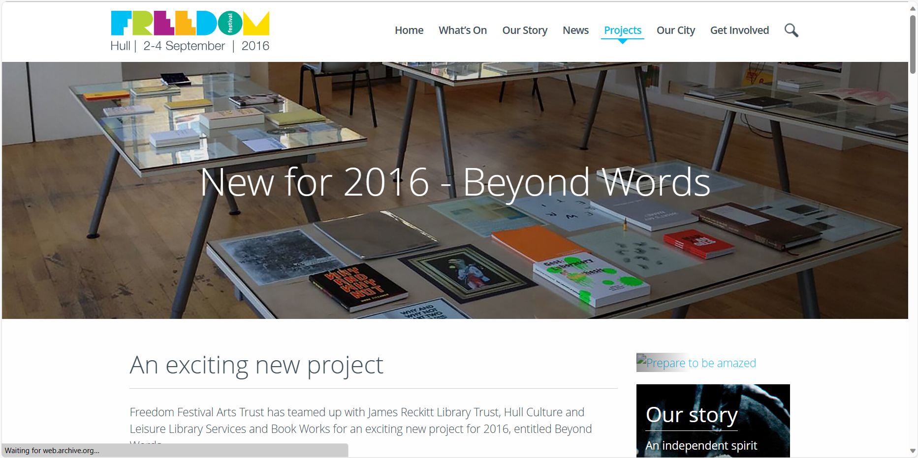
This is the most recent Freedom Festival website. It is very different from the other two.
The first thing you notice is moving images when you open the website. This provides a visual idea of what the festival stands for, without having to tell us with words. The logo is also displayed over this, really large which shows importance. The logo is now a solid colour too, rather than a multi-colour design. Blue is also an accent colour throughout the website.
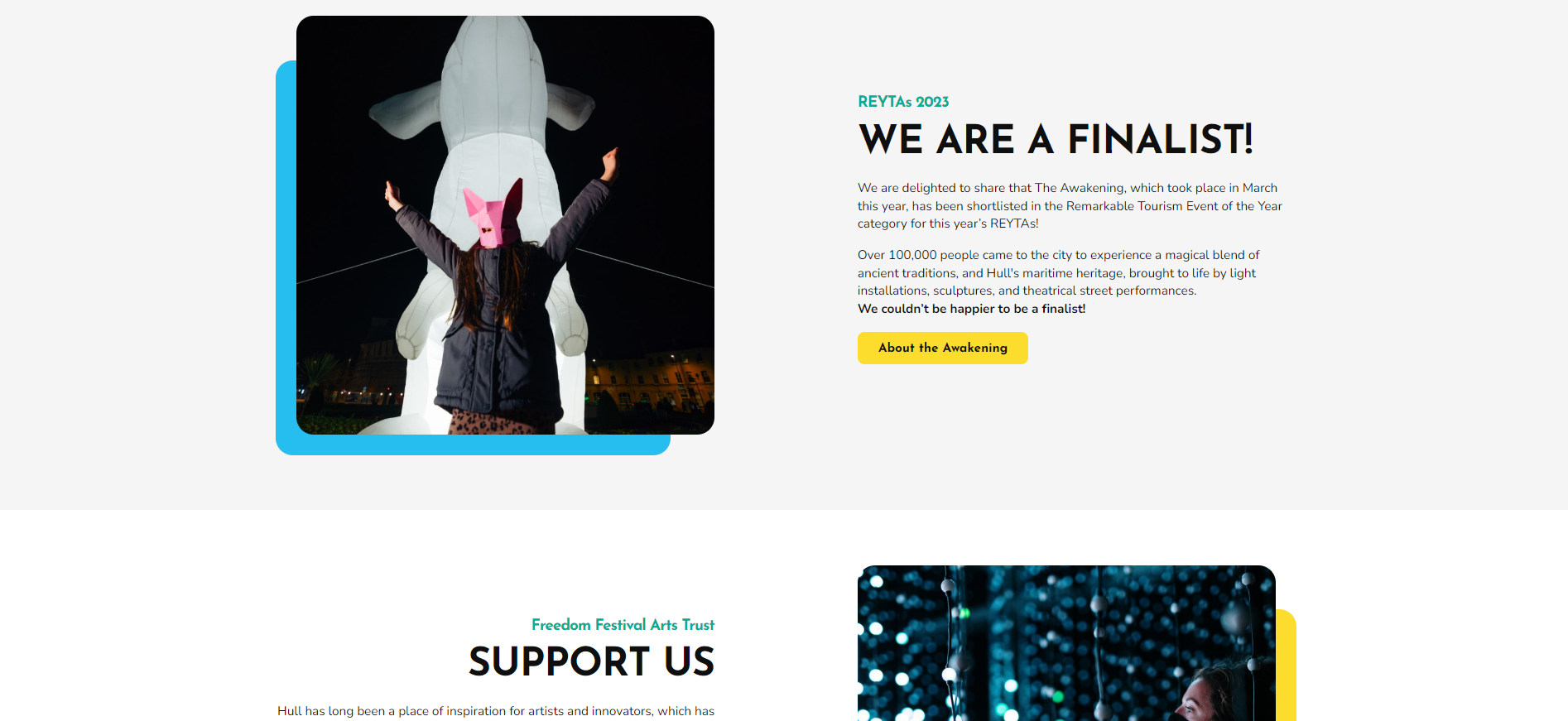
Call to action buttons are also used more, and take you to new parts of the website. When you scroll down, there are different sections and short information with one of these buttons, which let you find out more about each section. These sections use white space and feel breathable which is effective and allows viewers to break down information easier.
Use of bold fonts create hierarchy and colour brings attention to things such as images or buttons. This website flows better and seems more interactive with the use of moving images and hover animations on the navigation.
The news section is also refined and uses less rows to present information, so there isn’t too much all squeezed together. Like the 2016 website, there is also a hero image which introduces the page and breaks up the layout so you don’t have loads to look at right away.
Conclusion.
Now I have looked at previous designs of the Freedom Festival website, I am able to decide what to keep in my own design. To decide this, I am thinking about what has stayed over the years, and things which I think are unique or creative to the festival.
The elements that I will keep in my own design are:
Social media icons
Logo and navigation bar
Moving images / GIFs
Call to Action buttons
Accent colours
Grids to arrange events / news sections
I will also keep similar information such as the dates and location of the Festival. I will also use similar imagery to show what’s on and keep the same sections shown in the navigation, ect.