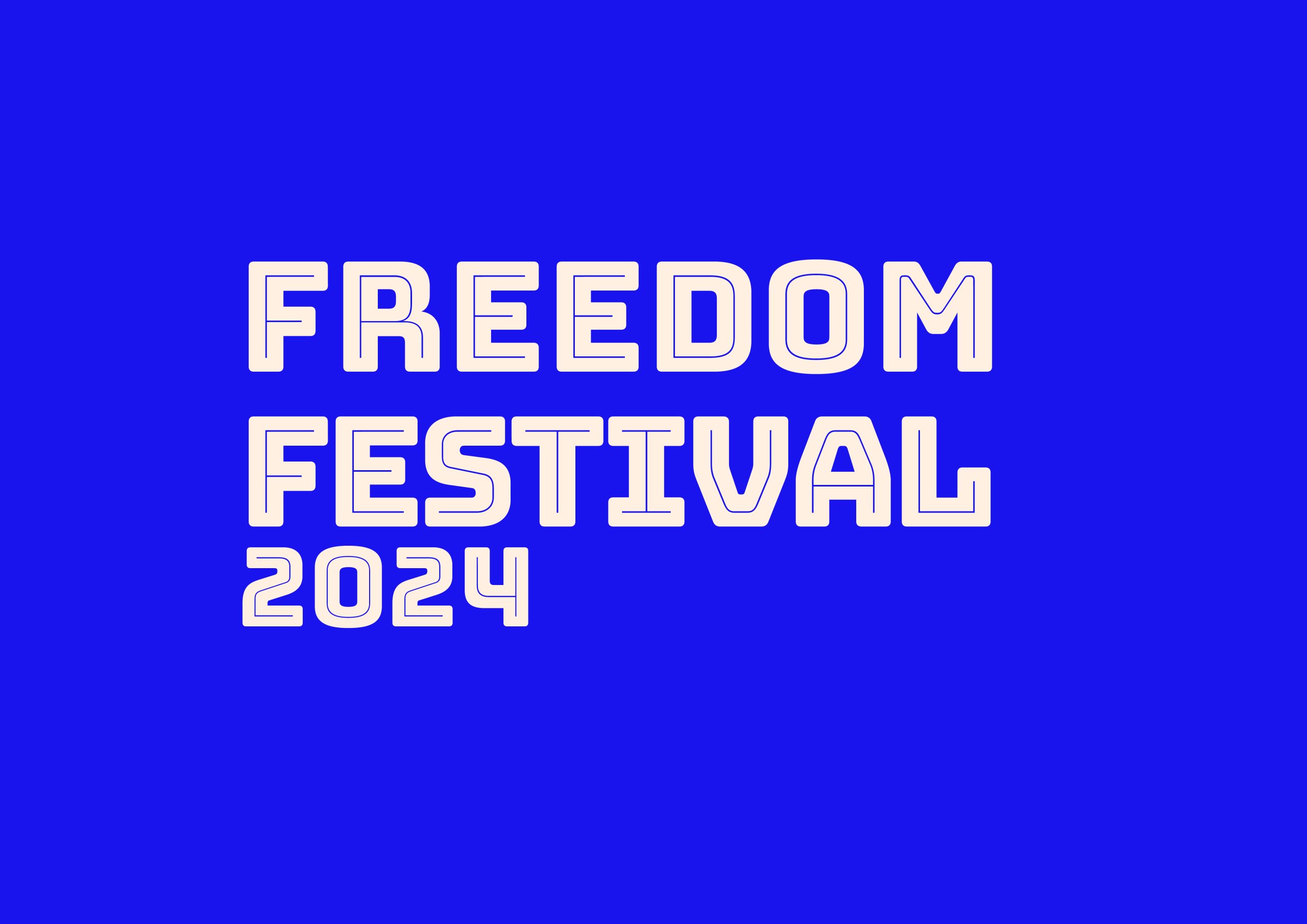
I started off with a few different ideas for the Freedom Festival logo. I found a font called ‘Bungee’ and thought it looked bold and impactful. I was drawn to the blockish type and geometric shapes which make a statement. I could imagine this font on different interfaces and thought it would be easy to read even on small screens as the type is thick and the blocky look defines each letter clearly.
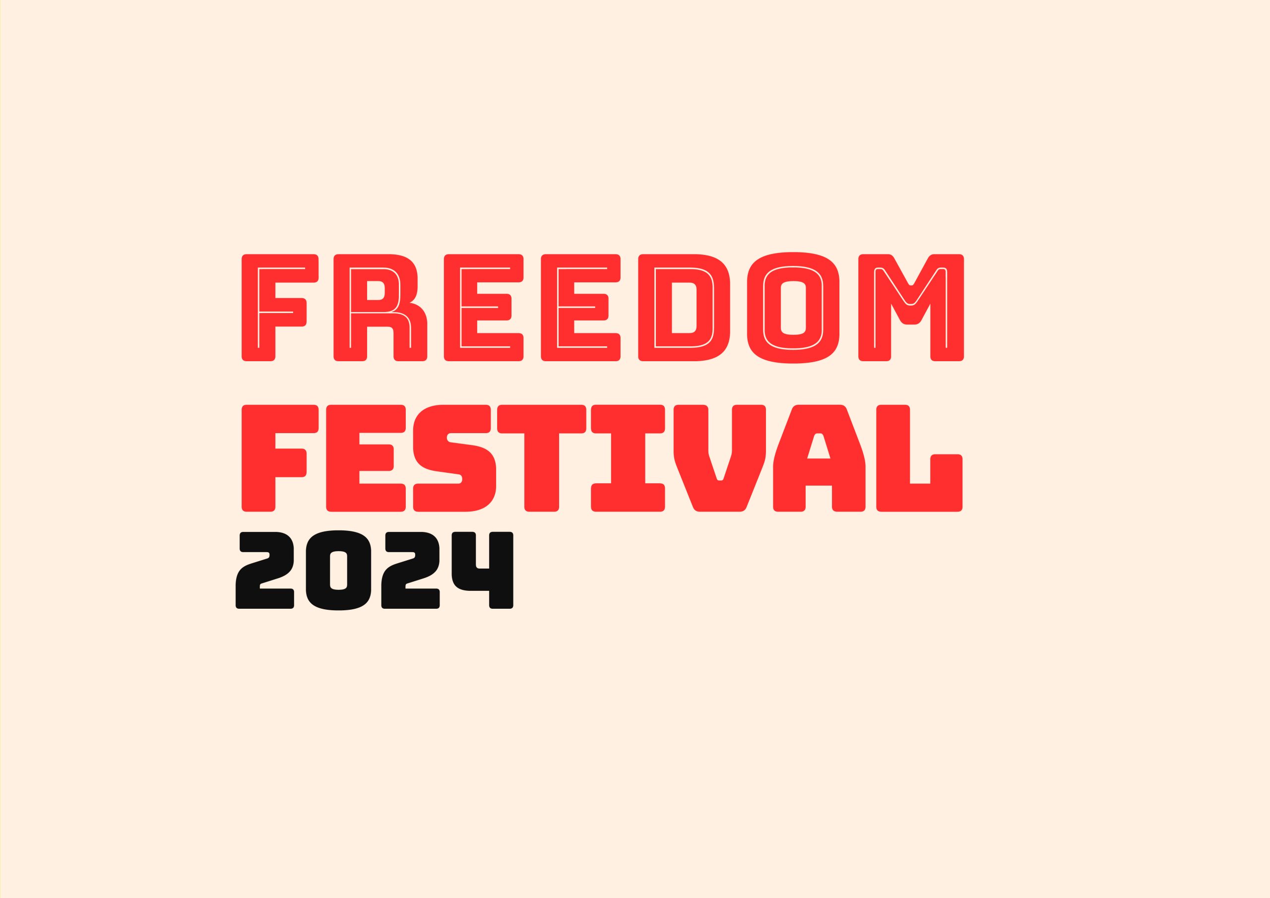
I chose to use the bottom left because of its simplicity. It is clear and easy to read quickly so the user knows exactly what it is and know they are on the Freedom Festival website. I marked this one and the top left design, which I will use as a secondary logo for small screens and display images on social media.
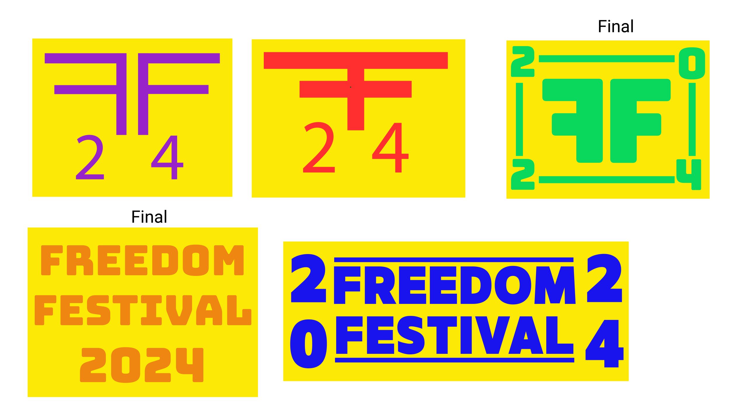
My first logo idea
My second logo idea using inline font and after fixing the alignment of the letters
My third logo idea trying out a different colour palette
Another logo idea using a different colour palette
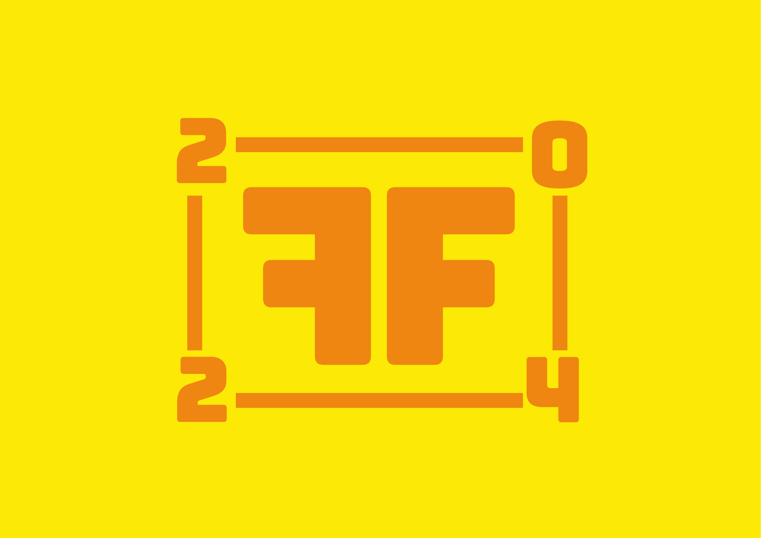
Secondary logo idea one
Secondary logo idea two using inline font and a different colour palette
I developed my two logos further and experimented with colour and font styles. The colours I used were bold and contrasting so that they are visible from afar and create a vivid atmosphere for the festival brand. I chose to use bright colours because the Freedom Festival is creative and celebrates art and culture, which is why bright colours have been used to mimic the pride and the positive atmosphere of the festival.
I also aligned the logo to the left and brought the letters in to create a boxed off shape for balance and order. The uniformity of the edges creates a formal and polished effect. In addition, I tested out the inline version of the typeface, but the lines were really thin and would not be visible at a smaller size.
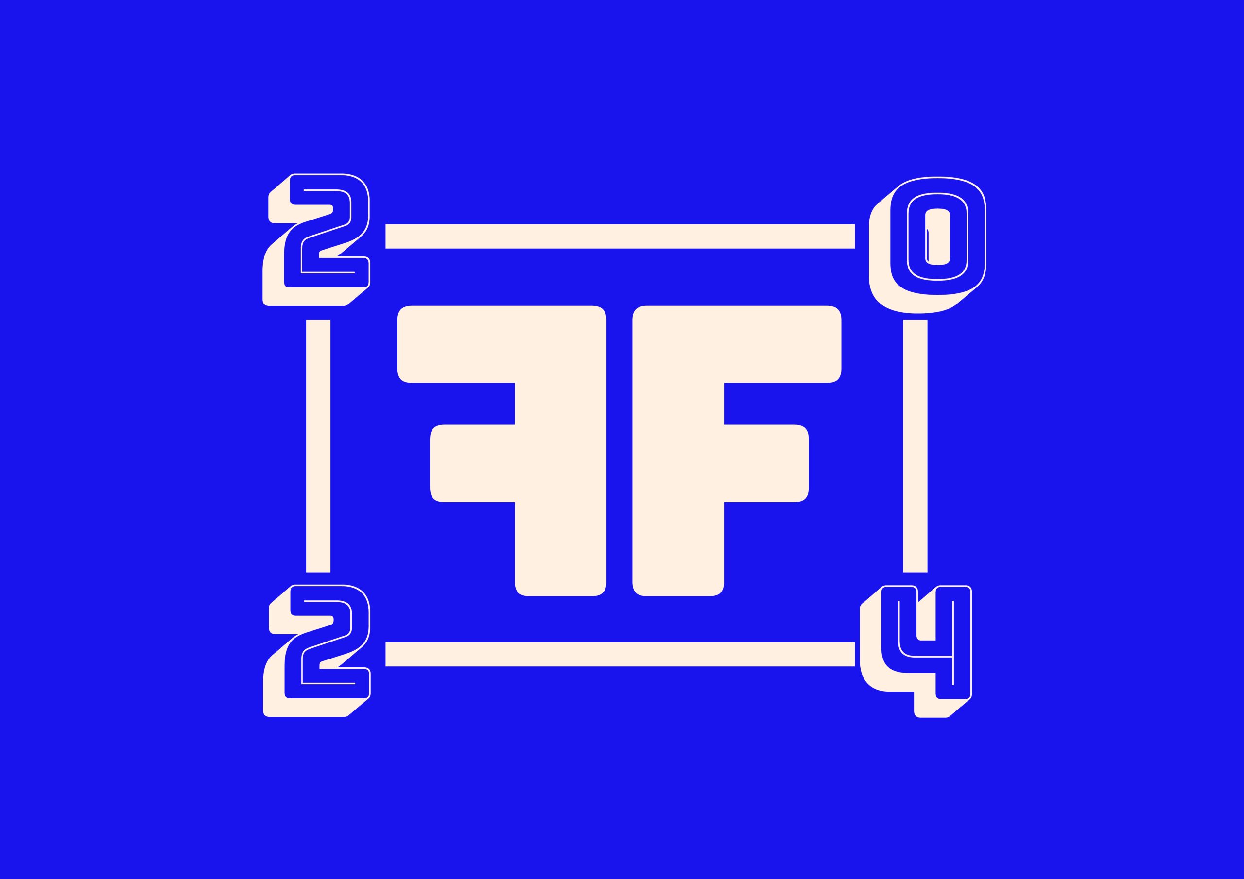
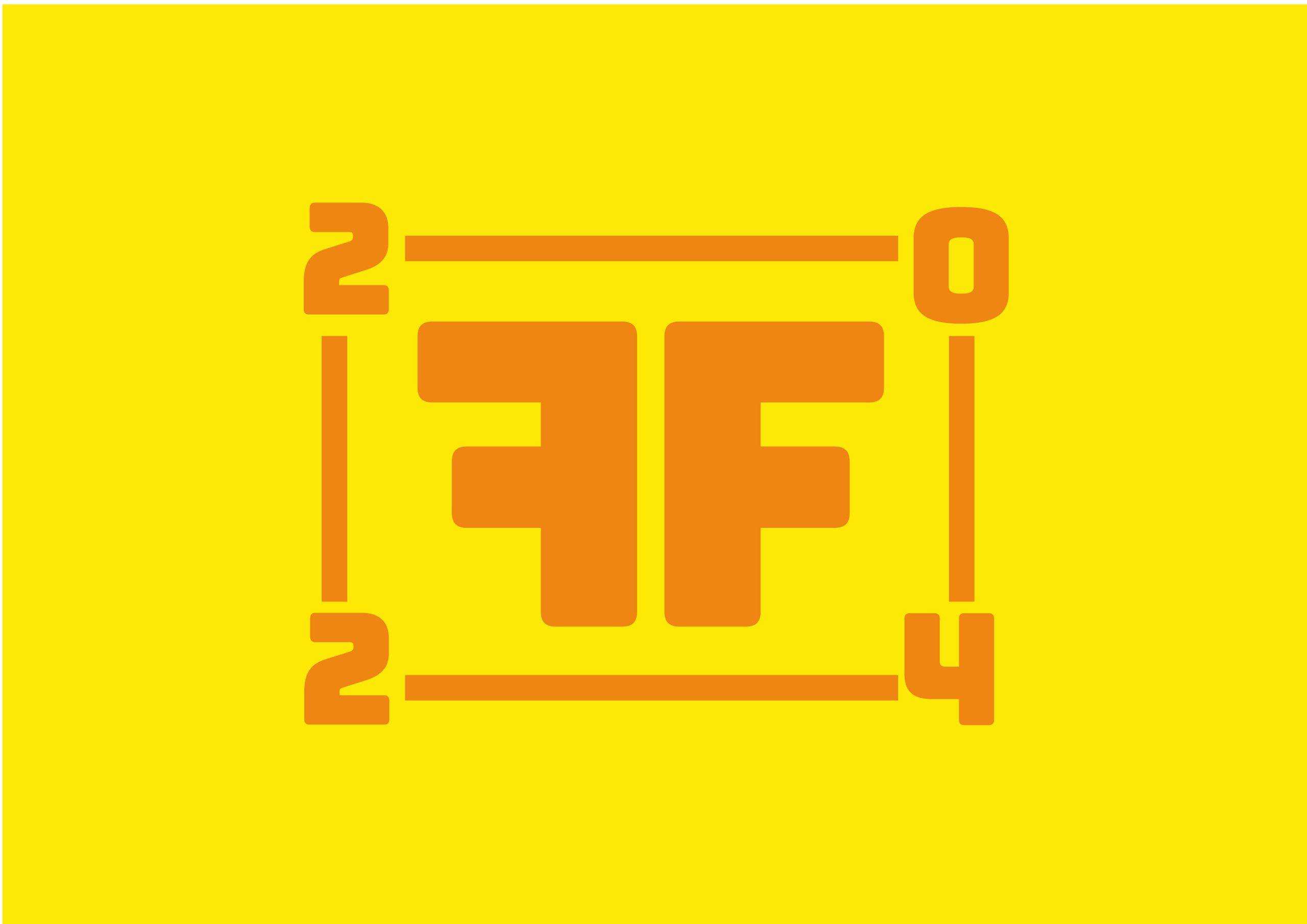
I kept my secondary logo the same. It uses the two Fs mirrored, with four edges and the year in each corner. This logo would be used for display images on apps such as Instagram or X/Twitter. Secondary or sub-mark logos are used in places where the format is smaller and you need to communicate your brand quickly to users (Mark Brand Boutique, 2023).
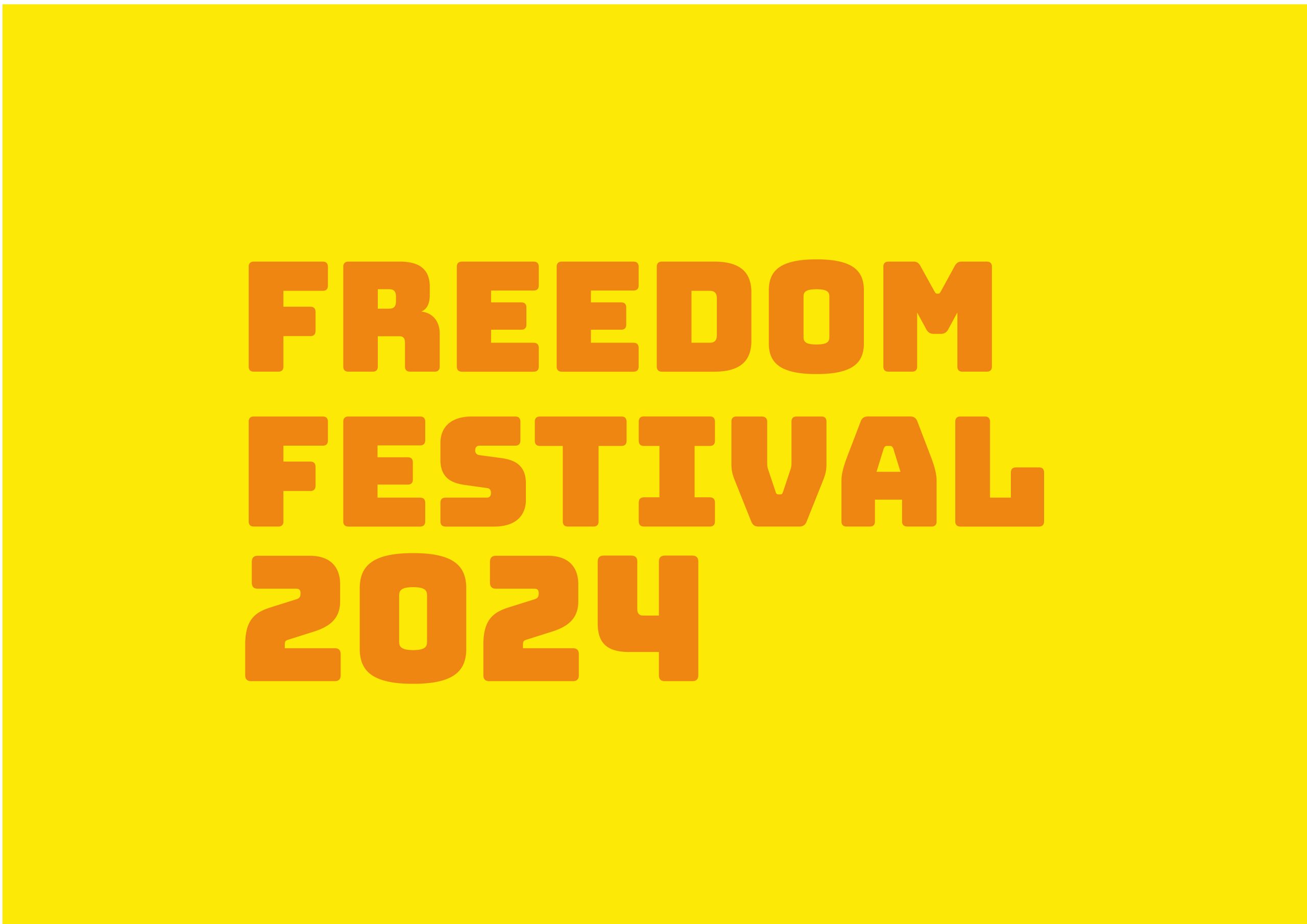
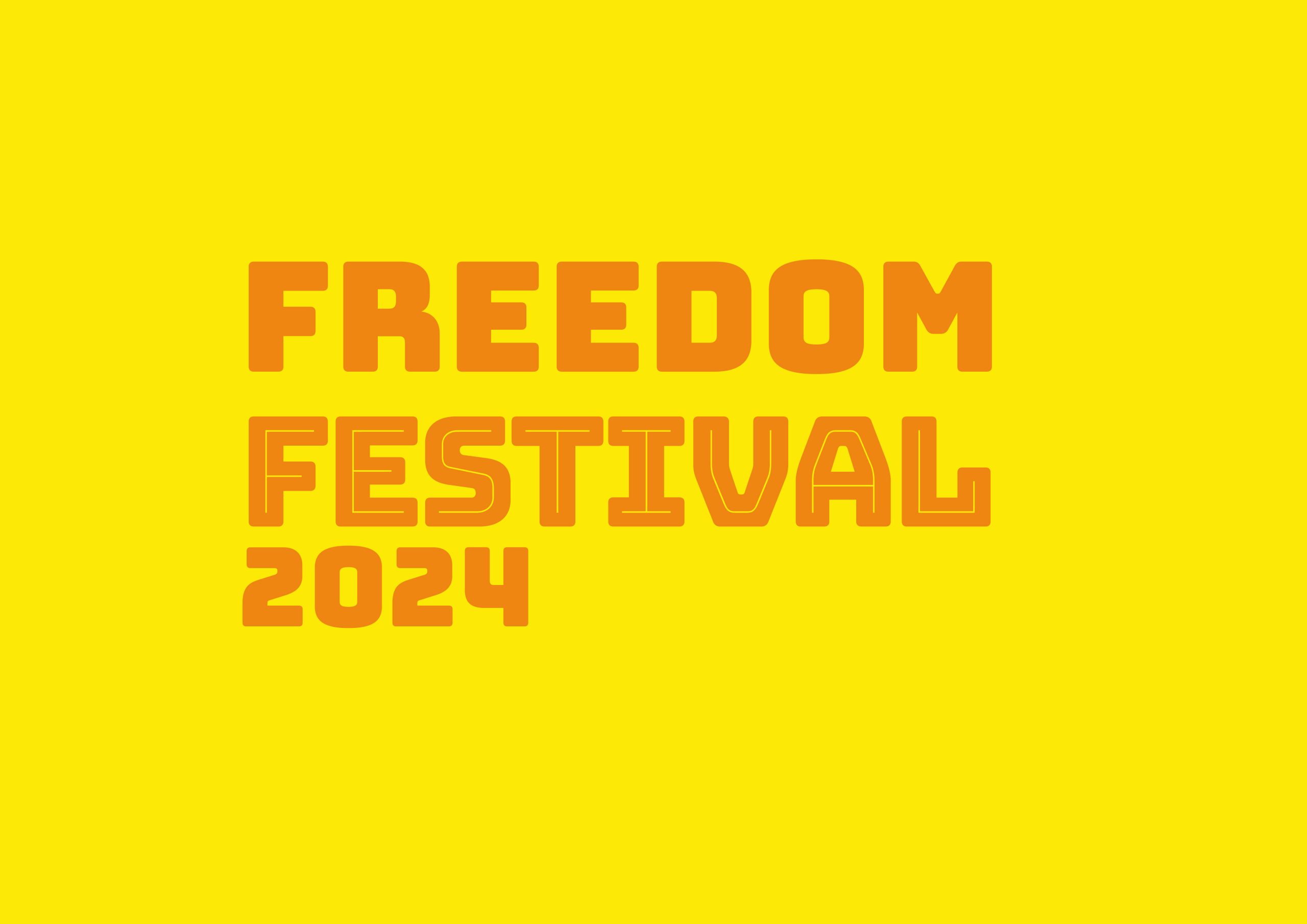
Final Logo Choices
Orange on Yellow Logo 1
Orange on Yellow Logo 2
Typography
When choosing typography for web and screens, it is important to consider things such as legibility and screen size. Some basic rules of typography on web are 1. Don’t use all caps and 2. Keep the number of fonts to a minimum (DeVos, ND).
I have chosen one font from Google Fonts that is safe for web. A web safe font is a font that is pre-installed and compatible with screens. According to WIX, web safe fonts are more consistent since they are already installed onto an operating system, so they will load easier (Shwake, 2018).
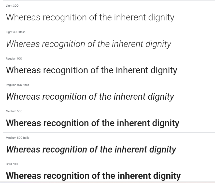
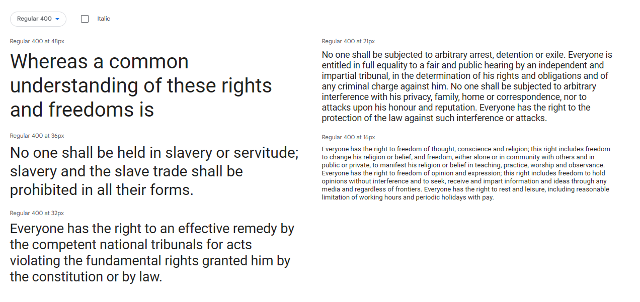
I have selected the typeface Roboto, which is web safe and comes with various weights and styles, so I can use the font for both headings and body text. The font is clear and can be read at different sizes due to being rounded and wide. The typeface is thinner than the one I used for my logo, so there is an established hierarchy and contrast between the two. To keep fonts at a minimum I will use the different weights for different sections on the website, so it is consistent but organised.
Roboto weights and styles
Roboto is readable at both small and large sizes
Colour
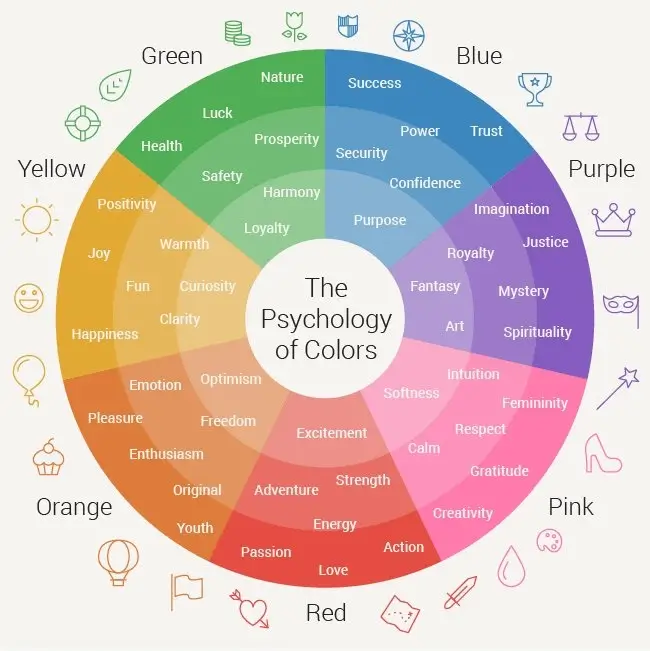
Colour psychology wheel
On web, RGB colours and HEX values are used to define colours.
“A website color scheme is the collection of colors that a designer chooses for their website design. Also known as color palettes, color schemes can include as few or as many colors as the designer sees fit. Each color can be used for a variety of elements throughout the website, meaning the same color may be used for different types of components. ” (Gillis, 2021).
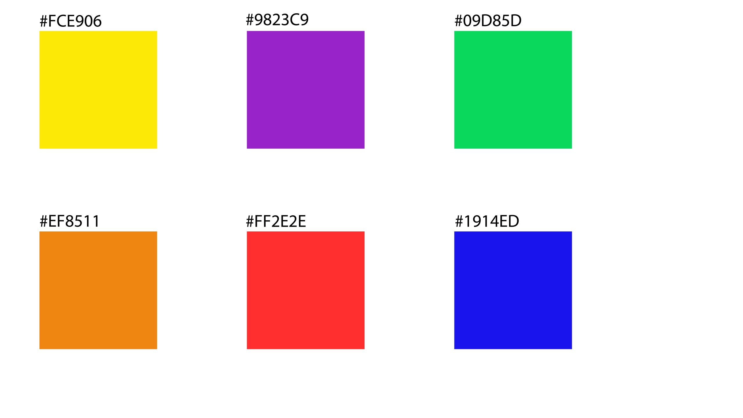
My colour scheme uses colour psychology to create an emotional response in the user when on the website. I used colours like yellow and orange to invoke joy and enthusiasm, and other vibrant colours to show how alive the festival is, such as purple for art and blue for trust and confidence.
My colour scheme with their HEX values
Layout
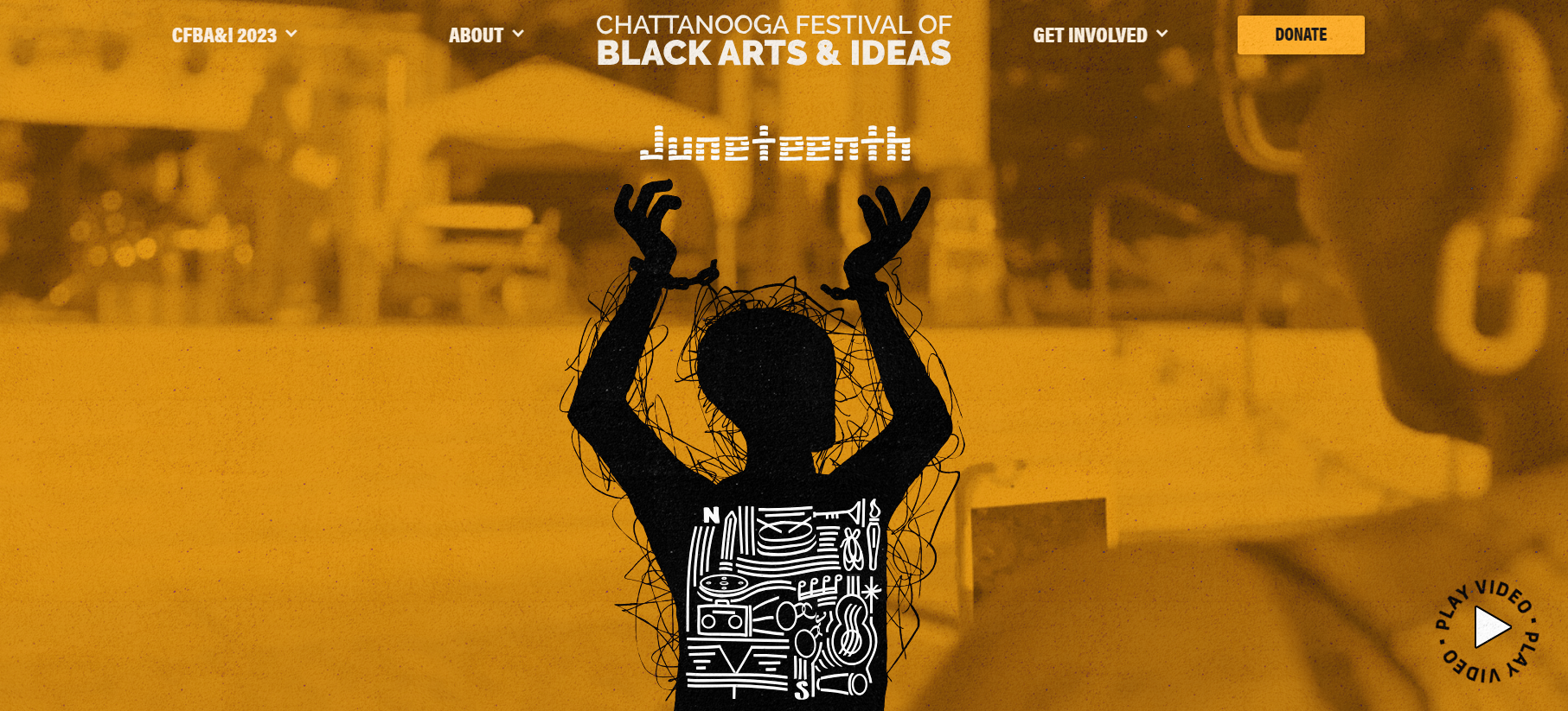
For layout inspiration, I looked at Awwwards.com to see examples of award winning festival websites. I found an interesting layout used in a website for Festival of Black Arts and Ideas. The website home page is effective as it uses a video in the background and is kept simple with only four navigation links, which drop down with more links. There is the logo in the center and the entire layout is kept open and spacious.
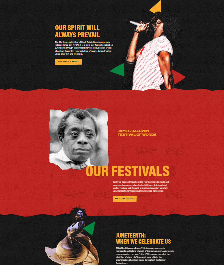
As you carry on down, there are different sections and energetic shapes and textures used to add personality and visual engagement. I like how the layers overlap and the loose, cut out effect used throughout the layout.
This inspires me to think about negative space and simplicity when presenting information. Relying on visual elements and only essential text for a more engaging user experience.
Festival of Black Arts & Ideas website landing
Festival of Black Arts & Ideas website
References
Black Arts and Ideas Festival (2023) Black Arts and Ideas Festival Home Page [Screenshot]. Available online: https://www.blackartsandideasfest.com/ [Accessed: 13.11.2023]
DeVos, Jordan (ND) Designing for Readability: A Guide to Web Typography (With Infographic) [Article]. Available online: https://www.toptal.com/designers/typography/web-typography-infographic [Accessed: 13.11.2023]
Gillis, Orlee (2021) 7 Rules for Choosing A Website Color Scheme [Article]. Available online: https://elementor.com/blog/website-color-schemes/ [Accessed: 13.11.2023]
Mark Branding Boutique (2023) what is a secondary and sub-mark logo? [Article]. Available online: https://www.markbrandboutique.com/blog/what-is-a-secondary-logo#:~:text=The%20secondary%20logo%20is%20a%20simplified%20version%20of,you%20must%20resize%20your%20logo%20to%20small%20formats. [Accessed: 13.11.2023]
Shwake, Emily (2018) 30 web-safe fonts and why you should use them [Article]. Available online: https://www.wix.com/blog/web-safe-fonts#viewer-1jlqe [Accessed: 13.11.2023]