I am at the stage in my process of designing an updated Freedom Festival website and mobile application where I am ready to present my work as a prototype to others for testing and evaluation, To get an outside opinion for my work I have asked a peer to navigate through my prototypes and test the website as a whole to give me feedback on what works well, what isn’t working and what could be done to better the user experience when using the website or app. After spending weeks designing, I am familiar with how the prototype works and I understand it more than someone coming and experiencing the design for the first time. What I personally thought made sense could be confusing to someone else, or they might pick up on errors or mistakes that I haven’t. I have provided my peer with questions about the website and app, including what they liked, what they would change, their thoughts on the navigation element and accessibility. If there is a part of the design that isn’t clear, I will change it and evidence what I have done and why.
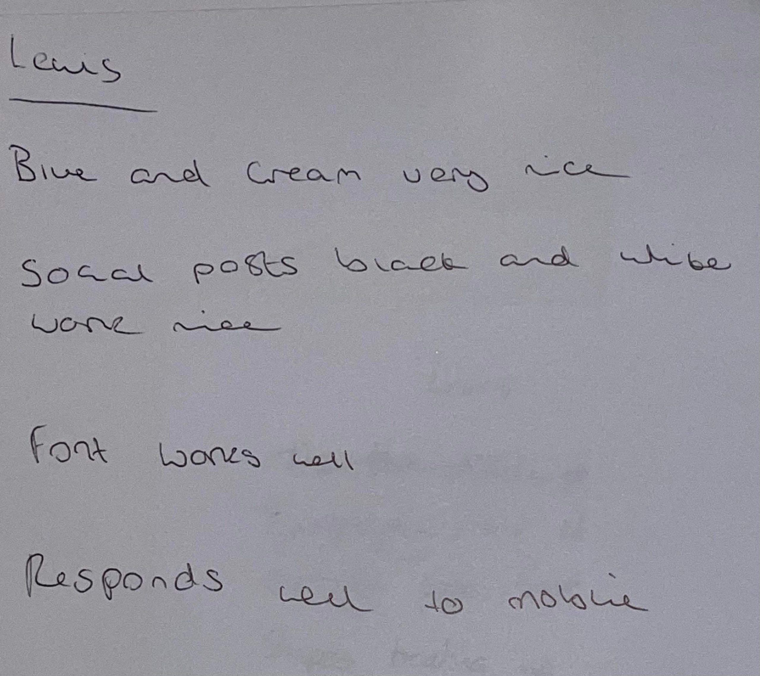
Feedback Q&A 1
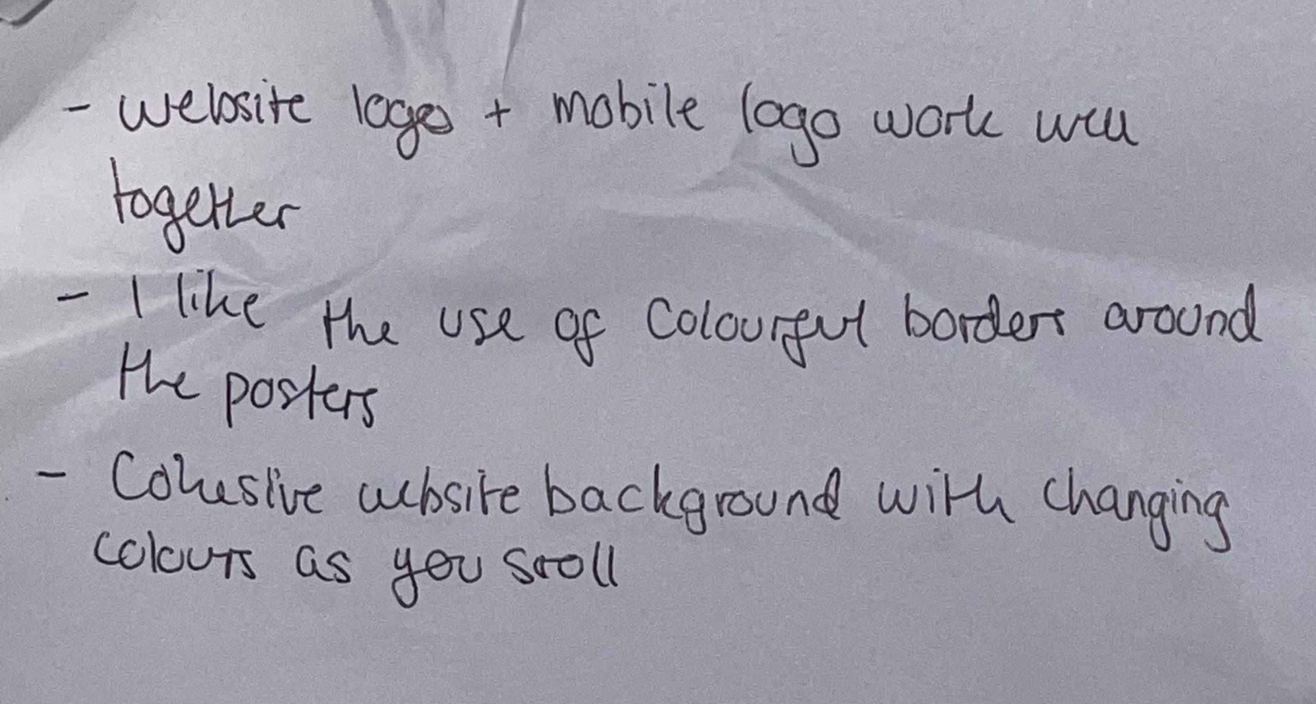
Feedback Q&A 2
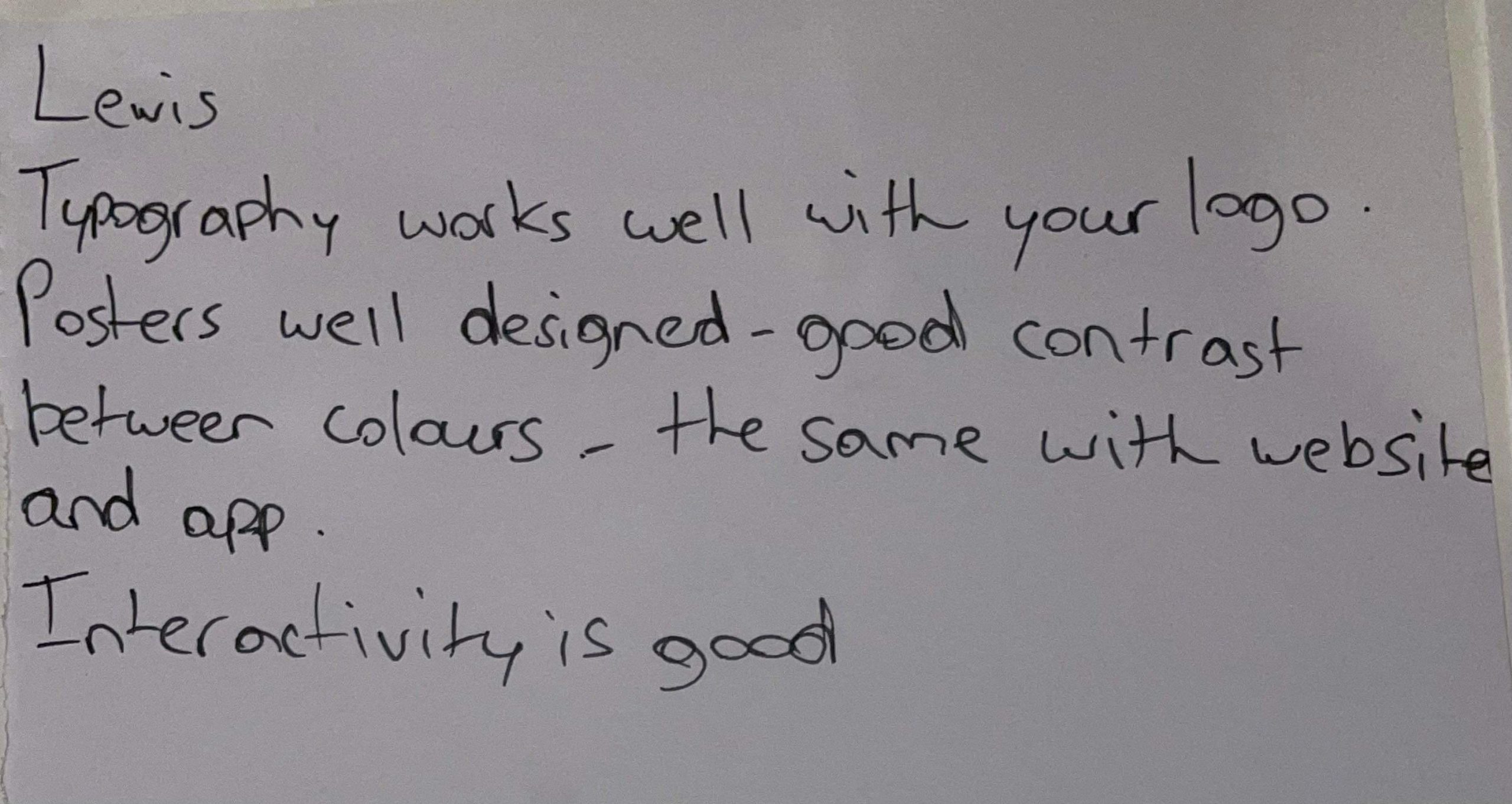
Feedback Q&A 3
There is a mixture of positive and constructive feedback in this reply. The website seems to function properly and my links work as they should do. Most of the critiques are about the look and appearance and will be easier to make changes to as I don’t have to re wire, etc. The web and mobile designs are responsive to each other and the information crosses over well to different screens, a part from some things such as size and positioning.
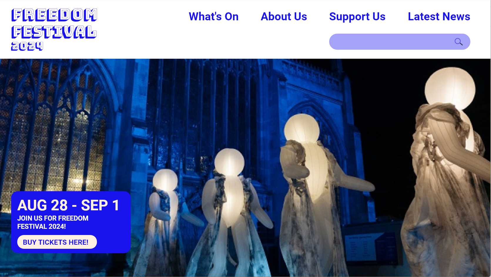
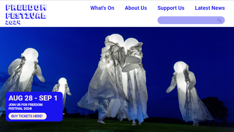
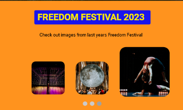
Home screen previously
Home screen now
One thing mentioned was that the image on the home screen was a bit blurry, so I swapped it for a similar image that is a higher resolution. I noticed that some of the text wasn’t aligned properly in the box over the image, and it ruined some of the hierarchy and balance so I decided to fix this by spacing them better and using the align tool to make each element line up to the left. I used another image from the same performance with the glowing orb people because I liked the style of the original image and the colours in it matched the navigation which felt nice and joint together.
Latest News
What's On
Support Us
I have also made all headers the same typeface which is called Bungee Shade and is the same one used for my logos across all of the visual identity. I had used it in a few pages on the website for headings, but changing all the headings to this typeface created a hierarchy and consistency across the website. This typeface works well for headings specifically because it is very impacting and visually strong, there is also added depth with the shadow which makes this really stand out first among everything else on screen. Not only this but it also links back to the logo design and creates a more solid brand as it is now a recurring element that is integrated across platforms.
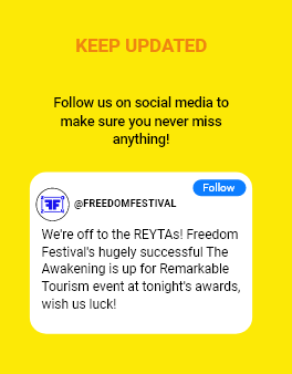
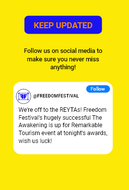
Yellow on orange typography
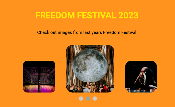
Class feedback
Class feedback 1
Class feedback 4
Class feedback 2
Class feedback 5
Class feedback 3
Class feedback 6
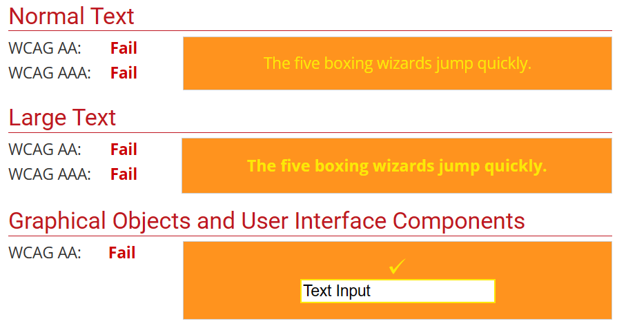
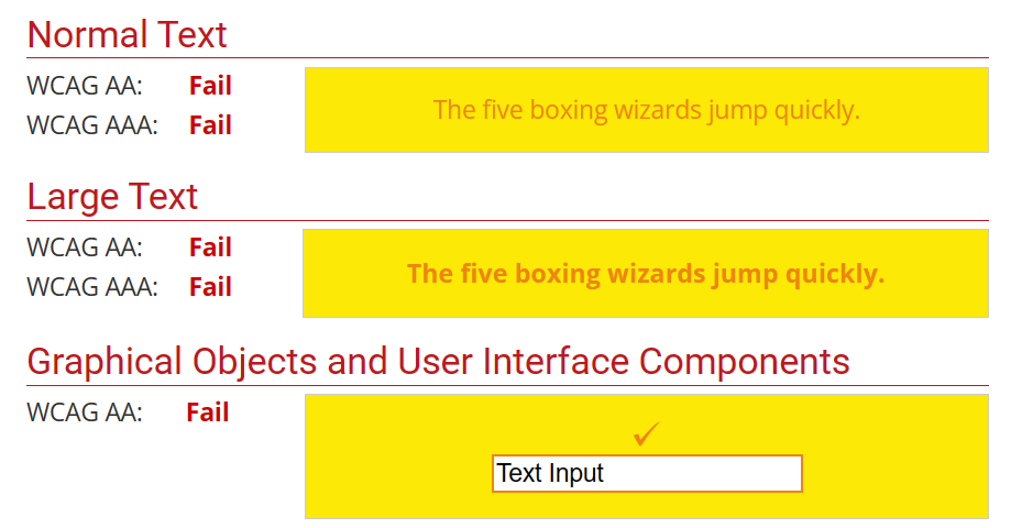
I received further feedback in class session when presenting my design portfolio, which included by prototypes. Some of my classmates gave me helpful feedback on the web and app design which I have taken onboard to improve further. One comment was about colour accessibility of the site, with the yellow on orange maybe not being accessible to the colourblind. I have used a colour contrast checker to double check this and it failed the contrast test, which has lead me to reconsider this colour combination. I have wondered if the Bungee Shade typeface could make it easier to see the text, but I might add a background shape to create separation but still stay with these colours. The WCAG guideline says that the contrast should meet a certain ratio to be classed as accessible and suitable for web: “
WCAG 2.0 level AA requires a contrast ratio of at least 4.5:1 for normal text and 3:1 for large text. WCAG 2.1 requires a contrast ratio of at least 3:1 for graphics and user interface components (such as form input borders). WCAG Level AAA requires a contrast ratio of at least 7:1 for normal text and 4.5:1 for large text.
Large text is defined as 14 point (typically 18.66px) and bold or larger, or 18 point (typically 24px) or larger.” (Webaim, 2023)
Failed colour contrast test
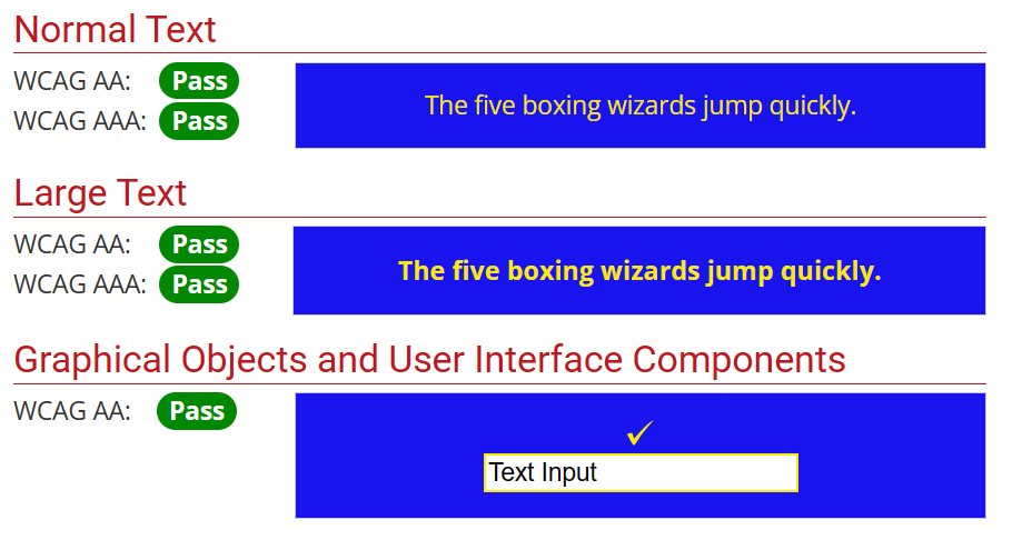
Some other people’s feedback said they like the use of the blue colour, and someone else wanted to see it more throughout the design, so I used a blue border to keep the yellow separate from the orange. When I tested the contrast for yellow on blue, I passed the test for contrast.
Passed colour contrast test
Improved colour contrast with blue
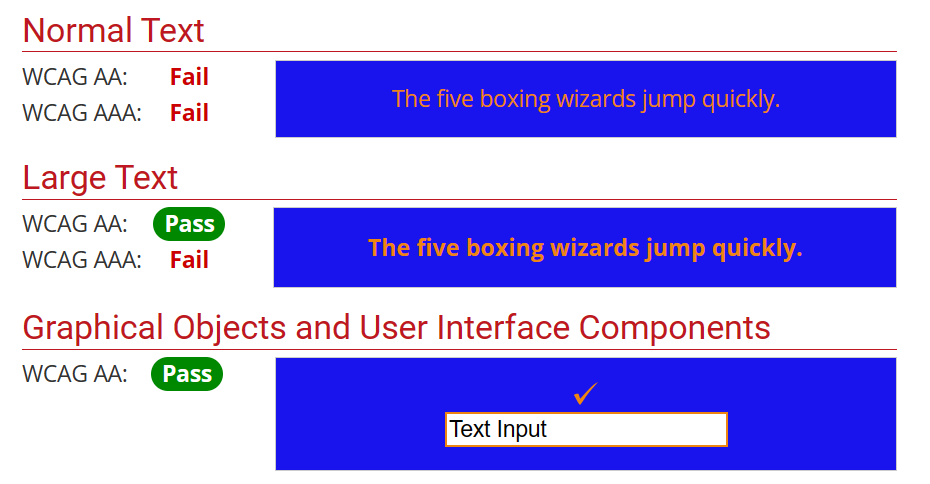
I tested other areas on my website too. I had a part which was orange on yellow, that also failed the test. I did the same by adding the blue background, and it passed two of the tests out of six. I felt this was fine though as the guides on the site state that large text (18px plus and bold) passes as long as the ratio is above 3:1. The ratio for mine is 3:39 so it passes text for large text and my text is 27px and bold on mobile and 95px and bold on web.
Orange on yellow colour contrast test failed
Orange on blue pass colour contrast for large text
Orange on yellow
Orange on blue
When showing my work in the presentation I showed my animated logo. A lot of people said they wanted to see it on my website design in their feedback so I made an opening screen that used the animation. There is a bit of feedback to work through so I will keep going through and making changes and then I will test my prototype again to see if it has improved.
Videos of my website and app for Freedom Festival 2024.