Blender Default Cube (2021) Low Poly Goldfish Modelling in Blender 2.93 [Video]. Available online: https://www.youtube.com/watch?v=S5khzrdH_eM [Accessed: 21/11/2024]
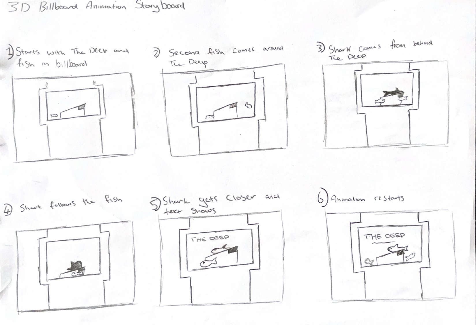
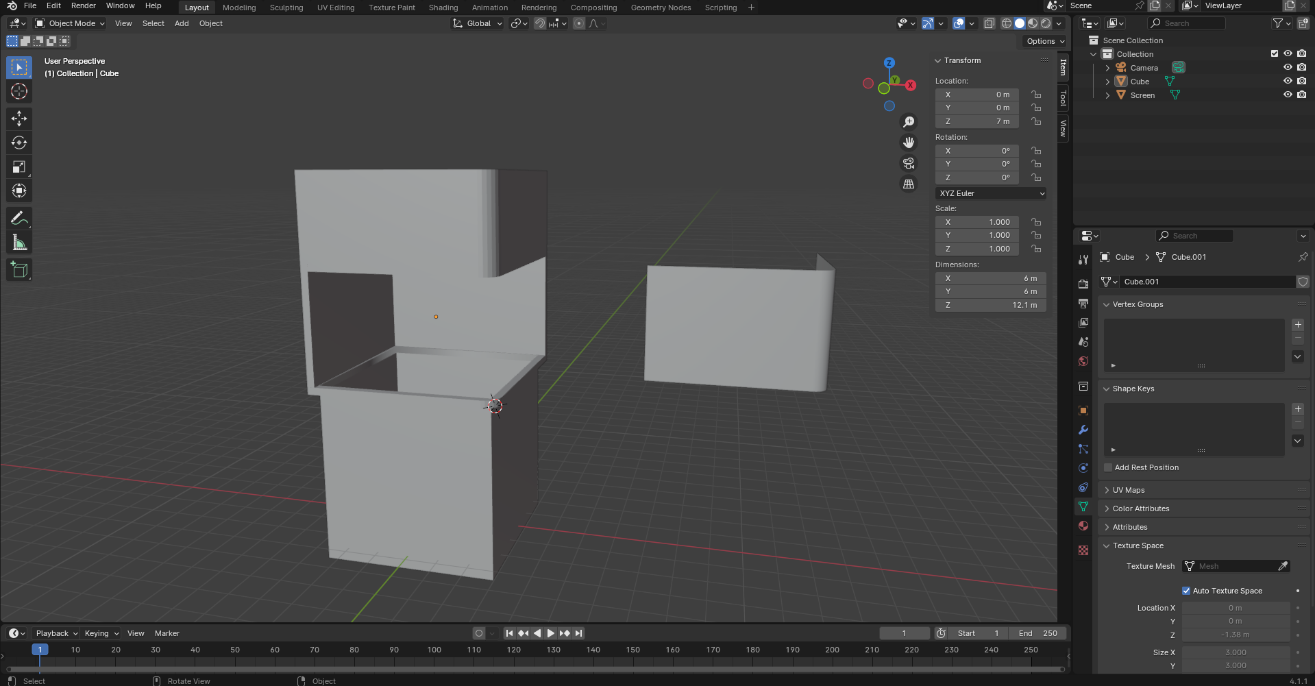
CGI Jujitsu (2022) Create 3D BILLBOARD VIDEOS for Curved Screens | Blender Tutorial [Video]. Available online: https://www.youtube.com/watch?v=xK3q641dd2c&t=367s [Accessed: 15/11/2024]
Cheuqs (2022) Blender Real Time Fake Liquid Tutorial [Video]. Available online: https://www.youtube.com/watch?v=F6KsMr7exCc [Accessed: 5/12/2024]
ClearChannel (nd) Guide to 3D advertising and examples of innovative 3D billboards [Article]. Available online: https://www.clearchannel.co.uk/new-to-out-of-home/make-the-most-of-your-ooh-marketing-campaign/guide-to-3d-advertising-and-examples-of-innovative-3d-billboards [Accessed: 22/12/2024]
Fatima, Maheen (2023) Everything You Need to Know About Nike Air Max 3D Billboard in Japan that surprises the world [Article]. Available online: https://brandingforum.org/general/everything-you-need-to-know-about-nike-air-max-3d-billboard-in-japan-that-surprises-the-world/#:~:text=This%20billboard%20advertising%20kicks%20in,people%20worldwide%20into%20potential%20customers. [Accessed: 01/11/2024]
KellyArts (2023) Blender Beginner Tutorial – Easy Shark [Video]. Available online: https://www.youtube.com/watch?v=LrHqjSEwjHk [Accessed: 18/11/2024]
KM007_ (2021) City Ambience [Audio]. Available online: https://pixabay.com/sound-effects/city-ambience-9272/ [Accessed: 23/12/2024]
Mischok, Andreas (2020) Canary Wharf HDRI [HDRI]. Available online: https://polyhaven.com/a/canary_wharf [Accessed: 23/12/2024]
Nova, Vallerie (2024) Understanding How 3D Billboards Work: The Magic of Naked Eye [Quote]. Available online: https://www.ubunzo.com/blog-posts/understanding-how-3d-billboards-work-the-magic-of-naked-eye [Accessed: 22/12/2024]
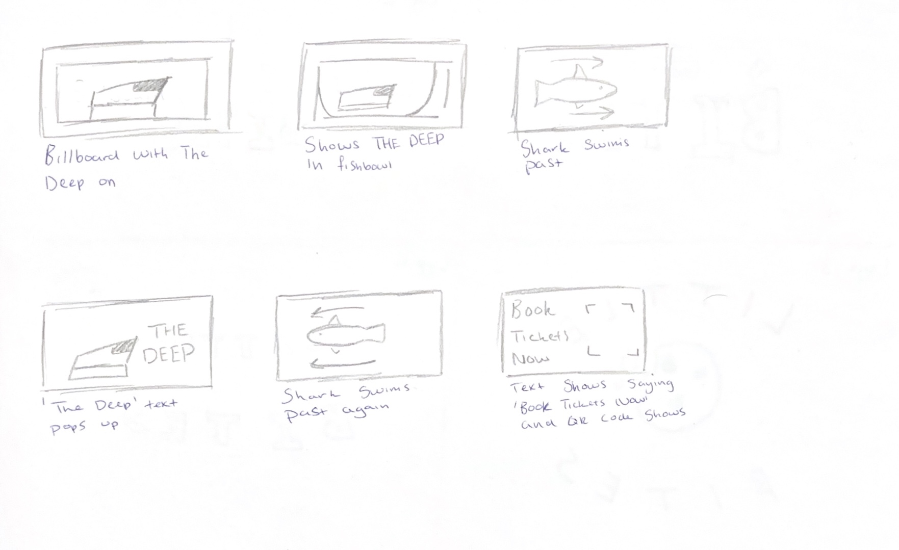
The Deep (2024) The Deep Logo [Image]. Available online: https://www.thedeep.co.uk/sites/default/files/logos/thedeep.png [Accessed: 23/12/2024]
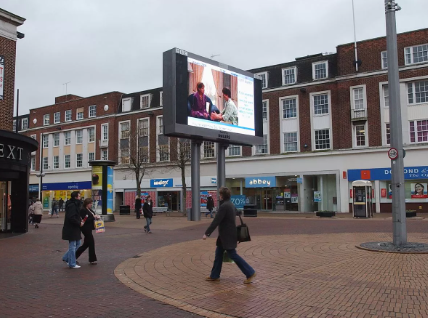
Unknown (nd) BBC Big Screen in Hull [Image]. Available online: https://i2-prod.hulldailymail.co.uk/news/history/article1606753.ece/ALTERNATES/s1200b/0_big-screenJPG.jpg [Accessed: 22/12/2024]
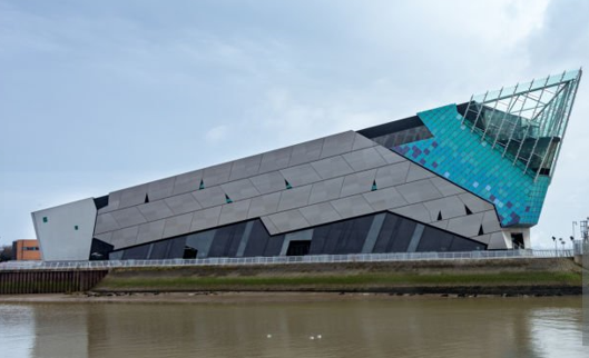
Unknown (nd) The Deep [Image]. Available online: https://media.istockphoto.com/id/939236112/photo/the-deep-an-aquarium-in-hull-england-exterior-view.jpg?s=612×612&w=0&k=20&c=qDl43YZU9uMpBB4Eaa8NUh2RMC3JXqAI0oqzCqMuJ6c= [Accessed: 14/12/2024]