Subject, Audience and Purpose

Subject, Audience and Purpose

Subject.

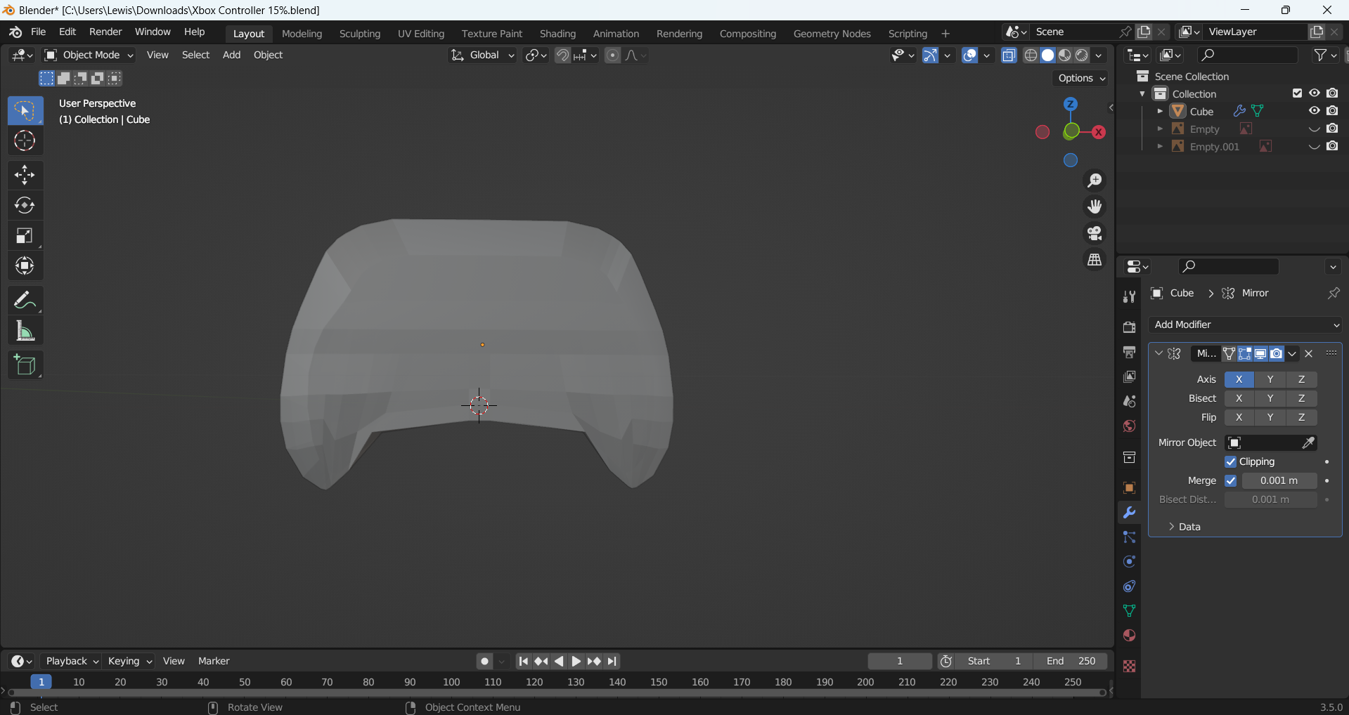
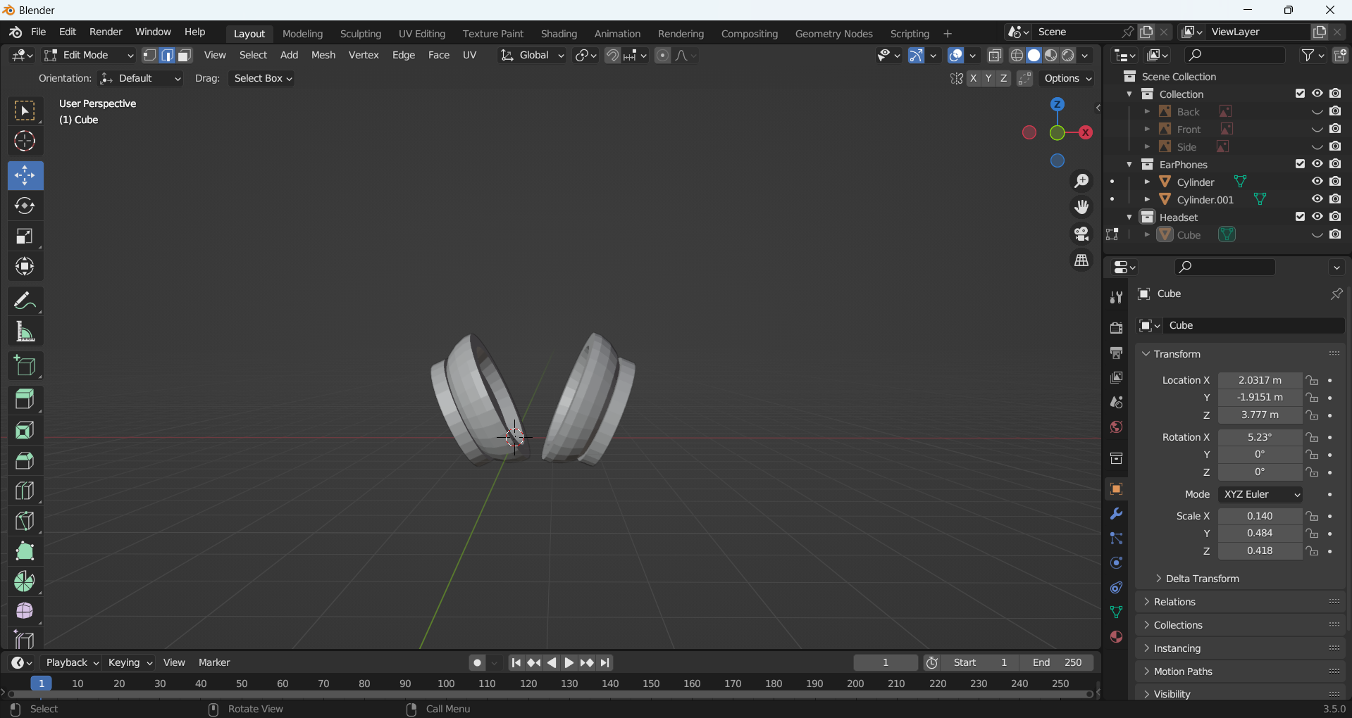
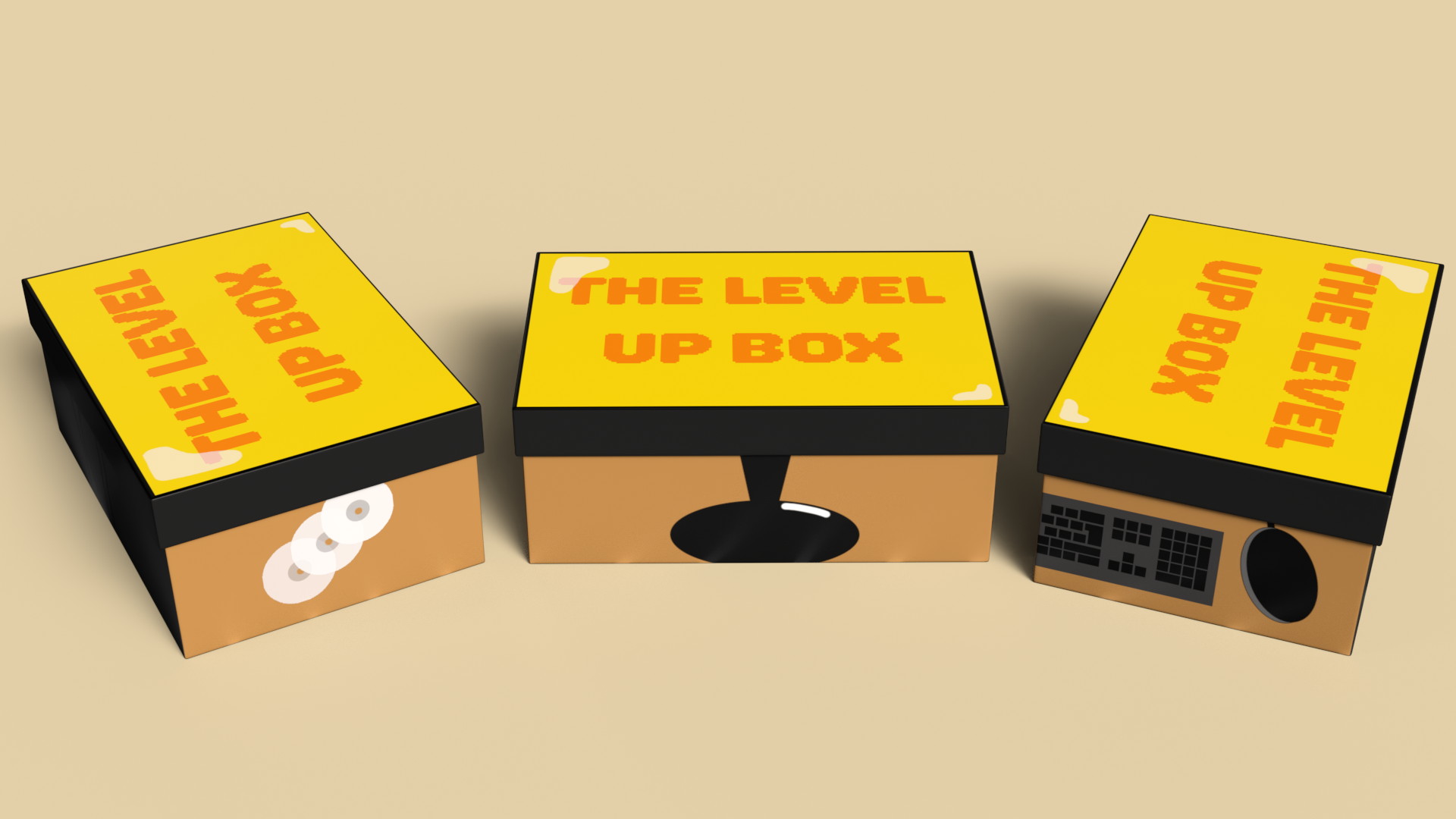
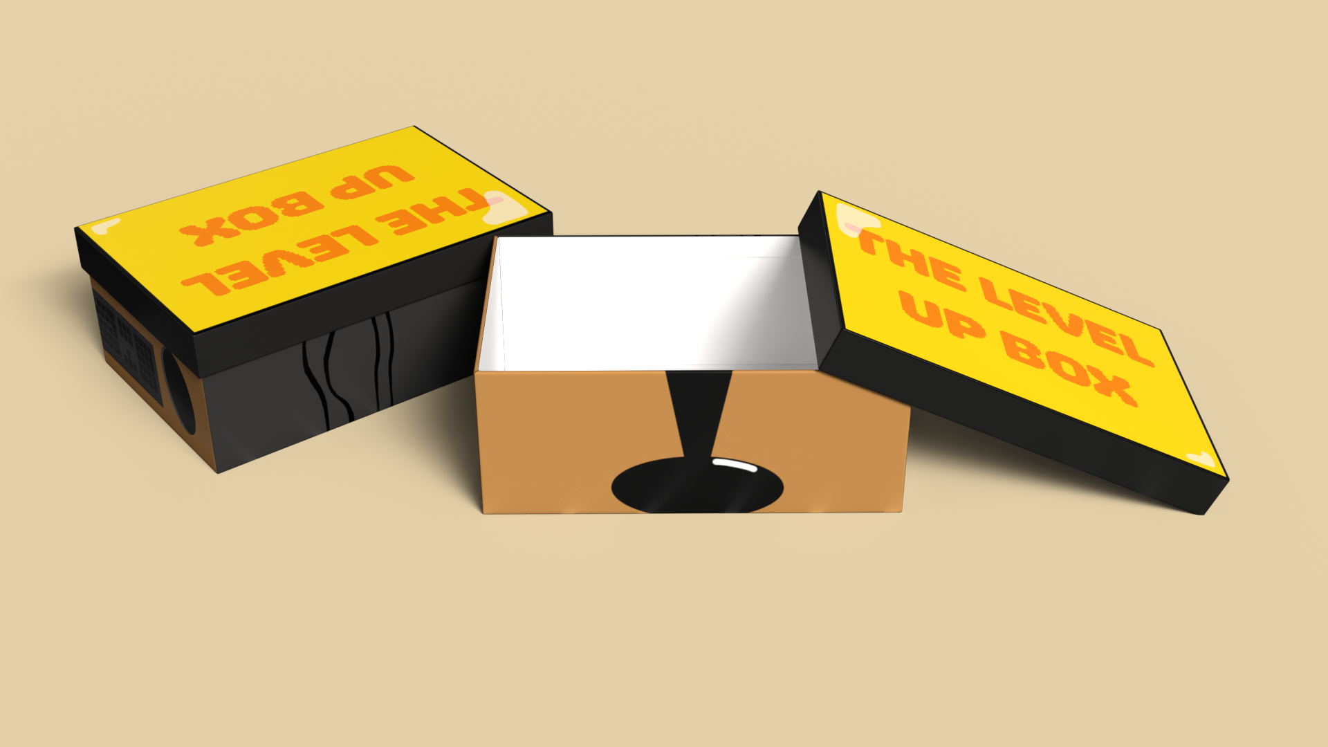
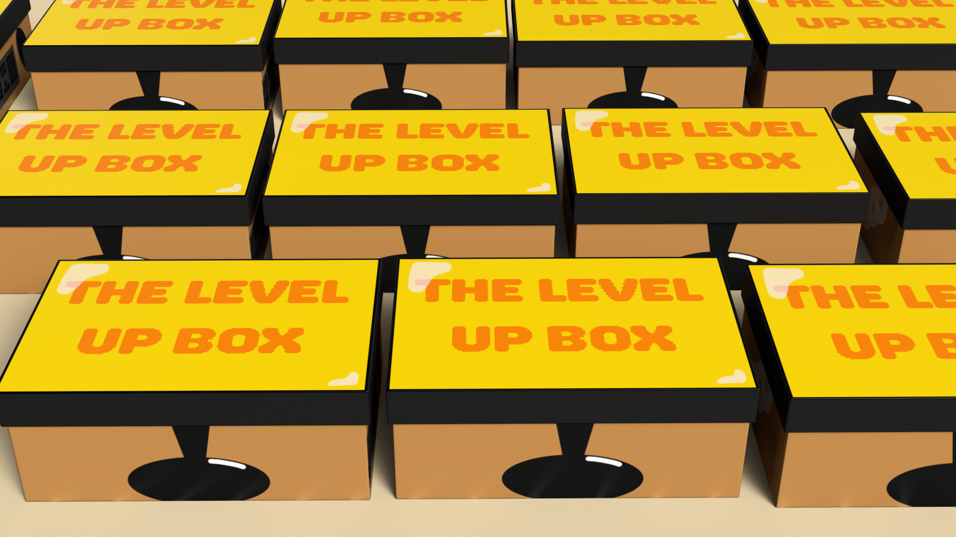
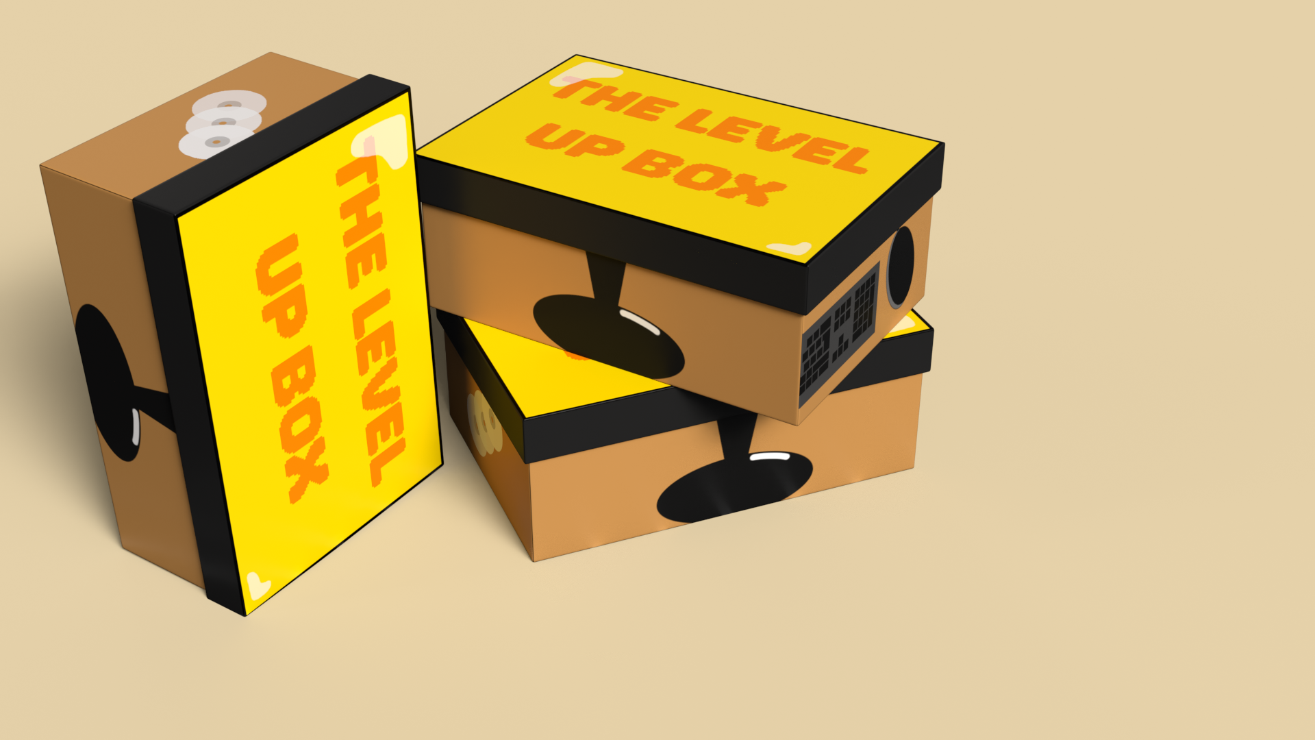
For my major project, I am going to make healthy food products that are alternative options for junk foods. I would like to create my own branding and packaging for snacks such as fizzy drinks, crisps, chocolate bars and ready meals. I would also like to create an advertising campaign, including posters, social media posts, and a 3D advertisement for the brand using 3D models I will create in Blender.

Audience.

My target audience for my brand is both children and parents. My brand is aimed at parents who want healthier but affordable choices to brands such as McDonald’s, who are really popular amongst young children. My brand will also appeal visually to children, who are usually drawn more towards the bright colourful packaging often seen on unhealthy foods.

McDonald's Happy Meals are designed to be appealing for children

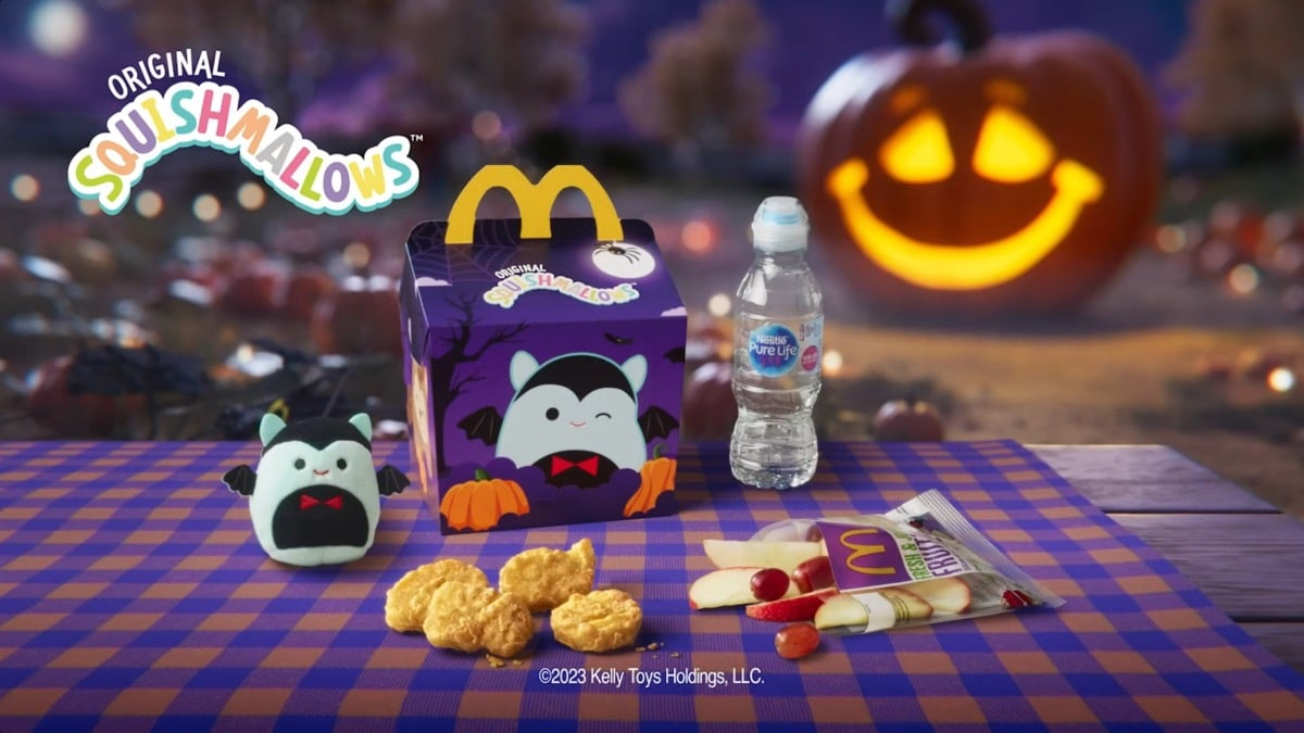
“Since its introduction in 1977, the Happy Meal offering has become a successful staple in McDonald’s menu, with the chain selling over 1.2 billion Happy Meals globally every year. It’s phenomenal success and appeal with children is the reason why the brand dedicates 4% ($32 millions) of its entire global advertising budget just to marketing the Happy Meal and its promotional toys.” (Ahura, nd) 

McDonald’s use their Happy Meals to appeal to children by using a unique box design covered in bright and playful illustrations. This makes them very exciting for children and the convenience and price makes parents more likely to buy them. McDonald’s also collaborate with other companies to bring out toys for their Happy Meals, such as Squishmallows, which is a popular toy brand for children. The toys usually vary, leading kids to want more Happy Meals in order to collect the entire set of toys. The tasty food, bright packaging and free toy all make this an appealing product for children.

Purpose.

The purpose of my brand is to offer healthier options to junk food which are just as appealing. This is to promote healthier living and for parents to become more educated on children’s nutrition whilst still being able to offer their favorite types of foods and snacks. I want to offer an option which is affordable to lower-income families and time-convenient for parents who don’t have lots of time to cook meals after work.


“A 2015 study found that 17% of people have jobs with irregular schedules, a disproportionate number of them low-income workers. Having little control over time makes it difficult for families to plan their meals in advance or even to know who will be there for dinner.” (Brenton, 2019)

Class feedback

Four logo sketches that I made for my product.

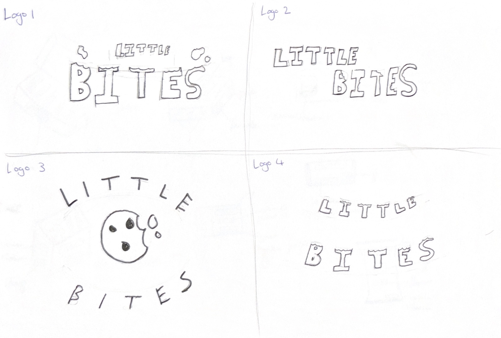
In class, I shared my project ideas with some of my classmates and my personal supervisor. I showed them my logo and brand name ideas, and they agreed that ‘Little Bites’ was the best option, and of the four logo sketches, the options were split between the first and the third one. My supervisor then suggested that I should try out both and see which one works better when mocked up on packaging. Another suggestion from class was that I should bring the bite mark into the letter ‘B’ since the shapes are similar. I am going to refine my logos more and try out some of the suggestions to see if they work and try out fun font choices to appeal more to children.

References

Ahura (nd) The Ethics of Marketing to Kids – A Happy Meal Example [Article]. Available online: https://www.ahurabranding.com/post/the-ethics-of-marketing-to-kids-a-happy-meal-example [Accessed: 22/10/2024]

Brenton, Joslyn (2019) Time to cook is a luxury many families just don’t have [Article]. Available online: Time to cook is a luxury many families just don’t have – Today’s Parent [Accessed: 22/10/2024]

McDonald’s (2023) McDonald’s Halloween Happy Meal [Image]. Available online: McDonald’s Halloween Squishmallows: McDonald’s Happy Meal Squishmallows Release Date, Locations, and More | The Mary Sue [Accessed: 22/10/2024]

3D Texturing and Concept Rendering

3D Texturing and Concept Rendering

To unwrap the UVs on my products I went into the UV Editing mode and selected the edges to mark the seams before using the smart unwrap to flatten the shapes into a UV map.  

Marking the UV seams
UV unwrap for Controller
UV unwrap for Headset
UV unwrap for Battery Pack

I then began adding colour and shaders to my products. I first started off with the controller. I added a black colour using the shader tab to create the general colour, and then I adjusted the shader to make the controller look more matte and less shiny. I also added shaders to the joysticks and the d-pad in a similar way. For the buttons, I added the letters in their correct colours and used shaders to make a glass texture. Unfortunately, the glass texture would only show when rendered in cycles and so I could not use this in the end due to render times and had to just have the buttons appear flatter. 

For the headset, I added black for the earpads and blue for the headband, and the microphone, which was both blue and black. I gave it all a matte texture again, except for the foam part inside the earpads. I tried to create the foam texture, but it did not go as I wanted it to and did not look like foam. 


I then moved onto the battery packs. I used black and silver for this. I again made this matte, except for the polymers which are more metallic. 

To render some shots of my final products, I added a set up with a floor and backdrop and some lights to get images of the finished products. I used the camera to get different angles which show the products from all viewpoints so you can see how I have added texture to them.  

Top of controller render
Front controller render
Side of controller render
Angled controller render
Top of headset render
Front headset render
Side of headset render
Angled headset render
Top of battery pack render
Front battery pack render
Side of battery pack render
Angled battery pack render

3D Animation and Lighting

3D Animation and Lighting

For my animation showing the Level Up box, I started by making a storyboard to show what would happen in the animation. I did change some of my ideas as I was working in Blender, but I used the storyboard as a reference. I then made an environment of a bedroom with two walls, a table, and a monitor. I thought that my environment looked a bit empty, so I decided to create two posters to put on each wall. The posters were my own artwork that I made in Illustrator and were inspired by gaming. The environment is a bedroom as this is where most people have their gaming set-up, and it fits the theme of my box. 

Storyboard that I made for my animation
Sketch of how I wanted by boxes to look in my environment

For the lighting, I went for a natural looking light to fit the bedroom interior. I did have one light at first to create a look of light from a window, but I had to add another light to the other side because there were harsh shadows covering the items. I had to add a light coming from above too so there were equal amounts of light everywhere. 

Screenshot of how my lights are set up

I rendered the animation in Eevee, which made some of my textures not work as well because I had been working in cycles. Rendering in Eevee was quicker so I had to use that, but in the future, I will consider the rendering time in advance. I added royalty-free 8-bit music to my animation to link to the gaming theme. 


What I have learned from this exercise is that I have improved my Blender 3D skills. I feel more comfortable with the interface and commands now, and I feel more confident modelling my own items and using the tools. I would like to improve more by getting better at keyframing my animations for a smoother animation and learning to make the camera move more smoothly too. 

Reference List: 


8-Bit-Arcade (2024) World Made of Platforms (loop) [Audio]. Available on Adobe Express. [Accessed: 10/04/2024] 


Blender Modelling

Blender Modelling

I started off by thinking of what products would link to the theme of my box. The three products I decided on was a controller, a wireless headset and a battery pack. To help model these, I took my own images from different angles to use as reference. 

I made the controller first. I added in my reference images and started to model the controller. I was unsure of how to do this at first, so I looked at some tutorials and found one which I followed along with but adjusted to fit my references photos. I made the base of the controller with a cube which I manipulated the shape of. I then mirrored this, so I had a symmetrical shape and added the joysticks and the buttons using circles. I added a sphere for the glass on the buttons and letters to represent the A,B,X,Y . 

Controller Left Side Reference Image
Controller Front Reference Image
Controller Back Reference Image
Controller Right Side Reference
Making the shape of my controller
Making the side of my controller
Controller made as a solid
Controller with the joysticks being made
Controller with buttons
Controller with d-pad made

After completing the controller, I then moved on to making a wireless headset. To create the headset, I added in my reference images and then started to model it using a cylinder which I extruded and resized to make the earpads. When I had one earpad created, I was able to duplicate it for efficiency as they are both the same. I then made the headband using a square, which I extruded and rotated to make an arch. I used a cylinder which was scaled and extruded to make the microphone.  


Headset Front Reference Image
Headset Back Reference Image
Headset Side Reference Image
Earpads made for my headset
Headband starting to be made
Microphone made for my headset
Headband made for my headset


The final product I made was a twin battery pack for the controller. I used my own reference images again and began with a cylinder shape which I resized and scaled down thin for a basic shape. I then added small details such as the polymer batteries using smaller cylinders and a rectangle for the part which attaches to the controller. 

Battery Pack Front Reference Image
Batter Pack Side Reference Image
Battery Pack shape being made
Left side part made for battery pack
Right side part being made for battery pack
Polymer parts made for battery pack
Battery pack duplicated

Reference List: 


3D Tinkerer (2019) 3D Model an Xbox One Controller in Blender (Blender 2.8) – Part 1 [Video]. Available online: https://www.youtube.com/watch?v=18iZpfHkuhc [04/05/2024]

Substance Stager

Substance Stager

For my Substance Stager box design, I first started off by thinking of a concept for my box. I decided to create a box aimed for gamers. I then thought of a name for my box, and the one I came up with was ‘The Level Up Box’. I chose this name because the phrase ‘Level Up’ is associated with gaming, and because the box is meant to level up or upgrade your gaming set up.  

After I had my name for my box chosen, I started sketching out how I would like my box to look. I designed the box to look like a gaming set up, with items such as a keyboard and mouse on the side, and the front, back and lid of the box were made to look like a monitor, with the lid being the screen. I chose this design because it links to the gaming theme. 

Sketches of how my box design will be

I chose the box I wanted to use and exported the UVs into Photoshop, and I made a design based off of my sketches. I added white shapes with a low opacity to create a reflective effect on the monitor screen, so it looked illuminated. I then brought the design back onto the box in Stager. 

Screenshot of the top of my box

I made six renders of the box and set them out in different angles to get a range of images which show the box all around. I used multiple boxes in some shots so you could see how the box made the gaming set up when lined up together. I also made a turn-table animation so you could get a 360 shot of the box also.

First Box Render
Second Box Render
Third Box Render
Fourth Box Render
Fifth Box Render
Turn Table Box Render

My target audience for this product is gamers of all ages as gaming is a hobby that people of all ages and genders enjoy. I used yellow as the main colour so the box didn’t seem too manly or feminine and could appeal to everyone. 

Animate

Animate

I have made a web-based advert for an imaginary nightclub. When planning this out, I started with making a sketch of how I would like my nightclub to look. I decided to make a gaming themed nightclub because they are popular and nostalgic. In my nightclub design, I have added arcade machines, buttons from a Play Station controller on the floor and lights on the wall in the shape of gaming items. I planned how the interactions will happen and made storyboards for them too. 

Sketch for my Nightclub
Sketch of how my buttons will work

For my name and logo, I decided to call it The Gaming Tavern. This is because taverns are often featured in fantasy games, and they are drinking locations. For my logo, I designed a tavern and made a badge outline for it, I took inspiration from gaming clan badges and emblems.  

Logo sketch
Finished Logo
Inspiration for my logo

I made the nightclub in Illustrator and then used Adobe Animate to make things move and make the buttons. 

When deciding on where I would like my buttons to be for my popups, I chose on having them being on the wall and having the popups drop down but this didn’t look as good as I wanted it to, so I thought of changing this so the interactions were on the buttons on the floor which were inspired by the buttons on a controller. This idea made more sense than my original idea, as using the buttons on the floor links to the gaming theme.  

Screenshot of my Nightclub

From doing this assignment, I have learned new things that I think will help me with work in the future. I feel like I am more confident with using Adobe Animate and I know how to make interactive animations. I am more confident in using keyframes then I was before, and I understand tweening better. 

Reference List:

Activision (2012) Call Of Duty Black Ops 2 Prestige Mode [Image]. Available online: https://www.ign.com/wikis/call-of-duty-black-ops-2/Prestige_Mode [Accessed: 09/05/2024]

3D Metamorphosis Animation

3D Metamorphosis Animation

Reference List:


Art and Life (2022) No Copyright Seagull Sound Effect | Ocean Wave Sounds Royalty Free | Nature Sounds Free Download [Audio]. Available online: https://www.youtube.com/watch?v=1lMy2sQ781A [Accessed: 03/05/2024]


Homemade Sound Effects (2023) Fast Whoosh Sound Effect [Audio]. Available online: https://www.youtube.com/watch?v=N3CALZudhkI [Accessed: 03/05/2024]


RutraSounds (2021) Plane Sound FX ( No Copyright ) [Audio]. Available online: https://www.youtube.com/watch?v=O5dohHuw2Eg [Accessed: 03/05/2024]

Final Design

Final Design

The first one of Edward Tufte’s theories that I have used in my work was micro and macro readings. I have done this by having the animation start with one bird before adding in more to create a v-shaped flock. I made the birds different sizes because some were more far back and this created a better effect as it added detailing to the animation and was more interesting to look at. 

Micro and macro readings in my animation

The next theory was layering and separation. My first plan was to use clouds to create layers in the distance but this didn’t happen in my final design. As there was an issue with the clouds not rendering correctly. I instead used the birds and planes at different sizes to make the effect of a foreground and background. I also placed them at different distances from the camera so there was a depth in the view of the camera. There is still an effect of layering and separation because there is a clear background and foreground in my animation. 

Layering and separation in my animation

I used small multiples to encourage comparison by using multiple birds and planes to create flocks and formations in a v-shape. The birds / planes closer to the front point of the V shape are the largest because they appear to be the most forward, and the ones further back are smaller. This brings the viewer to the conclusion that the ones at the front are the most important because they are the most strong visual element in the v shape. 

Small multiples to encourage comparison in my animation

The next theory was colour. The colours used were important in making the animation look more real and giving information to the viewer on the location and subject of the animation. I used a blue colour for the sky since it is the most obvious choice and every viewer will see it and understand we are flying in the sky. I used green for the planes as it links to the military since many armies use the colour for their planes and uniforms. The green also adds contrast to the sky so the planes stand out more. The birds are grey and orange as they are the colours of seagulls. 

The final theory is narrative over space and time. When applying this theory, I and a few issues when creating my transition as it wasn’t going right and didn’t work how I wanted. Instead of the flock of birds turning into a flock of planes, I made the flock of birds turn into one plane, before other planes fly in. This made it easier to line up the shapes of the birds and the plane to create a smooth transition, which creates a narrative over space and time. 

Narrative over space and time as birds turn to the plane

Visual Design Treatment

Visual Design Treatment

Edward Tufte came up with five design principles for properly conveying data and information. He talks about these five ideas in his book, Envisioning Information, which include Micro and macro readings, layering and separation, small multiples to encourage comparison, colour, and narrative over space and time. 

“But, finally, the deepest reason for displays that portray complexity and intricacy is that the worlds we seek to understand are complex and intricate. “God is in the details,” said Mies Van Der Rohe, capturing the essential quality of micro/macro performances.” (Tufte, 1990) 

My animation will use these ideas. To begin with, for micro and macro readings, I will start off by having one bird in my animation that is big when it comes into the frame, but gets smaller as more birds start to come in. You can see in the drawing below how I plan on showing this in my final animation. More birds creates more detail and creates complexity in the scene so it feels more real. 

Drawing showing birds changing size in different frames

Next is layering and separation, which I will show by having three main layers. These will be the sky, clouds and the birds. The sky will be the backdrop of the animation and the clouds and the birds will be the main focal objects in the foreground. The clouds will be placed behind and in front of the birds to make it feel like some are far back and others are up close. In his book, Edward Tufte talks about how layering and separation can make it easier for the viewer to process the information shown. 

I will then move onto small multiples to encourage comparison. This will be done by having all more than one bird in the animation to make a flock. The birds will be different sizes, and the leader of the flock will be the largest as this shows importance. I will do the same for the planes as it helps to create visual variety and can make the viewer understand which plane is leading the others as it is the has the most visual impact and is where we look first. 

I will use colour through my entire animation. This will be blue for the sky, white for the clouds, grey and orange for the birds and green for the planes. Colour can have a psychological effect on a viewer and helps them understand the story more since some colours can be associated with specific things, like how most people know that the sky is blue, and that green is a military associated colour. The birds will be seagulls so they are grey and orange like in real life. 

“Representing and communicating information, how are we to benefit from color’s great dominion? Human eyes are exquisitely sensitive to colour variations: a trained colorist can distinguish among 1,000,000 colors, at least when tested under contrived conditions of pair wise comparison.” (Tufte, 1990) 

To apply a narrative over space and time, the birds will all join together to make the plane. This will be the transition in my animation as the birds and the planes have a similar shape and can easily transform into each other when aligned in a v-shape. 

I will use colour through my entire animation. This will be blue for the sky, white for the clouds, grey and orange for the birds and green for the planes. Colour can have a psychological effect on a viewer and helps them understand the story more since some colours can be associated with specific things, like how most people understand that the sky is blue, and that green is a military associated colour. The birds will be seagulls so they are grey and orange like in real life. 


Reference List:


Tufte, Edward (1990) Envisioning Information [Quote] [Accessed: 15/04/2024]

Animation Storyboard

Animation Storyboard

In lesson, we were given six sheets of A3 paper and told to stick them together to make one big storyboard. Everyone had their own sheet and had to sit in groups based on what animation topic they had chosen. We were then asked to create storyboards and talk to each other about our ideas for the animation. 

Class storyboard (my section)

For my storyboard, I made six boxes. The animation must be 30 seconds long, so I did six boxes to equal every five seconds of the animation. My first idea in class was to make a rollercoaster transform into a racing car and then back to the rollercoaster as the theme of the coaster was a racing one, with the carts designed to look like race cars. I did end up having to change my idea after I realised that modelling and rigging the animation would be too complicated and I wasn’t sure if I could do it in the time I had. 

First Storyboard that I made

I had two other ideas which I storyboarded. The first idea was an old car driving through an old city, but would then go through a tunnel and come out in a newer car model in a more modern city. 

Car Storyboard which was a different option

The other idea was of a bird flying out of a tree and into the clouds, but then coming out from the clouds as a plane. I chose this option as it wasn’t as complicated and I felt more confident with my 3D animation skills to create this instead of the other two. 

Bird Storyboard which was another option

I developed my idea more and changed the ending do that there would be more birds, which fly into a v-shape and then change into a plane of a similar shape. I made a new storyboard to show my new idea. 


Improved Bird Storyboard that I chose

To make the birds in my animation, I will be following a tutorial on YouTube which shows how to model and rig the birds so that their wings will move and can be animated. For the plane, I will use simplified shapes to make a basic military style plane that is similar to the shape of the birds wings. This is linked in the reference section.

As I was making my animation, I had a problem with the clouds not showing, which affected the start of my animation. To solve this problem I decided to change the beginning of my animation to now have a title card which shows for the first five seconds instead of the clouds. The animation would then start with one bird flying across the screen before more birds appear behind. I made another storyboard to show this. I also changed the ending so that the planes fly off and up out of view. 

Updated Storyboard with title card added in

To make the title card, I used Illustrator to design it in the style of a classified file to make it link to the military theme of the plane design and add conceptual design. I made a stamp design with the plane and two stars to represent military ranks and to relate to the research I had done on my topic. The font used was Courier, which looks like a typewriter and also links to the army style.

Title card that I made for my animation

Reference List: 

Dwight (2021) Low poly Seagull bird modeling tutorial | Blender | Easy beginner [Video]. Available online: https://www.youtube.com/watch?v=TcuxN7cqwPo [Accessed: 11/04/2024]