For my animation, I have chosen the industrial design topic. This animation will have a transition which is in the style of a metamorphosis as it will show something turning into something else. The Cambridge dictionary definition of a metamorphosis is “a complete change of character, appearance, or condition:” (Cambridge Dictionary, 2024)
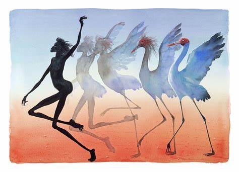
Metamorphosis by Judy Prosser
In this piece of art created by Judy Prosser, we can see a woman doing a pose and slowly transforming into a swan through the same pose. The metamorphosis is represented by using five different forms which are gradually changing until we reach the final stage of the woman’s transformation into the swan. The woman’s arm is in the same position as the swans wing, which helps ease us into the transition.
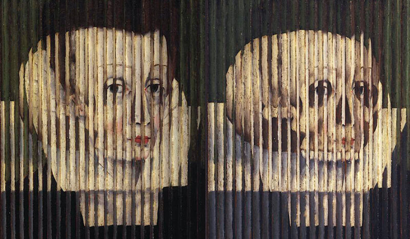
Anamorphosis, called Mary, Queen of Scots by Unknown
Another example is anamorphic art. Anamorphic art is a form of metamorphosis as it changes depending on the perspective it is viewed at. This is an anamorphic oil painting which is on display in the National Gallery Scotland. The painter is unknown. At first, it appears to be a painting of Mary Queen of Scot, but when the viewer of the painting moves, it transforms into a painting of a skull. The use of perspective creates a two-in-one painting which highlights life and death.
Metamorphosis can happen in many different ways, but it always includes an transformation somehow.
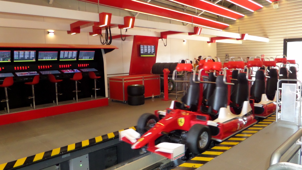
'Red Force' at Ferrari Land which has carts in the design of race cars
My first idea for my animation was to have a rollercoaster which transforms into a race car when it goes through a tunnel. I ended up changing ideas though because it was too complicated. I instead chose my second option, which was to have a bird transform into a plane.
“The design of airplanes has evolved significantly since the first powered flight by the Wright Brothers in 1903. Over the years, technological innovations have led to the development of new and improved airplane designs, resulting in faster, safer, and more efficient aircraft.” (Swanda, nd)
One of the earliest planes were the monoplane. These planes were more streamlined compared to other aircrafts and allowed for higher speeds and easier control. The design of these planes are still used today for mostly military and commercial purposes. (Swanda, nd)
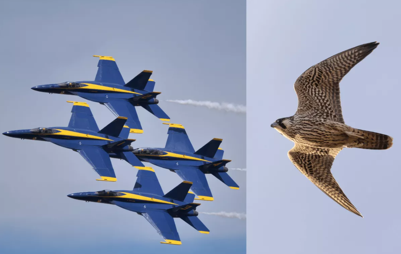
Bird anatomy inspire the design of planes
Most plane designs are based upon the anatomy of birds. Fighter jets are inspired by the short pointed wings of birds such as Eagles and Hawks. These birds were referenced by engineers to create fast planes which were also buoyant. (BirdsConnectSeattle, 2021)
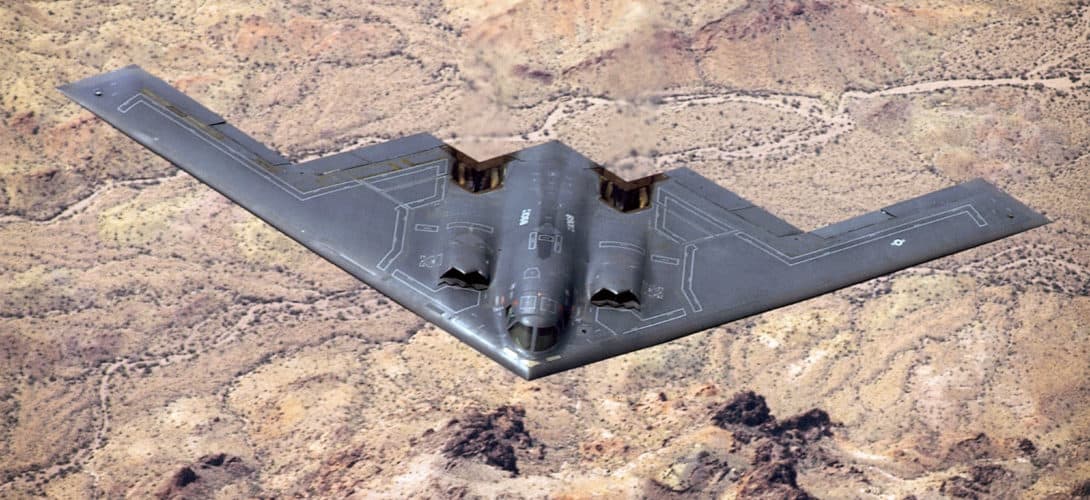
Modern aircrafts such as the Northrop Grumman B-2 Spirit utilise a ‘flying wing’ design, meaning they don’t have a tail. These planes were invented during World War Two, with the first being the C-47, a US craft with stronger cabin floors and reinforced fuselage to carry jeeps, trucks, cargo and passengers. (Guilmartin, nd)
The Nortrop Grunnman B-2 Spirit
Based on my research, my metamorphis idea will be to show the birds flying in a v-shape and then transforming into an old v-shape military plane in place of the birds to show how industrial design gave humans ‘wings’.
Reference List:
BirdsConnectSeattle (2021) It’s a Bird. It’s a Plane.: Aviation Designs Inspired by Birds | EarthCare Northwest [Article]. Available online: https://birdsconnectsea.org/2023/09/21/its-a-bird-its-a-plane-aviation-designs-inspired-by-birds-earthcare-northwest/#:~:text=In%20contrast%2C%20the%20short%20and,aerial%20combat%20and%20evasive%20maneuvers. [Accessed: 10/04/2024]
BirdsConnectSeattle (2021) Planes inspired by birds [Image]. Available online: https://birdsconnectsea.org/2023/09/21/its-a-bird-its-a-plane-aviation-designs-inspired-by-birds-earthcare-northwest/#:~:text=In%20contrast%2C%20the%20short%20and,aerial%20combat%20and%20evasive%20maneuvers. [Accessed: 10/04/2024]
Cambridge Dictionary (2024) Metamorphosis [Quote]. Available online: https://dictionary.cambridge.org/dictionary/english/metamorphosis [Accessed: 08/04/2024]
Guilmartin, John. F (nd) flying wing [Article]. Available online: https://www.britannica.com/technology/monoplane [Accessed: 10/04/2024]
Prosser, Judy (2022) Metamorphosis [Image]. Available online: https://judyprosser.com.au/product/metamorphosis-paper-print/ [Accessed: 09/04/2024]
Swanda Aerospace (nd) Discover the Evolution of Airplane Design [Article]. Available online: https://swanda.com/update/discover-the-evolution-of-airplane-design/#:~:text=The%20design%20of%20airplanes%20has,safer%2C%20and%20more%20efficient%20aircraft. [Accessed: 10/04/2024]
Unknown (1542-1567) Anamorphosis called Mary, Queen of Scots [Image]. Available online: https://www.nationalgalleries.org/art-and-artists/3239 [Accessed: 09/04/2024]
“The key ingredients of a great TV ad are a clear and concise message, engaging visual elements and a strong emotional appeal. Not only that, it’s important to consider the target audience, tone of the ad and timing as well.” (Holdens, nd)
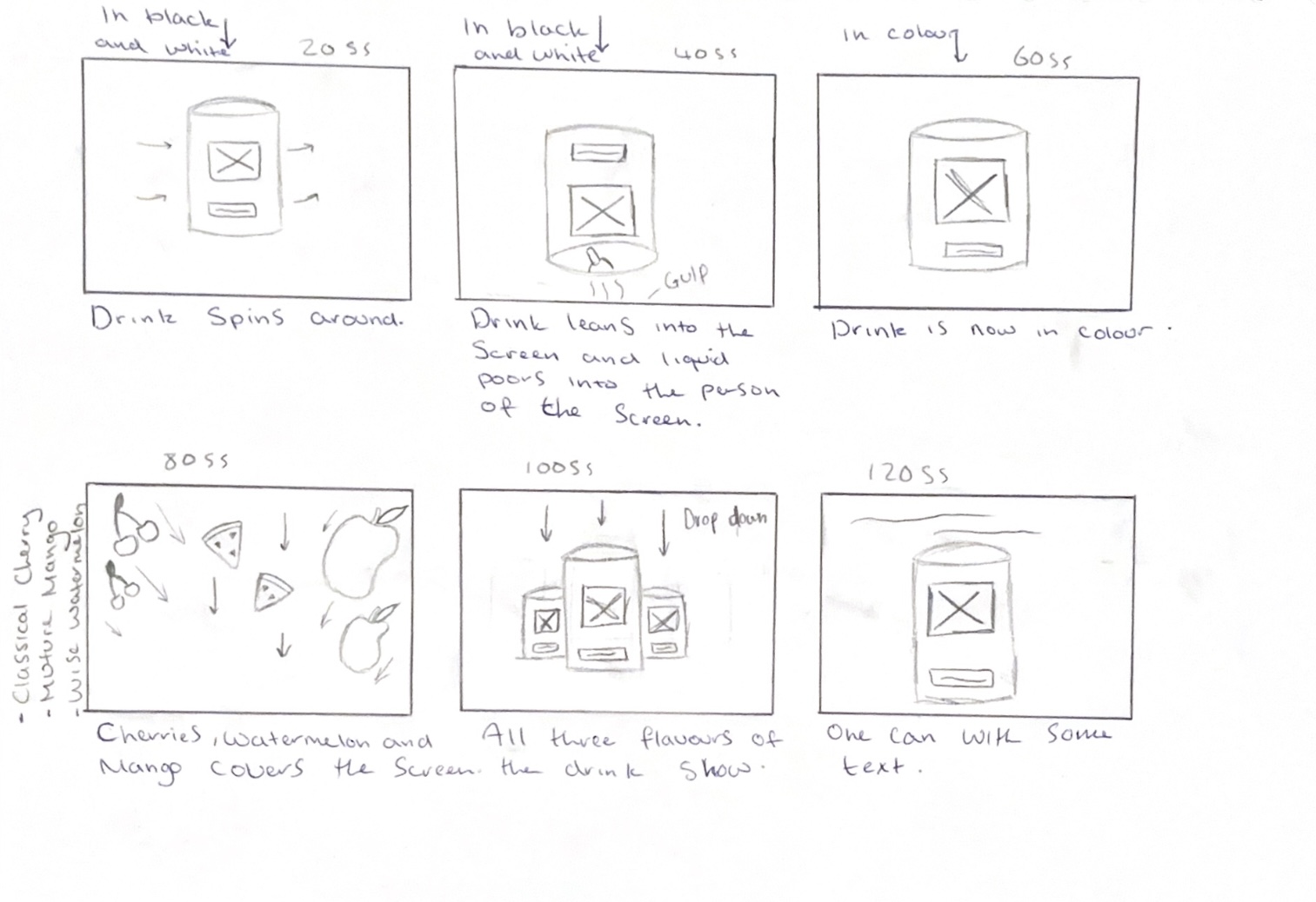
Once I had all my planning and designs done for my energy drink can, I then started to plan out my animation. To start this I made a storyboard and drew six boxes which would equate to twenty frames each to add up to the 120 frame amount.
I had my storyboard start with the can spinning so the viewer would see the whole can, then it would lean into the screen to act like the viewer is having a drink, then it would lean back to being stood up. After this, the can would then spin again, and once the can had done another spin, the flavours of the drink would fall down to cover the screen so it could go to a new scene. After this it would go back to a blank screen with all three cans dropping down into frame, and then the two cans on either side of the middle can, would then move in to leaving only the middle can. After this, the slogan would drop down, ending the animation.
This storyboard successfully shows off the product and it’s different flavours. I also plan on having the animation transform into colour from black and white to show the transformation after drinking it from dull to exciting, showing how the product gives you energy when drinking.
My storyboard for my energy drink animation
In my storyboard, I wanted the fruits to drop down into frame covering the screen which would create a transition. To do this, I first looked at some YouTube tutorials on how to make a cherry and watermelon slice in blender. I chose to use 3D models of the fruits to create depth and to prevent them looking flat as they drop down and bounce back up. Using 3D models also meant I could create a shadow and dimension which adds a sense of layering which is more interesting visually. Because I decided to not use the mango can design, I only made cherries and watermelons which I then added colour to before importing to Stager, where I could move them bit by bit and take screenshots. The tutorials I followed are linked below in the reference list.
In my animation, I would have the first half of the animation in black and white before transforming into colour. To do this, I will use After Effects and edit the footage made using screenshot to create this transition by using basic key framing to make the animation fade into colour after the drink tips forward. This idea came because the third-year students said that they liked my logo in black and white and mentioned the idea of possibly using this within my animation, as black and white is associated with old TVs, which link to the vintage name.
Reference List:
Farrukh 3D (2024) Easy Modeling Tutorial – Watermelon | Blender [Video]. Available online: https://www.youtube.com/watch?v=o2Qh-9jFKzs [Accessed: 17/03/2024]
Holdens (nd) The ingredients of a successful TV advert [Article]. Available online: https://holdens.agency/blog/the-ingredients-of-a-successful-tv-advert/ [Accessed: 18/03/2024]
Juhl, Soren (2023) Cherry in Blender | 3D Modeling Process | by 3D artist Søren Juhl [Video]. Available online: https://www.youtube.com/watch?v=TfwSZ7vzd1E [Accessed: 17/03/2024]
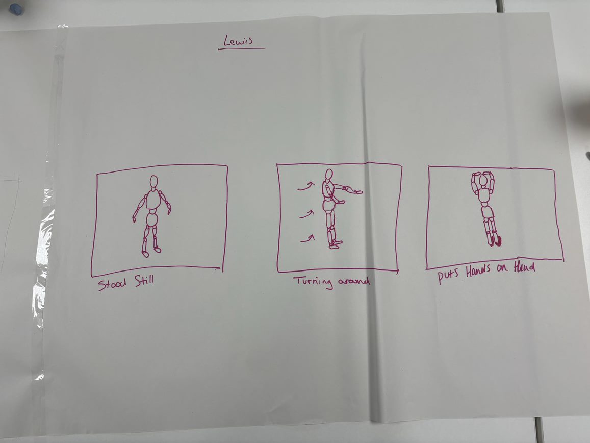
In class, we were assigned our second team-working task. Our assignment was to make a stop motion animation with some wooden figures. Everyone was told to write their name on a piece of paper, scrunch it up and then give it to the teacher. He then picked one out at a time until there were two groups of three. In my team there was me, Ashleigh and Kieran. “Individual commitment to a group effort — that is what makes a team work, a company work, a society work, a civilization work..” (Lombardi, nd)
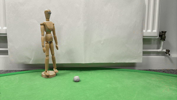
After the teams were formed , we were given three big pieces of paper, and miscellany items to use. We were given a wooden figure, two wooden hands and some blu-tac, we were allowed to use other items in the room to help, so we added some tape, a piece of paper and a green screen. After we had our items sorted, we then started to discuss what we wanted to create for the animation. After talking, we agreed upon an idea to make our stop motion about football. Ashleigh came up with the idea to use the blu-tac as a football, we then had it so the wooden character would kick the football and score a goal, but then me and Kieran suggested the idea to use the wooden hands to catch the ball like a goalie would. We also thought of using blu-tac to create facial expressions by modelling eye and a mouth, using a pencil to create little holes for the puples.
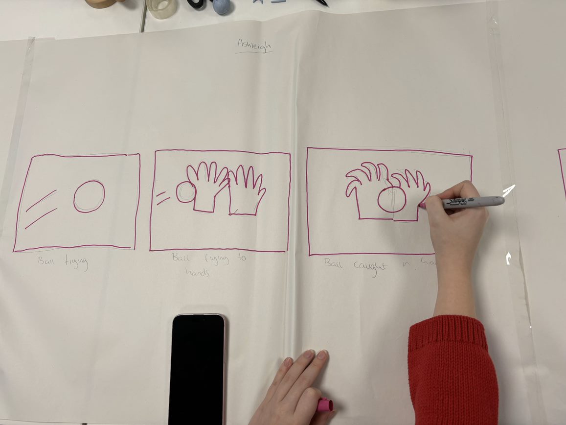
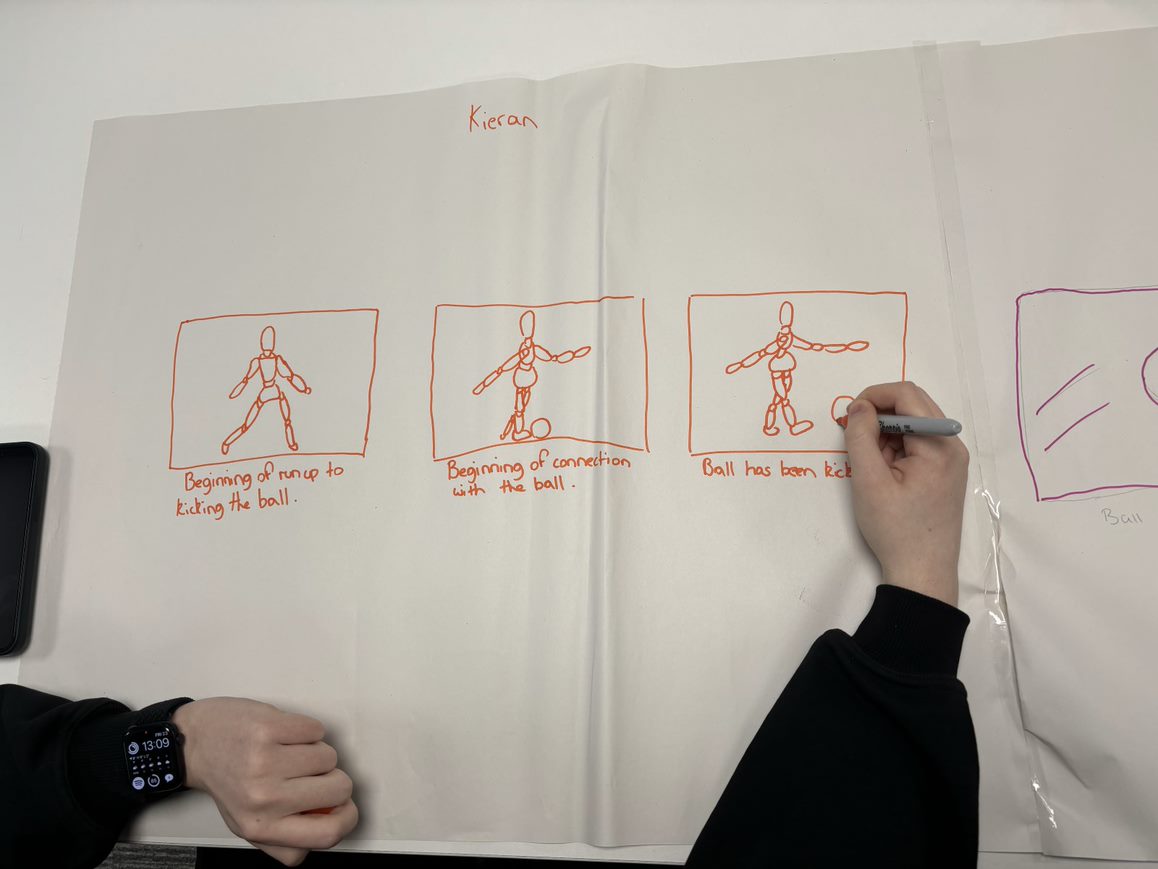
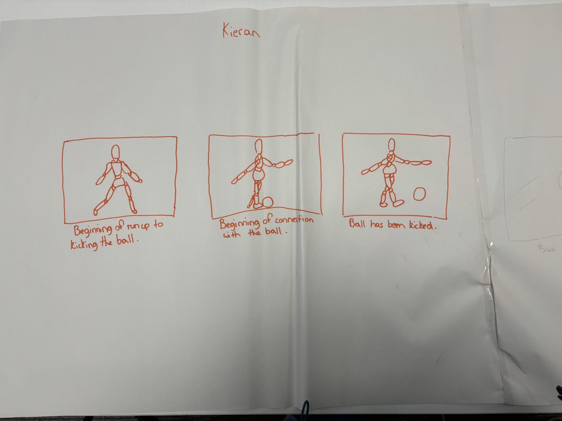
Once we had our idea we then decided on who would oversee which part, Kieran chose to do the start, Ashleigh chose to do the middle and I chose to do the end of the animation. This meant everyone got an equal share in the project and it sped the process up also. On the three big pieces of paper we all made a storyboard for our sections, making three main frames for the start, middle and end, which totalled nine frames between us all.
Picture of Ashleigh drawing her part of the animation
Picture of Kieran drawing his part of the animation
Kieran's part of the storyboard
Ashleigh's part of the storyboard
My part of the storyboard
Kieran started his first because he had the start and Ashleigh had to see how he would end his section so she could do the middle part. Kieran made the character run and kick the ball, and we communicated about how the character would move and how each section would lead into the next. Ashleigh then started the middle part with the ball being in the air and then landing in the goalies hands. I then started the end part following from this, with the character reacting as he turns away with his head in his hands to show disappointment, I showed this further by having the facial expression become downturned.
We then began to film the stop motion and took turns positioning the objects for our respected scenes, whilst someone else took the pictures on the phone a stop motion app. We help guide each other as we recorded and did some problem solving by using tape to hang the ball so it looked as if it was floating. Because the animation was recorded on Ashleigh’s phone, we created a group chat where the animation was then uploaded to so we all could save it to our own devices.
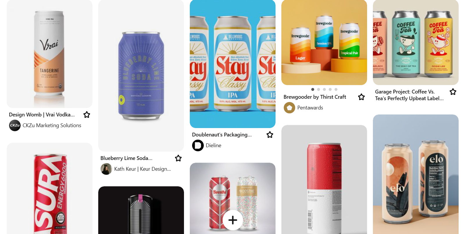
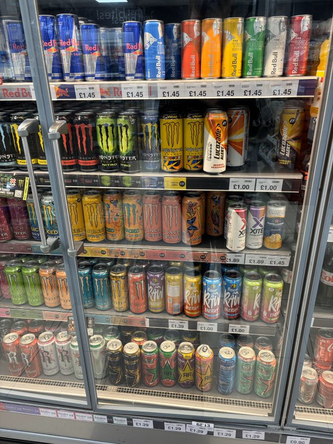
After creating a logo, I then started to look at packaging designs. I started by going on Pinterst and gathering different images of packaging designs, then I decided to gather my own images by going to shop and photographing all the energy drinks in the fridge. From looking at what Images I have gathered, I have found that most energy drink have the same feel to their can design as they are all aimed for young adults. Even though they are not aimed towards an older market, they all include necessary information such as, ingredients, use by date and nutrition information. I will use this information in my own package design as it is legally required.
“Correct product packaging and labelling is crucial not only for the customer experience, but also for their safety.” (Gareth, 2022)
Some package design inspiration that I found on Pinterest
My own image of energy drinks in shops
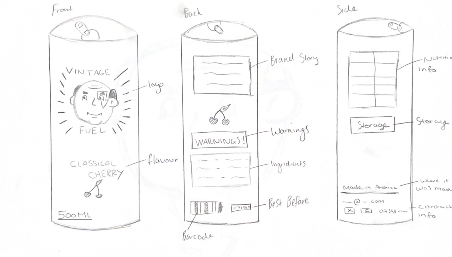
I then created some sketches of how my package design will look from the front, side and back. On my package design I decided to curve the text where the flavour is because it gives a nice classical feeling to it, I also gave it sunbeams behind the logo as this is a vintage style used often and it draws the eye inwards to the logo. I put all the required text on, such as the ingredients, barcode and best before date in places where I think they would go althoughI later changed some of this when creating it digitally.
My sketch of my package design
After showing the package design to my teacher and the third-year students, I got some useful feedback. I was told to make sure everything curves around the can right, to not leave massive amounts of space or cramp things together, and to rearrange the text on the can so itcomplements each other. This feedback helped me when redesigning my package design digitally, leading it to come out much better and improved.
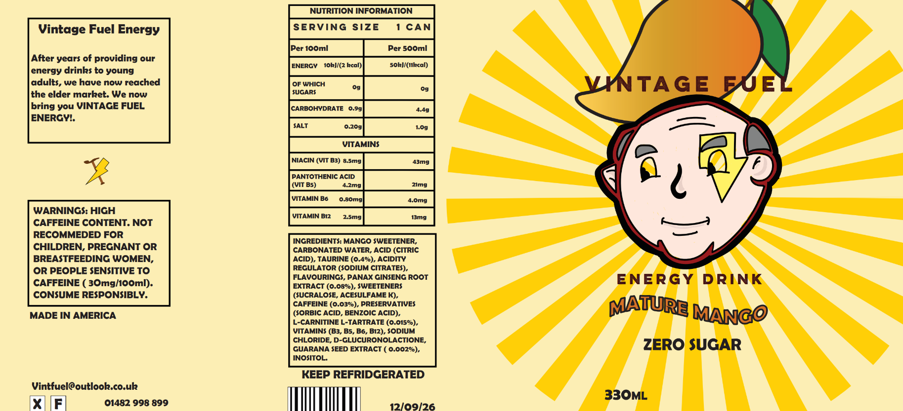
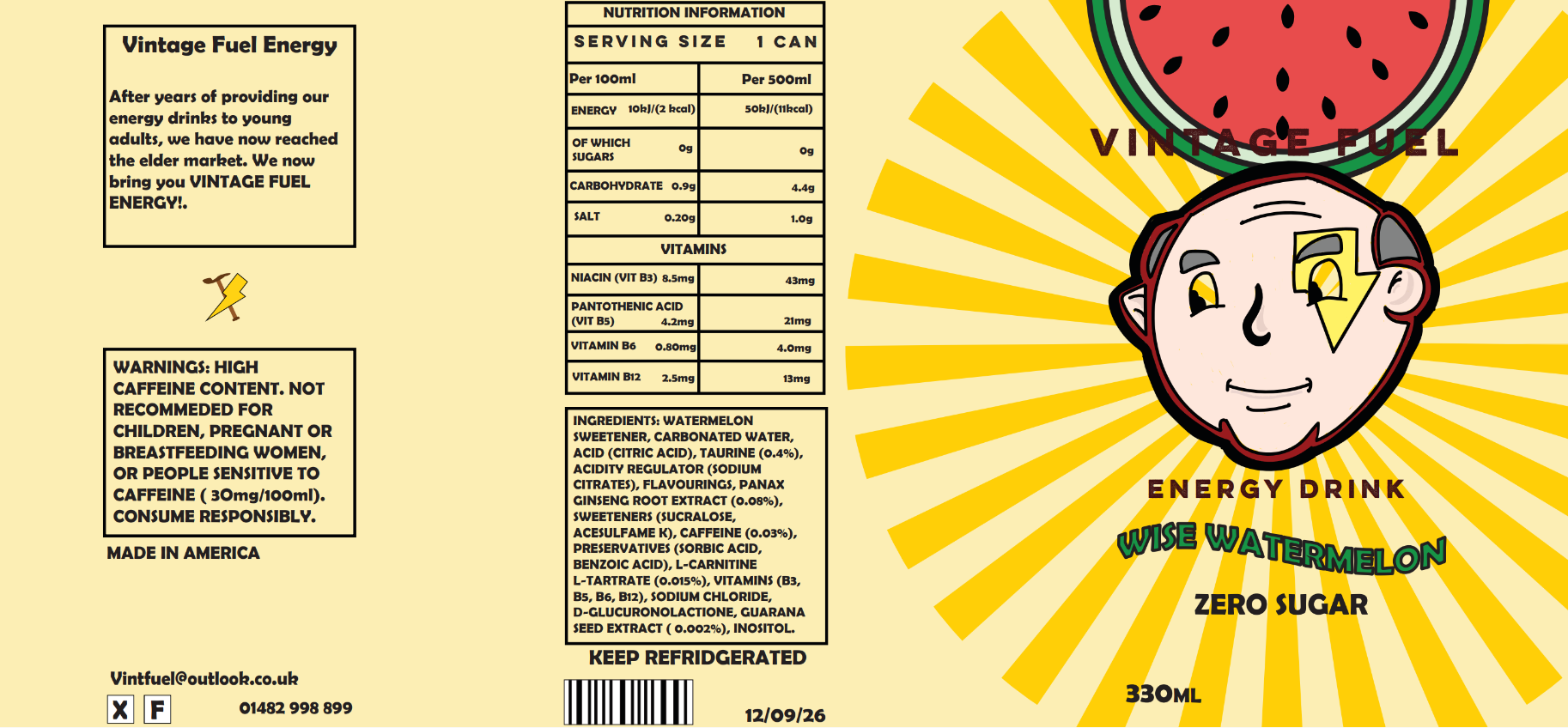
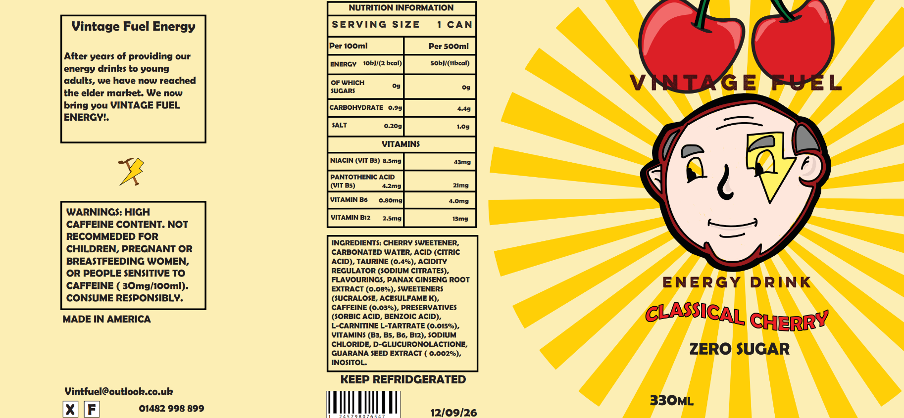
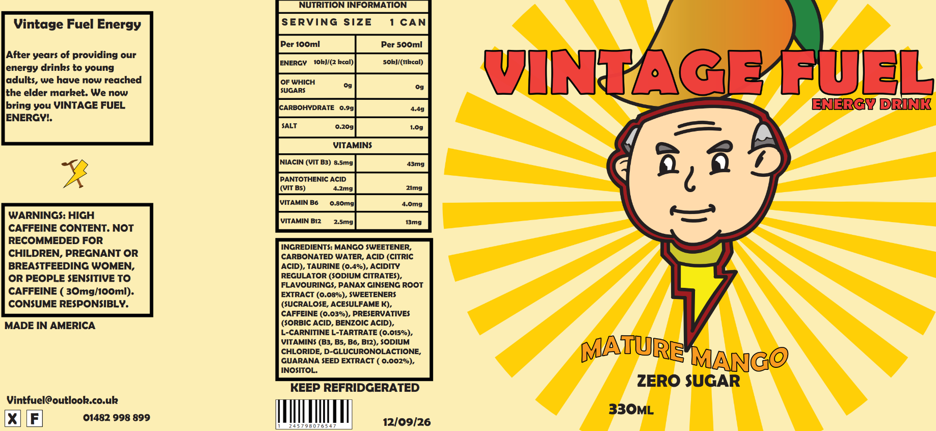
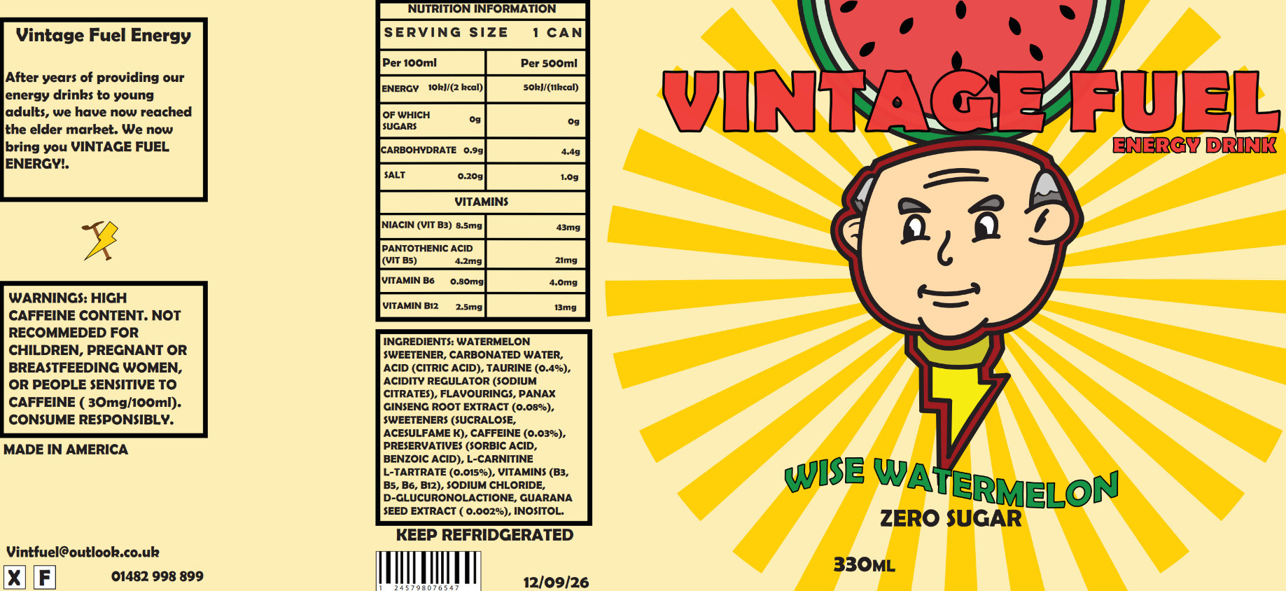
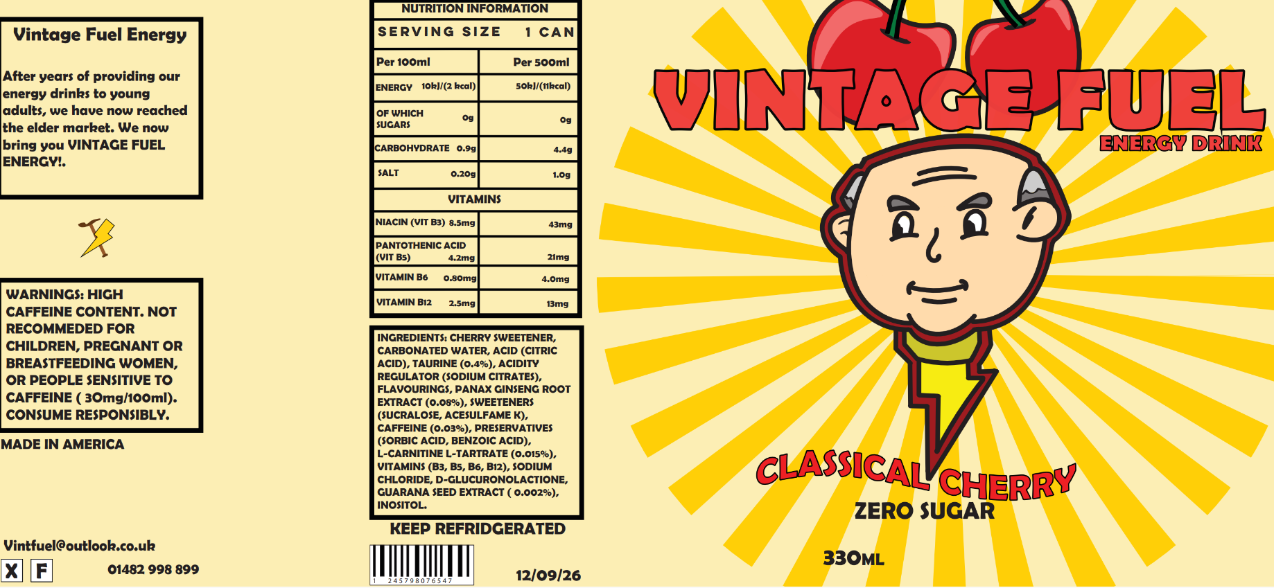
I made three different package designs, all using the same text but different illustrations of the fruit at the top to match each flavour. I did this so customers can clearly see the illustration and know what flavour it is without having to spend ages looking for it on the label. The three flavour ideas I decided upon were Classical Cherry, Wise Watermelon and Mature Mango. I used words like Classical, Wise, and Mature because they relate to elderly people, and I used alliteration to create a snappy fun name for each flavour.
“In the shopping context, where consumers decide which food products to buy by spending a limited amount of time and cognitive resources [1], packaging helps consumers decide which product to choose by capturing their attention and convincing them that it contains the product which best suits their needs.” (Gill-Perez, 2019)
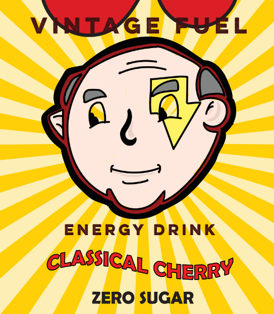
Original Mango package design with original font
Original Watermelon package design with original font
Original Cherry package design with original font
Updated Mango package design with updated font (didn't end up using)
Updated Watermelon package design with updated font
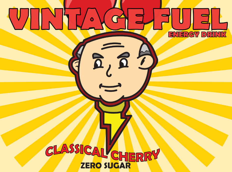
Updated Cherry package design with updated font
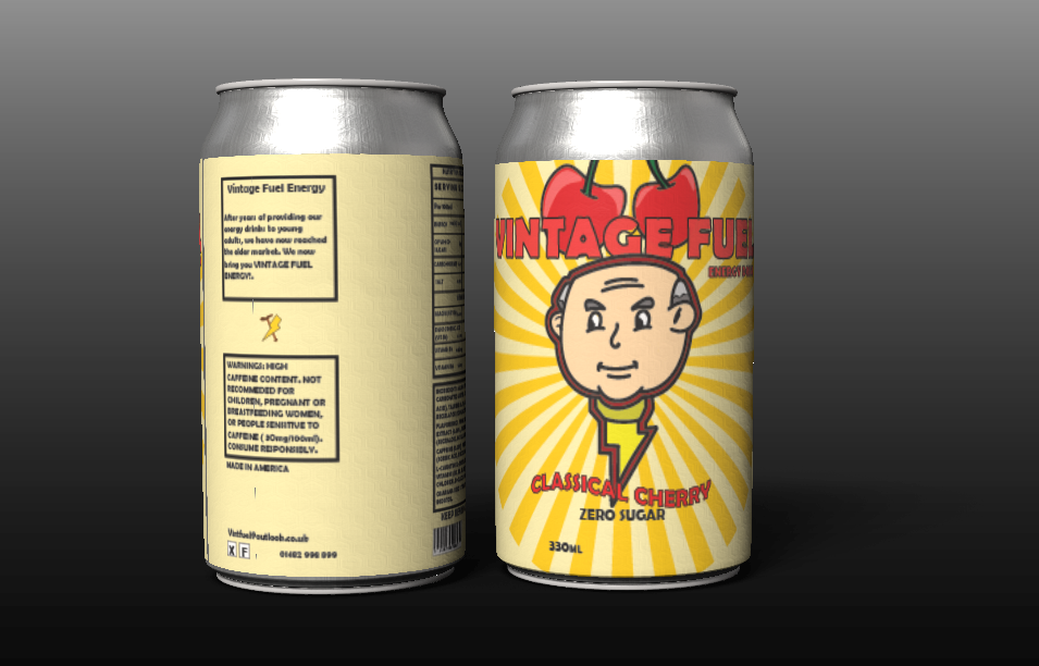
I eventually decided to take out the mango design. I did this because I thought that the mango illustration appeared more like a pepper andcould be confusing to some people. I instead stuck with the other two designs, which I placed onto a can model to see how they would look when mocked up.
Final package design on can models
Reference List:
Gareth [2022] The Law on Product Labelling: What Must You Legally Show? [Article]. Available online: https://www.labelsource.co.uk/news/post/the-law-on-product-labelling-what-must-you-legally-show#:~:text=These%20need%20to%20include%20information%20on%3A%20The%20name,Storage%20and%20cooking%20instructions%2C%20where%20necessary%20Origin%20marking [Accessed: 15/03/2024]
Tonge, Lewis [2024] Package Design Inspiration [Pinterest Board]. Available online: https://www.pinterest.co.uk/lewis20022002/package-design/ [Accessed: 19/03/2024]
For this assignment, we have been asked to create an energy drink for people over 60. Fewold people drink energy drinks, statistics show that only 15% of people who are age 50-64 drink energy drinks. (Statistica, 2024)
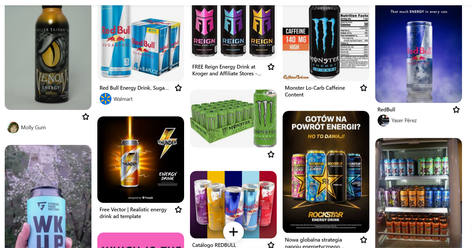
I first went looking for energy drink logos. I made a Pinterest board of logos, and after found that a lot of energy drink logos use a noticeably young adult style as they are more targeted towards this age group. They use brighter colours in the logos which are more eye-catching for a younger audience. An example of this style is Monster Energy. Monster use a mixture of bright colours on their logos as they use bright colours to fill in the logo. Their logo is a ‘M’ which is made by using monster scratches, also another eye-catching feature for a young audience and very masculine.
“If your target audience is younger, bolder and higher contrast colors can help create a sense of excitement.” (CTM, 2023)
Screenshot from my Pinterest board of energy drink logos
My own image of an energy drink logo
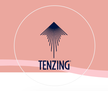
One of the energy drink logos that I have found that have more of an adult feel to them is Tenzing, I think this because their logo uses a less decorative font and doesn’t use stylizedsymbols in them like Monster, they also use an arrow with a sun at the top with sunbeams coming down to make the arrow, which is also used to make the top of a mountain which is used on the design. The logo is a simpler logo which makes me think that it is an energy drink aimed towards older adults looking for something more natural.
Tenzing energy drink logo that I found
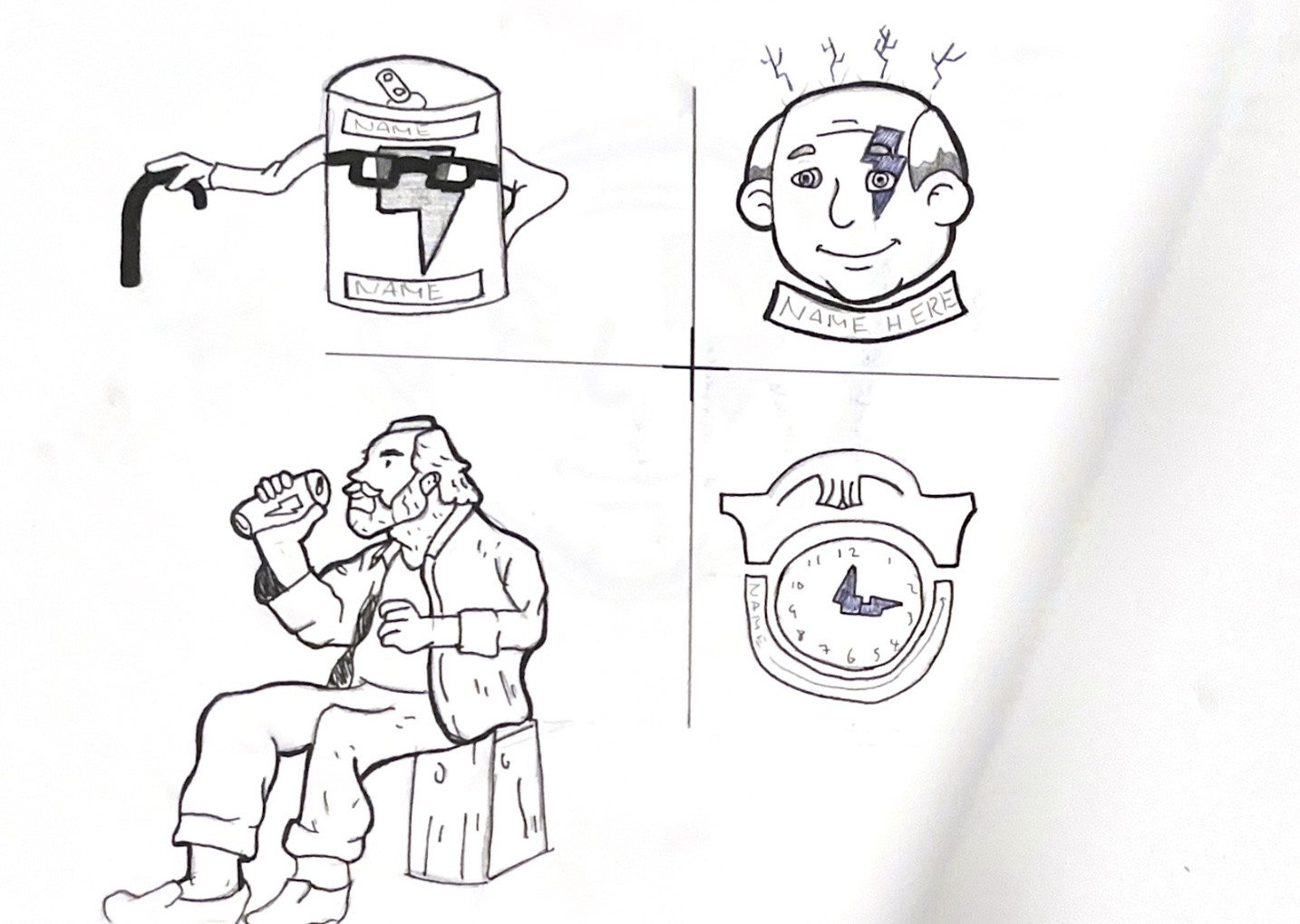
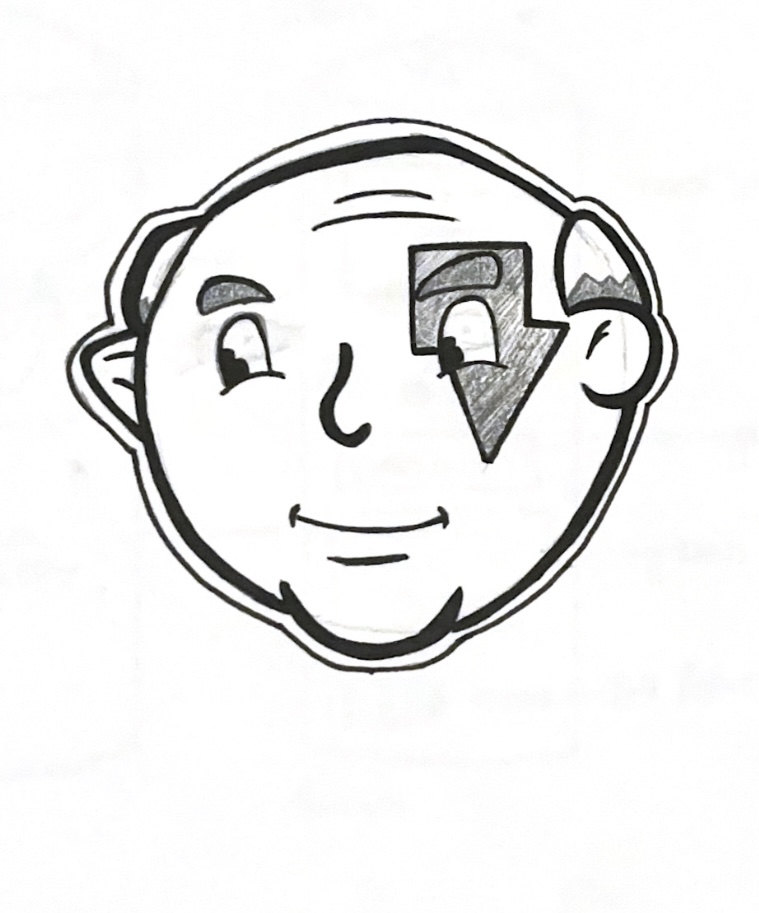
For my logo, I started off by making four logo sketches and picking the strongest idea. I went with one that has an old man with a lightning bolt across his eye. The first improvement I made was taking inspiration from vintage characters that I had looked at and giving my character the same eye style. The next improvement I made was by giving him more outlines and making them thicker.
My 4 logo sketches that I made
Inspiration for my logo with thick outlines
Inspiration for my logo with the eyes
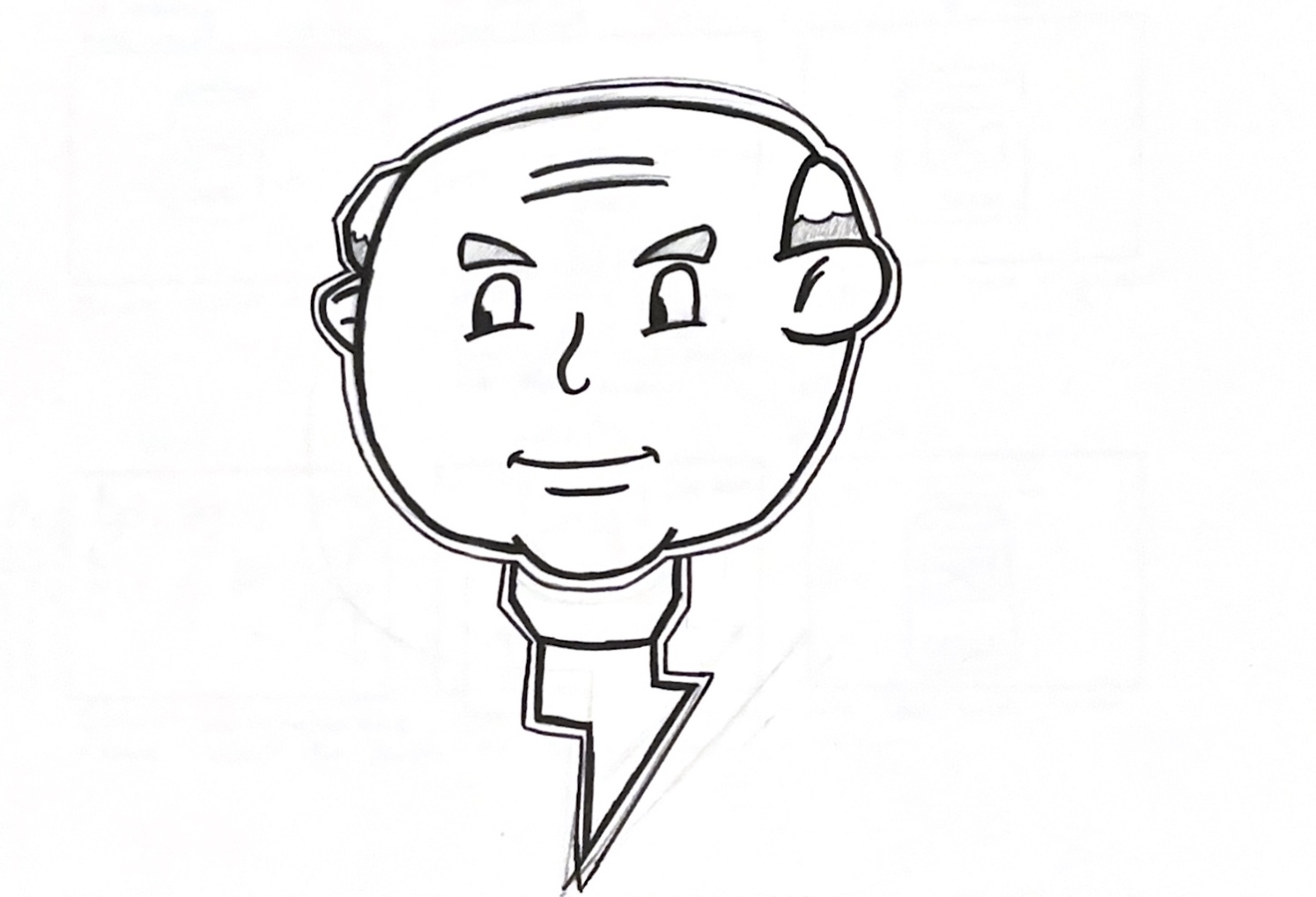
After doing this I then showed my teacher and the third-year students my logo for review. My teacher suggested I take the lightning bolt off the character’s face and use it as a tie. After makingthis change,the logo looked better, and I started making it digitally.
My first logo that I made
My updated logo after feedback
To produce the name for my energy drink, I began by writing down the words ‘Old’ and ‘Energy’ and wrote down other words that relate to them two. I had a few name ideas but narrowed it down to Senior Force or Vintage Fuel, I ended up choosing Vintage Fuel as I thought the name went better with my logo, I chose a font but wasn’t happy with how it went with my logo, my teacher then said to have the logo match with the way the flavor font looked by having a black outline. After finding a better font and giving it ablack outline I thought it looked much better and complete.
My can design with original font
My updated font after feedback
Reference List:
CTM (2023) Energy Drink Labels: Key Components You Need to Know [Article]. Available online: https://ctmlabelingsystems.com/labeling/energy-drink-labels-key-components-you-need-to-know/ [Accessed: 17/02/2024]
DckyDesign (nd) Panther Mascot [Image]. Available online: https://dribbble.com/shots/19172981-PANTHER-MASCOT [Accessed: 04/03/2024]
Statistica (2024) Consumers of energy drinks in the United States as of December 2023, by age [Article]. Available online: https://www.statista.com/forecasts/228168/energy-drinks-consumption-usa [Accessed: 17/02/2024]
Tenzing (2024) Tenzing Logo [Image]. Available online: https://itstime.earth/speakers/tenzing [Accessed: 22/02/2024]
Tonge, Lewis (2024) Energy Drink Logo Pinterest Board [Pinterest Board]. Available online: https://www.pinterest.co.uk/lewis20022002/energy-drink/ [Accessed: 19/03/2024]
Epidemic Fantasy (2019) Bonnie Grace – Deeper Than the Ocean [Audio] Available online: https://www.youtube.com/watch?v=rxnzd_tz0Gc [Accessed: 28/02/2024]
Robert Austin Music (2019) What Lies Beneath – Underwater Horror Ambiance [Audio] Available online: https://www.youtube.com/watch?v=Sd0dqgEYnqk [Accessed: 28/02/2024]
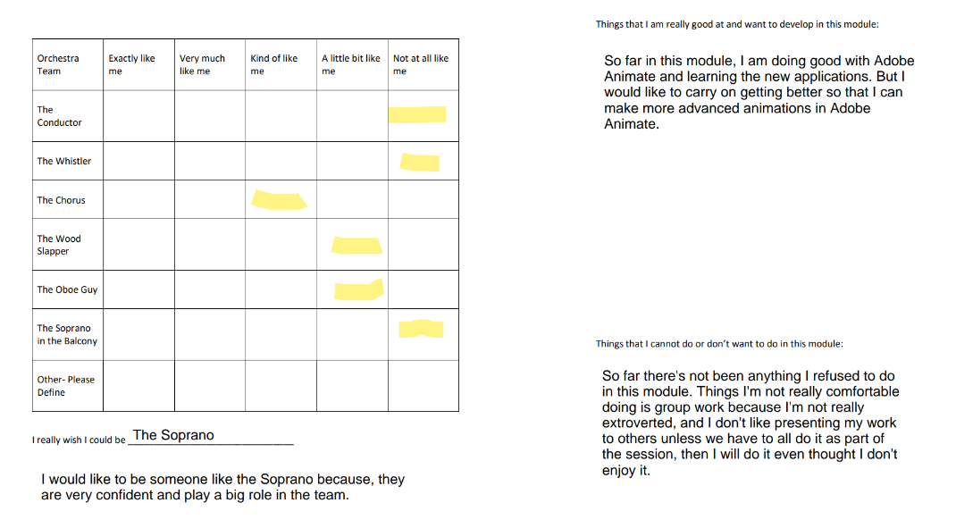
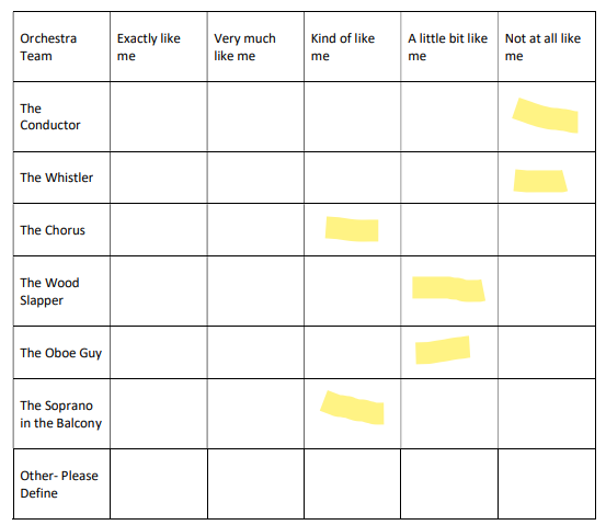
In lesson, we had to watch a video of a Orchestra performing. We were then asked to fill out a form about the Orchestra and label which roles were most like ourselves and not. In the Orchestra, the performers all have a different part but have to work together so that the performance is successful. The part which I thought resembled me was The Chorus, I this because The Chorus is made up of people all doing the same role and blending together as one. I am like The Chorus because in group work I don’t think I would work in a leadership position where I make important decisions and instead prefer to just go along with what everyone else is doing.
We then had to all work in our own team in class and were given post-it notes. The assignment we were given was to make a flip book about a caterpillar. We all had to work together to make a story of the caterpillar eating and moving from each post-it note to the next, like in The Hungry Caterpillar. Everyone was given a role in the beginning, middle or end and had to make their own part.
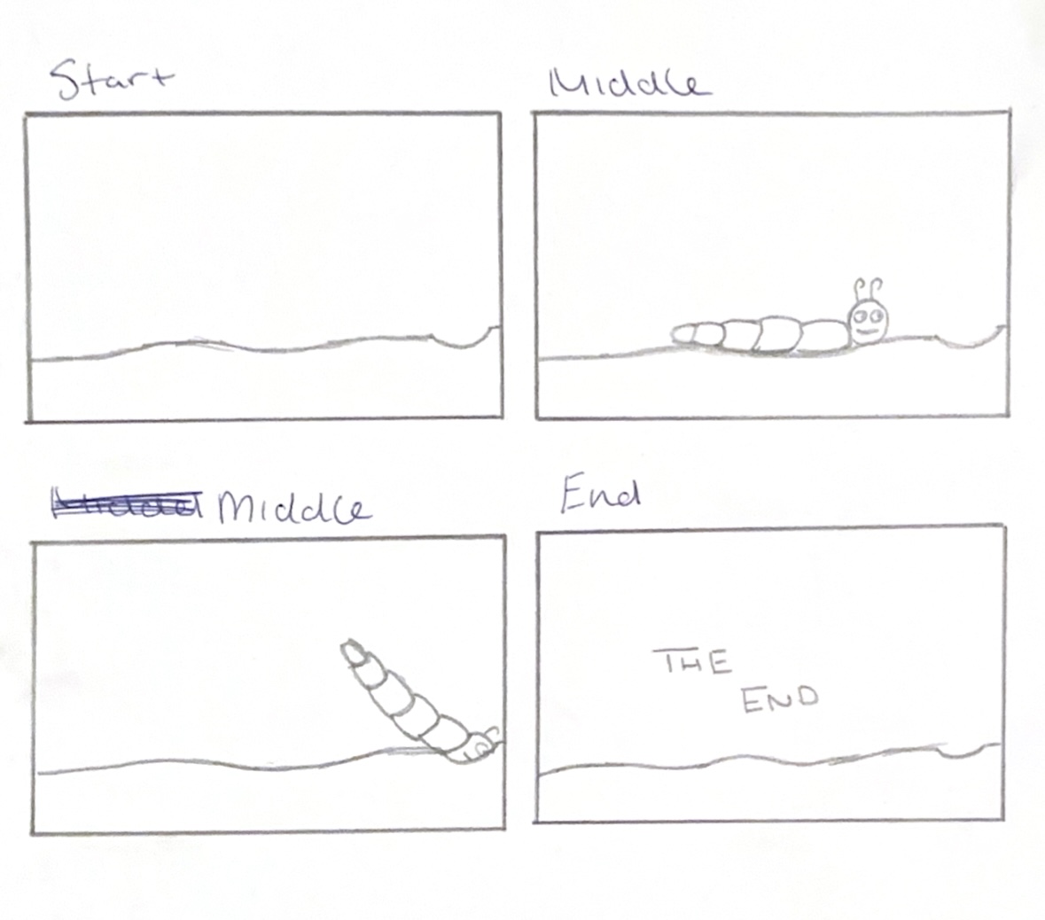
Four slide storyboard for caterpillar flipbook ending sequence
I was given the end part of the flip book, which meant I had an important role as I was in charge of finishing the story. I started out by making a storyboard with four slides which show the start, middle and end. I decided to end the story by making the caterpillar dig into the ground and disappear. I then added ‘The End’ to help the viewer understand that the flip book has ended.
I then started to draw the animation on the post-it notes and made lots of drawings which were the frames of the animation. Each frame shows the caterpillar moved over a little bit so that when the viewer flips through it’s as if the caterpillar is moving and as if it is slowly digging a hole in the ground and going under. It was important to make each frame look similar so it seemed all part of the same animation, and I drew from left to right because we were all told to start on the left and end on the right so each persons part would join up to the next persons part to make the story.
My finished part of the flip book
When I first filled the form out, I chose The Chorus as I thought that this related more towards my personality in group work, but in this project I played a more independent role like The Soprano. In the Orchestra, she helped to end the performance and had to do her part alone, which was similar to how I had to create the end of the animation. I have now re-done the form as my thoughts have changed. At the start of the session I would have hoped to have worked on the middle part of the animation like most of the other people in class were, so my part didn’t stand out as much, but the role I played wasn’t too bad and I felt comfortable doing it. I would maybe like to try more roles like this in future group work, but I still think I am more suited towards a role such as The Chorus.
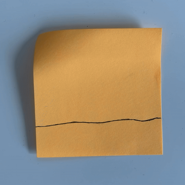
Updated Psychrometric Test with The Sophrano moved over more left
In this first video, the animation is made by using stop motion and physical items such as paper and shells. They have used paper and paints for the background, fish and debris, and they have used real shells to spell out the text for the viewer instead of doing this with paper or digitally. This works well in context as it is using materials that are found in the ocean which links it to the subject of the animation. I think this animation is aimed towards children, because it uses stop motion and is hand crafted which would appeal towards children due to it feeling more juvenile. It is also quite a short animation, which would help keep younger people much more interested. There isn’t much text in this animation and it used just three words, which I think also shows this it is aimed towards children as it relies more on the visuals rather than text.
Plastic "Float"
This next animation is created digitally. Doing this allows for a much cleaner animation compared to before. In this animation, we start off by seeing a child, this makes me thinks that this animation is for children as it is using a character around their age, which is more relatable. However, because of details, I think this is for older children. Once we have seen the child, a plastic bag comes into frame and the child grabs a hold of the bag and fly’s out of frame with it. Next, we see the child flying with all the plastic in the sky. We then see a man throw his cup into the floating trash, this gives a message of that people do not care about where their waste ends up. We then see the little child fly towards the sunset with the trash which gives off a happy feeling at first, but then the child jumps off the plastic as it is flying into the ocean and we realise along with the child that it isn’t a good thing and it is harming the ocean. At this point the colours go from being warm to cold and dark. Then a message shows reading “Help us fight plastic pollution.” As we are left seeing in the background all the plastic go into the ocean.
This video won't embed so I have added the link to it below
Blue Voice - Plastic Pollution in the Ocean -Animated Short Film - 3D Short Animation
This last animation is also made digitally. It begins with a view of the ocean, as a plastic bottle is dropped into frame. We then see a fish hiding at the bottom of the ocean as it sees the plastic bottles dropping in. The style of animation makes me think that this is aimed towards children, because it uses a small fish which shows emotions with its face, which is stylised and children usually like these type of animal characters. The fish then goes towards the plastic and we can see the microplastics floating around as the fish proceeds to eat some, before realising it isn’t food and spitting it out. After this, the fish starts gathering the plastic bottles and makes a fish with red crosses for eyes, signifying death. This is conceptual as it is using the plastic bottles to form a symbol associated with death and destruction, drawing a link between plastic bottles killing the sea life. The animation starts to turn black with only the red bottles staying in colour.
For my animation, I will use a digital style and keep the animation short to keep the attention span of my target audience, which is young children.
Golbi Kh (2017) Blue Voice – Plastic Pollution in The Ocean [Video] Available online: https://www.youtube.com/watch?v=uRnFzZj4dVk [Accessed: 10/02/2024]
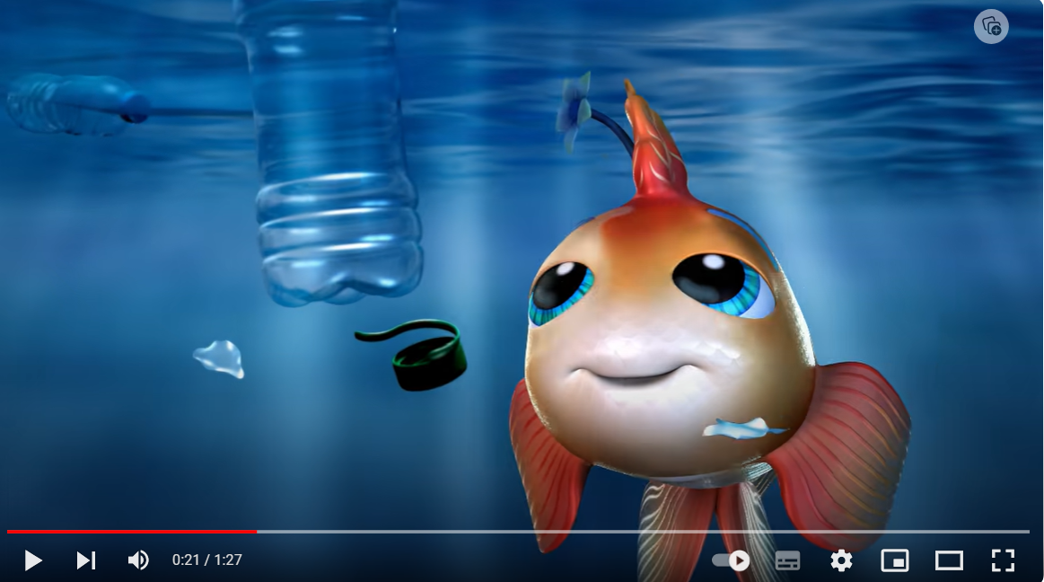
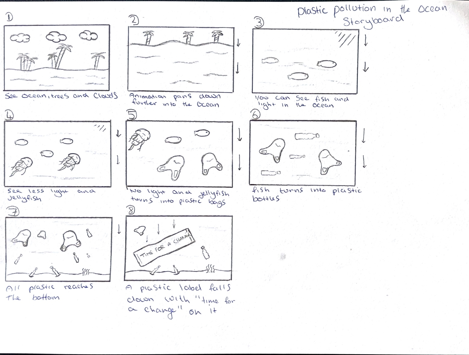
Refined storyboard for my classical animation piece
This is my storyboard that I have made for my animation. I have made this storyboard to plan out my animation and to see how the animation will begin and end. “A storyboard is the blueprint for your finished animation, it tells the story visually as sketches to show the story unfolding sequentially.” (Monitor, ND). I have also used this storyboard to plan my conceptual transitions.
My storyboard starts off by showing the horizon of the ocean and some land and the sky. In the second frame, my animation pans down further into the ocean, showing less of the land. In frame three, it pans even more and the scene is now in the ocean, and you can start to see some fish swimming and light from the surface. In frame four, it keeps moving down further and getting darker as different fish are introduced, like jellyfish. The scene is constantly moving down further as the animation goes on, becoming darker as you get closer to the ocean floor. In frame five, the jellyfish start being swapped with plastic bags. This is a conceptual transition that shows how plastic is killing fish and becoming more common in the ocean as it gets more polluted. The concept is that the jellyfish and plastic bags have a similar shape to each other and this will create a smooth transition as they can be used to morph into each other. In frame six, the fish are now becoming plastic bottles, this is another conceptual transition between two similar shapes, which will appear seamless as they transition from one to the other in the final animation. In frame seven, we have now reached the bottom of the ocean floor, where we can see more plastic and zero fish. This is to show that plastic is taking over and the problem is growing over time. The animation will now be very dark in colour and will show the darker side of the story. In the last frame, a plastic wrapper floats into the frame, with a message on that reads ‘time for a change’, to encourage more people to think about the damage they are causing to the ocean and to the wildlife by mindlessly polluting and not doing things such as properly recycling, which is causing the issue.
My animation starts off on land, where it is bright and colourful, but ends deep down in the surface, where it is darker and polluted. This is to create a comparison and to point out the depth of the issue and to show how easy it is to ignore the situation from above, but how if we leave it, it will only spread and get worse. I have kept the transitions basic so that my target audience, which is young children, can understand the message and so they don’t get confused. They can see how the animation changes and understand that it is showing the plastic taking over and replacing the wildlife.


