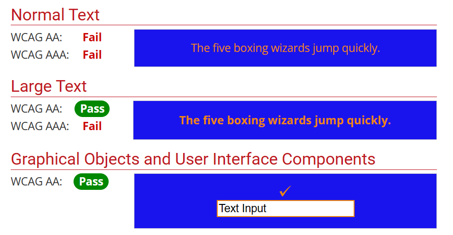
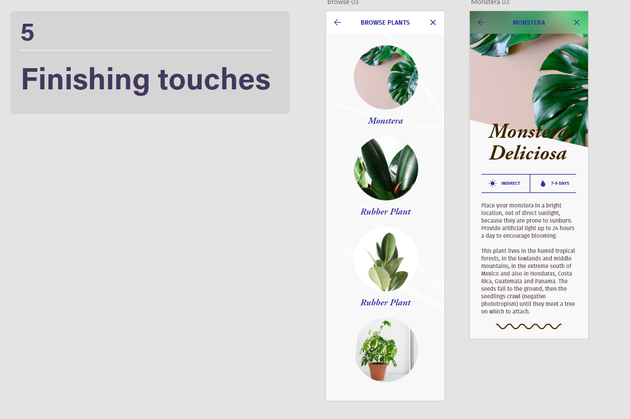
Ethical or Sustainable Subject
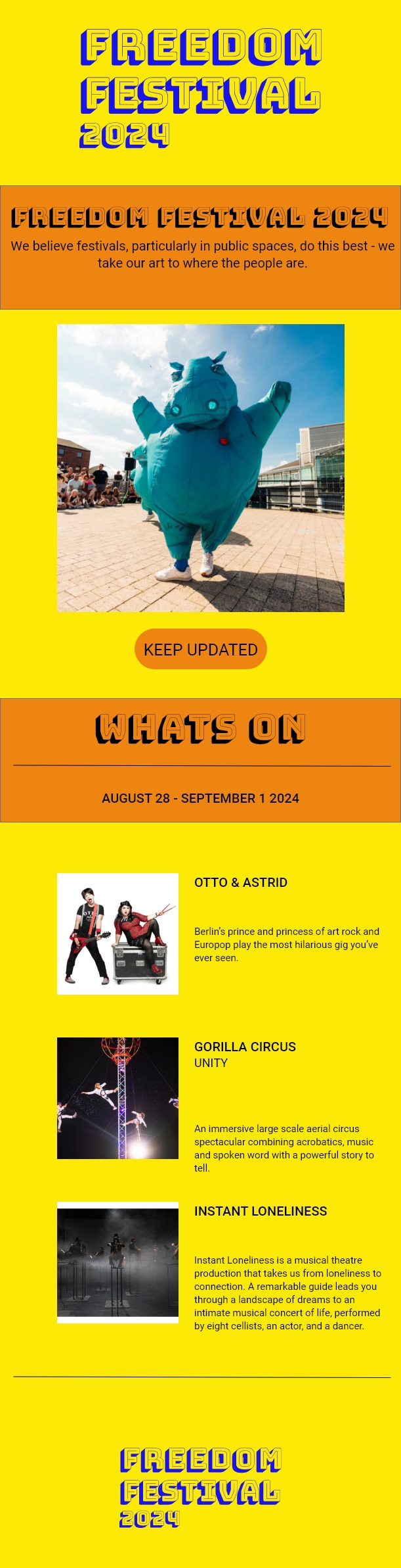
For my classical animation piece, the topic I have chosen is plastic pollution in the ocean, I have chosen this topic because not enough people are informed on where the waste ends up and the damage it is causing to the environment and wildlife in the ocean. The target audience I am trying to reach is young children aged 7-10 years old, as I think everyone can play their part in helping the ocean, and teaching children from an early age means it is more likely to carry this information down for generations and to slow down the pollution in the ocean. The purpose of my animation is to get people to realize the damage they are causing and to show them slight changes can make a difference in the long run such as making sure that their plastic is being disposed of properly and in a sustainable way.
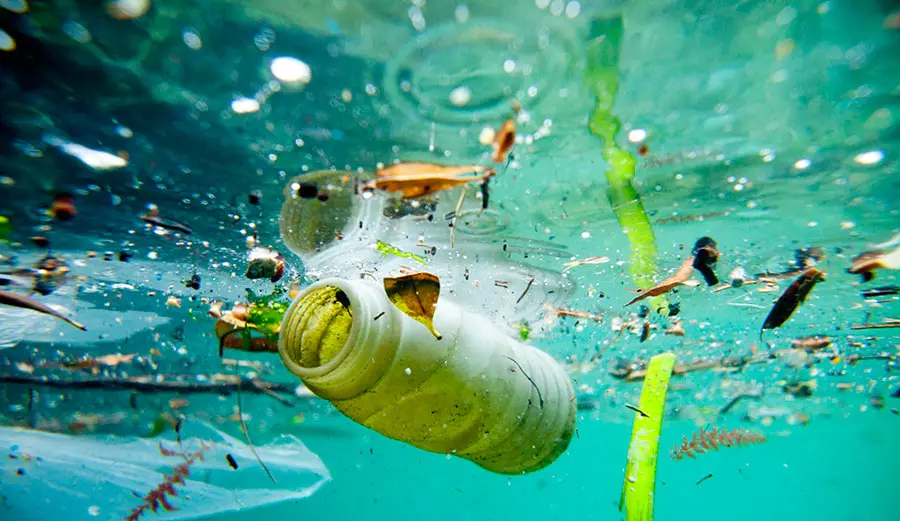
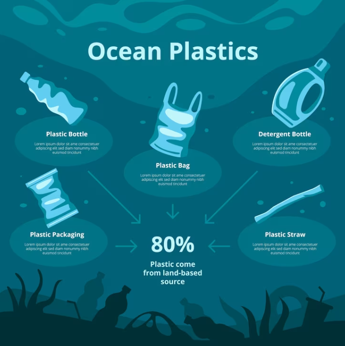
Statistics have shown that 80% of all marine pollution is made up of plastic waste and that around 8 to 10 million metric tons of plastic end up in the ocean each year. (Fava, 2022) this is worrying because the plastic debris has been proven to harm and kill marine animals such as fish and seabirds, for example the sea turtle species and at least 266 other species. Sea animals are at risk of ingestion, suffocation, and entanglement, to name a few of the deadly consequences of plastic pollution (Clean water action, ND). Plastic items such as straws and six pack drink holders are some of the most common culprits for the death of sea wildlife. “100 million marine animals die each year from plastic waste alone” (Condor, ND).
Another major problem plastic causes to wildlife is that once plastic is in the ocean it can take hundreds of years to degrade and then becomes microplastics. Microplastics are tiny particles of plastic that are eaten by marine animals and end up in their bodies and tissues leading to consequences for the health of the planet and all wildlife. (Fava, 2022) Microplastics are also harmful to humans, and if we consume fish who have consumed microplastics we are also at risk because microplastics release toxic chemicals and can cause cancer (Yuan, 2022)
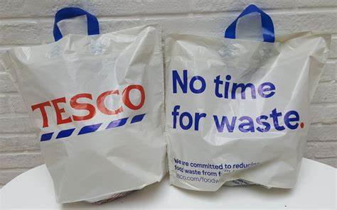
Some companies are trying to contribute to the cause by swapping to different packaging. One of the companies that have done this is McDonald’s, who swapped out their plastic straws in 2018 for paper ones. McDonald’s did get backlash for this as the new paper straws were not recyclable ‘Since the straws cannot be recycled, this may end up being more harmful than helpful’ (Giaquinto, NA) In 2017, Tesco introduced bags for life, encouraging shoppers to reuse bags and charging 30p to convince them to bring a bag with them so they do not have to pay extra.
Plastic pollution in the ocean is an issue which affects all of us, and it is important to raise awareness from an early age, so the next generation know to be more sustainable to help the planet out.
Reference List:
Clean Water Action (ND) The Problem of Marine Plastic Pollution [Article] Available online: https://cleanwater.org/problem-marine-plastic-pollution#:~:text=In%20the%20ocean%2C%20plastic%20debris,of%20all%20marine%20mammal%20species. [Accessed: 04/02/2024]
Condor [ND] Shocking Ocean Plastic Statistics: The Threat to Marine life, The Ocean & Humanity [Article] Available online: https://www.condorferries.co.uk/plastic-in-the-ocean-statistics [Accessed: 04/02/2024]
Fava, Marta (2022) Ocean plastic pollution an overview: data and statistics [Article] Available online: https://oceanliteracy.unesco.org/plastic-pollution-ocean/
[Accessed: 04/02/2024]
FreePik (ND) Hand Drawn Ocean Plastic Pollution Infographic [Image] Available online: https://www.freepik.com/free-vector/hand-drawn-ocean-plastic-pollution-infographic_41775458.htm [Accessed: 04/02/2024]
Giaquinto, Robert (ND) McDonald’s Switch to Paper Straws, but They Aren’t Recyclable [Article] Available online: https://www.greengeeks.com/blog/mcdonalds-switch-to-paper-straws-but-they-arent-recyclable/ [Accessed: 04/02/2024]
Unknown (2021) Ocean Pollution Plastics [Image]. Available online: https://www.reusethisbag.com/wp-content/uploads/2021/08/ocean-pollution-plastics.jpg.webp [Accessed: 04/02/2024]
Unknown (2017) Tesco Bags [Image] Available online: https://www.thegrocer.co.uk/tesco/conservation-charity-cautiously-backs-tesco-scrapping-5p-bags/556292.article [Accessed: 04/02/2024]
Yuan, Zhihao (2022) Human health concerns regarding microplastics in the aquatic environment – From marine to food systems [Journal] Available online: https://www.sciencedirect.com/science/article/pii/S0048969722008221#:~:text=MPs%20may%20pollute%20drinking%20water%2C%20accumulate%20in%20the,%28sub%29%20chronic%20toxicity%2C%20carcinogenicity%2C%20genotoxicity%2C%20and%20developmental%20toxicity. [Accessed: 04/02/2024]
