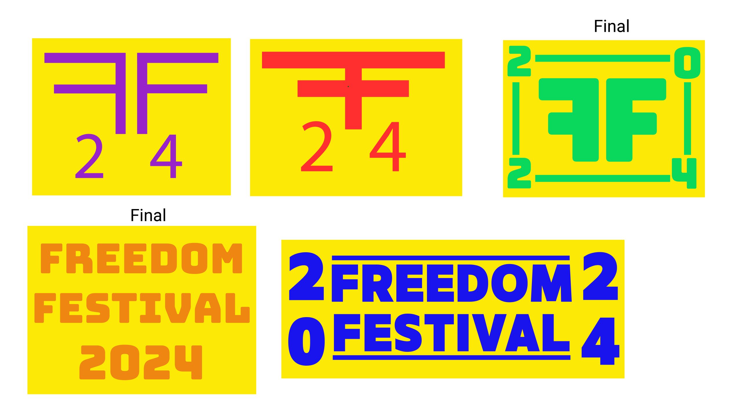
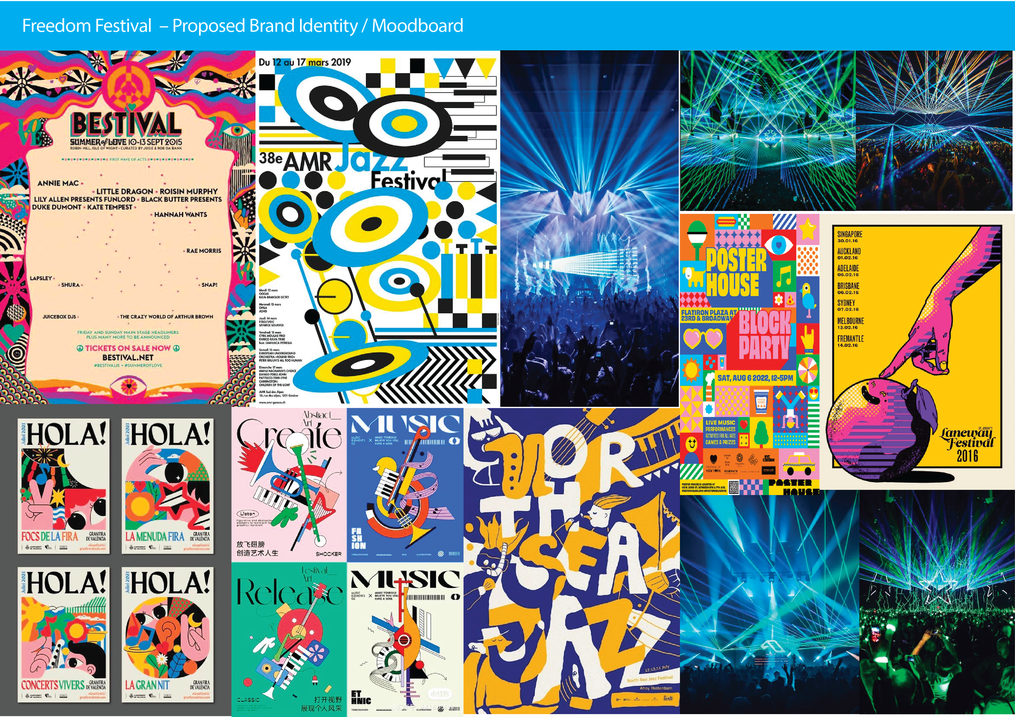
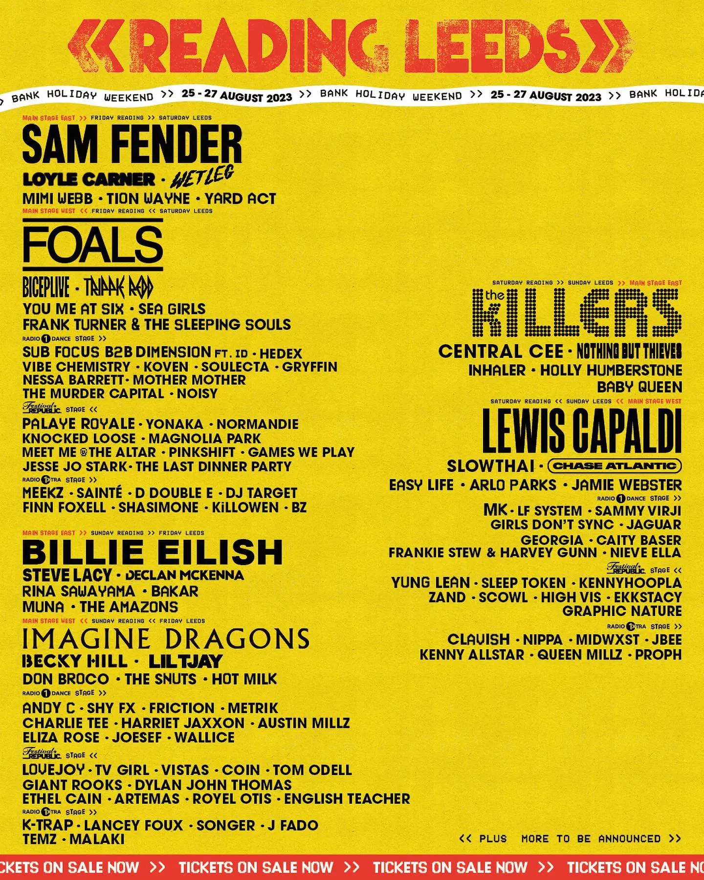
Wireframes for Freedom Festival Website

Wireframes for Freedom Festival

Now I must think of the layout and appearance of the Freedom Festival User Interface. I can do this by using wireframes. I have previously explored some wireframes and ideas, where I tested out different layouts and styles, but I think I could conceptualize something better, after looking at examples of other websites and their layouts. 

Web Paper Wireframe 1
Web Paper Wireframe 2 and 3
Web Paper Wireframe 4 and 5
App Paper Wireframe 1 and 2
App Paper Wireframe 3 and 4
App Paper Wireframe 5

These are some examples of ideas that I considered initially, before being inspired by websites on Awwwards.com. It was also before I had started to think about visual elements, which is why I have decided to create a new wireframe to base my ideas off using the research I have gathered. 

Paper Wireframe

Paper wireframe for web
Paper wireframe for web continued
Paper wireframe for mobile

Starting off, I made these paper wireframe sketches for a low-fidelity prototype detailing how the website should be structured. I made one for both web and mobile to demonstrate how the website would be responsive and can adapt to screen sizes. I decided on a minimal header, with a hero image, heading, call to action and a navigation bar linking to parts of the site. Under this, I worked in sections to add areas such as a gallery of the previous festival, which users can click through horizontally. I then added another section for information about the Festival and its origins, with a call to action button allowing users to continue reading if they wish to. There is then a section for social media updates embedded, where users can follow the festival on other platforms to receive updates and news. At the end of the website is some information about the core funders, and the footer bar. 

To make the site mobile responsive, I condensed the elements inwards, making them more vertical to accommodate the narrow screen layout. For the gallery, I included only one image on the screen rather than three, but kept the option to flick through using the arrows as this saves space vertically and allows the user to interact with the interface for a more compelling user experience. I used vertical stacking throughout the site, such as for the core funders and the footer. This gives each element room to breathe and creates more space as the elements aren’t cramped up horizontally.


Digital Wireframe

Digital wireframe for web
Digital prototype for mobile

I then moved on to create digitized, mid-fidelity prototypes in Adobe XD. I took the same structure from before, but added in actual text – lorem ipsum for copy and paragraphs, and some headings for each section. Throughout this prototype, I used the Roboto typeface at various styles and point sizes to form a representation of how the text may alter the visual hierarchy on the website. The use of columns helped me to place the website elements in order and align them together to be more concise and neat. I was also able to work with straight lines and shapes, which allowed me to see my wireframe in a more orderly fashion. I could see how the interface was starting to come together at this point and build a solid foundation which I could work further on.  

High-fidelity Wireframe

High fidelity mockup of my wireframes
High fidelity mockup of my wireframes on mobile

For the last step in my wireframing process, I made high-fidelity mockups. I used the colours, typography and logos which I had specified before and implemented them into a more detailed mockup of the site. I created some sections using the pen tool and made wavy shapes to separate sections and to bring personality to the interfaces. I kept the colour refrained to a few main colours paired with some accents, as I didn’t want it to look too overwhelming. It is important that the interface expresses liveliness and energy, but doesn’t feel too strong for the user, or too childish with a lot of colour.

 To make the interface more realistic, I have used images from the current Freedom Festival website to get an accurate visual representation of the festival. Using images taken from the festival itself helps me to design in a way that matches their imagery and provides users with information of what to expect at the festival and what kind of acts and events take place. I decided to allow the hero image to span across the screen instead of being in its own box because it felt more ‘free’ and open. Having the image boxed up like in my previous wireframes felt constricting, which isn’t the feeling I want to give users as the festival is all about freedom and expression.

I like how this looks and I can now begin to think of ways that I can make the site interactive and accessible to users.

Rejected Ideas

Paper wireframe for web (rejected idea)
Paper wireframe for mobile (rejected idea)

This was an earlier concept that I came up with initially but decided didn’t work very well for the purpose of this project. It is a paper wireframe for both mobile and web that I never developed further since it wasn’t appropriate for the style I was aiming towards. Previously, my header was split in half for a vertical image and vertical text box to be beside each other, but after reflecting on this I thought it may not give the best first impression to users if they are welcomed with a large text block. I eventually changed this in my later designs, by having the image be the focal point of the header and the text smaller and more concise.

Reference List:

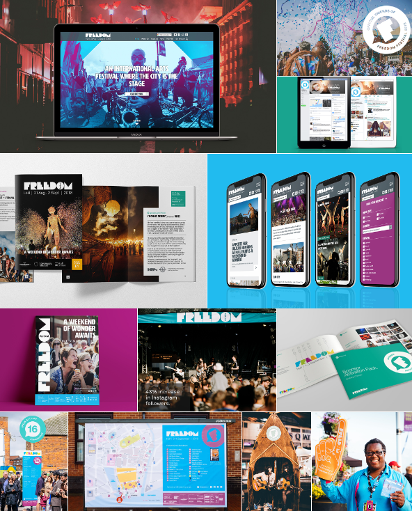
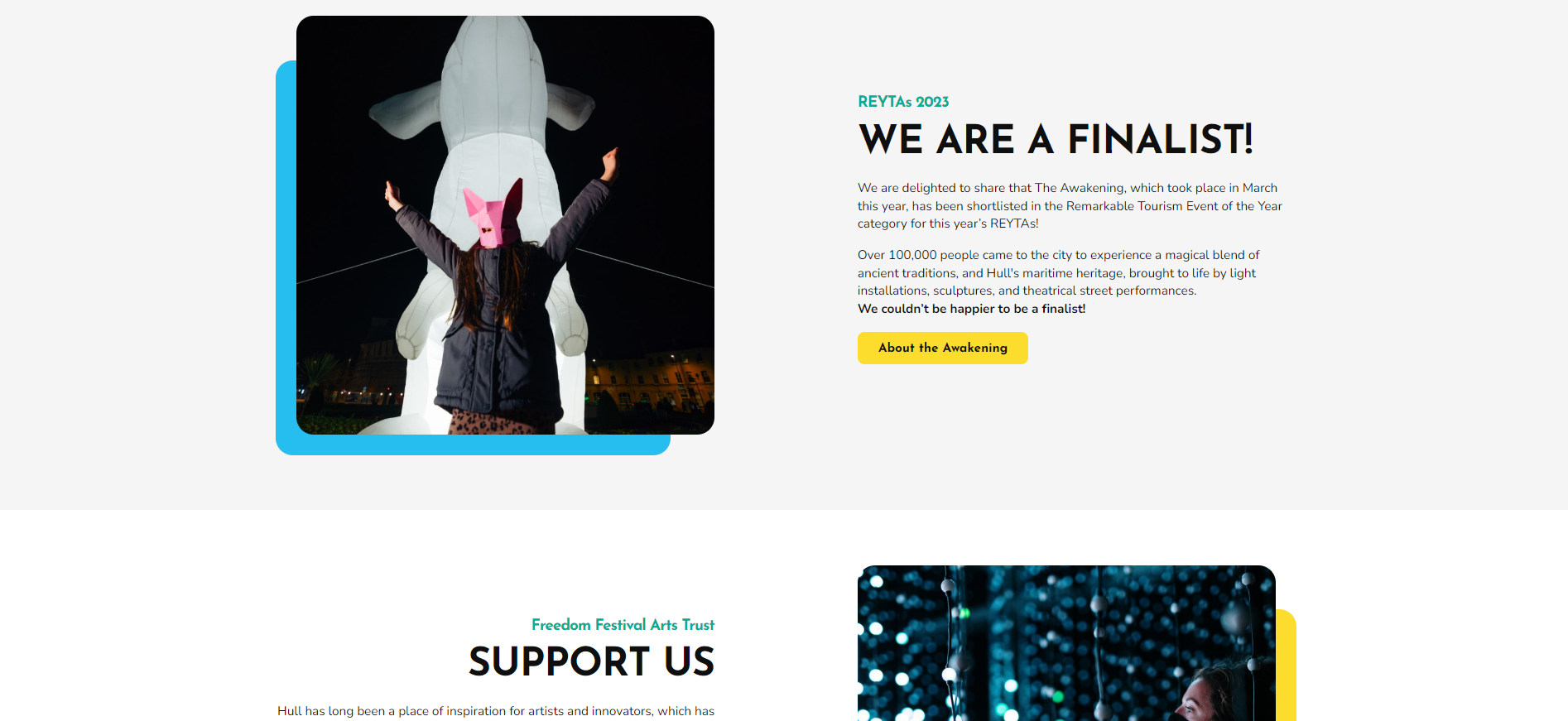
Arran, Tom (2022) The Awakening [Image]. Available online: https://www.freedomfestival.co.uk/what-we-do/festivals-projects/the-awakening/the-awakening-2022/ [Accessed: 18.11.2023]


Unknown (ND) Freedom Festival Moon [Image]. Available online: https://www.freedomfestival.co.uk/what-we-do/our-work2/ffat-gallery/#images-2 [Accessed: 18.11.2023]


Unknown (ND) Freedom Festival Performers [Image]. Available online: https://www.freedomfestival.co.uk/what-we-do/our-work2/ffat-gallery/#images-4 [Accessed: 18.11.2023]


Unknown (ND) Freedom Festival Stage [Image]. Available online: https://www.freedomfestival.co.uk/what-we-do/our-work2/ffat-gallery/#images-13 [Accessed: 18.11.2023]


Unknown (ND) Freedom Festival Street Parade [Image]. Available online: https://www.freedomfestival.co.uk/what-we-do/our-work2/ffat-gallery/#images-33 [Accessed: 18.11.2023]


Arts Council England (ND) Arts Council England Logo [Image]. Available online: https://www.freedomfestival.co.uk/ [Accessed:18.11.2023]


Hull City Council (ND) Hull City Council Logo [Image]. Available online: https://www.freedomfestival.co.uk/ [Accessed: 19.11.2023]


University of Hull (ND) University of Hull Logo [Image]. Available online: https://www.freedomfestival.co.uk/ [Accessed: 18.11.2023]


Insitu (ND) Insitu Logo [Image]. Available online: https://www.freedomfestival.co.uk/ [Accessed: 18.11.2023]


European Union (ND) European Union Logo [Image]. Available online: https://www.freedomfestival.co.uk/ [Accessed: 18.11.2023]


Wykeland (ND) Wykeland Logo [Image]. Available online: https://www.freedomfestival.co.uk/ [Accessed: 18.11.2023]


KCOM (ND) KCOM Logo [Image]. Available online: https://www.freedomfestival.co.uk/ [Accessed: 18.11.2023]


Hull City Wide (ND) Hull City Wide Logo [Image]. Available online: https://www.freedomfestival.co.uk/ [Accessed: 18.11.2023]


Reyta (2020) Reyta 2020 Finalist Award [Image]. Available online: https://www.freedomfestival.co.uk/ [Accessed: 18.11.2023]


White Rose Awards (2020) White Rose Awards 2020 Finalist [Image]. Available online: https://www.freedomfestival.co.uk/ [Accessed: 18.11.2023]


White Rose Awards (2019) White Rose Awards 2019 Silver [Image]. Available online: https://www.freedomfestival.co.uk/ [Accessed: 18.11.2023]


Reyta (2018) Reyta Tourism Awards 2018 Winner [Image]. Available online: https://www.freedomfestival.co.uk/ [Accessed: 18.11.2023]


Hull Lifestyle Awards (2017) Hull Lifestyle Awards 2017 Winner [Image]. Available online: https://www.freedomfestival.co.uk/ [Accessed: 18.11.2023]

Conceptualization of Website Design

Conceptualization of Website Design

Logo

My first rough ideas for my logo

I started off with a few different ideas for the Freedom Festival logo. I found a font called ‘Bungee’ and thought it looked bold and impactful. I was drawn to the blockish type and geometric shapes which make a statement. I could imagine this font on different interfaces and thought it would be easy to read even on small screens as the type is thick and the blocky look defines each letter clearly. 

I chose to use the bottom left because of its simplicity. It is clear and easy to read quickly so the user knows exactly what it is and know they are on the Freedom Festival website. I marked this one and the top left design, which I will use as a secondary logo for small screens and display images on social media.  

My first logo idea
My second logo idea using inline font and after fixing the alignment of the letters
My third logo idea trying out a different colour palette
Another logo idea using a different colour palette
Secondary logo idea one
Secondary logo idea two using inline font and a different colour palette

I developed my two logos further and experimented with colour and font styles. The colours I used were bold and contrasting so that they are visible from afar and create a vivid atmosphere for the festival brand. I chose to use bright colours because the Freedom Festival is creative and celebrates art and culture, which is why bright colours have been used to mimic the pride and the positive atmosphere of the festival.

I also aligned the logo to the left and brought the letters in to create a boxed off shape for balance and order. The uniformity of the edges creates a formal and polished effect. In addition, I tested out the inline version of the typeface, but the lines were really thin and would not be visible at a smaller size. 

I kept my secondary logo the same. It uses the two Fs mirrored, with four edges and the year in each corner. This logo would be used for display images on apps such as Instagram or X/Twitter. Secondary or sub-mark logos are used in places where the format is smaller and you need to communicate your brand quickly to users (Mark Brand Boutique, 2023).

Final Logo Choices

Orange on Yellow Logo 1
Orange on Yellow Logo 2

Typography

When choosing typography for web and screens, it is important to consider things such as legibility and screen size. Some basic rules of typography on web are 1. Don’t use all caps and 2. Keep the number of  fonts to a minimum (DeVos, ND). 

I have chosen one font from Google Fonts that is safe for web. A web safe font is a font that is pre-installed and compatible with screens. According to WIX, web safe fonts are more consistent since they are already installed onto an operating system, so they will load easier (Shwake, 2018).

I have selected the typeface Roboto, which is web safe and comes with various weights and styles, so I can use the font for both headings and body text. The font is clear and can be read at different sizes due to being rounded and wide. The typeface is thinner than the one I used for my logo, so there is an established hierarchy and contrast between the two. To keep fonts at a minimum I will use the different weights for different sections on the website, so it is consistent but organised.


Roboto weights and styles
Roboto is readable at both small and large sizes

Colour

Colour psychology wheel

On web, RGB colours and HEX values are used to define colours. 

A website color scheme is the collection of colors that a designer chooses for their website design. Also known as color palettes, color schemes can include as few or as many colors as the designer sees fit. Each color can be used for a variety of elements throughout the website, meaning the same color may be used for different types of components. ” (Gillis, 2021).

My colour scheme uses colour psychology to create an emotional response in the user when on the website. I used colours like yellow and orange to invoke joy and enthusiasm, and other vibrant colours to show how alive the festival is, such as purple for art and blue for trust and confidence. 


My colour scheme with their HEX values

Layout

For layout inspiration, I looked at Awwwards.com to see examples of award winning festival websites. I found an interesting layout used in a website for Festival of Black Arts and Ideas. The website home page is effective as it uses a video in the background and is kept simple with only four navigation links, which drop down with more links. There is the logo in the center and the entire layout is kept open and spacious. 

As you carry on down, there are different sections and energetic shapes and textures used to add personality and visual engagement. I like how the layers overlap and the loose, cut out effect used throughout the layout.

This inspires me to think about negative space and simplicity when presenting information. Relying on visual elements and only essential text for a more engaging user experience.

Festival of Black Arts & Ideas website landing
Festival of Black Arts & Ideas website

References

Black Arts and Ideas Festival (2023) Black Arts and Ideas Festival Home Page [Screenshot]. Available online: https://www.blackartsandideasfest.com/ [Accessed: 13.11.2023]


DeVos, Jordan (ND) Designing for Readability: A Guide to Web Typography (With Infographic) [Article]. Available online: https://www.toptal.com/designers/typography/web-typography-infographic [Accessed: 13.11.2023]


Gillis, Orlee (2021) 7 Rules for Choosing A Website Color Scheme [Article]. Available online: https://elementor.com/blog/website-color-schemes/ [Accessed: 13.11.2023]


Mark Branding Boutique (2023) what is a secondary and sub-mark logo? [Article]. Available online: https://www.markbrandboutique.com/blog/what-is-a-secondary-logo#:~:text=The%20secondary%20logo%20is%20a%20simplified%20version%20of,you%20must%20resize%20your%20logo%20to%20small%20formats. [Accessed: 13.11.2023]


Shwake, Emily (2018) 30 web-safe fonts and why you should use them [Article]. Available online: https://www.wix.com/blog/web-safe-fonts#viewer-1jlqe [Accessed: 13.11.2023]


Unknown (nd) Colour Psychology Wheel [Image]. Available online: https://www.wordstream.com/blog/ws/2022/07/12/color-psychology-marketing [Accessed: 13.11.2023]


Refreshed brand approach to Freedom Festival 2024

Refreshed brand approach to Freedom Festival 2024

For the Freedom Festival 2024, I am going to refresh the brand identity to suit a more contemporary audience through the use of more modern stylisation and by taking inspiration from current and trending events similar to the Freedom Festival.

The agency who designed the current Freedom Festival brand are Sowden & Sowden, based in Hessle. Their website shows a range of promotional and branding materials for the Festival, such as brochures, logos, mobile and website designs. Their style worked but could be updated to feel more fresh and less family-focused, and instead more ‘cool’ or ‘progressive’. 

Freedom Festival branding designed by Sowden & Sowden
Freedom Festival current visual language

My Proposal

Mood board 1, showing ideas and inspiration for a refreshed Freedom Festival brand.
Mood board 2, showing ideas and inspiration for a refreshed Freedom Festival brand.

My proposed idea for the Freedom Festival is one which is vivid and designed to be loud and creative. Since the festival focuses so much on creativity and the arts, I think a style similar to either of the mood boards I have made above would be effective in showing this, and presenting the festival as something fresh and exciting.

A breakdown of the elements in my mood board

The typography could be expressive and bold,  which would make it stand out. I think the logo could be updated, but still be kept strong to draw in attention. The colours should stay bright and vivid to show creativity and positivity. The illustrations would also be expressive and loose to show the idea of being ‘free’ but also shouldn’t be too childish or cartoonish. This could be achieved by some stylisation and the use of singular flat colours. Finally, the tone of voice should be optimistic but still centred around the community, similar to the current tone of voice that is used.

Ways to promote the event

I think the Festival could explore some different ways of marketing the event also.

Paragon Arcade is known for its local cafes, restaurants and shops.

One method is to work with local businesses, artists and retailers to appeal to people in the area of your event. Collaborations through social media helps to advertise your event and who you are working with, which is beneficial to everyone. Locals will then be drawn to your event and it can bring in a larger audience and interest.


For Freedom Festival in particular, there are many local artists and businesses in the Hull area to work with. An example of this is Paragon Arcade, or Humber Street – areas in the city centre known for their local businesses. Advertisements could go on social media, in shop windows, or even be given to customers in the form of leaflets or flyers

M&M's pop up event in New York used to market their products

Another way to promote the festival is to create experiences that are ‘instagrammable’, or can provide photo opportunities that visitors can share onto their own social medias, or show to colleagues, friends and family. Having your audience show themselves having fun at your event can inspire others to attend, as it seems more reliable and authentic to see people they know at your event. Word of mouth can also feel more natural and less-forced, so more people would be curious in attending.

An example of unique and immersive experiences is M&M’s, who set up ‘Flavour Rooms’, an immersive experience in New York City. The event was visually fun and helped M&M’s reach a larger audience through their attendees social media pages (Becker, 2023)

Synapse have used a countdown to give a sense of urgency to their users, encouraging them to sign up for the event.

In the lead up to the festival, I think that creating a mailing list and allowing users to sign up for updates could create excitement for the festival.

Emails send a notification to users, reminding them of your event and keeping it fresh in their minds.

An example of this is a company called Synapse, who sent emails out to users with a countdown to their event, with a call to action telling the user to ‘register now’. This creates urgency and the countdown emphasises how close your event is. When paired with the call to action, users are more likely to join or register to attend your event out of a fear of missing out on the fun.

This technique is called urgency marketing, and has been proven to work. (Rafalson, 2018).

References

Becker, Braden (2023) 13 Examples of Experiential Marketing Campaigns That’ll Give You Serious Event Envy [Article] Available online: https://blog.hubspot.com/marketing/best-experiential-marketing-campaigns [Accessed: 01/11/2023]


DEANDREW PHOTOGRAPHY (nd) Paragon Arcade, Hull [Image]. Available online: https://www.creativetourist.com/venue/paragon-arcade/ [Accessed: 1/11/2023]


Rafalson, Brandon (2018) 10 Creative Examples of Event Email Promotion [Article]. Available online: https://www.campaignmonitor.com/blog/email-marketing/10-creative-examples-of-event-email-promotion/ [Accessed: 1/11/2023]


Smith, Ellen (2018) Interactive Crunchy Chocolate Pop-Ups [Image]. Available online: https://www.trendhunter.com/trends/mm-popup [Accessed: 1/11/2023]


Sowden & Sowden (2018) Freedom Festival Hull [Webpage]. Available online: https://www.sowden-sowden.co.uk/work/freedom-festival/ [Accessed: 1.11.2023]


Synapse (nd) Synapse Countdown Email [Image]. Available online: https://www.campaignmonitor.com/blog/email-marketing/10-creative-examples-of-event-email-promotion/ [Accessed: 1/11/2023]


Marketing approaches taken by festivals across a multi-channel experience

Marketing approaches taken by festivals across a multi-channel experience

For the next stage in my research, I am looking at the ways other festival events market themselves through a multi-channel experience approach. 


Multi-channel Marketing is a practice which involves reaching an audience through multiple channels, like social media, email, mobile apps, physical print and more. (WIX, nd) Multi-channel Marketing creates a universal user experience and brings consistency and familiarity with users. It also expands your audience as content is shown to users across many different platforms, so more people become aware of your event.

Reading / Leeds Festival Multi-channel Experience

What I have done is looked at Reading and Leeds Festival. I think they make a good example for a multi-channel marketing approach because their brand is well-known and one of the most famous UK festivals.

The Reading Festival website uses the iconic yellow and red and logo.

Their website uses a red, yellow, black and white colour scheme. This is iconic to the festival and is something they have used for many years, and they continue to use it in all their advertising campaigns. Their logo is also iconic, with the two arrows and faded texture. They always use images of the festival and use effects such as collage for a gritty effect and to show the spontaneous feel of the festival.

Reading and Leeds Fest Instagram
Reading and Leeds TikTok
Reading and Leeds YouTube

On their social media accounts they use the same logo and the same username, so they can be found easily by using the same name and image, which is more easy to recognise. They always link to other social media and their website too on their accounts. On the Instagram they use the same style for their story highlights, using the same colours and fonts so it matches and is pleasing to look at.

Reading Festival Poster
Leeds Festival Poster

For posters I noticed that they use red for the Reading Festival and yellow for Leeds Festival. I went back and noticed that they do this on other platforms too, which helps to keep the two events separate. Although they are run by the same people, they are in two locations across the country. so it helps to make it clear which is which so that users don’t get confused between the two. For the posters, they use different sizes of text to bring attention to bigger acts, and to create hierarchy. They also reuse things like the arrows from the logo, but in other areas of the design. The arrows are like a shorthand version of the logo, and are used as an icon in their own way.  

Leeds Festival Merchandise

The merchandise and official shop for the festivals also use the same colours, fonts and the arrow icons. The merchandise shows the festival name, which would promote the event more when the person wearing it is out and other people can see. 


As a whole, the brand uses simple things like colour, icons, type and imagery to be easily recognised. They stand out because they have managed to make a visual identity unique to them, so other people can easily spot them.

Conclusion

This statistic shows the most popular social media platforms as of October 2023. With this information, I can decide which to prioritise when marketing Freedom Festival on social media.

“There are so many different channels that you can find your audience on, and that number is growing every single day.” (West, 2021)


I am going to make a brand language that can be used across all channels, like Reading and Leeds Festival have done. Doing this for the Freedom Festival will mean that users will become familiar with the event and begin to trust it.  Based on the statistic above, I will pick out the most important social media, as well as use web and print methods to promote the festival.

References:

Reading Festival (2023) Reading Festival Line-up Poster [image}. Available online: https://www.google.co.uk/url?sa=i&url=https%3A%2F%2Fwww.newburytoday.co.uk%2Fnews%2Fwhat-to-take-what-not-to-take-what-items-are-banned-at-re-9324274%2F&psig=AOvVaw0iuxmVIo3gae2VMJ-SjMsw&ust=1699300176787000&source=images&cd=vfe&opi=89978449&ved=0CBEQjRxqFwoTCIDRqc3QrYIDFQAAAAAdAAAAABAG [Accessed: 05.11.2023]

Reading Leeds Festival (2023) Leeds Festival Line-up Poster [Image]. Available online: https://www.google.co.uk/url?sa=i&url=https%3A%2F%2Fclunkmag.com%2Freading-leeds-2023-line-up-yard-act-sleep-token-and-arlo-parks-announced-in-second-wave-with-over-70-names-added%2F&psig=AOvVaw2Ota7VPrCBz0Mitv6Gjqjf&ust=1699300318865000&source=images&cd=vfe&opi=89978449&ved=0CBEQjRxqFwoTCJC_-pDRrYIDFQAAAAAdAAAAABAE [Accessed: 05.11.2023]

Statista (2023) Most popular social networks worldwide as of October 2023, ranked by number of monthly active users [Image]. Available online: https://www.statista.com/statistics/272014/global-social-networks-ranked-by-number-of-users/ [Accessed: 05.11.2023]

West, Chloe (2021) Multichannel marketing: What is it and how to start using it effectively [Article]. Available online: https://sproutsocial.com/insights/multichannel-marketing/ [Accessed: 5.11.2023]

WIX (nd) Multi-channel Marketing [Article]. Available online: https://www.wix.com/encyclopedia/definition/multi-channel-marketing [Accessed: 1/11/2023]

Analysing previous Freedom Festival websites

Analysing Previous Freedom Festival Websites

Now, I will take a look at how the Freedom Festival website has changed over the years. I am doing this so that I can see what is important to the design and function of their website.


I have used the Wayback Machine website to collect screenshots of old Freedom Festival websites. This is a website which archives different webpages and lets you look back through different years at websites. 

2012

Freedom Festival 2012 website
Freedom Festival 2012 website information page
Freedom Festival 2012 website events page

This is how the website looked in 2012 for Freedom Festival. This website style is clearly outdated and more simple compared to the websites we see today. This design is split into small block sections, and there isn’t a lot of white space, so there seems like there is a lot of information in the space. 

I notice that the colour purple stands out a lot, and it is paired with black. I don’t think this is a good choice of colour as it seems quite dull and makes the festival seem lacklustre because of it. The navigation also doesn’t work well since some of the titles float in the middle and it makes the boxes seem too big in comparison, which throws off the overall look. 

There is a countdown to the next Freedom Festival, which looks a bit dull also. It doesn’t seem exciting and the graphic style is outdated. It is a similar colour to the background, so becomes lost. The social media icons are also outdated, but that is because it is the 2012 designs, and some of these sites aren’t popular no more.

There is an overall lack of contrast, which brings the hierarchy down. The typography is a bit plain and does not really stand out to me. For the ‘Why Freedom’ page, there is too much space, where I think an image should have maybe gone to add some more interest to this section. 

For the events section of the website, I noticed that some of the boxes are different in size, which looks messy and breaks the grid used. I think these sections could have been condensed so that they line up, which would look better because it is more ordered.

2016

Freedom Festival 2016 website
Freedom Festival 2016 website projects page
Freedom Festival 2016 website news page

This is how the website looked in 2016 for Freedom Festival. This version looks better because it is more bright and vivid, which shows more personality for the festival. The black text against white is also easier to read and there is more clear use of a grid. 

In the grid, there are sections of different sizes to show importance and make you look to the important sections first. The variation is also fun, but it works because each section lines up and still respects the grid layout. Hero images are also used for different pages, which helps to break up the large bits of text, where before there was no images and just text which left too much empty space. 

The typography is still simple, but more rounded and uses different point sizes to create hierarchy. More simple fonts work better on screen because they are easier to read at smaller sizes, which is why sans-serif type is used a lot in web.

The colours of the logo have also been used throughout the website, which looks cohesive. The navigation also becomes highlighted with these colours to show what page you are on, which shows attention to small details and ties the design together. 

The navigation is neater and less blocky now, it instead sits in line with the logo at the top of the screen, making it easier to use the website properly.

2023

Freedom Festival 2023 website
Freedom Festival 2023 website sections
Freedom Festival 2023 latest news

This is the most recent Freedom Festival website. It is very different from the other two. 

The first thing you notice is moving images when you open the website. This provides a visual idea of what the festival stands for, without having to tell us with words. The logo is also displayed over this, really large which shows importance. The logo is now a solid colour too, rather than a multi-colour design. Blue is also an accent colour throughout the website. 

Call to action buttons are also used more, and take you to new parts of the website. When you scroll down, there are different sections and short information with one of these buttons, which let you find out more about each section. These sections use white space and feel breathable which is effective and allows viewers to break down information easier. 

Use of bold fonts create hierarchy and colour brings attention to things such as images or buttons. This website flows better and seems more interactive with the use of moving images and hover animations on the navigation.

The news section is also refined and uses less rows to present information, so there isn’t too much all squeezed together. Like the 2016 website, there is also a hero image which introduces the page and breaks up the layout so you don’t have loads to look at right away.


Conclusion.

Now I have looked at previous designs of the Freedom Festival website, I am able to decide what to keep in my own design. To decide this, I am thinking about what has stayed over the years, and things which I think are unique or creative to the festival.

The elements that I will keep in my own design are:

  • Social media icons
  • Logo and navigation bar
  • Moving images / GIFs
  • Call to Action buttons
  • Accent colours
  • Grids to arrange events / news sections

I will also keep similar information such as the dates and location of the Festival. I will also use similar imagery to show what’s on and keep the same sections shown in the navigation, ect. 

Examination and Analysis of Other Festival Websites and Apps

Examination and Analysis of Other Festival Websites and Apps

For this project, I have been asked to come up with a refresh for the Freedom Festival brand, including a new web design. Before I start to design, I will look at other festival’s websites and apps for inspiration and to see what key features I should think about when I make my own for the Freedom Festival 2024.

Your events website is important for promoting your website because it has all the information that visitors should know. If your website is designed poorly, and visitors cannot access this information, then you may lose interest or confuse the visitor.

Glastonbury Festival

Glastonbury Festival website as of 2023.

To start off, I have took a screenshot of Glastonbury Festival’s website. I think that this website uses a column grid, with large margins on either side. I think this because each section of the navigation is equal in width going across the top of the page, with the main section also taking up the same amount of space as the navigation, which has caused them to be aligned. 

The use of a grid has meant that there can be hierarchy and order, and also allows creative choices, such as the varied heights in the navigation bar, and the varied text alignment in the lower section. These choices work because they fit the guides still, and the website flows easily. The guides help the designers know where to place design elements without losing hierarchy or shape (Galvan, nd)


Glastonbury website on a mobile phone

For the mobile website, I think they have also used a column grid similar to the main website design. The elements still line up but have had to become stacked so that they fit on a smaller device. Because the navigation is so long, there is a burger menu at the top right. This makes the website more organised and means that there isn’t lots of information squished into a small space.

You can see that the design is the same. They use the same logo, illustration, colours and typography. The consistency makes the website recognisable and makes sure visitors can tell they are on the same website even if the layout is slightly different.

Glastonbury mobile app design

And now I have looked at the Glastonbury app for mobile. I think that the app is confusing because it doesn’t look like the main website or mobile website. The colours, typography and imagery are completely different and misguiding. Even the logo is a Vodaphone logo, and not the Glastonbury one. This inconsistency is not good, because it could make the user feel untrustworthy and that it is a fake app. 


“Consistency is the key to successful branding. And consistency goes beyond the product itself. The brand promise must be clear with every interaction each stakeholder experiences.” (Arruda, 2016).

This app doesn’t reflect the same ideas as the website, and is unclear because of this. This is why it is important to aim for consistency across platforms, which can be done through similar visuals and design choices.

Mobile First Website Design

Something a lot of companies do now is use mobile first design to create their websites. This is because recent years show that over 50% of web traffic comes from mobile, so it is now being prioritised as it is the most popular way of viewing sites. 

Designing for mobile first means that you can work your way up from the smallest screens, and add in more elements as you go up, instead of working on large screens first and being forced to compromise design choices. (Unadkat, 2023)

Global mobile web traffic 2012-2022

This chart shows how much share of traffic mobile phone devices have taken in the past 10 years. You can see how it has risen over the years, which proves its importance.

Conclusion

For the project, I want to make sure that I use clear grids to form hierarchy and shape. I will also use grids to form similar layouts on different platforms. I also want to keep visuals consistent too by using the same elements, which will make the Freedom Festival clear and trustworthy to stakeholders. I also want to take a mobile-first design approach to make sure the website will work across screens effectively.

References:


Arruda, William (2016) Why Consistency Is The Key To Successful Branding [Article]. Available online:https://www.forbes.com/sites/williamarruda/2016/12/13/why-consistency-is-the-key-to-successful-branding/ [Accessed: 29.10.2023]


Galvan, Monica (nd) How To Use A Grid In Web Design [Article]. Available online: https://www.flux-academy.com/blog/how-to-use-a-grid-in-web-design [Accessed: 29.10.2023]


Oberlo (2023) WHAT PERCENTAGE OF INTERNET TRAFFIC IS MOBILE? [Image]. Available online: https://www.oberlo.com/statistics/mobile-internet-traffic [Accessed: 29.10.2023]


Unadkat,  Jash (2023) Mobile First Design: What it is and How to Implement it [Article]. Available online: https://www.browserstack.com/guide/how-to-implement-mobile-first-design [Accessed: 29.10.2023]

Big Green Bus

Big Green Bus Mini Brief

Mood Board for E Bus ideas
Initial sketches for E Bus
Initial sketches for E Bus 2
E Bus refined concept ideas
E Bus logo 1
E Bus logo 2, alternative
E Bus promotional image
E Bus promotional advert
E Bus animation storyboard

This work was done in collaboration with Ashleigh Kareen

BRIEF:

Over the course of Semester 1 during the Art Direction Advanced Web Design module you will becreating an integrated brand communication campaign to promote and communicate next year’sFreedom Festival. As a warm up challenge you are being tasked with a mini 1 week brief, that willalso be a digitally enabled campaign to encourage residents and visitors to Hull to use publictransport, rather than drive within the city. Air quality particularly in urban areas is an increasingconcern all over the world, as is the cost of living for ordinary people in the UK.

In response to this Hull City council are launching a new electric powered bus service within the city,which will be known as the Big Green Bus*?! Fares will be heavily discounted £1 for anywherewithin the city, commuters will be encouraged to use the new big green bus* card which offersfurther discounts and benefits. The advantages of this service are obvious: cleaner, greener travelat an affordable price for residents and visitors to the city.

For this mini 1 week brief, you are tasked with creating a digitally enabled online campaign that willencourage people to use public transport (The Big Green Bus*) in Hull rather than drive in responseto environmental concerns: air quality, sustainability and to help alleviate cost of living issues.

The brief is open but it must be digitally enabled: Think online banner ads, SM posts on Facebook,Instagram, Twitter (X), Threads etc. There could also be experiential & environmental applications:digital / video projections, a lenticular** billboard or adshel posters. Think about the customerexperience, how will residents find out about the offer and receive the key messages / call to action.

At this point the idea is the most important thing, don’t worry about how to actually create it if youdon’t have the appropriate digital skill-sets yet. Visualise your ideas, so we can understand yourthinking and what your proposing. It could be communicated via typography, iconography,illustration, photography / video. It could utilise audio, animation / moving image, think aboutthe tone-of-voice of your campaign, is it informative, friendly, local, quirky?

*If you have ideas for a better brand name than The Big Green Bus, please do propose alternatives.


What we have produced:

– Mood-board

– Typographic Logo / Illustrative Logo Mark

– Web Ads / Banners

– Storyboard For An Ad

– Animated Ad Video

Website Appearance and Responsive Mode

Website Appearance and Responsive Mode

This is how I have decided to layout my website content, following one of the sketches I did in my prototype stage.

I have now completed my final design for my website portfolio and I have created all my content to go in it.

The idea from my layout was one that I did in my paper prototypes, with the images swapping sides. I made a few adjustments so that it worked better, like keeping text to all one side. I kept the text all to the left besides the original art and above my recreation. This way is better as the user can view it in an upside down L shape from Original-Text-Redesign, which creates a natural viewing flow and is more pleasant.  

To make the experience more fun, I have used motion effects to make the content for each section float in as you scroll down to it. I had to be careful to not go too overboard, since motion effects can easily become too annoying or distracting for the users. This is supported by Page Laubheimer, who says, “when UI animations are subtle, unobtrusive, and brief, they can improve the user experience and can communicate feedback and state changes, prevent disorientation, and strengthen signifiers. But they should not be overused, as they can easily become overwhelming and distract users.” (Laubheimer, 2020). 

I think this is true, so I have only used it to introduce new sections and to create more progression in my website.

The colours I have used are black, white, dark blue, and light blue. I wanted a professional and clean appearance and didn’t want too much colour to distract from the designs. I used white for regular text, black for the website title, dark blue for the background and light blue for links. I also chose to use one font, which was a sans-serif clear font that can be easily read on screens.


At the top of my portfolio website I added contents. This is so users can jump to sections if they are looking for something specific

At the top of my website is the name and a little subtitle which tells the user what my website is for.

I didn’t like that my website opened and straight away, you see all the content and artwork. It felt a bit rushed and I wanted to add something before this so that you aren’t jumping right into everything. Also, this way the motion effects wouldn’t all start as soon as you open the page, which may be offputting.

I instead just made a contents, which is placed in the centre to avoid an unbalanced space as the text reads down. I just put the artworks in order and linked each title to the section so users can click to a point. This also brings in the timeline aspect a little bit better as you can see everything all at once in order.

A reference list at the end to show where the art is from

At the end I put all my references. I had found my artworks in a book, but downloaded the images online, so I cited the online websites since I used those downloaded photos. 

I added the references to give proper credit to the original art and to make it clear they were outside sources. I used Harvard referencing for this.

Top of my website on mobile
How my website looks on mobile

I then finally made sure my website was responsive on mobile. Most users now view sites on mobile (Interactive Design Foundation, nd), so making it responsive is important. Because my website was already quite simplified in layout, the only thing that really needed changing was the heading. I made the heading smaller and centred the text to read better on mobile. The rest of the content automatically stacked on each other and worked well on mobile.

References:


Interactive Design Foundation (nd) What is Responsive Design? [Article]. Available online: https://www.interaction-design.org/literature/topics/responsive-design [Accessed: 07.05.2023]


Laubheimer, Page (2020) The Role of Animation and Motion in UX [Article]. Available online: https://www.nngroup.com/articles/animation-purpose-ux/ [Accessed: 07.05.2023]

Design Portfolio

The Studio

By Aubrey Beardsley, 1895

The Studio - Aubrey Beardsley, 1895

To make this into a modern website design, I have taken inspiration from the medieval and gothic appearance to make a tattoo website. I drew banners to place text headers in and I used a black and white colour palette for the inky look. I used AI generated photos of tattoo designs to create an image gallery for a portfolio section  and used boxes to create structure like in the original art. My inspiration was the illustrative ink style, which reminded me of tattoo line work.

My website design inspired by The Studio by Aubrey Beardsley

Simplicissimus

By Thomas Heine, 1897

Simplicissimus - Thomas Heine, 1897

To make this into a modern website design for a pub, I have cropped the dog’s head and made it into a logo icon. The original art uses only a few elements, so to match the minimalistic look of this poster, I have replaced the menu with a hamburger icon for a more simplified look. I illustrated a beer glass and made it look reflected for depth and I chose a similar, slightly imperfect font to create a heading text aligned opposite the illustration. I added an arrow to direct visitors on the website and used a similar refined colour selection to the original art.

My website design inspired by Simplicissimus by Thomas Heine

AEG Lamp

By Peter Behrens, 1910

AEG Lamp - Peter Behrens, 1910

To make this into a modern website design for a light appliance brand, I’ve made similar geometric shapes using a dotted brush for an elegant and classical look, it also reminded me of detailing seen on hanging chandeliers. I have created a drawing of a lightbulb and placed it in the middle, illuminating the centre outwards and creating focus, where I have added a heading and a button using the same golden style as the text boxes in the original, which I added an inner glow to for depth and shine to feel more luxury. I used serif typefaces for a fancier and more classic look and created a menu with different product types on next to the logo.

My website design inspired by AEG Lamps by Peter Behrens

Blast No.1

By Wyndham Lewis, 1914

Blast No.1 - Wyndham Lewis, 1914

To make this into an energy drinks website, I have been inspired by the dynamic angles and the energetic fonts and used these in my own design. I made this as a pop up ad for their new drinks flavour, which is berry. I used the pink colours to show the flavour and added drink splash illustrations framing the text. I added a cross so the window can be closed, and a button which takes you straight to the product. I also made a faint gradient from the middle to create depth and draw the eye in as I noticed that the original artwork is also darker around the edge.

My website design inspired by Blast No.1 by Wyndham Lewis

BOSCH

By Lucien Bernard, 1940

BOSCH - Lucien Bernard, 1914

To make this into a modern website design for a music streaming service, I have used the colours to make a navigation banner. I used a similar typeface to make the logo and illustrated a microphone which was shining like the item in the original art. I used my own photographs to create images for different playlists, and arrows to swap between them. I made the middle one bigger to show that it is the one playing. I added a bar to show how long the playlist has left, and used the same orange and purple colours to match the top of the website.

My website design inspired by BOSCH

08 Kriegsanleihe

By Julius Klinger, 1918

08 Kriegsanleihe - Julius Klinger, 1918

To make this into a modern website design, I have recreated the dragon illustration and used it for a Chinese restaurant website. I used the same limited colour palette and placed the illustration at the right of the frame so it stood out. I also found a font which was condensed and serif like the original. To break the website up, I used lines which were similar to the arrows of the original. I added a menu to the bottom left, which continues off screen, and an order button at the top left to add balance. I also added a phone number in case some people would prefer to ring instead of order online.  

My website design inspired by Kriegsanleihe by Julius Klinger

Soaring To Success

By Edward McKnight Kauffer, 1918

Soaring To Success - Edward McKnight Kauffer, 1918

To make this into a modern website design for office supplies, I took inspiration from the triangular shape of the birds. This reminded me of stationary found in an office. I used the same colours for my own design, adding strokes to match the border on the artwork. I used an AI generated image of an office desk and placed text for a sale right in the centre to fill the spacious area. I created triangular shapes pointing inwards to the text to lead the eye in, and I added a shadow to them so they looked part of the image. I added icons for the navigation and a search bar too. I used a similar style of font to match the original but to also create a formal feeling which is suitable for an office.

My website design inspired by Soaring To Success by Edward McKnight Kauffer

IT IS WARMER DOWN BELOW

By Austin Cooper, 1924

IT IS WARMER DOWN BELOW - Austin Cooper, 1924

To make this into a modern website design, I have created a landing for a music festival website. The squares of the original inspired me to create an illustration which shows audio soundwaves, using the same gradient colours to show the volume getting louder. I also made speaker illustrations at either side, creating balance and symmetry. I cropped part of the original to form a logo for the festival and added a hamburger icon to avoid cluttering the composition as it was busy. I found a similar typeface and added a large heading and a button to buy tickets. I kept the overall colour palette the same and tried to create an energetic feel.

My website design inspired by IT IS WARMER DOWN BELOW by Austin Cooper

Rural Electrification Administration

By Lester Beall, 1937

Rural Electrification Administration - Lester Beall, 1937

To make this into a modern website design, I used the imagery to create a website for a solicitors. I used similar shapes and colours, like the diagonal orange shape, to cut the composition and create a dramatic edge. I made arrows which pointed through the top right corner to form leading lines and pointed them to the heading, and an recreation drawing of the house. I made the heading about buying a house to make sense with the illustration. I used a heavy sans-serif font for intensity and added a hamburger menu to the top right corner.

My website design inspired by Rural Electrification Administration by Lester Beall

Fortune

By Joseph Binder, 1938

Fortune - Joseph Binder, 1938

To make this into a modern website design, I have took the same colours and glowing effects to make a website for a betting organisation. I used a blue background, which is glowing in the centre, and added boxes to create sections. I made the boxes a dark gold and used the same dark blue for the text and to add contrast. I added a sign up section and a navigation below, showing different sports to bet on. I showed upcoming football matches, with a large button to bet now, and illustrated team shirts to show who’s playing. To match the stars and the glow, I used flare brushes and bokeh brushes to create a similar glowing effect, which felt shiny and appealing.

My website design inspired by Fortune by Joseph Binder

References

Bealle, Lester (1937) Rural Electrification Administration [Image]. Available online: https://www.google.com/url?sa=i&url=https%3A%2F%2Fwww.rit.edu%2Fpress%2Flester-beall-poster-radio&psig=AOvVaw21IDVHOx8ExmI-tQmrRp_f&ust=1683499964048000&source=images&cd=vfe&ved=0CBAQjRxqFwoTCPjg9pzk4f4CFQAAAAAdAAAAABAE [Accessed: 06.05.2023]

Beardsley, Aubrey (1895) The Studio [Image]. Available online: https://www.google.com/url?sa=i&url=https%3A%2F%2Fen.wikipedia.org%2Fwiki%2FThe_Studio_%2528magazine%2529&psig=AOvVaw27TSxLjmqPld501mKmSHCM&ust=1683500160690000&source=images&cd=vfe&ved=0CBAQjRxqFwoTCMD48_nk4f4CFQAAAAAdAAAAABAE [Accessed: 06.05.2023]

Behrens, Peter (1910) AEG Lamp [Image]. Available online: https://www.google.com/url?sa=i&url=https%3A%2F%2Fsmarthistory.org%2Fpeter-behrens-turbine-factory%2F&psig=AOvVaw26YZcpCBTyYxgEOboLIVSj&ust=1683500032788000&source=images&cd=vfe&ved=0CBAQjRxqFwoTCPiI3bzk4f4CFQAAAAAdAAAAABAE [Accessed: 06.05.2023]


Bernhard, Lucien (1914) BOSCH [Image]. Available online: https://www.google.com/url?sa=i&url=https%3A%2F%2Faudradesigns.wordpress.com%2F2019%2F01%2F24%2Fplakatstil-sachplakat%2F&psig=AOvVaw0UBIUf3_h4IyflvUfdzk8k&ust=1683500332913000&source=images&cd=vfe&ved=0CBAQjRxqFwoTCOjAoczl4f4CFQAAAAAdAAAAABAE [Accessed: 06.05.2023]


Binder, Joseph (1938) Fortune [Image]. Available online: https://www.google.com/url?sa=i&url=https%3A%2F%2Feyeondesign.aiga.org%2Fseminal-designer-joseph-binder-is-proof-that-even-legends-escape-wikipedias-notice%2Ffortune-magazine-joseph-binder%2F&psig=AOvVaw3fIU7e7eVoCUO0lCQIKBr5&ust=1683500425485000&source=images&cd=vfe&ved=0CBAQjRxqFwoTCJjH6ffl4f4CFQAAAAAdAAAAABAE [Accessed: 06.05.2023]


Cooper, Austin (1924) IT IS WARMER DOWN BELOW [Image]. Available online: https://www.google.com/url?sa=i&url=https%3A%2F%2Fwww.ltmuseum.co.uk%2Fcollections%2Fcollections-online%2Fposters%2Fitem%2F1983-4-1662&psig=AOvVaw0iwMPCRA0IyWFRpMHbMiwT&ust=1683500498675000&source=images&cd=vfe&ved=0CBAQjRxqFwoTCMj4kZvm4f4CFQAAAAAdAAAAABAE [Accessed: 06.05.2023]


Heine, Thomas (1897) Simplicissimus [Image]. Available online: https://www.google.com/url?sa=i&url=https%3A%2F%2Fwww.art-prints-on-demand.com%2Fa%2Fheine-thomas-theodor%2Fsimplicissimus-1-1.html&psig=AOvVaw0zMrmG_JAgW2eYaShA0R-e&ust=1683500623743000&source=images&cd=vfe&ved=0CBAQjRxqFwoTCID-4Nbm4f4CFQAAAAAdAAAAABAE [Accessed: 06.05.2023]


Kauffer, Edward McKnight (1918) Soaring To Success [Image]. Available online: https://www.google.com/url?sa=i&url=http%3A%2F%2Fwww.artnet.com%2Fartists%2Fedward-mcknight-kauffer%2Fsoaring-to-success-daily-herald-the-early-bird-on-CIpDCY82GRo5eXB0-N_PKQ2&psig=AOvVaw0mAneMPB0dag2SbHmSdA5z&ust=1683500720056000&source=images&cd=vfe&ved=0CBAQjRxqFwoTCMCz14Tn4f4CFQAAAAAdAAAAABAE [Accessed: 06.05.2023]


Klinger, Julius (1918) 08 Kriegsanleihe [Image]. Available online: https://www.google.com/url?sa=i&url=https%3A%2F%2Fcommons.wikimedia.org%2Fwiki%2FFile%3AJulius_Klinger_WWI_poster.jpg&psig=AOvVaw3mrOtsTJYL0fOpcqP8qKnp&ust=1683500842906000&source=images&cd=vfe&ved=0CBAQjRxqFwoTCOj8or_n4f4CFQAAAAAdAAAAABAE [Accessed: 06.05.2023]


Lewis, Wyndham (1914) Blast No.1 [Image]. Available online: https://www.google.com/url?sa=i&url=https%3A%2F%2Fen.wikipedia.org%2Fwiki%2FBlast_%2528magazine%2529&psig=AOvVaw0SZS_I_O8U1RZhOSP17tNd&ust=1683500908819000&source=images&cd=vfe&ved=0CBAQjRxqFwoTCLjH2d7n4f4CFQAAAAAdAAAAABAJ [Accessed: 06.05.2023]

Planning My Website Layout

Planning My Website Layout

I have made quick low-fidelity sketches on paper to help come up with ideas for layouts on my website.

Low fidelity prototypes are good to use in website design because they’re fast to make and can be easily changed (Tan, 2021). I have done eight sketches, where I tried to think of different layouts each time so that I had lots of ideas down.

Layout ideas for my website

These are my sketches. I started off with the most basic idea and tried to get more adventurous as the sketches went on. I also thought about the websites I had looked at before and included things that I thought worked well in them. Some of these ideas wouldn’t work as well as others, but I was trying to come up with as many different options in a quick time. 

My favourite is the second one, where the images alternate sides. I was inspired by the Chelsea FC website from before, which used this layout. I would like to also include motion effects too so that things fade in as you go through the website. 

Another idea that I did try was to create a horizontal scrolling page. I thought that it would be unique and a fun experience for visitors on the website. Unfortunately, this didn’t work and the page kept rotating to be vertical. The tutorial I tried to follow used custom HTML and I wasn’t sure how to fix this problem, so I had to instead forget this idea. 

A failed attempt that didn't work out for me

Because of this setback and time constraints, I am going to create my website in the style I mentioned earlier, with alternating sides. I am going to try to add animation and motion effects to make the design less simple and more interesting to use for the viewers.

References:

Tan, Fredo (2021) The Differences Between Low Fidelity vs. High Fidelity Prototyping [Article]. Available online: https://www.protopie.io/blog/low-fidelity-vs-high-fidelity-prototyping [Accessed: 04.05.2023]