Website analysis

Analysing websites

I have analysed some websites which had interesting timelines and ways of displaying information. This is to create inspiration and to see if there is anything I could do for my own website.

Chelsea website homepage

This is a screenshot taken from the official Chelsea Football site. This site is effective to use since you can clearly make your way around the site, with headings leading to different areas like the shop, news, and ticket purchases. There is a slideshow which plays when you come onto the website, which tells you all the recent team news. The slideshow moves on its own but you can also click on the little bars to check it out yourself. The layout is well organised and easy to navigate.


I like the slideshow and I think it could be something I could include in my website. I could use a slideshow to show each design and make a timeline out of it. 

Cadbury's chocolate website timeline

This is the Cadbury website. There is a timeline which guides you through the history of Cadbury. The timeline is easy to find through the bar at the top of the page, showing different headings. There’s a large image with some information on how to use the timeline, and a back button to take you to the previous page. The timeline itself sits under this, and allows the user to scroll down, showing the year on the sidebar. Instead of having the time frames arranges in one long row, there are a few grouped horizontally, which means you don’t have to scroll as much. There are also photographs from the time frame, which are interesting and help show how far back Cadbury goes. It’s very straightforward and can be figured out quite easily. You also feel more safe since the website is well made and doesn’t appear to be unreliable.


I like the way that there is a section at the top which introduces the page. This could be something I use for my website. I don’t think the format of the timeline would work though as mine will include more information like text and images.

Alton Towers website timeline

Alton Towers also shows a timeline of its history. This timeline is laid out differently and feels more structural. As you scroll down, you see varied blocks of text and type, which section off different time frames. This website also feels easy to navigate and is simple to use as you just have to scroll down, since it is arranged as a single row. 


I like this timeline and how it switches sides as you scroll which keeps the website varied and interesting. I might use a similar template for my own website and use the alternating layout to display the art and then the design based off of it. 

References:


Alton Towers Timeline (Website). Available online: https://www.altontowers.com/about-alton-towers/heritage/ [Accessed: 05.02.2023]


Cadbury Our Story (Website). Available online: https://www.cadbury.co.uk/our-story [Accessed: 05.02.2023]


Chelsea FC (Website). Available online: https://www.chelseafc.com/en [Accessed: 05.02.2023]

User Needs and Journey

User Needs and Journey

To know the user needs, you need to know the users problem. The problem my users face are that they need a resource for art history links in web design, but there aren’t many adequate existing resources which cater to a large audience. According to Simplicable.com, user needs are defined as ‘a process of engaging users to understand their problems, goals, and preferences’ (Spacey, 2018). 


Some common user needs include:

  • Efficiency 
  • Accessibility 
  • Convenience 
  • Learnability 
  • Stimulation
  • Visual Appeal
  • Information

So, if I use this list as a checkpoint for my website, I should already cover a lot of common user needs. 

To do this, I can create a website design that is easy to learn, and provides sufficient information in a digestible format. I can also use visual elements such as colour, motion effects, and typography to create visual appeal and stimulation for the user. By doing this, I will be able to form a straightforward, enjoyable user experience which is effective for users of different abilities and preferences.


A user persona sheet for a student
A user persona sheet for a teacher

As a way to help create a better understanding of the user needs, I have made some persona sheets which offer a more personal insight into the needs of the websites users. Using persona sheets can create context and humanises the users so that you can understand them better and connect more with their emotions and needs. Having this information down allows you to make more informed and design accordingly to their needs (UXDesignInstitute, nd)

User Journey

The user journey is the journey the user will take to reach their goal. The main goal of my website is to provide information to users, so their user journey should ideally lead to them finding this information.

Here, I have mapped out my ideal user journey.

A user journey map for my website

The ideal user journey is simple. It begins with the user finding my site, scrolling through and then finding the information that is relevant to them and art history. Then they leave the website, happy and calm.

I need to make sure that this happens, so I need clear direction on my website, and I should avoid having too much crazy effects happening so that the user isn’t frustrated. I want my website to be quick and easy to use, so that it is the most convenient and helpful as it can be.

References:


Spacey, John (2018). 35 Examples of User Needs (Article). Available online: https://simplicable.com/design/user-needs [Accessed: 30.04.2023]


TeachInScotland (2023) Mathematics Teacher [Image]. Available online: https://teachinscotland.scot/secondary/mathematics/ [Accessed: 30.04.2023]


UniKit (nd) Student [Image]. Available online: https://www.google.com/url?sa=i&url=https%3A%2F%2Fwww.unikitout.com%2Fblogs%2Fstudent-info%2Feverything-you-need-to-know-to-prepare-for-university&psig=AOvVaw3fcBd3ByLskOpjB8ROAdpL&ust=1683671983903000&source=images&cd=vfe&ved=0CBAQjRxqFwoTCOjpi4bl5v4CFQAAAAAdAAAAABAE [Accessed: 30.04.2023]


UXDesignInstitution (nd) What are UX personas and what are they used for? [Article]. Available online: https://www.uxdesigninstitute.com/blog/what-are-ux-personas/#:~:text=A%20UX%20persona%20is%20a,and%20make%20design%20decisions%20accordingly. [Accessed: 30.04.2023]


DRB 1: Modern retro collage and Christiana Coucerio

DRB 1: Modern retro collage and Christiana Coucerio

A collage by Julien Picaud, showing two children holding rifles. This collage is very powerful, and I interpret its message to be about gun control, and how guns are sometimes seen as toys, and not deadly weapons.

Modern retro collages are contemporary collages which use imagery that is vintage, or vintage-inspired. The results are often strange and unusual, creating a new meaning by taking multiple images and altering them into a new one.

Retro collages can be made by hand, digitally, or by using a mixture of both methods. They are modern as they use new techniques and technology to create collages that appear to be retro inspired.


A collage made by Christiana Couceiro which shows a tank.

Christiana Couceiro is a Portuguese artist who makes modern retro collages. Here is some of her work above. In her work, she uses colours such as blue, yellow and green against a pale off-white background. In this collage, she places a tank in the centre of the frame, and has made it black and white. She has then used lots of colourful squares to pixel out the edges around the tank. She uses a lot of shapes – like squares and circles, which add fun and excitement into her work.

Another design by Christiana Couceiro

In this collage, there are lots of shapes overlapping. Lots of layers can add depth and can look really interesting. Here, Christiana Couceiro has used blue and red to create strong contrast, as they are opposites.

She sometimes uses type in her work too. Here, it looks like she has written the type herself as it is messy and looked scrawled on. She has also repeated the type over and over to create repetition. Her collages are sometimes a bit chaotic and messy, which help them to not feel too perfected and more expressive.

A magazine cover designed by Christiana Couceiro

In this magazine cover made by Christiana Couciero, she has used negative space to create the illusion of a house. She has done this by cutting the shape out of the red area. She has then added some images of trees and such to make the cover look more like a suburban street. She also used an actual photo of a house, but left the rest silhouetted and not as detailed, as her work is minimalistic.


My first design in the style of Christiana Couceiro. This is a design for the footballer Eusebio.

I have made my own collages in the style of Christiana Couceiro. This one is about a Portuguese footballer called Eusebio. I used shapes to form an abstract Portuguese flag in the background, and cut out an image of Eusebio mid-kick. I chose this image because it was dynamic and lead the eye horizontally. I copied it three times and made each one slightly more desaturated. I also made the images get larger as they went across because it added variety.

my second collage. I have made a collage which shows Chelsea winning the 2021 Champions League

I designed another football based collage. I wanted to capture the moment that Chelsea won the Champions League in 2021. I used a black and white photo of the whole team celebrating, with blue diagonal lines behind them. I used the diagonal lines to fill the space and to add a pop of colour. Blue is also the team colour for Chelsea, which is why I used blue lines. Because N’Golo Kante was the man of the match, I placed another image of him. I made this image colourised to create a point of interest and to make hierarchy and importance.

My third collage. I was inspired by a news article about the cost of living

I made this collage after seeing a news article by the Huffington Post called ‘Here’s how much your food bill has gone up (again)’ (Nicholson, 2022). It is about the cost of living crisis affecting the cost of food shopping.

I made an abstract geometric shape leading the eye to a point. I made the shape green because green is associated with money. At the top of the point, I used an image of some shopping bags to relate to the content of the article. I also added some red arrows pointing up, to indicate rising costs and to add contrast to the green shape.

This collage was more minimalistic and serious to match the content of the article, compared to my other two collages which are more fun and about entertainment.

My last collage inspired by the 2019 movie ‘Joker’.

My last poster is inspired by the ‘Joker’ movie. I started off by using an image from an important part of the film, of the Joker and his followers. I placed this at the bottom and manipulated it to be one solid colour for contrast. I then used a photo from another iconic part of the movie, where the Joker is dancing manically. I then created some lines and squares to add structure. I chose to use colours from the Jokers suit and face paint, linking to the movie more.
For this collage, I wanted to try a new composition and used line to format my elements and to lead the eye around the frame.


references:

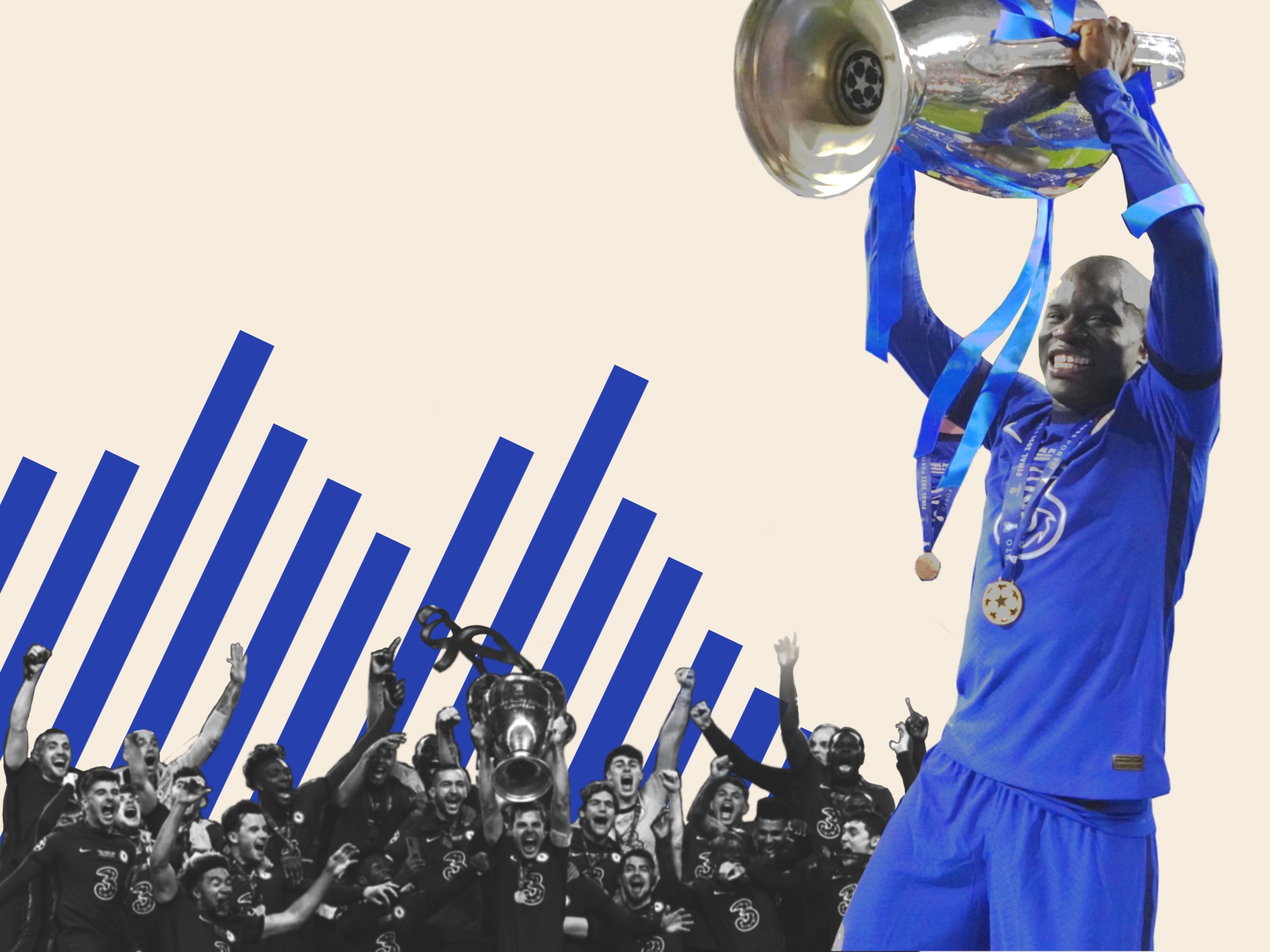
Chelsea FC (2021) Chelsea Win The Champions League [image] available online: https://www.chelseafc.com/en/video/-the-purest-joy—–chelsea-win-the-2021-champions-league-final–8chl24gy [accessed 12.02.2023]

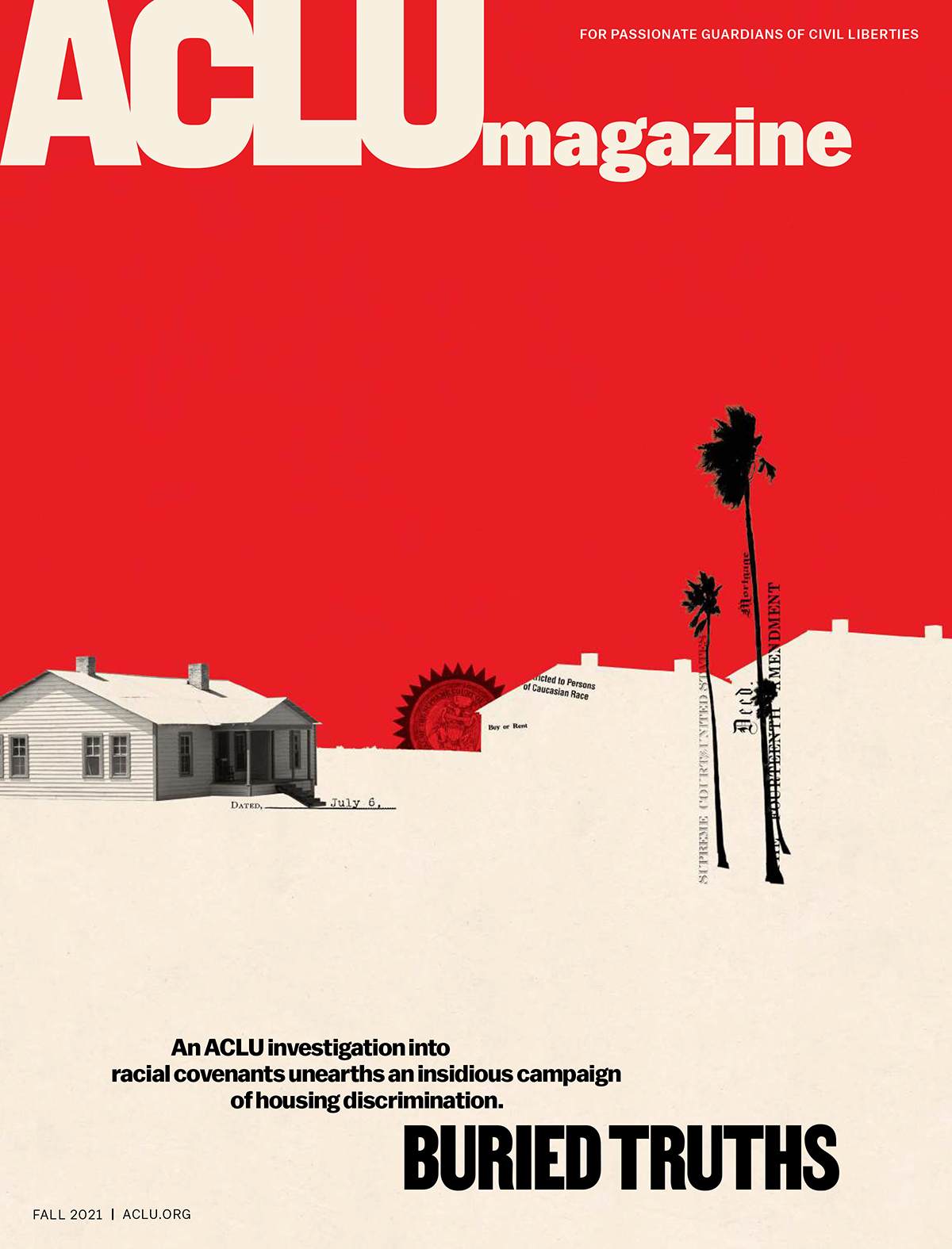
Couceiro, Christiana (ND) ACLU Magazine [image] available online: https://cristianacouceiro.com [accessed 15.02.2023]


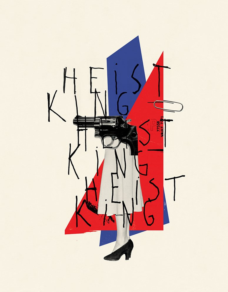
Couceiro, Christiana (ND) Heist King [image] available online: https://cristianacouceiro.com [accessed 15.02.2023]


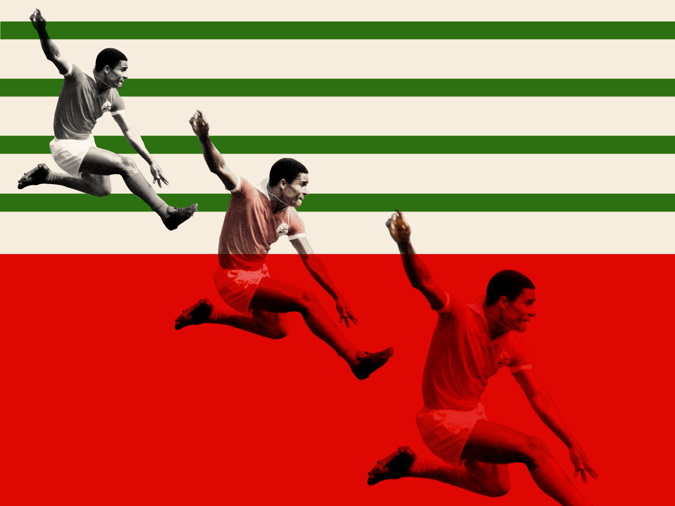
Unknown (ND) Eusebio [image] available online: https://pin.it/5SPhGMU [accessed 12.02.2023]


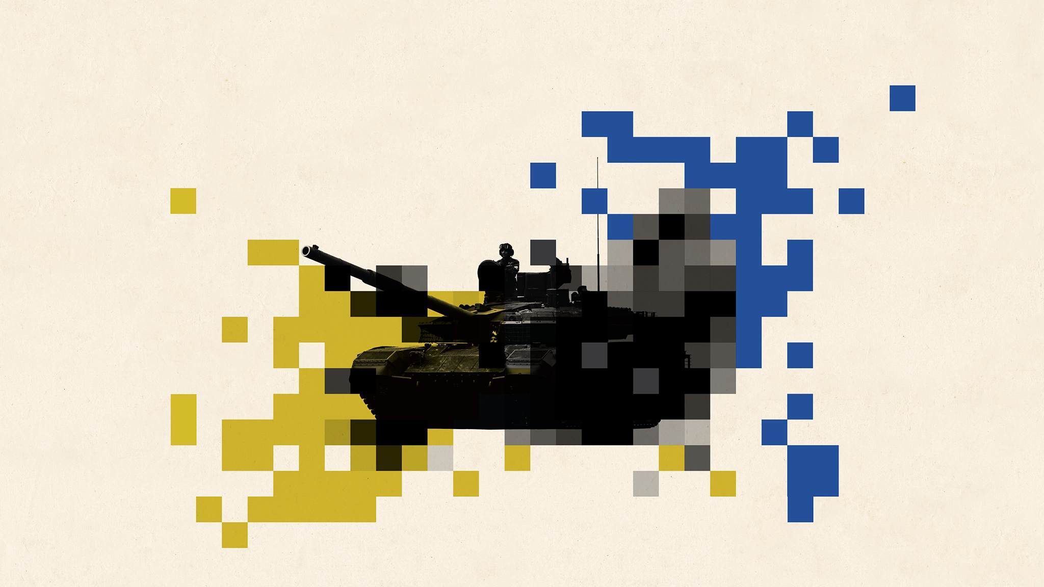
Couceiro, Christiana (ND) tank collage [image] Available online: https://cristianacouceiro.com [accessed 15.02.2023]


Getty images (2021) N’golo Kante celebrating Chelsea’s win [image] available online: https://idsb.tmgrup.com.tr/ly/uploads/images/2021/06/07/120035.jpg [accessed: 12.02.2023]


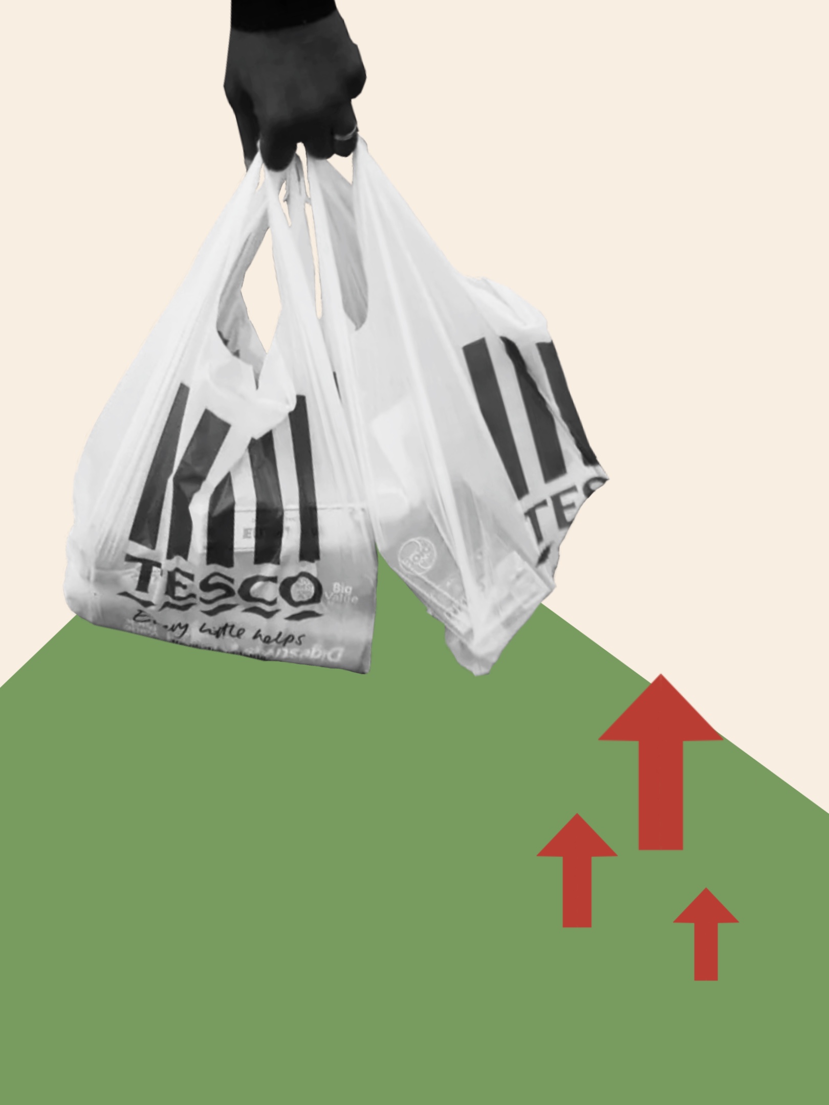
Getty Images (ND) Tesco bags [image] Available online: https://www.independent.co.uk/life-style/fashion/balenciaga-shopper-bag-tesco-carrier-b2039947.html [accessed 12.02.2023]

Nicholson, Kate (2022) Here’s how much your food bill is going up (again) [article] available online: https://www.huffingtonpost.co.uk/entry/how-much-has-food-bill-gone-up-by-inflation_uk_6385f4c3e4b082d8e6d4d5a8 [accessed 12.02.2023]

Phillips, Todd (2019) Joker crowd scene [image] available online: https://pin.it/7w3W1iz [accessed 12.02.2023]


Phillips, Todd (2019) Joker Stairs Dancing Scene [image] available online: https://www.google.co.uk/url?sa=t&rct=j&q=&esrc=s&source=web&cd=&ved=2ahUKEwjIj8DWqZj9AhVOXMAKHZcdD80QwqsBegQIEBAF&url=https%3A%2F%2Fwww.youtube.com%2Fwatch%3Fv%3DTl5zk46i0Bs&usg=AOvVaw3e4TOneN3S57-QgGxujeSr [accessed 12.02.2023]


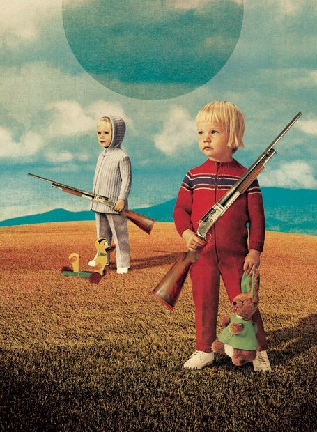
Picaud, Julien (ND) Children holding guns [image] available online: https://pin.it/5MgEFEu [accessed: 15.02.2023]

Defining the problem space

Defining the problem space

What is a problem space?

According to WritingCommons, a problem space is described as:

“The Problem Space is the problem and everything associated with the problem, including such things as the history of the problem; the stakeholders (those who benefit from the problem, those who contribute to the problem, and those who feel the problem most deeply, as pain).”

It is important to determine the problem space, so that you can work on a proper solution to the problem.


What is the problem space for my website?

The problem space for my website is that the Users need a resource which can be used to educate them on how art history pieces can inspire modern day website designs. The problem is, it is hard to find examples all in one place. It may also be hard for a design beginner to understand the advanced details of design, so they may feel intimidated by other resources which may automatically assume that all users can understand the technicalities. Users may feel more inclined to give up when researching, either due to being bored, confused, or uninspired.

How can I create a solution for these problems?

To create a solution space to the problem space, I can do a few things to make sure my website caters to users needs, and provides a good solution.

First, I will need to do some research and begin to understand who my users are. I can then begin to research other websites and analyse what works and what doesn’t. Finally, I can then use this information to form a website which caters to a range of needs and personality types. I can then go back and test my website on a small group of users for feedback, before making final refinements.

The end goal would be to have a website which successfully erases the users’ problems, and instead replaces them with a clear, clarified solution. 

Once you define the problem space, it is easier to form a solution.

What would be a success?

A success would be a website which is helpful for my users and easy to use. It would have features which help the user to follow a journey through the website and helps them find the information they are looking for. 

A successful website would also be able to keep the viewers from closing the tab or clicking away. To make sure this doesn’t happen, I am going to use Jakob’s Law. Jakob’s Law proves that users like familiarity and shows that users react better to websites that are similar to ones they have used before (LawsOfUX, nd). I will look at websites like my own and then bring in common elements to my own website so that the users can feel familiar and do not want to click away.

References:

LawsOfUX (nd) Jakob’s Law [Article]. Available online: https://lawsofux.com/jakobs-law/ [Accessed: 15.04.2023]

WritingCommons (nd) Problem Space, Solution Space [Article]. Available online: https://writingcommons.org/section/rhetoric/rhetorical-situation/occasion-exigency/problem-space/#:~:text=The%20Problem%20Space%20is%20the,most%20deeply%2C%20as%20pain). [Accessed: 15.04.2023]

Unknown (nd) Problem Space Diagram [Image]. Available online: https://cdn.sanity.io/images/hgftikht/production/625d5e0b4203d920426e1e2252c034c4b3e1978a-1444×536.png?w=1280&h=475&fit=crop [Accessed: 15.04.2023]

Stakeholders

Stakeholders For My Website.

Stakeholder Definition

A stakeholder is someone with influence over your website or product. They can impact or be impacted by your website (Fernando, 2023). It is important to identify who they are before producing your website as it will help you to cater to their needs, making your site more suited to them. 

Usually, they can be your boss, client, or target audience. It is important that your website is in the interest of all different stakeholder groups, and it is your job to make sure the website appeals to a variety of stakeholders with different needs and wants. 

Stakeholders For My Website

To understand my stakeholders, I will first refer to the brief for my project:

“You will produce a long scrolling web page (initially you may wish to prototype this in XD) but finally realised in Elementor on your University of Hull WordPress site containing 10 pairs of images (10 found images, plus 10 original images you have created from scratch using any technique or software of your choice)

All images must be expandable with a click.

Each found image (fully referenced) will be accompanied by an original visual (that you create) emulating the style but decontextualising it from its history and representing it for a modern audience in a contemporary web page design style. For example a famous example might be Van Gogh’s sunflowers in which bold bright colours together with vigorous brush strokes create an energetic lively effect – how can that style be used in the design of a web site for a florist? (for example). You can chose the subject of each website and you may use Lorem Ipsum in your visual if you wish. The history must be roughly chronological down the page from the latest to the earliest but you can start from any point in time and include any artists or designers you like. You could start at cave paintings or you could start at Tesla Car designs or anywhere in between.

The audience for this web app is anyone interested in the relationship between the subject of design. Students of design in higher education could be a specific target audience.

Each pair of images must include a description in  approximately 100 words explaining how you have translated the original design into a contemporary web page.

You design as a whole must clearly reflect you understanding of the principles of UX.”

From this, I understand that:

  • My website is to be a single scrolling page
  • It has to demonstrate how design history links to web design
  • It must be visual
  • Its audience can be anyone interested in the subject of design – such as higher education design students.

These points will act as my main goals, which I will keep in mind at all times throughout the design process.

Following from that last point, I can now think of different people interested in the subject of design – this will help define my stakeholders.

People Who May Be Interested In Design

  • Students

Students who are studying design may be interested in my website. Students is a broad term and can range from secondary education to higher education, so I will have to keep this in mind when designing my website – so that people of all learning abilities can learn and understand the information shown.

  • Teachers 

Similar to students, teachers may range from secondary to higher education. Teachers may want to use my website as a resource when teaching, and as a way to provide a visual demonstration to students. My website will need to be informative and professional, so that it may be used as a way to educate and inform.

  • Art Historians

Art historians may be interested in researching design history, and may find it interesting to find out how it impacts website design. I will need to make my website interesting and informative, so that people feel like they have learnt something whilst also enjoying using my site.

  • Graphic/Web Designers

Other designers may also want to use my website. It may help them to find inspiration, or to identify and discover new styles. My website will have to be inspiring and visually appealing.

What users need from interaction with the site?

  • To learn about art history links to web design.
  • To easily understand and learn how to use the website, and how it functions
  • To be entertained and kept engaged whilst using the site, alongside being educated.
  • To be informed and to learn something new and interesting
  • To find inspiration from the content shown.

References: 

Fernando, Jason (2023) What Are Stakeholders: Definition, Types, and Examples [article] Available online: https://www.investopedia.com/terms/s/stakeholder.asp [Accessed: 28.03.2023]

EX 1: ELEMENTOR

BASIC GUIDE TO ELEMENTOR

Step 1.You would start by creating a new post in WordPress. To access Elementor, you would press the'Edit with Elementor' button at the top of the screen.

Step 2. Once you have done this, you will go down to settings in the bottom left, then go to page layout and press 'Elementor canvas'.

Step 3. After you have pressed 'Elementor canvas' you will might want to change the background, to do that you would go to style, background type then colour and choose which colour you want as a backgound.

Step 4. The next step after the background is to add your columns. To add your columns you need to press 'add new selection' which is the plus sign in the centre of the screen. After adding your columns you will want to edit the width, to do that you press the six dots in the middle and go to layout.

Step 5. To add text to your post you will need to press the plus sign in one of your columns, after doing that you need to drag the 'heading' icon to that column. Once you have done that to change the colour and font you will need to press on the text, go to style and then the text colour and typography will be there for you to change.

Step 6. When you have added your text you can add an image. To do this you have to do the same as you would with text and drag the 'image' icon to the column, then after doing that you will press chose image then upload the image you want in your post, once the image has uploaded you can change the image size and alignment.

Step 7. After adding your images you might want to add a button to show that you can click on it to show text. To do this you would add some new columns and drag the 'button' icon to the column, if you want to change the colour and the text on the button you would click on the button and you can easily change the text and for the colour you would go on style and change the colour from there.

Step 8. Once you have done all these steps you can see how your website would look on desktop, tablet and mobile. To do this you would go down to 'responsive mode' in the bottom left, after doing this the three options will show up at the top and you can see how they all look.

Step 9. Now that you have done all the steps you can publish your work. To do that you just press the 'publish' button in the bottom left of the screen, then when you have published your website you can see how it looks when completed.