DRB 4: Brutalist / punk / anti/anarchic design

DRB 4: Brutalist / punk / anti/anarchic design

Trellick Tower is a brutalist style building

Brutalism is a design style which originally began as architecture. In the 1950’s, after the effect of the war, architects began to use more raw materials such as concrete. These buildings were very harsh and to some, were depressive and unattractive. The word comes from a French term, ‘beton brut’ – meaning raw concrete (McKnight, 2022).


An example of brutalism inspired design

Brutalism has also bled into graphic design. The core principals remain, with the design being visually heavy and structural – similar to a building. Thick, impactful fonts, textured surfaces and flat colours are often found in these designs. These designs are the opposite of delicate, and are instead more daring and experimental (Moran, 2017)

Punk fan magazine from 1976

Punk design is similar in the way that it rejects what is seen as the ‘norm’. Punk originated in 1970s England, and was centred around self-governing and non-conformist behaviours. Punk design is most recognised for looking like ransom notes – especially following Jamie Reid’s work with the Sex Pistols, whose style became synonymous with Punk culture (3cc London, nd). 

Anti design example album cover

Anti design is another style which goes against traditional rules. Anti design is usually more chaotic and doesn’t follow rules regarding hierarchy or grids. The result of this is challenging and provocative. 

My design of The Batman inspired by punk styles.
The inspiration for my design. Jamie Reid's art for the Sex Pistols.

I have taken inspiration from punk design to create this poster. It shows Robert Pattinson as Bruce Wayne, from The Batman. In the movie, The Riddler (villain) sends anonymous letters in a ransom note style. I have copied this by layering news papers from the film and a photo of Bruce Wayne. I covered his eyes to create anonyminity, and placed one of The Riddler’s quotes there, using a ransom-note font. I also added ‘The Riddler’ on the mouth as a sign off. I was inspired by the work of Jamie Reid, so I placed the image in a oval shape, similar to his design for the Sex Pistols. 

A brutalist design I made for footballer Reece James

Inspired by brutalism, I made a design for Reece James, a footballer. I used the threshold tool to reduce the image to shadows and highlights, cutting him out and pasting him to the right hand side of the frame. I recoloured the image to be blue, the colour of Chelsea, the team he plays for. I then added a blue rectangle for structure and added his name, going vertically for variation in direction. I then added his shirt number, the Chelsea badge, and Nike logo (Chelsea’s sponsor). I made this text white to contrast, whilst keeping with the singular colour theme. I then added a texture overlay for a more messy, roughed out effect.

Brutalist design for Kendrick Lamar's latest album

This is a design I made for Kendrick Lamar’s new album, Mr Morale And The Big Steppers. I screenshotted images from his music video and manipulated them with the threshold tool for a gritty look. I arranged them into three rectangles, with the largest image at the bottom for balance. I added a maroon outline, matching the colour of the design. I added a rectangle, where I placed the track list. I halved the list and placed them at either side to create more balance horizontally. I added the album title and artist, running vertically for leading lines. I also added information such as the copyrights, record label, and an explicit warning for a more authentic album cover effect. I added noise for some grain and texture to finish.

Poster for the Disney+ show, Moon Knight

I decided to make a portrait oriented poster. I made this for the show ‘Moon Knight’. I began by taking a still from the show and cutting the characters out, along with the desert sand. I used a gradient map and colourised the images blue. I placed this image at the bottom of the frame, and added three squares running down the left hand side – showing some of the main characters of the show. I then added a Moon Knight quote on the opposite side, but turned the opacity down so it didn’t disrupt the balance. For the final line, I brought the tracking down so ‘I am Moon Knight’ was emphasised and shown as important. I then added noise to make it feel more brutalist and ‘gritty’.

Reference:

3cc London (nd) Punk’s influence on graphic design [Article]. Available online: https://3cc.london/blog/40/picturing-punk [Accessed: 16.04.2023]


Calmatic (2022) Kendrick Lamar Rich Spirit Music Video [Screenshot]. Available online: https://www.youtube.com/watch?v=toBTPGfurLc [Accessed: 12.04.2023]


Chelsea F.C (2023) Chelsea FC Badge Logo [Image]. Available online: https://sco.wikipedia.org/wiki/File:Chelsea_FC.svg [Accessed: 12.04.2023]


Disney (2022) Moon Knight Arthur Harrow [Image]. Available online: https://www.pinterest.co.uk/pin/896075657088832918/ [Accessed: 12.04.2023]


Disney (2022) Moon Knight Episode 2 [Image]. Available online: https://www.pinterest.co.uk/pin/896075657088832932/ [Accessed: 12.04.2023]


Disney (2022) Moon Knight Episode 3 [Image]. Available online: https://www.google.com/url?sa=i&url=https%3A%2F%2Fwww.comicsbeat.com%2Fmoon-knight-episode-3-recap-review%2F&psig=AOvVaw2svKZNm-sR2TgER3Ne71i9&ust=1681754012111000&source=images&cd=vfe&ved=0CBAQjRxqFwoTCIDh74X8rv4CFQAAAAAdAAAAABAE [Accessed: 12.04.2023]


Disney (2022) Moon Knight Layla Episode 8 [Image]. Available online: https://www.pinterest.co.uk/pin/896075657088833063/ [Accessed: 12.04.2023]


Marvel Comics (1990) Moon Knight Vol 116 [Quote]. Available online: https://marvel.fandom.com/wiki/Category:Marc_Spector_(Earth-616)/Quotes#:~:text=I%20became%20Moon%20Knight%20to,darkness%20inside%20my%20own%20heart.&text=I%20am%20Moon%20Knight.,of%20the%20mantle%20of%20Khonshu. [Accessed: 12.04.2023]


McKnight, Christopher (2022) Your Art is Boring: The Rise of “Brutalist” Design [Article]. Available online: https://wearetribu.com/your-art-is-boring-the-rise-of-brutalist-design/ [Accessed: 16.04.2023]


Moran, Katie (2017) Brutalism And Antidesign [Article]. Available online: https://www.nngroup.com/articles/brutalism-antidesign/ [Accessed: 16.04.2023]


Nike (2023) Nike swoosh logo [Image]. Available online: https://en.wikipedia.org/wiki/Swoosh#/media/File:Logo_NIKE.svg [Accessed: 12.04.2023]


PGLand (2023) PGLand logo [Image]. Available online: https://en.wikipedia.org/wiki/PGLang#/media/File:PGLang_Logo.jpg [Accessed: 12.04.2023]


Phung, Koah (2022) Mononke Cover [Image]. Available online: https://www.shutterstock.com/blog/anti-design-inspiration [Accessed: 16.04.2023]


Reid, Jamie (1976) Anarchy In The UK Fanzine [Image]. Available online: https://designobserver.com/feature/the-art-of-punk-and-the-punk-aesthetic/36708 [Accessed: 16.04.2023]


Reid, Jamie (1977) God Save The Queen [Image]. Available online: https://i.guim.co.uk/img/media/db657b16011ca28578b55b3782f2f53901224fed/0_244_4280_2568/master/4280.jpg?width=1200&height=900&quality=85&auto=format&fit=crop&s=68988b6d07aa3a45cd0cdf33b531b689 [Accessed: 16.04.2023]


Unknown (nd) Gotham Newspaper [Image]. Available online: https://www.google.com/url?sa=i&url=https%3A%2F%2Fwww.pinterest.com%2Fbmoserff%2Fnewspaper%2F&psig=AOvVaw2zwhdwQ51gWB1rhR4Qftc9&ust=1681753346795000&source=images&cd=vfe&ved=0CBAQjRxqFwoTCJi1ysj5rv4CFQAAAAAdAAAAABAE [Accessed: 12.04.2023]


Unknown (1996) Parental Advisory Label [Image]. Available online: https://en.wikipedia.org/wiki/Parental_Advisory#/media/File:Parental_Advisory_label.svg [Accessed: 12.04.2023]


Unknown (nd) Reece James [Image]. Available online: https://www.google.com/url?sa=i&url=https%3A%2F%2Fwww.mirror.co.uk%2Fsport%2Ffootball%2Fnews%2Fchelsea-injuries-james-chalobah-kante-27873923&psig=AOvVaw3hZmxL60_cZ_qB7f1_mCGY&ust=1681753445529000&source=images&cd=vfe&ved=0CBAQjRxqFwoTCJCr2vf5rv4CFQAAAAAdAAAAABAH [Accessed: 12.04.2023]


Unknown (nd) Trellick Tower [Image]. Available online: https://en.wikipedia.org/wiki/Trellick_Tower#/media/File:Trellick_Tower_front_view_(colour_brightness_adjust).jpg [Accessed: 16.04.2023]


Unpopular Content (2023) Valendie [Image]. Available online: https://www.behance.net/gallery/163771085/Valendie?tracking_source=search_projects%7Cbrutalism+poster+design [Accessed: 16.04.2023]


Warner Bros (2022) Robert Pattinson in The Batman [Image]. Available online: https://www.google.com/url?sa=i&url=https%3A%2F%2Fwww.rollingstone.co.uk%2Ffilm%2Fnews%2Frobert-pattinson-says-the-batman-is-sad-and-his-bruce-wayne-is-a-weirdo-11037%2F&psig=AOvVaw1oPeJpfsLL_BEOqiSCExRK&ust=1681752946442000&source=images&cd=vfe&ved=0CBAQjRxqFwoTCNDi4on4rv4CFQAAAAAdAAAAABAE [Accessed: 12.04.2023]

DRB 3: Maximalism, Kitsch and Jeff Koons

DRB 3: Maximalism, Kitsch and Jeff Koons

An example of maximalism design

Maximalism is a style of graphic design which is the opposite of minimalism. It is defined as bold, loud, colourful and aggressive (Rimmer, 2021). It is divisive and some people call it ‘ugly’, whereas others call it ‘unique’. Usually, everything is packed in tightly, and the composition is very busy. 


Kitsch illustration

Kitsch is a form of maximalism. The word actually is German in origin and translates to ‘bad taste’. Lots of kitsch styles can also be considered tacky or ugly, but some people have an appreciation for its irony. A form of kitsch is American kitsch, which is a retro style popularised in the mid 20th century. At the time, designers were trying to grab attention in any ways possible, so the outcome was bold and eye-catching (Visual Arts Department, nd). 

Jack Kirby illustrated many retro comic books. Comic books are considered American Kitsch.

Part of the American Kitsch style also included comic book art. Jack Kirby is a famous comic book artist of this time who illustrated many comic book covers for Marvel. Comic covers are kitsch because they are over the top and exaggerated, with bright bold colours and defined line work.

Artist, Jeff Koons

An artist known for being extremely minimalistic and over the top is Jeff Koons.

Jeff Koons is an American artist who has an expansive career. His art covers a range of topics, mostly relating to popular culture. His work usually shows everyday objects, blown up to a massive scale. He also produces paintings and prints, but is most famous for his sculptures (Gagosian, nd).

Balloon Dog by Jeff Koons

This is one of Jeff Koons’ famous sculptures. It is called Balloon Dog and is made of blue-tinted mirror polished stainless steel. It stands at over 120 inches tall and 140 inches wide. It is an example of how Jeff Koons will take a small scale object and make it gigantic. There doesn’t appear to be any significant meaning, and it is merely for decorative purposes and to just be enjoyed as it is. There is a sense of childlike wonder through some of these sculptures, since balloon animals are usually associated with children’s parties and entertainment. It seems that Jeff Koons wants to make it impossible to ignore these sculptures, from the massive scale, to the shiny, gleaming surface and the bright blue colour.


I have now made my own designs inspired by American Kitsch, Maximalism and Jeff Koons. I have also been inspired by Jack Kirby’s artwork, and have produced four comic book cover illustrations, mimicking styles from the mid 20th century. I used the threshold tool in Photoshop to create outlines of the different characters, and then used the brush tool to add in flat colours. I then moved into Illustrator, where I created the rest of the covers, and added typography. I added noise to all the covers for an old, vintage effect.

My comic illustration for Thor.

This is my illustration for a Thor comic cover. I used an image from the newest Thor movie, turning it into an illustration. For the background, I chose blue to contrast with his blonde hair. I chose a flat colour style similar to comics at the time. I created a spiked sticker shape and added a price. Old comics usually had these little decorative elements and prices in. I added Marvel Comics in a yellow banner at the top, using the yellow to add extra contrast. I also added ‘The Mighty Thor’ at the bottom of the frame for balance, enlarging the point size for ‘Thor’ and adding a red drop shadow for emphasis and dramaticism.

My illustration for a Captain America comic cover

This is a comic cover I made for Captain America. The image was taken from the first Captain America movie. For this cover, I had Captain America coming in from the bottom left, cutting part of his body off to better fit the composition. I made the background a crimson red, with a faint explosion shape for subtle detail. I added a black rectangle to break the upper third up and placed text up here. I arched the main text for drama and impact, adding some movement too. I also added a small rectangle for the Marvel Comics type, the price and a close up image of Cap’s shield. Old comics used to have these small rectangles with images in, which is why I have done this also.

My illustration of a Hulk comic cover

This is my Hulk comic cover. I decided to centre the Hulk as he is a large character known for being brash, so I wanted to show this. I added an explosion shape behind him for impact and to bring even more attention, making it appear as he is smashing through the composition. I also made the text appear hunched by bloating out the top of it, mimicking his stance. I added a price sticker, this time in a circle, as there were already lots of harsh, sharp shapes within the design.

My Spiderman comic illustration

This is my final comic illustration. This one is for Spider-Man. 

The illustration shows him hanging upside down on a web, so I made it appear as if he was hanging down the frame. I used a diagonal shape to cut through the composition and lead the eye, and placed the web here. I made the text run parallel to the diagonal line and used drop shadows to make it pop and add depth. 

Around his head, I added lines. In the comics, these lines are used to show his powers of spidey-sense. They also helped to add balance at the bottom of the frame. I added another rectangle, placing an illustration of just his mask. I overlapped the sticker to add some imperfection and added the Marvel Comics type.

References: 

Disney (2022) Thor Love and Thunder [Image]. Available online: https://i.guim.co.uk/img/media/9daf9efb27a85daab1d8a5c54430cf6db146bd06/0_91_3504_2103/master/3504.jpg?width=620&quality=45&dpr=2&s=none [Accessed: 15.04.2023]

Everett / Rex / Shutterstock (2012) The Hulk in The Avengers [Image]. Available online: https://i.guim.co.uk/img/media/cb8bbc8f92417e857e0dd6447224ae5fc19bed8d/107_0_2204_3304/master/2204.jpg?width=380&quality=45&dpr=2&s=none [Accessed: 15.04.2023]

Gagosian (nd) Jeff Koons [Article]. Available online: https://gagosian.com/artists/jeff-koons/ [Accesssed: 15.04.2023]

Kirby, Jack (1963) The Avengers” #1, September 1963, Marvel Comics [Image]. Available online: https://www.illustrationhistory.org/artists/jack-kirby [Accessed: 15.04.2023]

Koons, Jeff (2000) Balloon Dog [Image]. Available online: http://www.jeffkoons.com/artwork/celebration/balloon-dog-0 [Accessed: 15.04.2023]


Ord, Cindy (nd) Jeff Koons [Image]. Available online: https://www.townandcountrymag.com/leisure/arts-and-culture/a38528663/jeff-koons-qatar-interview/ [Accessed: 15.04.2023]

Paramount Pictures / Marvel Studios (2011) Captain America: The First Avenger [Image]. Available online: https://www.britannica.com/topic/Captain-America [Accessed: 15.04.2023]

Paresqui, Roberlan Borges (nd) Too Kitsch [Image]. Available online: https://dribbble.com/shots/17413656-Too-Kitsch [Accessed: 15.04.2023]


Rimmer, Kelsie (2021) Minimalism vs. Maximalism: Battle of the Divisive Design Styles [Article]. Available online: https://www.envato.com/blog/minimalism-vs-maximalism-design-style/ [Accessed: 15.04.2023]


Sony Pictures (2019) Tom Holland Spider Man [Image]. Available online: https://images-wixmp-ed30a86b8c4ca887773594c2.wixmp.com/f/5b8d2b12-21e8-4931-8a6d-fb9ecdd60383/deonnlm-d1d46867-2700-4d3c-a005-3a8f26809e6f.png?token=eyJ0eXAiOiJKV1QiLCJhbGciOiJIUzI1NiJ9.eyJzdWIiOiJ1cm46YXBwOjdlMGQxODg5ODIyNjQzNzNhNWYwZDQxNWVhMGQyNmUwIiwiaXNzIjoidXJuOmFwcDo3ZTBkMTg4OTgyMjY0MzczYTVmMGQ0MTVlYTBkMjZlMCIsIm9iaiI6W1t7InBhdGgiOiJcL2ZcLzViOGQyYjEyLTIxZTgtNDkzMS04YTZkLWZiOWVjZGQ2MDM4M1wvZGVvbm5sbS1kMWQ0Njg2Ny0yNzAwLTRkM2MtYTAwNS0zYThmMjY4MDllNmYucG5nIn1dXSwiYXVkIjpbInVybjpzZXJ2aWNlOmZpbGUuZG93bmxvYWQiXX0.8XOmwaSNkDGtcsCpuicBXCjb0M8jiyXQTMMuqJu1p70 [Accessed: 15.04.2023]


Visual Arts Department (nd) Kitsch | Graphic Design History [Article]. Available online: https://visualartsdepartment.wordpress.com/kitsch/ [Accessed: 15.04.2023]

DRB 2: Architecture interior design and Zaha Hadid

DRB 1: Architecture, Interior Design and Zaha Hadid

Architect Zaha Hadid

Zaha Hadid was an Israeli-British architect famed for her pioneering and innovative architectural designs. Born in Baghdad, Hadid studied mathematics, before attending the Architectural Association School in London, where she received the Diploma Prize in 1977. Hadid also taught at the Architectural Association School in the 80’s, and also held classes at Harvard, Columbia and other esteemed institutions. (Zaha Hadid Architects, nd).

Hadid’s style is quite minimalistic. She was inspired by the work of Kazimir Malevich, an artist who was a pioneer in minimalistic art styles. An example of this would be his Black Square painting – which was a rejection of realistic art. Malevich believed in using simple geometric shapes and colours – this influence can be seen in Zaha Hadid’s buildings.

Kazimir Malevich's Black Square, 1913.

Malevich believed in abstraction and the refinement of elements. In another one of his paintings, he depicts a plane flying, but represents the plane by using simple, geometric shapes to loosely create the form. He also uses a minimal colour palette and uses mostly primary colours placed upon a beige backdrop.  

We can see Malevich’s influence in Zaha Hadid’s work. Hadid takes a minimal approach and uses simple shapes pieced together to create complex-looking and refined outcomes.

Airplane Flying, 1915 by Kasimir Malevich

Zaha Hadid was widely known as ‘queen of the curve’. Curved shapes can be found in lots of her buildings, and were a demonstration of her innovation and engineering heights. Zaha Hadid pushed conventions of modern architecture to create unique buildings. Her company, Zaha Hadid Architects have carried this on, continuing to push boundaries. The use of curves is unusual when compared to most other buildings. The curves feel luxurious and elegant, especially when paired with the large scale of them.

Heydar Aliyev Center

This is the Heydar Aliyev Centre in Baku, Azerbaijan. It was designed by Zaha Hadid and opened in 2007. The building was designed to break away from the rigid, Soviet architecture of Baku and to inspire optimism and freedom (Zaha Hadid Architects, nd).

The building dips and bends, creating a sea-wave look, bending up and down. The building has movement and rhythm, and is very unique. 

It uses simple concrete and glass materials, and is minimalistic in appearance due to the limited colour palette. You can see the Malevich influence through the use of shapes and lines. Lines and tiles are also common in many architectural designs by Zaha Hadid.

Al Janoub Stadium

Zaha Hadid also helped create the Al Janoub Stadium in Qatar, which was one of the stadiums used for the 2022 World Cup. The building is perfectly symmetrical  and formed with waving lines which create flow and movement, which looks very organic. The crisp, cool toned white is complimented by the warm lights from within the stadium, which illuminate through gaps in the building. The top of the stadium is meant to look like sails, so the rippled effect creates the appearance of wind blowing. The vented look is probably intentional as it can allow more airflow into the stadium, which is situated in a hot desert climate. The stadium is massive and can hold up to 44,000 people at a time

In response to Zaha Hadid’s work, I have produced four posters which show different architectural landmarks around Hull. I chose recognisable areas, such as The Humber Bridge, MKM Stadium, Hull Minster, and The Deep. 


I have also been inspired by minimalistic, geometric layouts of Kazimir Malevich’s paintings, and have applied similar principals to my designs by using blocky shapes to create balance and structure. 


To create these, I used an A4 layout and brought in multiple images of each landmark, displaying them from multiple angles for different perspectives. I cropped into the images too so that I could create size variations and fit the frame better to avoid overpowering elements. I made the images greyscale to create a monochromatic feel, which is mirrored by the text colour, for a more refined minimalist look.

I chose to have one larger ‘focus’ image paired with a smaller ‘accent’ image, and I placed them at opposing sides for balance. I used a sans-serif typeface for the text, which shows the name of the landmark in all caps for some drama. I used sans-serifs as they are clean and minimal, matching my theme. 

In larger, blank spaces, I added boxes to fill the composition and bring in visual weight. These blocks also help to create a more architectural and structured effect. I made the boxes the same colour as the text to continue the monochromatic black and white theme. 

To complete the design, I added a tiny bit of noise for some added textures. I did this because the simple colour scheme was making the design felt quite flat and I wanted to add a little bit of extra depth without disturbing the minimalistic qualities. 

My poster for the Humber Bridge, inspired by minimalistic styles
My poster for The Deep, inspired by minimalistic styles
My poster for MKM stadium inspired by minimalist styles
My poster for Hull Minster inspired by minimalist styles

References:


Avalon (2004) Night Shot at The Deep in Hull (Image). Available online: https://www.alamy.com/night-shot-of-the-deep-in-hull-sammys-point-river-humber-east-yorkshire-united-kingdom-designed-by-sir-terry-farrell-partners-image210339507.html?imageid=3DD9B69F-DD15-4B9D-AC64-2A0E59E5C516&p=718016&pn=1&searchId=e84f1bd26aeb50cf1972522025d1a8c1&searchtype=0 


Dixon, David (2017) The Tower, Hull Minster (Image). Available online: https://www.geograph.org.uk/photo/5456176 [Accessed: 24.04.2023]


Ellis, Paul (2022) Humber Bridge (Image). Available online:https://www.bbc.co.uk/news/uk-england-humber-60306832 [Accessed: 24.04.2023]

Getty Images (2013) Heydar Aliyev Centre [Image]. Available online: https://www.architecturaldigest.com/gallery/zaha-hadid-greatest-works-slideshow [Accessed: 24.04.2023]


Harrop, Phillip (nd). MKM Stadium Exterior (Image). Available online: https://www.football-stadiums.co.uk/grounds/england/the-kc-stadium/ [Accessed: 24.04.2023]


Hull City FC (nd) MKM Stadium (Image). Available online: https://www.wearehullcity.co.uk/news/2021/august/mkm-stadium-fans/ [Accessed: 24.04.2023]


Knight, Steve (2019). Hull Minster (Image). Available online: https://www.flickr.com/photos/kitmasterbloke/48671382663 [Accessed: 24.04.2023]


Malevich, Kazimir (1915) Airplane Flying [Image]. Available online: https://www.theartstory.org/artist/malevich-kasimir/ [Accessed: 24.04.2023]


Malevich, Kazimir (1913) Black Square [Image]. Available online: https://www.tate.org.uk/art/artists/kazimir-malevich-1561/five-ways-look-malevichs-black-square [Accessed: 24.04.2023]


Pankhurt, Phillip (2005) The Deep (Image). Available online: https://en.wikipedia.org/wiki/The_Deep_%28aquarium%29#/media/File:The_Deep,_Kingston_upon_Hull_-_geograph.org.uk_-_660427.jpg [Accessed: 24.04.2023]


Ternovy, Dimitry (2013) Zaha Hadid In Heydar Aliyev Cultural center in Baku nov 2013 [Image]. Available online: https://en.wikipedia.org/wiki/Zaha_Hadid#/media/File:Zaha_Hadid_in_Heydar_Aliyev_Cultural_center_in_Baku_nov_2013.jpg [Accessed: 24.04.2023]


Unknown (nd) Humber Bridge (Image). Available online: https://www.theconstructionindex.co.uk/news/view/spencer-returns-to-humber-bridge-for-hanger-inspections [Accessed: 24.04.2023]


Unknown (nd) Al Janoub Stadium (Image). Available online: https://www.dezeen.com/2013/11/18/zaha-hadid-unveils-design-for-qatar-2022-world-cup-stadium/ [Accessed: 24.04.2023]

Zaha Hadid Architects (nd) Heydar Aliyev Centre [article]. Available online: https://www.zaha-hadid.com/architecture/heydar-aliyev-centre/[Accessed: 24.04.2023]


Zaha Hadid Architects (nd) Zaha Hadid [Image]. Available online: https://www.zaha-hadid.com/people/zaha-hadid/ [Accessed: 24.04.2023]

Movie poster Advertisements

All images are my own.

SLICE bus advertisment

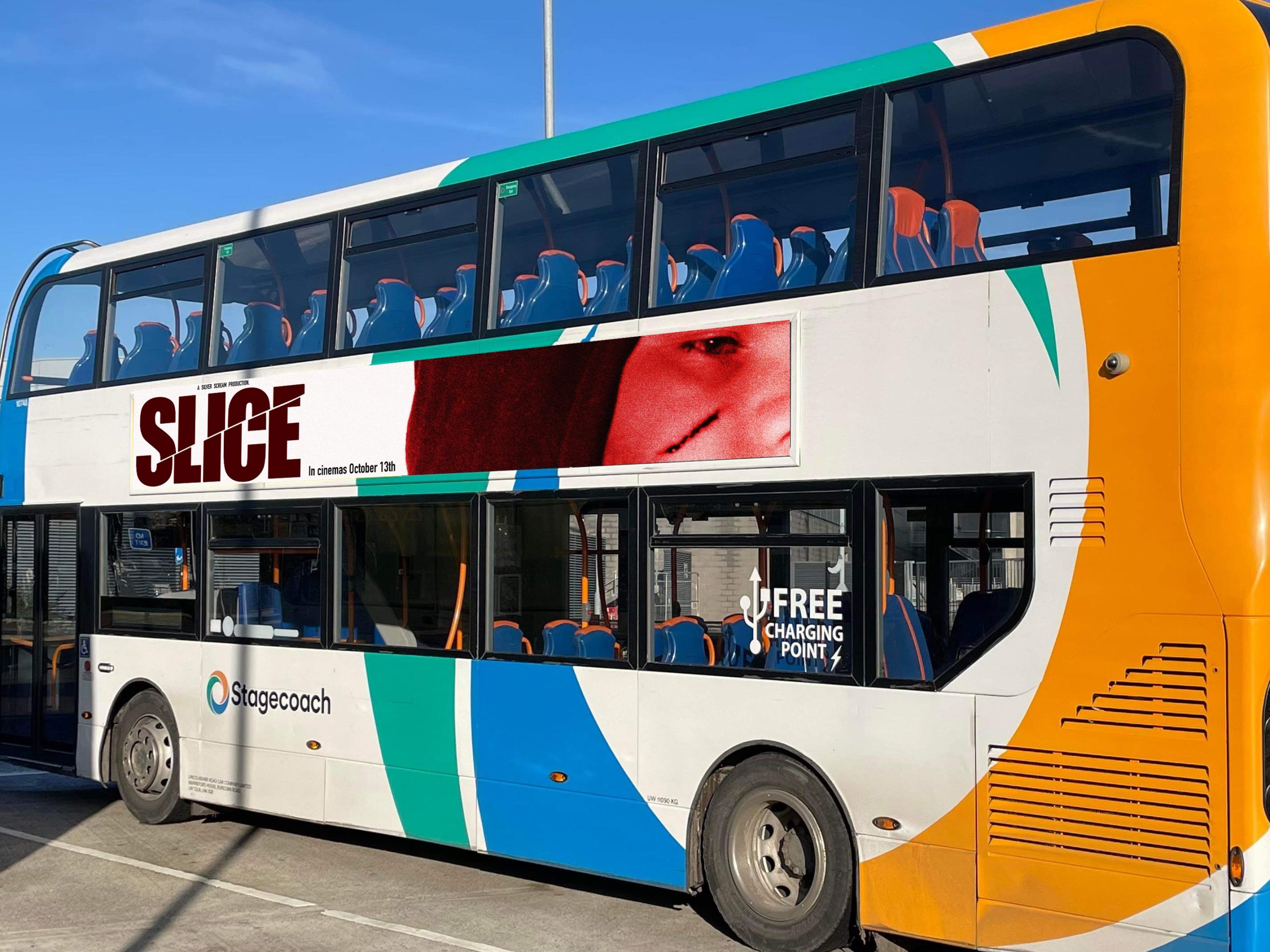
I made this poster so that it can be displayed on the side of a bus. Lots of people take public transport around the city, and the bus travels all around which means it is likely that many people will see this poster whilst out. Since you will probably only see the bus passing briefly, I made sure to put all relevant information – movie name, release date, and an interesting image which links to the movie.

SLICE poster advertisment

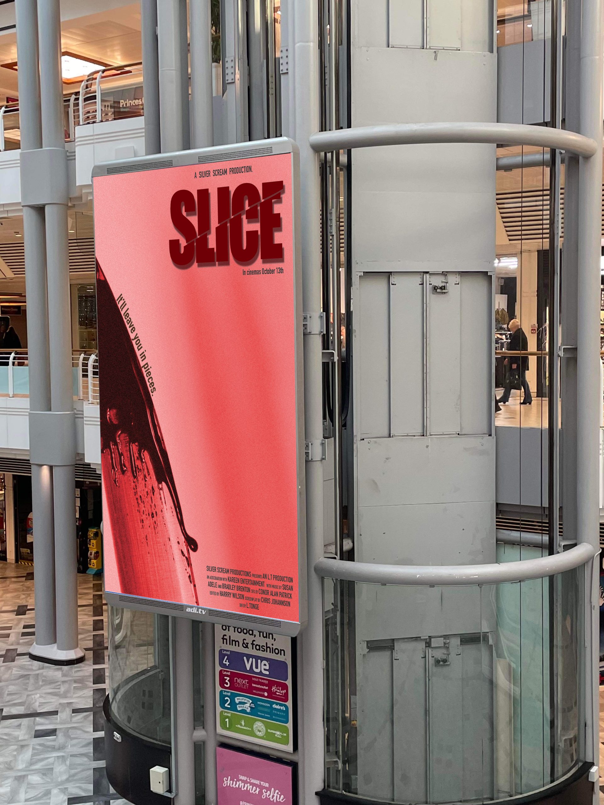
Because this poster is situated on a stationary object, unlike the last one which is placed upon a moving vehicle, I am able to place more information, such as the production credits and a tagline. I’ve also kept the important information, but now passers-by can take more time to look at the poster. The photograph is eye-catching and has a sense of shock value, which will grab attention and force viewers to acknowledge the poster – which will lead them to the information, and generate interest.

SLICE 2 advertisment

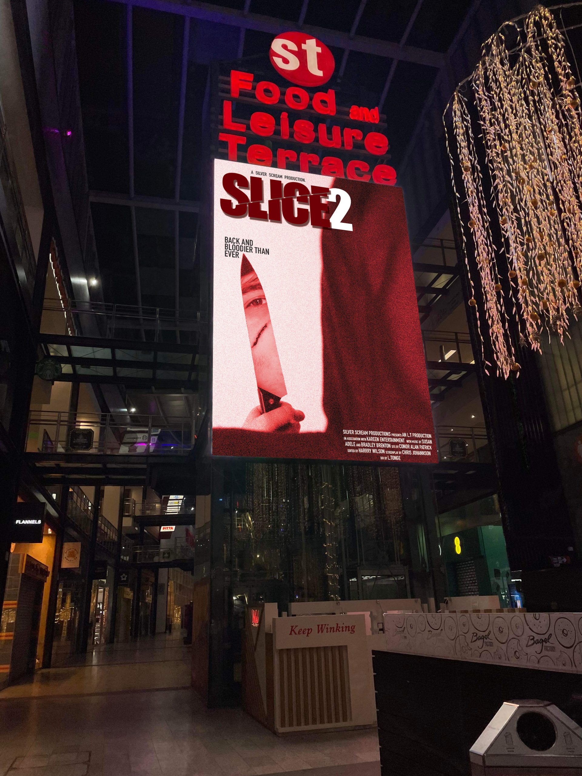
For the sequel poster, the advertisement is within a busy shopping centre. When walking through, it will appear as if we are behind the killer, who is looking at us through the knife’s reflection. The feeling of being watched is typically unsettling and most people find it slightly uncomfortable, so this will create an atmosphere of what to expect from this movie – attracting horror fans. The main villain is also prevalent and recognisable due to his scar, which is likely to attract fans of the first movie to go and watch this one.

ENVY – conceptual billboard design

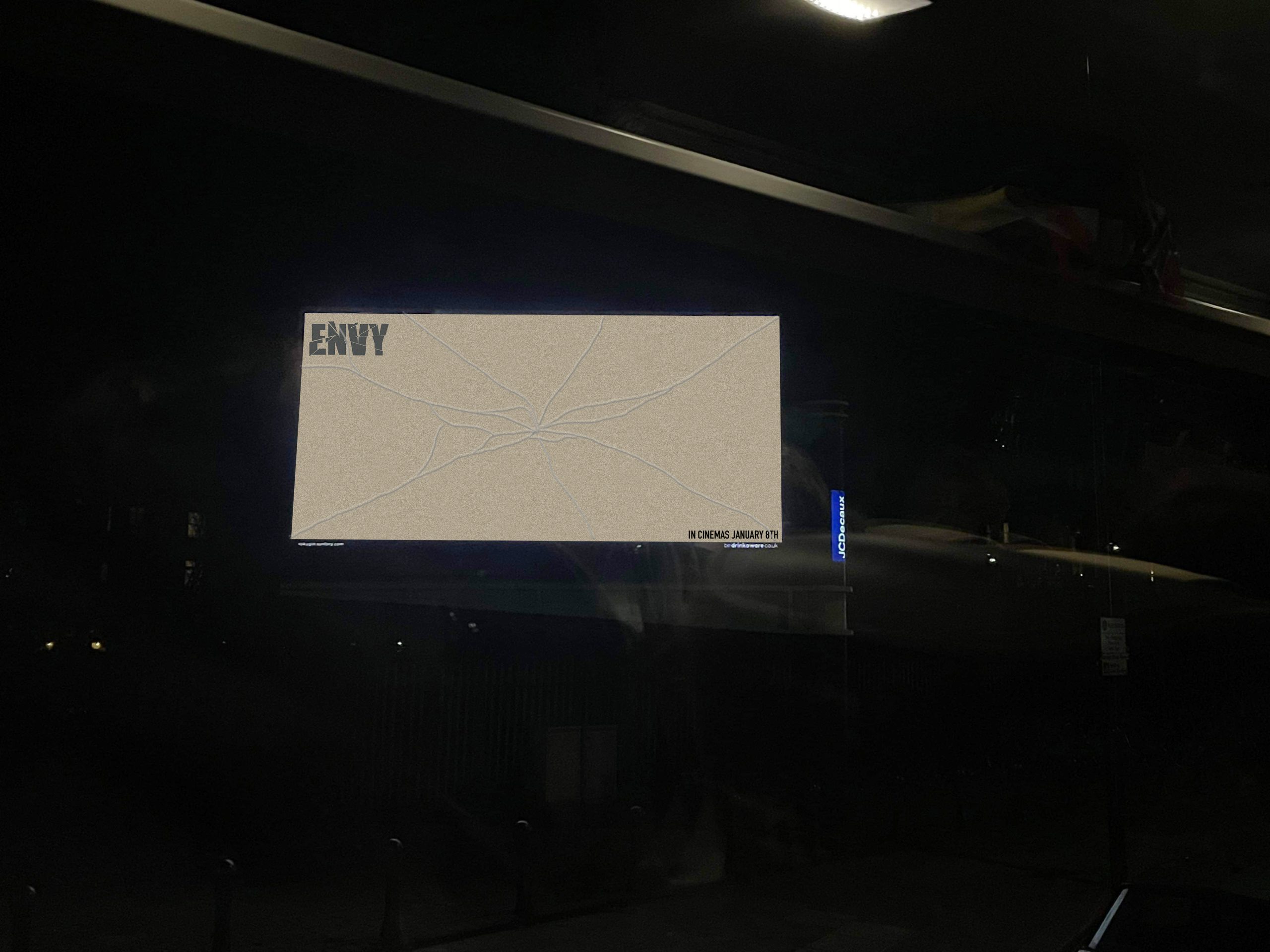
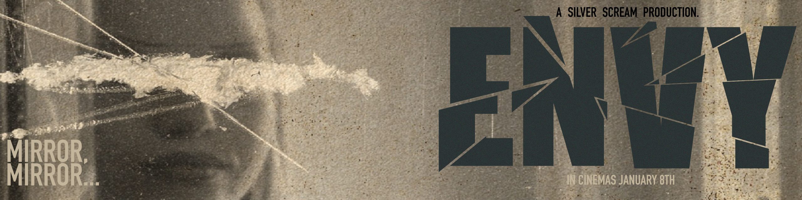
To form more of a conceptual advertisement, I designed a minimalistic bilboard poster for Envy. I used the vintage sepia-tone brown and placed the movies logo and release date in either corner. I made a cracked glass effect, which links to the movies theme of vanity and self-obsession turned deadly. Although simple, this poster instinctively creates curiosity within the viewer to find out more. It is unusual and makes you double take at the shattered effect. The result is that viewers will search the movie up to find out more information, and a buzz will be created.

The Intruder – An immersive and conceptual advertisement within an elevator

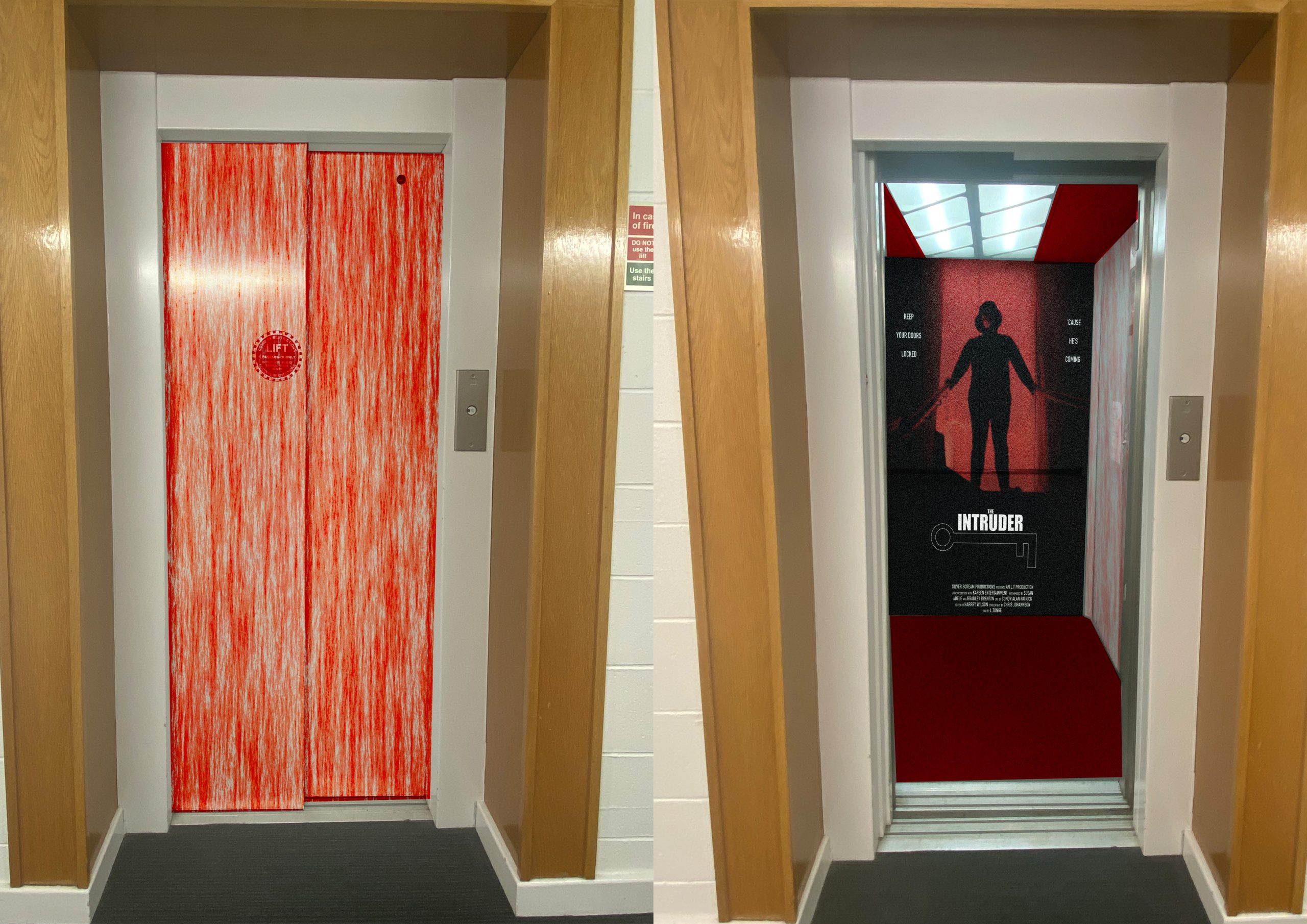
This advertisement is meant to be more immersive for the viewer. When approaching the elevator, you see the doors covered in blood, which straight away piques a mixture curiosity and fear. When the doors open, we see the movie poster on the back wall, and more blood on the side walls. The reasoning for this is because it pushes the boundaries of regular advertisements and creates shock and excitement, which will get people talking about the film.

The Intruder – Poster advertisement

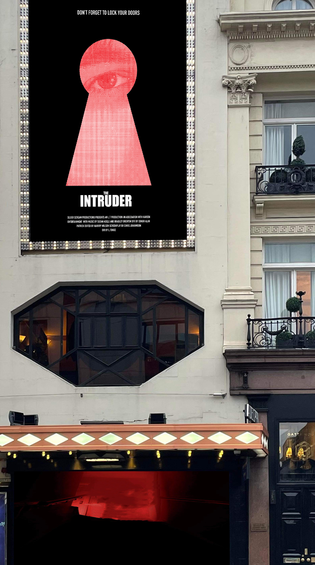
This is the second poster for The Intruder. This poster shows a huge keyhole with an eye looking through, which creates the sense of being watched and intrusion. The placement of the poster is right near these huge windows, which furthers the themes of intrusion and invasion of privacy. Because of the huge scale of the advertisement, which is on a busy street, viewers will be drawn to look at it, and will be more likely to inquire about the film, wanting to find out more.

Movie Poster Designs

Envy bus poster
Envy traditional poster

Envy:

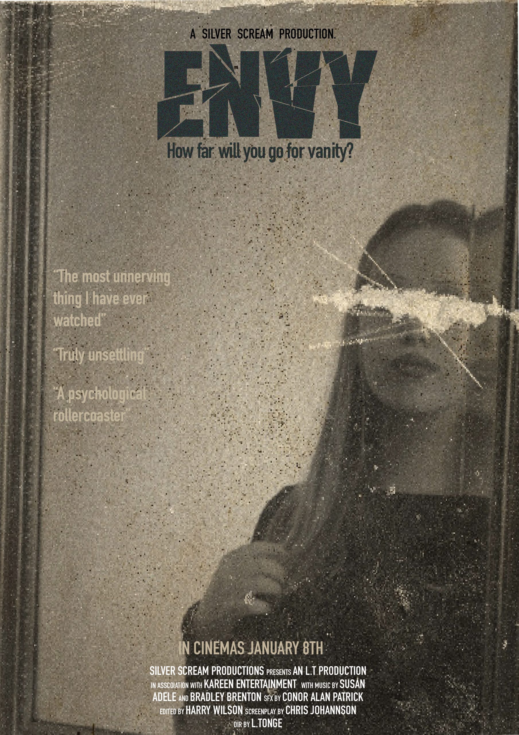
For this movie, I have created a regular poster, and a bus advertisement. The movie is about vanity and how jealousy can push someone to extremes. I added a vintage sepia filter to the image for a creepy haunting feel, and added texture to make the photo look like an old photograph. For a creepier feel, I obscured the girls face to look scratched out, adding a sense of mystery. For the title, I have manipulated the text to look like shattered glass, linking to the theme of mirrors and vanity.

I have also added quotes to all posters and taglines, as well as production information and credits. This is to fill the composition and to make the posters feel more realistic.

SLICE traditional poster
SLICE bus advertisment

SLICE:

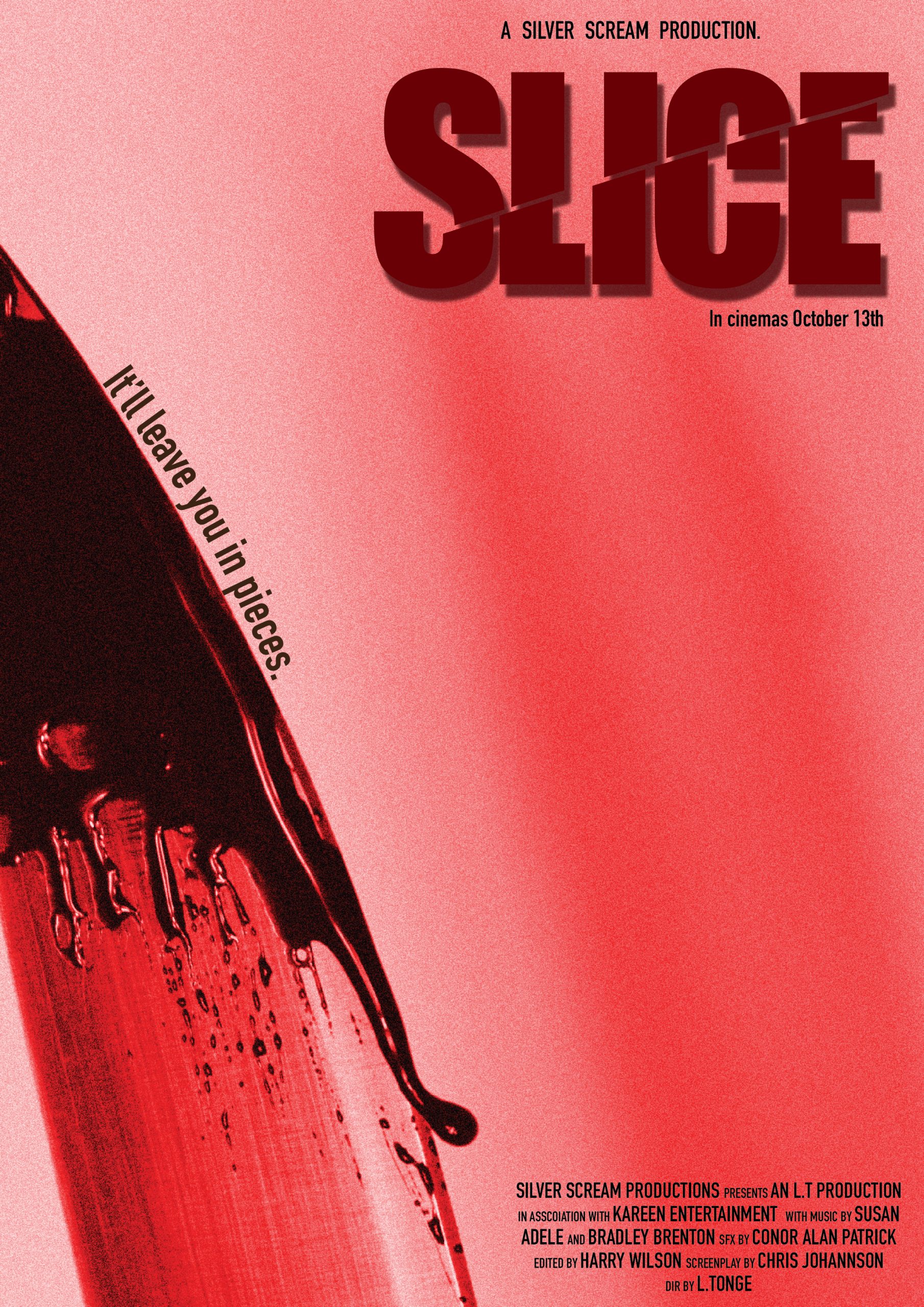
SLICE is a slasher horror film. To show this, I took images of a knife with fake blood dripping and close up images of the killer with a cut on his cheek. I added a red filter to create drama and a more intense appearance. The title has been ‘sliced through’ and is skewed to add personality. I used the curve of the knife to add the tagline and kept the first poster quite minimal. In both posters, we don’t see a full view of the killer, which adds mystery and fear of the unknown, raising the stakes and intensifying the designs.
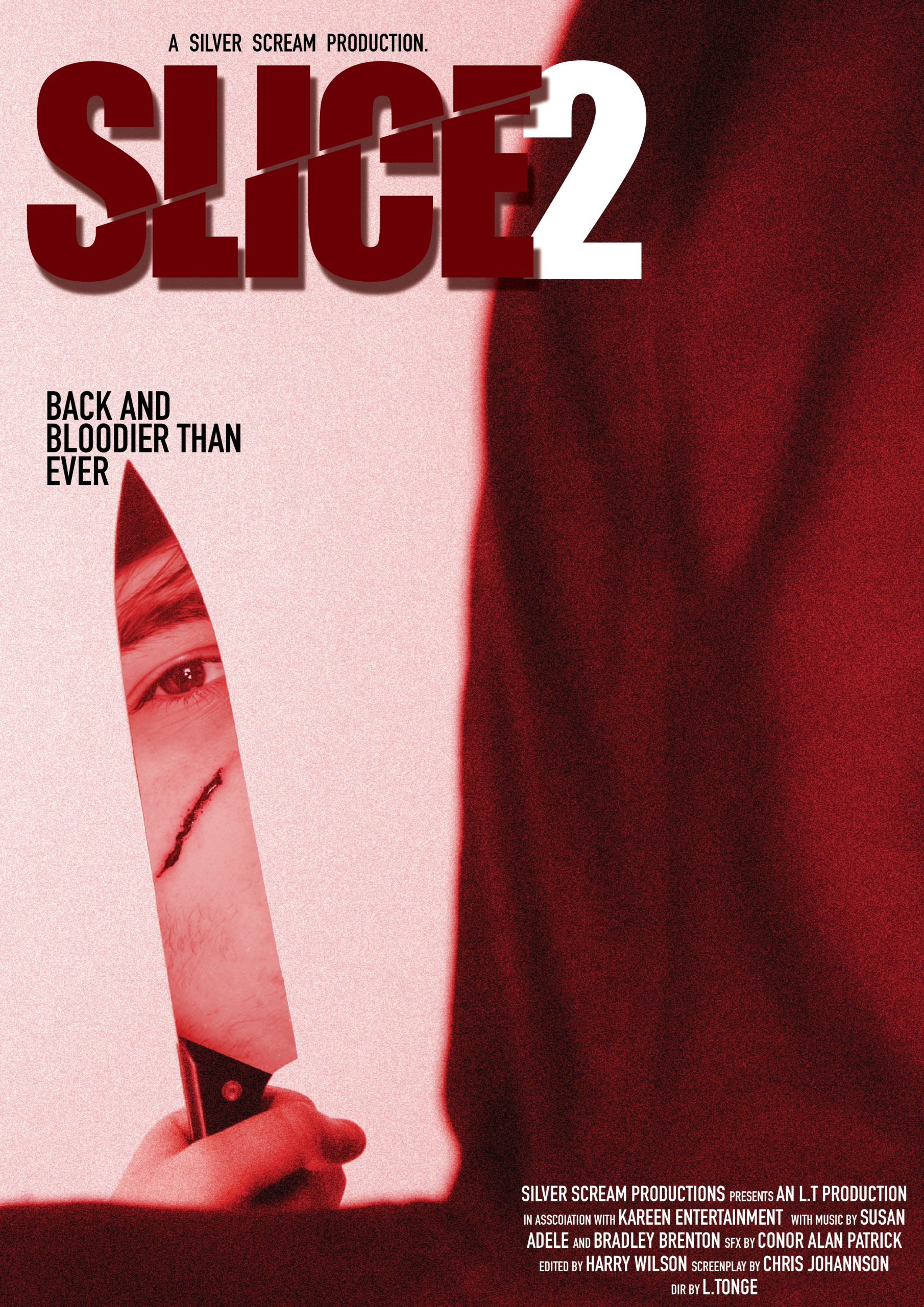
SLICE 2 traditional poster

SLICE 2:

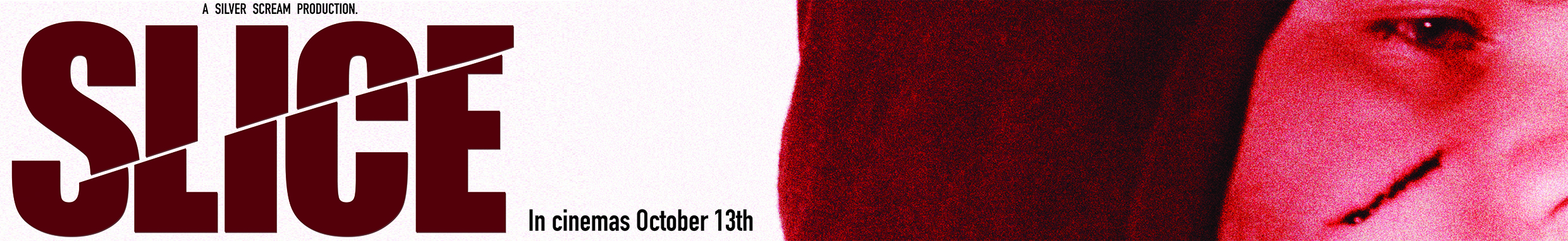
SLICE 2 is a sequel to SLICE. It is a continuation of the first film and has similar concepts. I kept many elements the same to show that it is a sequel and to create continuity between the posters. This time, we see the back of the killer, with a portion of his face reflected in the knife. By showing more of the killer here, it shows how we have learnt more about him and some of the mystery is slightly reduced, but still there.

The Intruder poster 01
The Intruder poster 2

The Intruder:

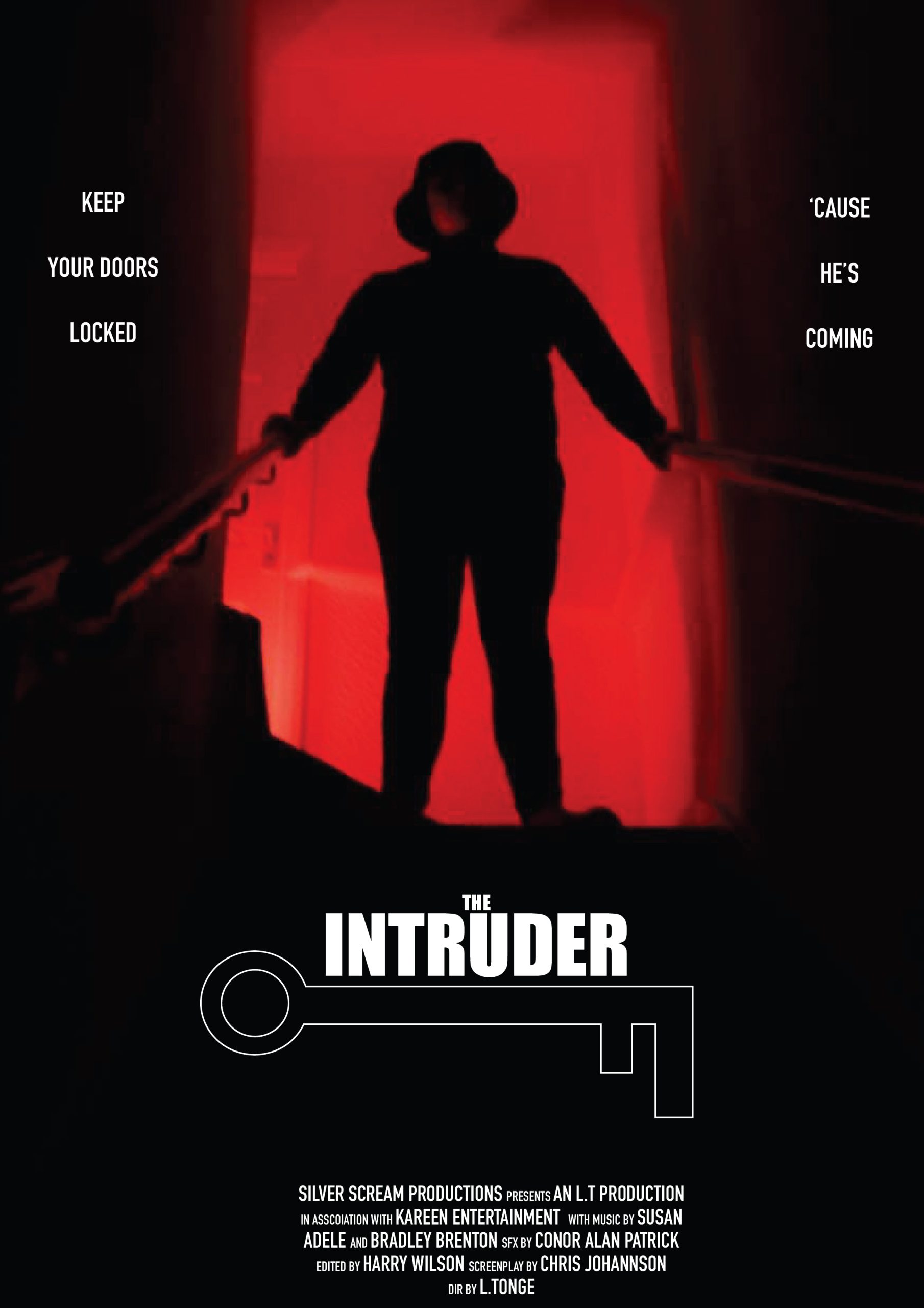
This is a horror thriller about an intruder within someone’s home. For the first poster, I used an image of the intruder at the top of the stairs, stood threateningly with a red light cast behind him to create a silhouette and a more intimidating look. The stair railings almost look like weapons and also lead us in towards the intruder. I blended the dark areas out and filled the negative space with the title and a key illustration. The tagline reads on either side of the figure to create symmetry and balance.

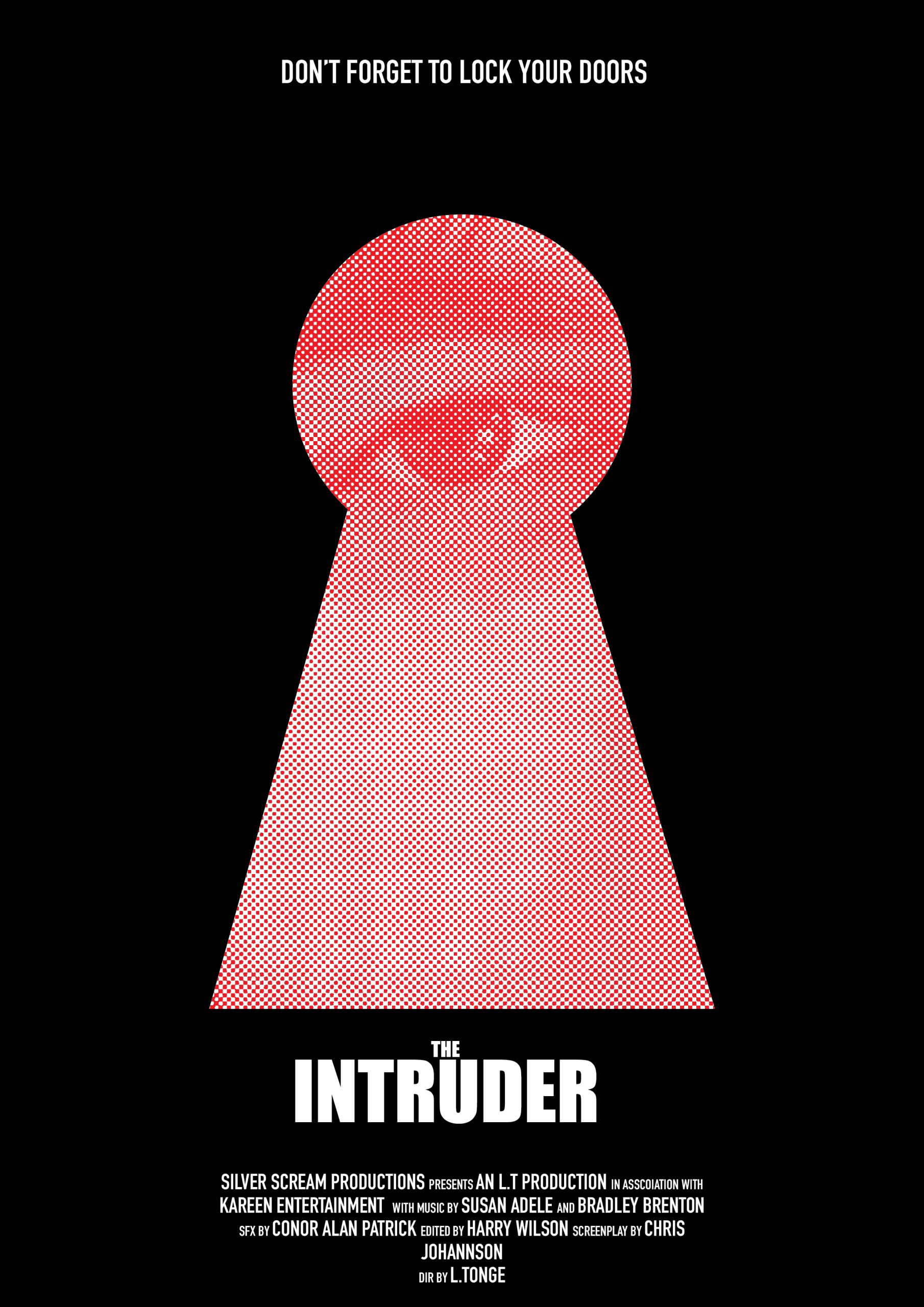
For the final poster, I used a close up photo of the intruder masked onto a keyhole illustration, so it looks like he is spying through into the house. I added a halftone effect and made the image red for a vintage effect similar to iconic posters such as The Shining, which uses similar effects to create something unsettling and intrusive. I didn’t include the key as I felt the keyhole was strong enough on its own.

Typographical Graphic Standards

To help create an understanding of the presentation and branding of Silver Scream, I have made guidelines which describe things such as fonts and colours which are to be used when designing movie posters and other materials for part of the campaign. The guidelines have been designed to reflect the company by using blood dripping imagery and dark, horror style colours and the company logo.

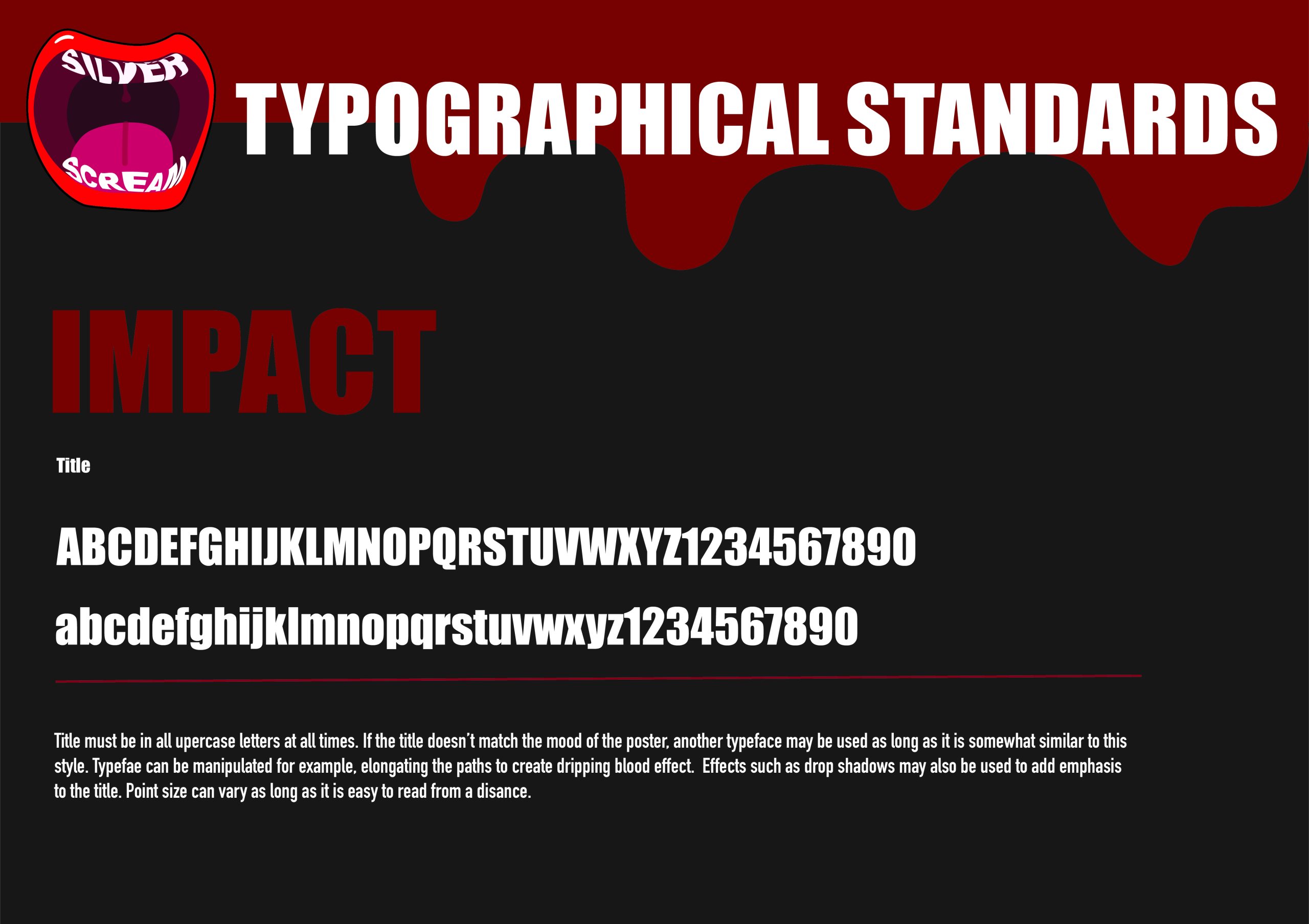
Movie titles should use Impact. The titles can be manipulated to add personality and to link with the themes of the movie in order to enhance the design. I chose impact since it is very bold and as the name would suggest, impacting, which would fit within the realm of horror due to it being dramatic and almost quite intimidating, instilling a sense of fear and precaution in the viewer.

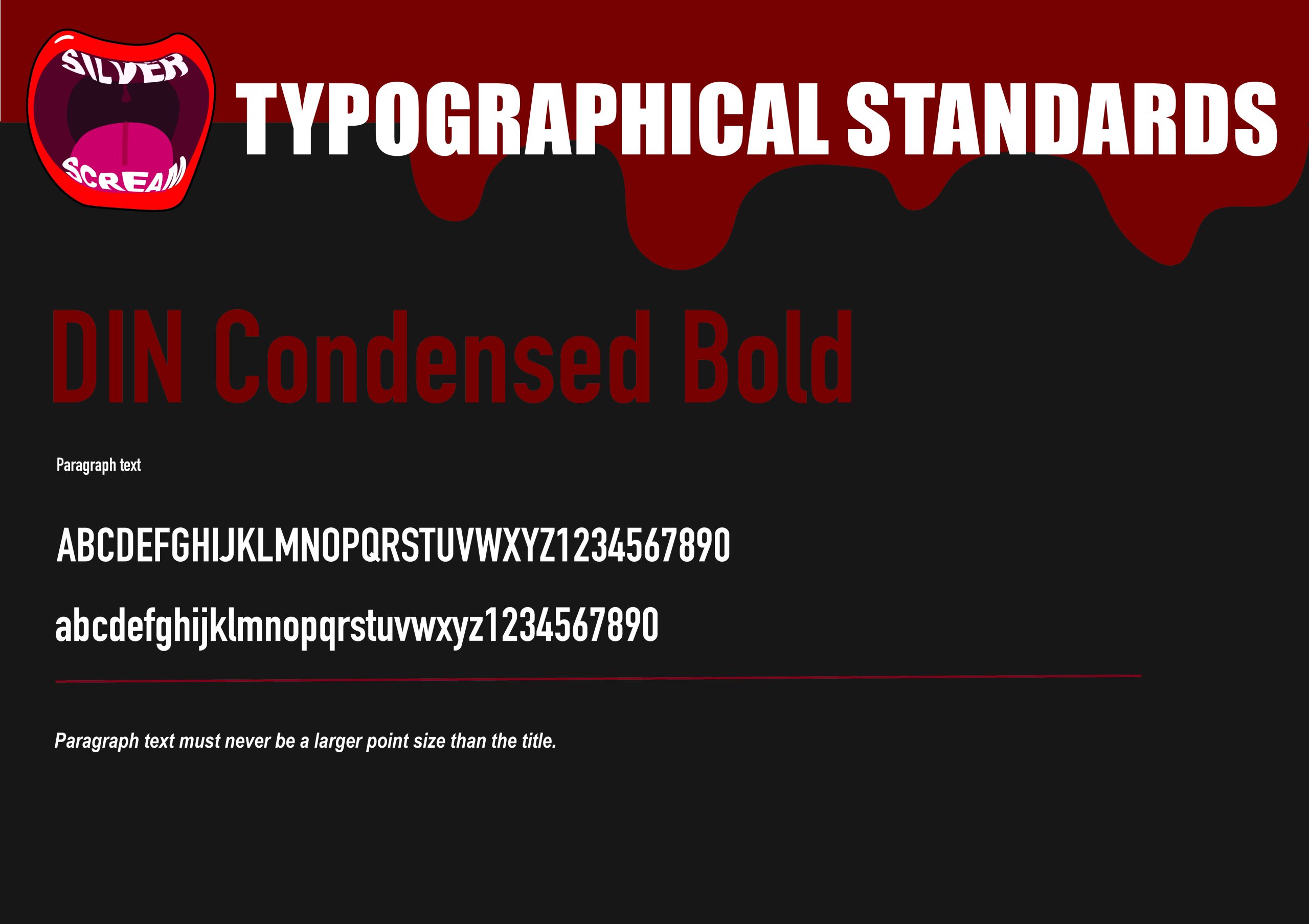
For paragraph text like credits or sub headings, I chose DIN Condensed Bold. I chose this because it is more thin and doesn’t compete with the more heavy title font. Because of how tall and narrow the font is, it creates a cramped and slightly uncomfortable feeling when looking at it. I have specified that the paragraph text must never be larger in size than the title, because the title text is more important than other text on the design, so it should always be the largest in size.

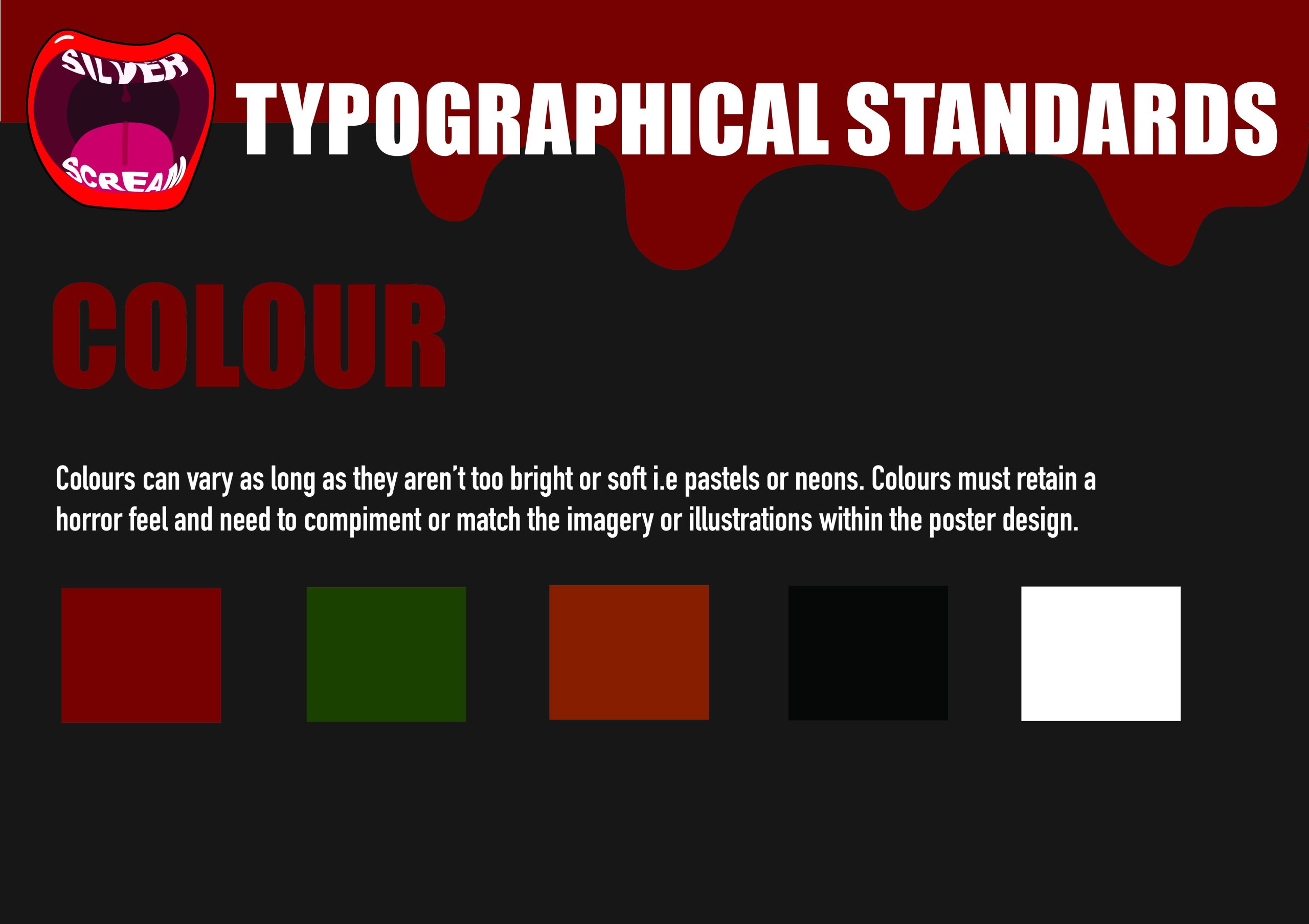
The final slide describes which colours are to be used. I have specified that the colours must not be neon or pastel rainbow colours, but instead need to be more muted and darker colours which are associated with horror. Colours such as blood red, greens, oranges, black and white are favoured, since they’re more grungy and dim. Rainbow colours would look confusing and strange, which is why I wouldn’t use them in my designs.

Traditional or Online Conceptual Editorial Masthead (Logo) Design

For my project, I am creating a campaign for a series of horror movie posters, produced by Silver Scream Productions. The campaign is aimed at horror and film fans alike, of all ages and genders.

When looking at other movie studio logos, you can see that there is usually some form of logomark/illustration which helps the viewer recognise the company in an instant. I kept this in mind when designing my own logo.
Logomarks tend to work better than type based logos in cases where the logo needs to be sized down. An example of this would be the side of a DVD case, in which the production logo is very small. In this photo, we see iconic logos such as 20th Century Fox and Warner Bro’s – both of which use a logomark, which is easier to recognise and fits better, where type would be illegible and hard to read due to the small size.

For the company logo, I have designed a logomark of a screaming mouth. The idea comes from the name ‘Silver Scream’ – which plays on the film term ‘silver screen’, and ‘scream’ – which is commonly associated with horror.

“Logos and branding are so important. In a big part of the world, people cannot read French or English–but are great in remembering signs.” (Lagerfeld, K)

Expanding on this point, a logos main function is to identify what something is, and to be memorable. By using such imagery, it is clear that the logo is linked to horror or fear. The quirky design also makes it stick and easier to recognise.

First rough design for my logo before considering colour and detailing.
Final design with added detailing and colour.

The logo itself is quite simplified. I held back on finer details since the logo would need to be clear at any size, big or small, and adding minute details may obscure the logo at smaller sizes and won’t be very clear anyways. To avoid the logo being too simplified and flat, I used a range of tones to add shadows and highlights so that the design is more lively and fun.

I had the idea of replacing the teeth with the name of the company. To do this, I made each word into a ‘set of teeth’, warping the text to fit the contours of where the teeth would typically be. The warping of the text also creates movement, as there are areas in which one letter seems to swell, and another seems to recess. The shakiness is reminiscent to how ones voice may shake and quiver when screaming, or even the way that one may tremble physically when feeling fear, which ties back in to the themes of horror.

References:

DeJong, J (2021) DVD’s stacked atop each other [photograph]. Available online: https://twitter.com/snailstampede/status/1346891606260129800?ref_src=twsrc%5Etfw%7Ctwcamp%5Etweetembed%7Ctwterm%5E1346891606260129800%7Ctwgr%5E2080d7a7520aa7a15429b99d7ed8290f24942382%7Ctwcon%5Es1_c10&ref_url=https%3A%2F%2Fmelmagazine.com%2Fen-us%2Fstory%2Ffamily-video-vs-blockbuster. [Accessed: 01.01.2023]

Dougherty, S (Unknown) Film Company Logos [Photograph]. Available online: https://www.pinterest.co.uk/pin/570409109032386186/ [Accessed: 01.01.2023]

Lagerfeld, K (2009) Karl Lagerfeld, Global Aphorist [Article]. Available online: https://www.wired.com/2009/07/karl-lagerfeld-global-aphorist/ [Accessed: 01.01.2023]

Colour

Colour

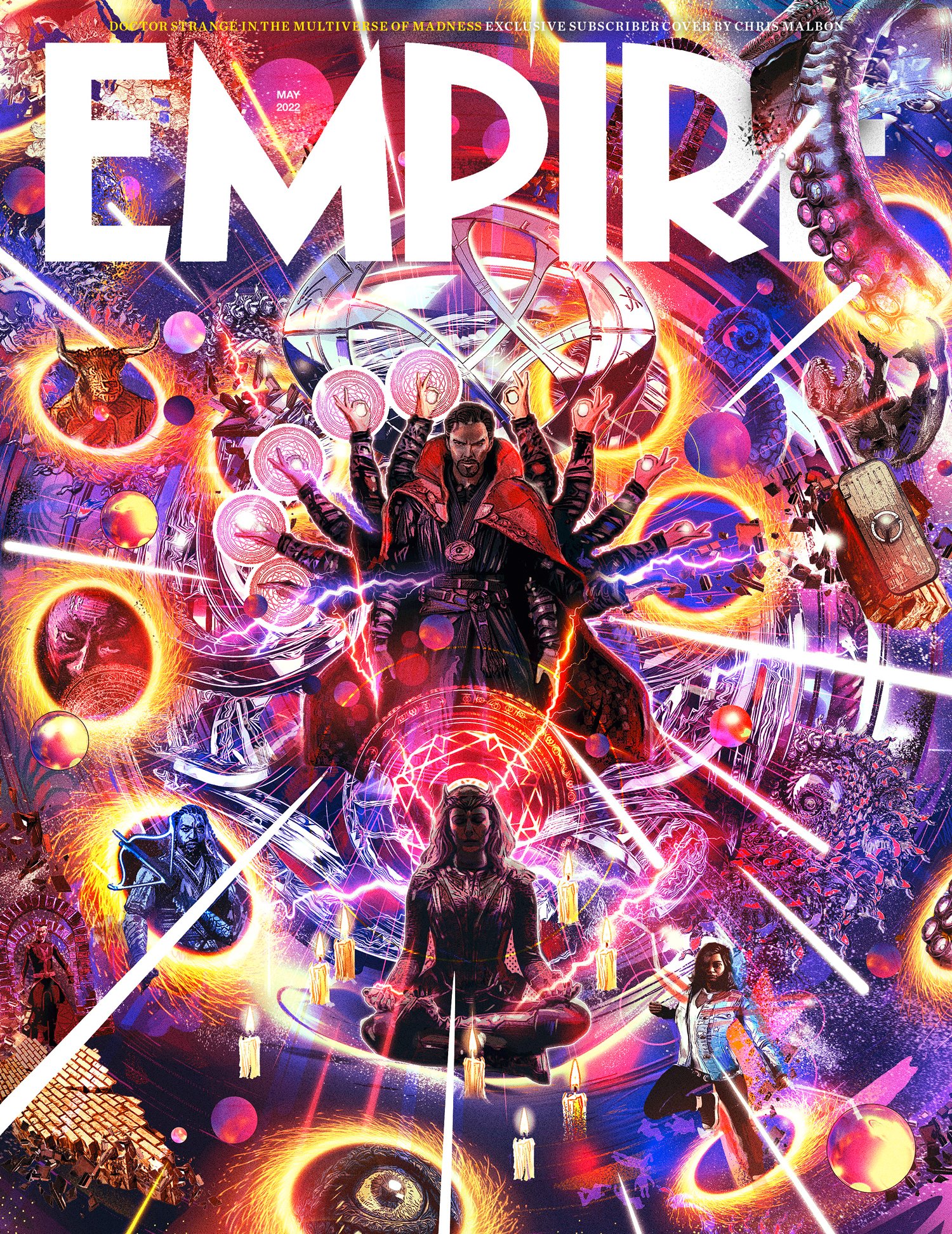
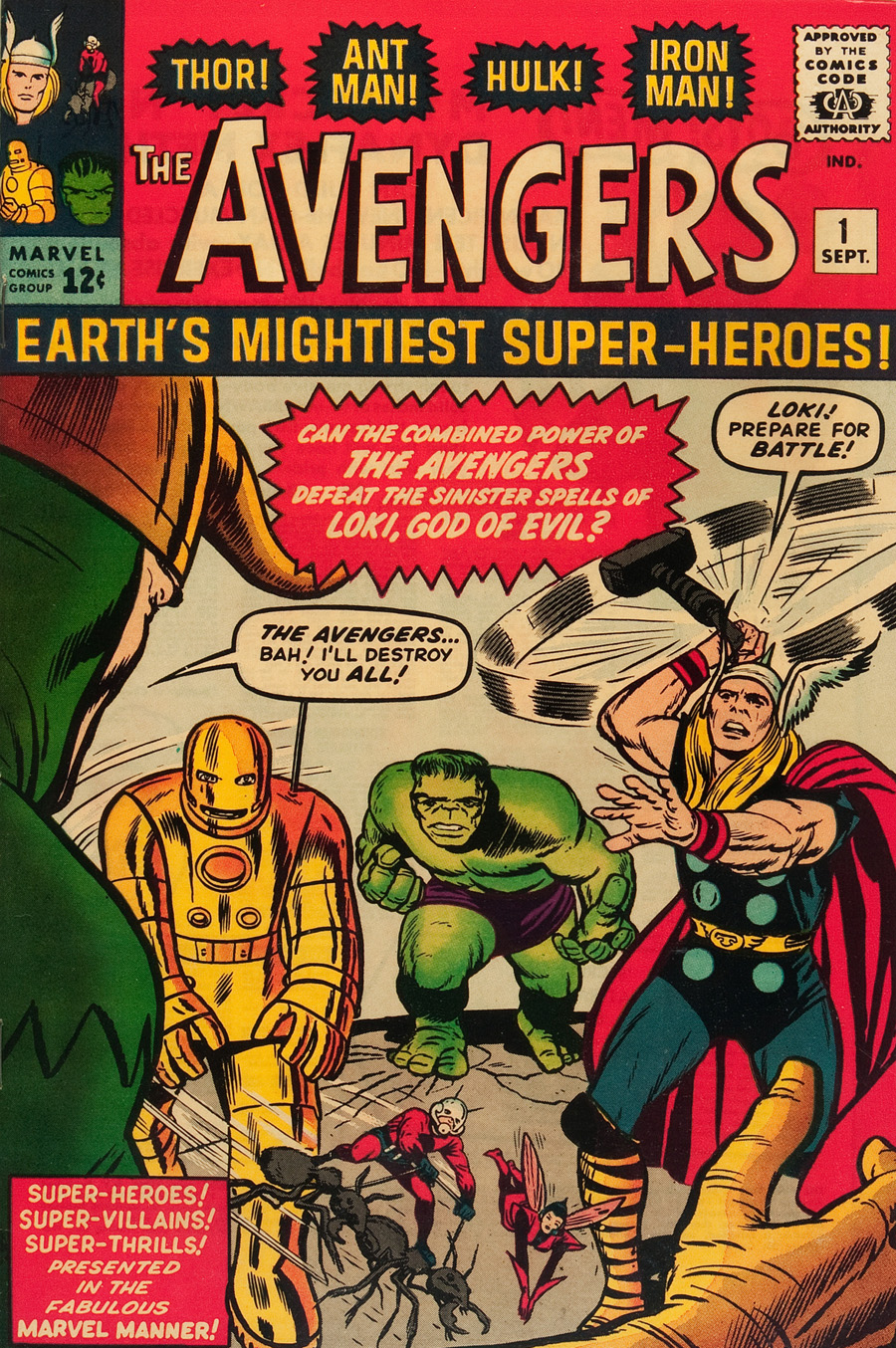
Left: Good use of colour in editorial design

This is a good example of colour in editorial design. This image shows a magazine cover illustration which employs lots of colour.

The designer has used an array of vibrant, expressive colours which are balanced out with each other. The result is a highly saturated, visually appealing magazine cover. This cover is dramatic and enticing to the eye. From far away, it is hard to miss and seems to draw you in out of curiosity.

The most dominant colours in this design seem to be a deep blue and warm yellow. The two colours are both on opposite sides of the colour wheel, which creates contrast between cold and warm tones. This same contrast prevents the design from being overly blue and brings in some differentiation between colour groups.

The people within this design appear to be darker in tone, using less saturated colours to offset the bolder shades. This draws attention to them and creates a range from light to dark, which is more effective as it distinguishes the people from the background, which is quite busy and has the potential to become extremely overpowering.

Another way the design is equalled out is by the use of white. The white is extremely bright and adds a sense of luminance, with the lines segmenting the design and also drawing the eye inwards. The EMPIRE text is also in white, which pronounces it more and adds importance to the name, emphasising the title. The white is extremely stark and automatically sets itself apart from the rest of the design. If the white was to be swapped out for another colour, the legibility may become affected and parts would become lost within the rest of the design. The white acts as a rest stop for the eye, leading us away from the more chaotic background momentarily.

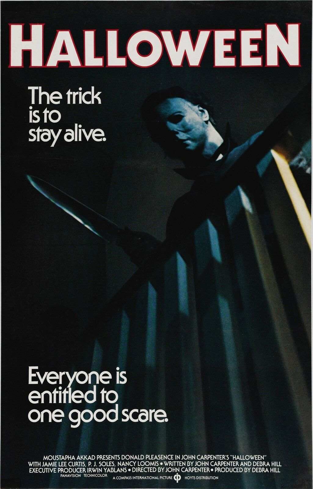
Left: Less effective use of colour in editorial design

This is an example of less effective use of colour in editorial design. This is a movie poster for the 1978 film Halloween.

Halloween is a slasher movie, and the man in the poster is the main villain of the movie. The colour blue doesn’t convey this very well and doesn’t appear scary or intimidating. The blue also doesn’t work very well when paired with the stroke of the text.

I have used the Pantone colour books in Adobe Illustrator to show how I would redesign this with better use of colour.

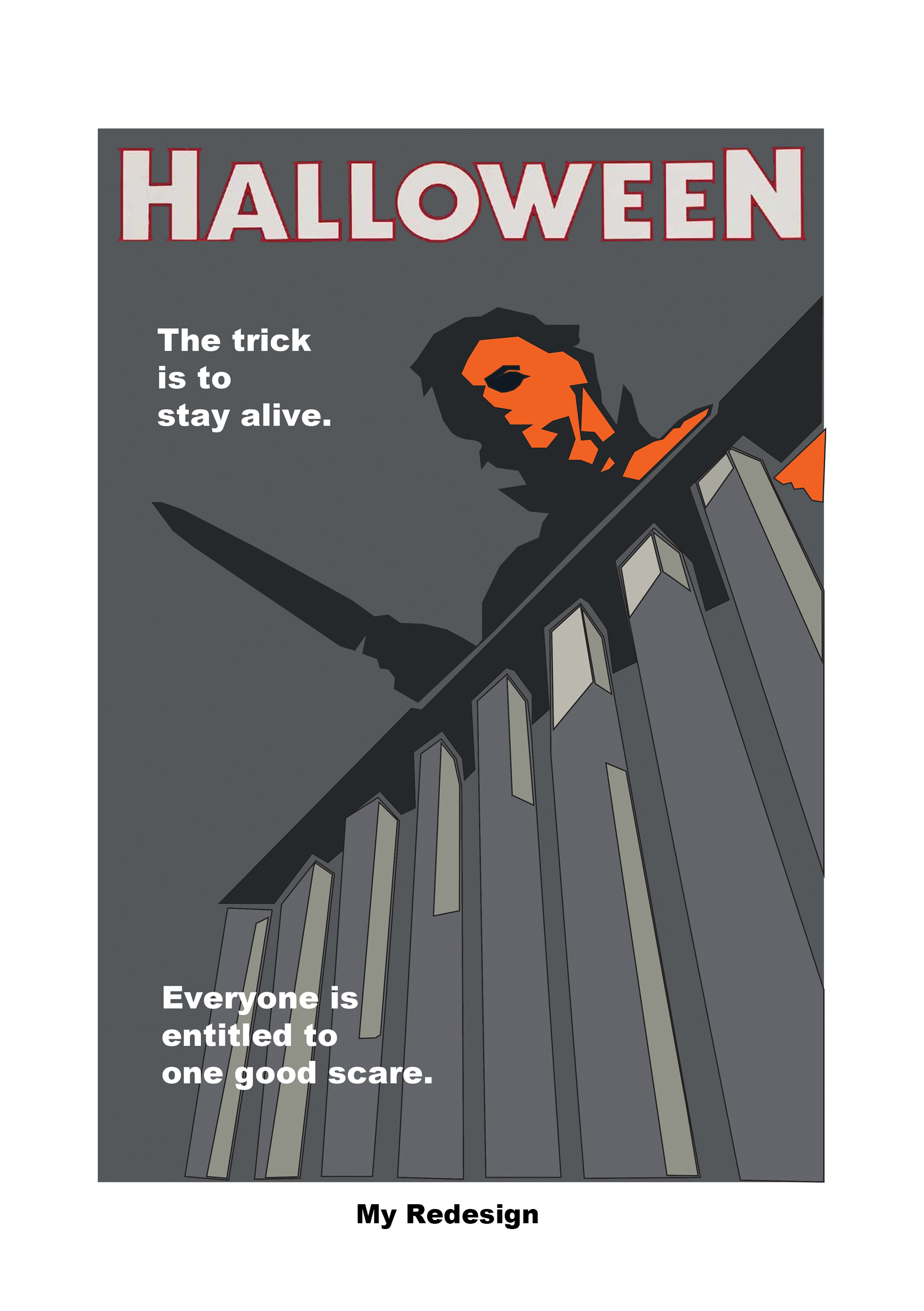
In this redesign, I have swapped out the blue light being cast over the villains face with an orange one. I have chosen to use orange as it is more associated with the concept of Halloween.

The colour blue is seen as non-threatening and calming (Cherry, 2020). This makes the villain seem less unnerving which isn’t desired as the poster is promoting a slasher movie. We do not want the viewer to feel calm, but instead we want to make them feel alert and more on edge when viewing this poster.

As opposed to the colour blue, orange is more high-energy (Cherry, 2021), so it would be more likely to draw the attention of the viewer and make them focus on the villain.

I kept the dark backdrop to contrast the orange. The darkness also creates a more unnerving feeling to the poster.

References:

Cherry, K (2020) The Colour Psychology Of Blue. Available online: https://www.verywellmind.com/the-color-psychology-of-blue-2795815 [Accessed 26.10.2022]

Cherry, K (2021) The Colour Psychology Of Orange. Available online: https://www.verywellmind.com/the-color-psychology-of-orange-2795818 [Accessed 26.10.2022]

Malbon, C (2022) Empire – May 2022 Subscriber Cover [Magazine]. Available online: https://www.empireonline.com/movies/news/empire-doctor-strange-multiverse-of-madness-covers-revealed/ [Accessed 26.10.2022]

Unknown artist (1978) Halloween (1978) The Trick Is to Stay Alive [Poster]. Available online: https://www.ebay.com/itm/222001097140?icep_id=114&ipn=icep&toolid=20004&campid=5338192659&mkevt=1&mkcid=1&mkrid=711-53200-19255-0&ufes_redirect=true [Accessed 26.10.2022]

Composition 

Composition

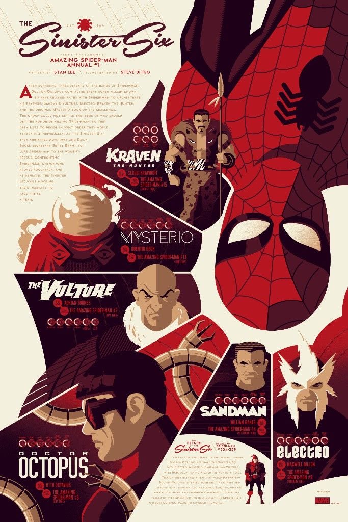
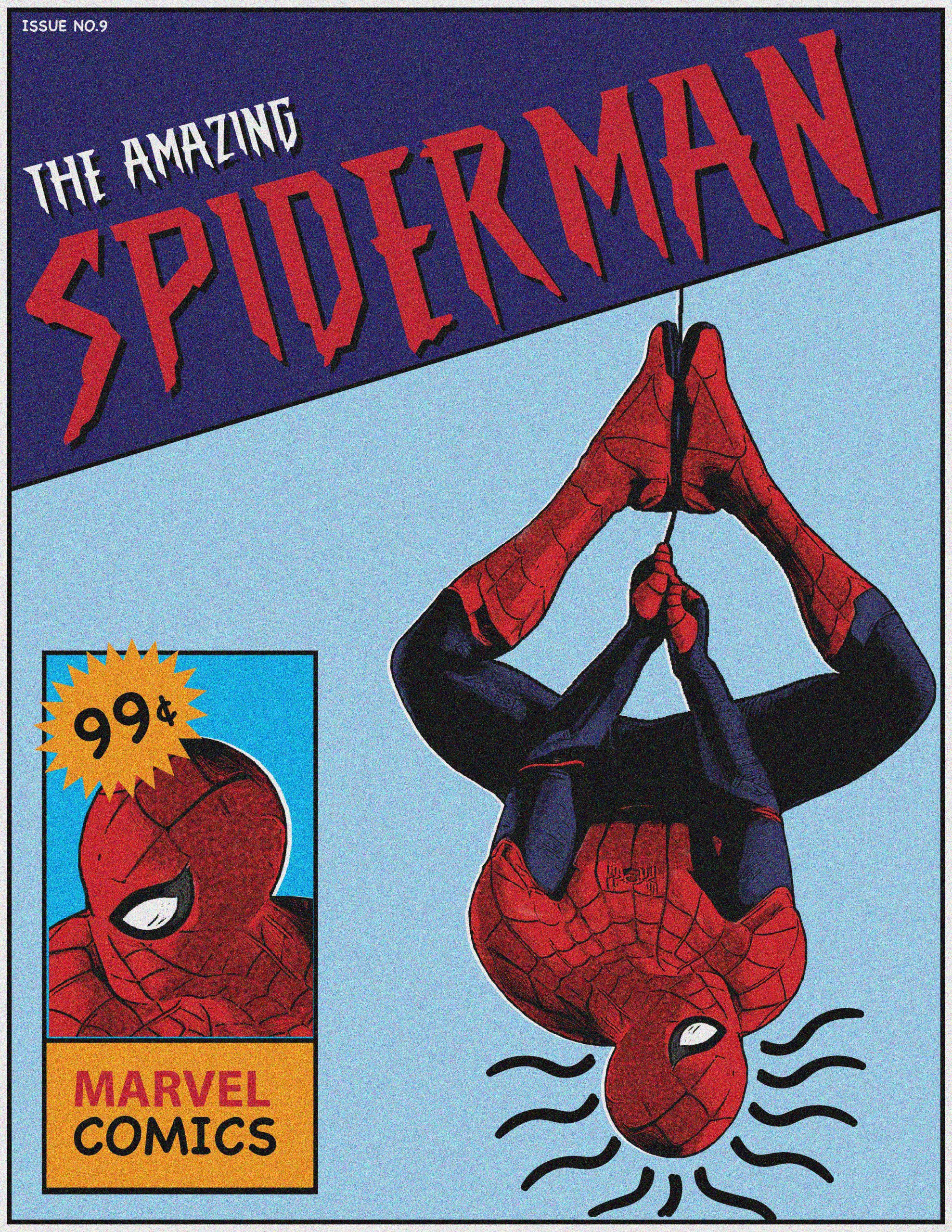
Left: Good example of 2D composition

This is an example of good 2D layout and use of composition within editorial design.

This design has been well considered and flows well, leading the viewer across the page and drawing attention to each element inside the design.

The most dominant element is the spiders web, which expands from around the character and down to the lower left corner of the design, creating a diagonal split in the composition, leading the eye around each arch of the web, all of which showcase a different piece of information.

The use of white space also breaks up the elements and makes the design easier to digest, as it isn’t all just spaced together tightly, allowing breathing space for each segment of information.

The headline is placed in the upper right corner, and is sized appropriately in order to not throw the composition of balance by being too large. Underneath this, we see a body paragraph, and the designer has aligned the text to warp around the web, which fills this space nicely and doesn’t leave any awkward spacing between the text and the illustration.

In the upper left corner, there are also some faint diagonal lines descending towards the heading, subtly leading the eye downwards towards the text. The bottom right corner is balanced by a second body paragraph, which is smaller, filling in the small area of space and avoiding any chunky gaps.

Finally, the Marvel logo is placed right within the lower right corner, fitting nicely and ensuring that everything is perfectly balanced without being overpowering.  

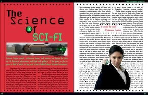
Left: Poor example of 2D composition

I have now found a bad example of 2D layout and composition in editorial design. This is a magazine spread about sci-fi, and the science behind it. The design isn’t laid out well and all the text is grouped together into two large columns, which appears monotonous. The balance isn’t very good either, as the images and headlines seem to clash and throw each other off.

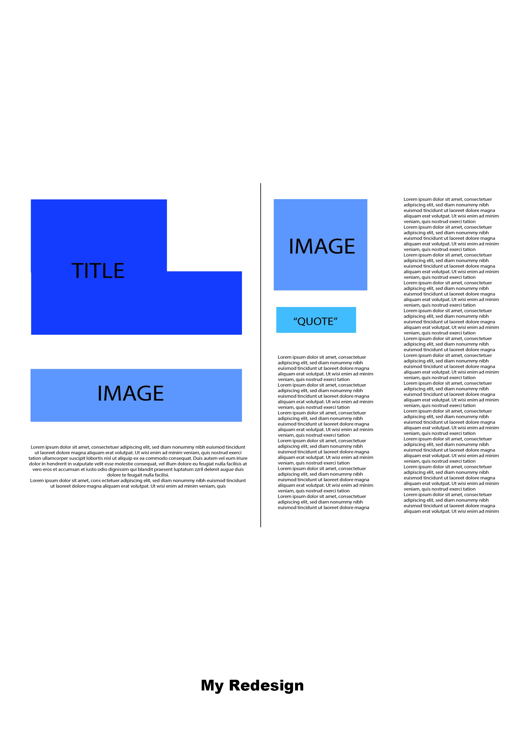
Using Illustrator, I have used basic shapes to show how I would change the layout to be more effective.

I would start by having the title flushed right in the upper left corner, allowing the text to spread across the top third of the frame, bringing the eye outwards.

I would then place the screwdriver image slightly below the centre of the left page, leaving a slight bit of space for the text to avoid a cramped appearance.

Then with the short blur paragraph, I would align that beneath this in the centre, condensing the text box and creating length horizontally to draw the eye inwards.

On the right side, I’d place the image of the woman in the top left corner, creating balance between the two images by having them aligned almost diagonally. Then I would place the quote beneath this so it doesn’t affect the text columns.

For the left text column, I would bring it down lower than the right to create some slight asymmetry and to avoid the text looking intimidating. By breaking down the sizes of the text boxes, it appears less like an essay to the viewer and creates a break visually. The right text box descends vertically down the entire page, forming vertical lines to break the horizontal ones, which is also accentuated further by the spacing between columns, creating a more flattering and inviting composition to this spread. 

References:

Unknown Artist (n.d) The Science Of Sci-Fi [Magazine Spread]. Available online: https://www.pinterest.co.uk/pin/896075657084929462/sent/?invite_code=402dc90d257e45218d476c251760b3da&sender=896075794516860563&sfo=1 [Accessed: 20.10.2022]

Whalen, T (2016) Sinister Six [Poster]. Available online: https://www.artcollectorz.com/artworks/artwork-detail?artwork_id=12797&edition_id=16352 [Accessed 20.10.2022]