Conceptual Design 

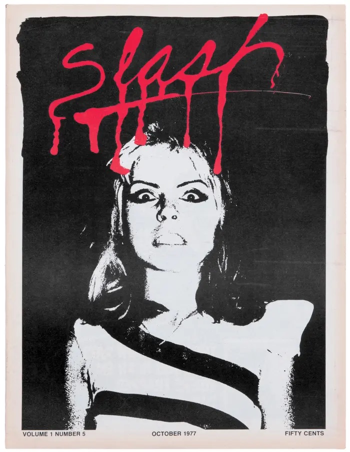
Left: A good example of conceptual logo design

This is a magazine masthead (logo) which employs conceptual design. This is Slash Magazine, a punk magazine from the 1970’s. This logo uses conceptual design in a subtle way that isn’t too obvious and yet still manages to capture the magazine’s identity. The logo is blood red and the typeface has been manipulated to look like dripping blood, as if the text has been slashed in. The logo is underlined and this line also looks like blood that is dripping, creating a horror-inspired look which is dramatic and a little bit edgy. Because the magazine was all about punk culture, bands and other slightly unconventional topics for that time, the masthead is a reflection of the strange, bizarre side of these subcultures. The blood red colour is striking and creates lots of contrast against the black and white image underneath it. This logo shows creates the sense that this magazine isn’t afraid of being gritty and embraces being different to the more mainstream options of magazines available at that time. Alongside being edgy, the logo also seems quite fun and expressive, the design is prominent and definitely stands out which tells us that it wants to provoke the reader, it wants to shock you and draw you in. It embodies the non-conformist punk attitude by being imperfect, which is reflected in the logo by the messy, varied lengths in which the drips are formed. Even the line going underneath the text tapers off and hasn’t been made to be all one continuous line weight – which further adds to the perception that the magazine isn’t concerned about being absolutely perfect. This masthead manages to give us a brief idea of what the magazine is about and creates a personal identity for the magazine also. 

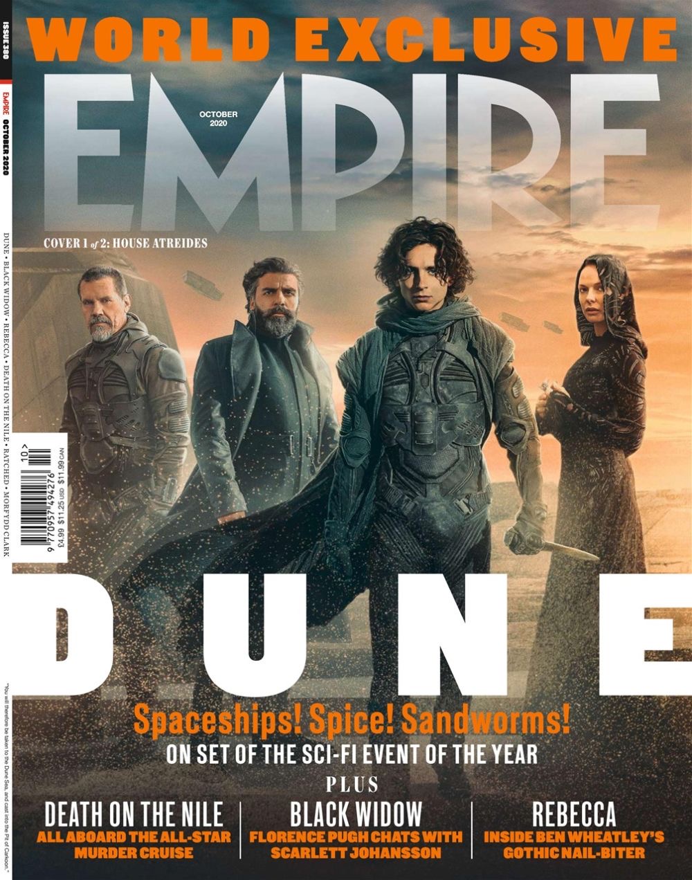
Left: An example of a non-conceptual logo design

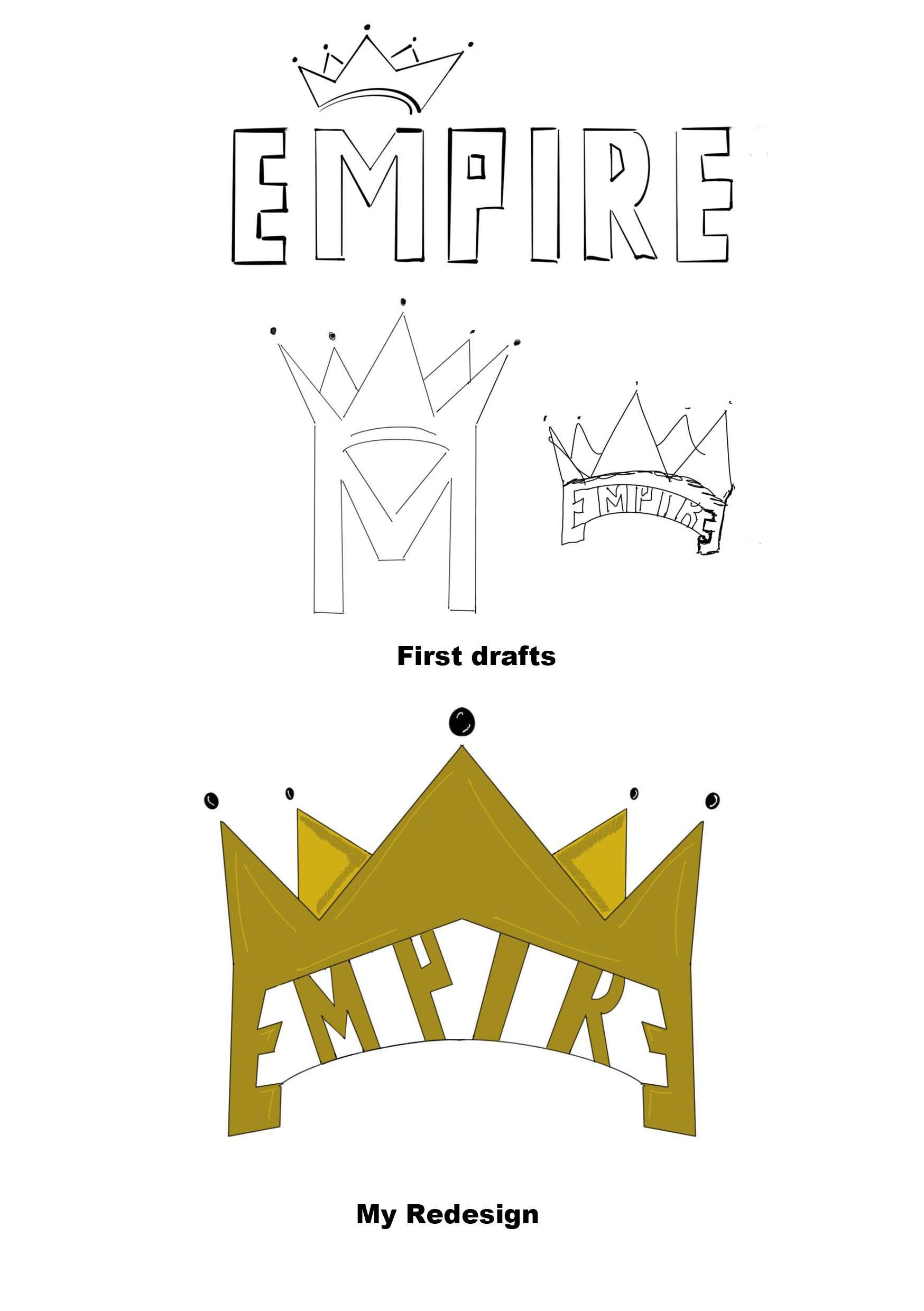
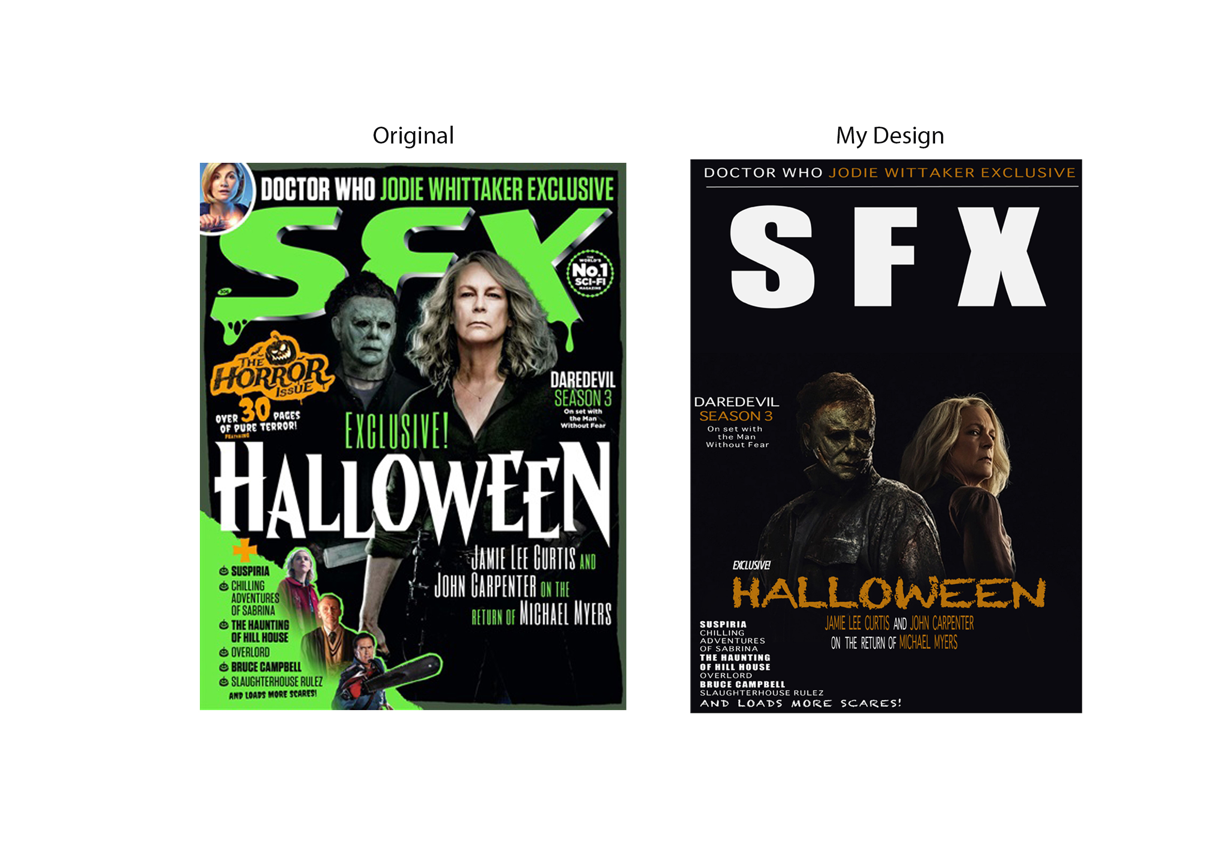
This is a masthead for Empire magazine. This logo doesn’t employ conceptual design and is instead a bold, impactful sans-serif typeface. I think the intention of this logo was to appear strong and dramatic, since Empire focuses on major film and TV news. I have redesigned this logo to appear more conceptual, taking inspiration from the boldness of the original masthead. I began brainstorming words associated with Empire and came up with the concept of a crown to suggest regality and pride. In my first sketches, I illustrated the crown hovering over the M in Empire, but I felt as though it didn’t really merge with the design and didn’t seem to flow very well. I then thought of just using the singular M, this time with the crown replacing the points of the letter, conjoining the two more seamlessly. I liked this but thought it it would more likely be seen as ‘M Magazine’, and not ‘Empire’. I then experimented by having the word be fit into the band of the crown, with each corner being mirrored and turned into E’s. This design felt more conceptual and appeared dramatic and theatrical, which reflects the theme of the magazine. The masthead also has a sense of symmetry which makes it appealing to the eye due to the two E’s at the beginning and end of Empire are mirrored. I kept the lettering within the crown as a sans-serif typeface as I felt that using a serif typeface would clash too much with the rest of the design, which already has a lot going on, so the more simplistic typeface keeps a sense of balance in the design. 

Bauer Media Group (2020), October 2020 Issue [Magazine]. Available online: Empire’s Dune World-Exclusive Covers Revealed | Movies | Empire (empireonline.com) [Accessed: 11.10.2022]

Hat & Beard Press (1977) Slash Magazine October 1977 [Magazine]. Available online: The Magazine that Unflinchingly Chronicled LA’s Nascent Punk Scene (hyperallergic.com) [Accessed 10.10.2022]

Typography 

My subject for editorial design research is film.

Left: Good example of typography

This is an example of effective use of typography in editorial design. This spread is from Esquire magazine and features Samuel L. Jackson. The image on the right shows Jackson shaving his face, and the designer has mirrored this on the opposite side by using a white, streaky typeface upon a contrasting black backdrop. The text has been manipulated to resemble shaving foam, with the headline reading ‘Smooth operator’. The letters get larger in the middle, giving a sense of movement and rhythm, with the letters joined up close together to create a continuous, ‘smooth’ effect. This word is also aligned so that it goes diagonal instead of horizontal, which, along with how large the text is, adjusts the hierarchy to force the viewer to read this first as it is so bold and dramatic. The word ‘operator’ stands out as one of the only inclusions of colour in the design, along with Samuel L. Jackson in the body text – this commands the viewers attention and is used to bring the eye to where the designer wants the reader to look. ‘Operator’ uses a sans-serif text to contrast ‘smooth’ and is placed within the counter of the ‘O’, varying between upper and lower case to oppose the ‘smooth’ typeface above in favour for a more jagged looking effect. The body text uses a sans-serif typeface which helps distinguish this part of text to the the heading and the smaller size also tells us this. The text is centre aligned and the tracking is close-knit, filling in the lower area of the page nicely and balancing out the large heading above. Some important bits of information have been made bold, such as the films Jackson has starred in, this adds emphasis and brings in interest to popular projects, making the viewer want to read on. 

In comparison, this magazine cover doesn’t use typography as effectively. I have redesigned this to improve the typography using Adobe Illustrator. I began by placing the magazine title at the top of the design, making sure it wasn’t covered up like the original which affects the readability and is covered up by the image. I swapped the slimy-effect for a simple sans serif typeface to make the title seem more dramatic and intense. I think the slime was a little bit cliché and cheesy, which is why I opted to not include it in my own design. I felt as though there was too much information on the original design, so I narrowed it down a little bit, placing smaller headings around the image instead of placing text directly over the photograph. I made use of the excess space around the image rather than covering it up as I felt it balanced the frame out more and allowed each element to stand out on its own. I chose to use orange alongside the white text to add contrast, but also because it seems to match the Halloween theme better than green but still keeps the vivid bold aspect of the design. I used a few different typefaces, mostly sans-serifs in different sizes and weight variations, but I did go for more of a decorative, spooky looking typeface for ‘Halloween’. I did this to add more personality to the cover and to compliment the main story heading, which improved the order of hierarchy, making this the most obvious piece of information alongside the title. I kept the essence of the original design, such as the slight horror-elements and some of the text placements, but I instead chose to refine other elements down for a less overpowering and busy design. 

Reference list:

Blumhouse Productions (2022) Halloween Ends [Poster]. Available online: Halloween Ends (2022) (imdb.com) [Accessed: 7.10.2022]

Future plc (2018) SFX November 2018 [Magazine]. Available online: SFX Magazine Subscriptions for Businesses (dltmagazines.co.uk) [Accessed: 6.10.2022]

Hearst Communications (2019) Smooth Operator [Magazine spread]. Available online: SMOOTH OPERATOR | Esquire | April 2019 [Accessed: 6.10.2022]

Adobe Illustrator Self Portrait

My first self portrait (true to life style)

This is my first self portrait made using Adobe Illustrator. For this portrait, I used a photograph of myself as a reference. The photo I used is an ID photo, which is serious and true to life, which I decided to convey in the portrait itself. The reason why I did this is because I wanted the viewer to have an accurate representation of me, like how I am in person.


For this design, I took a more realistic approach with the tones and shapes used. I used the colour picker to get the tones within the image as close as I could in the illustration, matching the tones of my skin, hair and eyes. This is so that people can recognise me and place a face to the designer. It creates more of a personal feeling and a connection between the viewer of my work and myself, making them feel more at ease and familiar as to who I am .


Although I used true to life colours, I wasn’t precise with my shapes, choosing to create a general suggestion with more basic shapes. This creates a more lifelike appearance but also has an illustrative feeling to it, so it doesn’t look 100% exactly like the photograph it is based off of, which would defeat the purpose of it being an illustration. We can see this on the nose, where I used a thin stroke to create a general idea of the shadows – it still looks like my own nose, but it doesn’t show every intricate detail and shadow. I chose to create a semi-stylised portrait which kept enough basic features for it to look realistic enough and recognisable.

Second Illustrator self portrait. I leaned more towards stylisation for this portrait, making it different from my first.

This is my second self portrait made in Illustrator. I based this illustration off of another photograph of myself, this time at a more tilted angle for an interesting composition. The photo is a selfie that I took, which is why I decided to take a more fun, unserious approach to match the casualness of a selfie, as opposed to the more serious ID picture. I went for more impressionistic shapes and decided to use a monochromatic grey colour palette to create dramatic contrasts between light and dark.

The choice to use grey was to get across that I am calm and cool-headed, that I am serious and that I manage to remain at ease under pressure. Grey can also vary from being a light ashy tone, to a more moody dark tone, I think it can create a multitude of feelings so I wanted to use it as a way to add depth and some drama to my portrait.

The shapes used are a lot more jagged and imperfect. I was less precise and instead created a fragmented appearance, which I have furthered by separating elements such as the hair, the neck and the eyebrows. The negative space adds more contrast and looks like bits of a puzzle being put together.

My intention for this portrait was to show myself as different pieces being put together, all of which make up who I am. It represents all my ideas and traits being put together to form who I am as a person.

Self-Promotional Image Poster

First self promotional poster

For my first self-promotional image poster, I designed an abstracted, almost psychedelic retro-looking poster. I had the idea of using my last name to create an impactful feeling, placing it in the central-upper third. I used a tall, condensed typeface and manipulated it so it appeared to be melting. The elongated text worked well for this as it looks to be pulling downwards. The melting represents all my creativity and ideas ‘bleeding out’ onto the page, almost as if there is too much and it is spilling out. My full name is on the top of the poster too, but I have used it more as a frame since my last name is already really pronounced and is a big focal point in the poster.

I wanted to fill out the upper third of the design, so I brought in an image of my eyes. The eyes are supposed to be a window to the soul, and this creates a more personal aspect to the poster, as if the eyes are looking directly at the viewer and connecting with them. The type is the strongest element in this poster, so I made the eyes a lighter blue tone for lower contrast, as not to take away focus from the text and have the elements clashing.

Blue is my favourite colour, which is why I used it. The poster is monochromatic but contrast is formed through the different shades used. Darker shades of blue are used for the areas I want to be pronounced, such as my surname. I added grain onto the poster for some texture, and to create a more ‘worn’ and imperfect appearance, which adds more depth to the design.

My second self promotional poster

My second poster is a landscape one. I wanted to try out a different format. This poster is more structural, using sharp lines and shapes to divide the composition. I started by splitting the composition diagonally, creating leading lines. Half of the frame is light green, and the other is dark green – my second favourite colour following blue. In the upper left corner is my full name underlined for emphasis. Underneath it is graphic designer, which is what I am advertising myself as in this poster. I then made two image boxes, with a black border. The images are from my trip to London, which shows I enjoy travelling and having fun experiences. One of the photos shows a hot chocolate I had in London, which I included as it is one of my favourite drinks.

In this poster, I decided to show myself. I used a photograph of myself, placing it in the lower right corner to balance out the rest of the elements. I colourized the image to green to match the rest of the design. I cropped my eyes and brought them outwards to create a more interesting look to the image. The cropping of the eyes adds more shape and forms a more surreal appearance.

Adobe Photoshop Self Portrait

First Photoshop self portrait

This is my first Photoshop self portrait. I have created a low-poly style portrait, which forms lots of flat toned, triangular shapes on my face. The shapes create a more three-dimensional appearance and add depth and tone to the image.

I purposely left out some areas to create a combination of digital art and photography. I left my eyes, nose and lips so it didn’t look too uncanny and unrealistic as I wanted it to still look like a photograph at first glance. The result is almost futuristic and artificial, which represents how technology is quickly progressing and it is getting harder and harder to differentiate between what is real and what is fake. I am interested to see how technology developing will affect graphic design in the future and I am excited to incorporate it into my work.

For the background, I have created a gradient from dark to light blue, the colours are chromatic looking and add to the strange, futuristic feeling in the portrait. I have added such an emphasis on the future in this design because I am optimistic and excited to explore new technology and techniques, evolving as a designer and adapting to new trends.

Second Photoshop self portrait

My second self portrait is more anonymous, with an air of mystery surrounding it.

I decided it would be interesting to show my silhouette, therefore creating somewhat of a representation of myself, but not showing myself entirely. The image used was a photo taken at a 3/4 angle. I felt that a side view would work better as you can distinguish features more than a straight ahead image. Here, you can see areas of my hood, my neck, and my hair, which create an interesting shape to work in.

I masked another image within the outline of myself. This is a photograph that I took at Victoria Dock. I added a blue hue to the image, my favourite colour, and intensified the shadows in the image. The result was duskish and slightly haunting since it made the scene look like apocalyptic. The eerie tone intensifies the whole mysterious feel.

For more contrast, I placed the mask onto a black background. The trees blend into the background too, so the transition between the background and the image is seamless. The contrast between black and blue works effectively, creating a twilight atmosphere.

Conceptually Designed Personal Logo

My first conceptually designed logo. An illustration of my hands forming my initials and creating a frame.

My first conceptually designed logo uses the idea of two hands placed together to form my initials. I based the illustration off of my own hands, which adds a personal touch rather than using a photograph of someone else’s hands. My initials are LT, so I used my thumb and index finger to form the two letters, with the bar of the T emphasised by the faint wrinkle which runs along from my thumb horizontally.

The space between my hands creates a frame effect, so I would be able to overlay this logo over other images to create points of interest, whilst adding my own personal effect. The frame aspect represents how I take careful consideration to make sure that all details of my work are on point and effective.

I chose to keep colours more subdued. I didn’t go for a variety of tones because whilst I wanted it to be obvious that the illustration is of hands, I didn’t want to distract from the shapes of the L and the T. I did use simple lines of a darker beige to add detailing between fingers, and I illustrated my fingernails to create more of an impression of hands.

I’ve also included part of my jumper sleeves within the composition, which form leading lines coming inwards and centralising the main area of the design (my hands). To have just the hands on their own wouldn’t really lead the eye anywhere and the hands would look strange since they’d just be floating in the frame.

To make it more clear who I am, I’ve also added in my full name, bending the text to fit around the corners of my hands. This helps to make the shapes more visible, and also fill out some of the excess space in the middle, so the gap isn’t too spacious and empty.

My second conceptually designed logo. Made to look like a football club badge to show my interest in football, and an illustration of the Humber Bridge, representing my home town, Hull.

This is my second conceptually designed logo. I wanted to show more of my interests and information about me in this design. I had the idea of creating a badge icon, similar to that of a football club badge, as I enjoy watching and playing football and it is one of my main hobbies.

I chose quite a simple format, which is almost like an arrow pointing down. This way, the logo can be applied to other designs but not look too complex and distracting.

For the main image on the crest, I have illustrated the Humber Bridge at sunset. I am from Hull, so it made sense to show this somehow – and the Humber Bridge is one of the most iconic parts of the city. As soon as you see the bridge you know you are home again. I used various line weights to create distinction between the beams and the joints of the bridge, making the design look more intricate and varied.

I used blue tones, as they are my favourite colour. Blue is also the main colour for Chelsea, who are my favourite football team. I used multiple shades of blue for depth and contrast. The blue and orange tones work particularly well as they’re complimentary colours.

I included my initials as well as my full name to fill up the middle and lower thirds of the design. My full name forms the point at the lower portion, leading the appealingly, where it descends down and then ascends back up to the other side of the design, creating symmetry also.

Typographical Name Logo

My two logo designs, a larger logo for larger scaled formats and a smaller icon-style for thumbnails.

I have made two name logos. I used the same serif typeface for both. I chose a serif typeface because they look more serious and professional and also since they seem more traditional. My first logo shows my full name within an oval. I have used an oval to frame the design and so that it can be placed onto other things like posters or websites without fading into the background. I placed my first name over my last to keep the logo from being too long. A shorter design means it takes up less space and fits better. I created a curved line to follow the edge of the oval to create a break in the design so it wasn’t too flat. I then made another logo, this time I just took the first letters from my first and last name to create a more simple logo. I used a circle instead of an oval since this design will be more condensed and won’t need extending as much as the previous logo. I placed the letters really close so the serifs almost met, bringing the eye from one letter to the other. I made another curved line to go within this design, helping to make the design less boring. Although simple, the curved lines fill some of the extra space up and make the logos slightly more interesting and appealing to look at. I didn’t overcomplicate the logos since the aim is to tell the viewer who I am, so it was important that the logo was clear and readable. The two logos compliment each other and could both be used alongside each other depending on the purpose.